
After synthesis of our intervention study, and informed by 6 weeks of research, the OneTrack team ideated solutions and mapped out assumptions before moving to the final product.
[Read time: 10 min]
Solution Ideation
Our team free-listed individual solutions, producing a range of feasible and infeasible features to address.
[photos – below]
We presented them to each other, and continued to flesh out our ideas through concept sketches.
[photos – below]
In a final ideation session, we selected the group of features that addressed our key issues. First, we pushed the idea of our facilitated work session. In the work mode, we chose to have users set a timed session (minimum 15 min) that leads them to an ambient interface and only two buttons: Break or Exit.
While working, we solidified the random accountability aspect in random BeReal photos taken through the computer’s webcam. This is consistent with users’ desires to be more aware of their work sessions, and is added un-distractingly to the ambient display in the interface. It may also increase a feeling of surveillance, or digital body doubling, that we explored in previous ideation.
The intervention study revealed that a random timer was disruptive while working, but effective in reeling people back in during breaks. We flipped this timed model and set a timer during breaks. This way, when a user feels the need for a break, they can initiate one guilt-free, as the interface does not discourage it. This decision was motivated by literature that praises the utility of breaks, and by user’s accounts that they do not take breaks because they take them naturally. When the user takes a break, they will be able to set a time and activity.
To preserve the mindfulness aspect, we chose to include an extended loading page that serves to 1) both force a small transition period on the user as they return from a break and 2) to prime the user to be ready to work as the session begins.
When a session ends, the user will confirm our app’s classification of work and break photos and be allowed to post one of them to their story. At this time, the social aspect of the app will be unlocked, and the user can view other stories. Copious privacy measures will be taken here. Users can continue their work session, or can end it.
Finally, as a way to automate choosing work times, the interface will learn about the user’s schedule and help to automate planning out study time around their calendar. This will be included in a data section of the app, where the user can also view their photos and history.
We believe that we found appropriate ways to incorporate the evidence from literature and user studies into cohesive features. As we develop the product, we plan to frame the solution as “Productivity meets mindfulness” (work scaffolding that centers accountability and sustainability).
Solution Mapping
To map out our assumptions, we wrote down each crucial concept on a sticky note, guided by this assumption mapping article. With grouping, we identified categories of ideas that we should address, ones we can ideate for, and ones that are unimportant to further investigate.
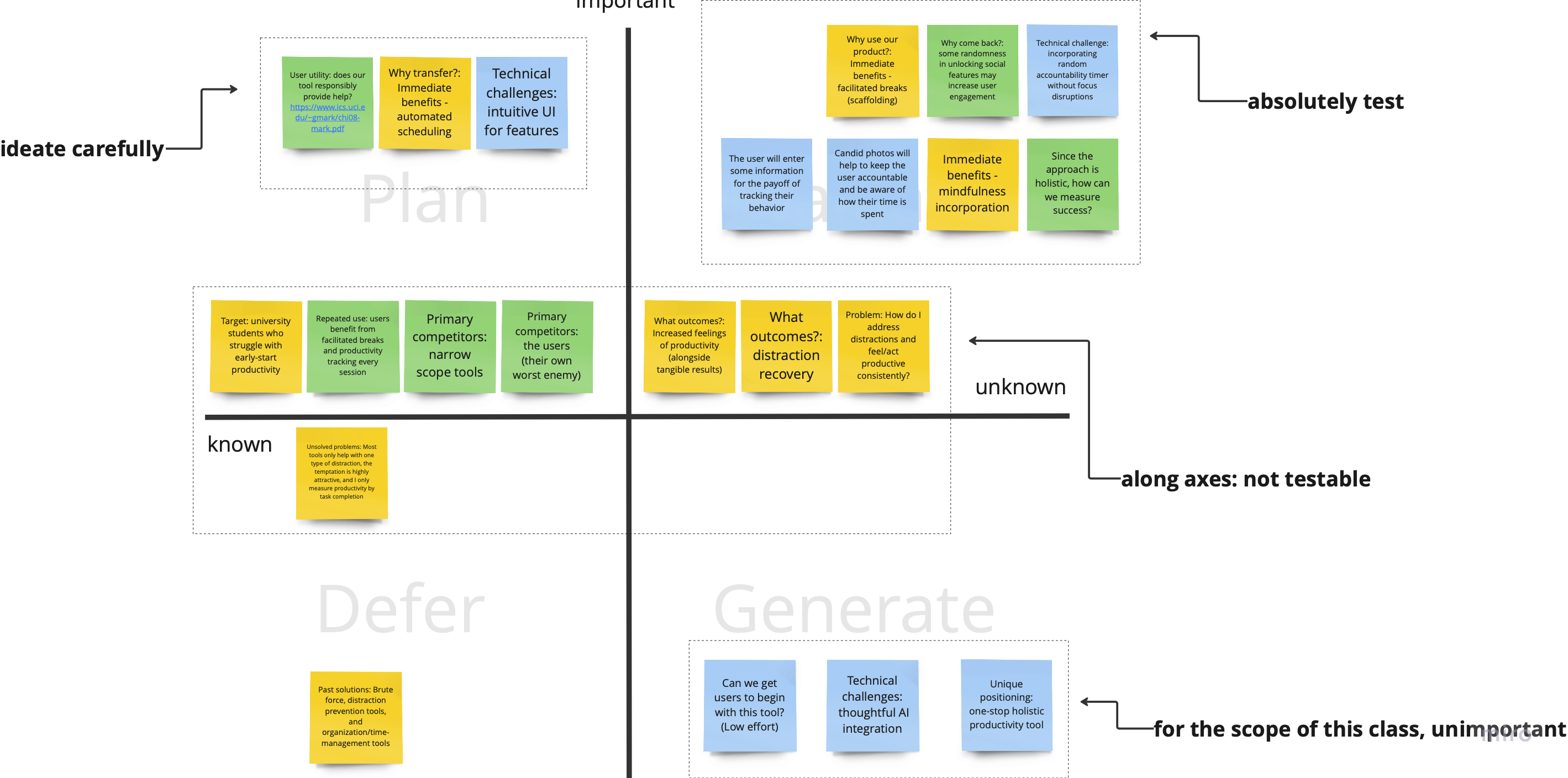
Assumption Test
Finally, we chose our assumption tests. We focused on key features in our solution design.
Candid photos: Would people feel uncomfortable with BeReal style candid photos?
If they are, this may provide a barrier to using our app. To test this, we will inform users of the privacy (images stored on the local device, ability to hide and delete) and ask participants to if this would be a turn-off while using our app (yes or no).
- Ask candidates to answer yes/no.
- If yes, ask them to explain their reasoning, and if no, ask them to explain what privacy measures would make them comfortable.
Our hypothesis: Most users will accept our suggested privacy measures as sufficient, but some will have suggestions for further trust.
Tracking and labelling data: How many prompts is too much?
Our solution relies on many screens. The user sets breaks and confirms the correct classification of data, etc., so knowing how many screens the user will tolerate is crucial. Using flashcards, we will design a simple screen with the prompt we intend to give, and present them to the user in a stack. On the back, the user will be able to view why this screen is being used, and they can look at it if they feel this reason would motivate their decisions. Then we’ll administer the test with these instructions:
- Put the stack down when you’re annoyed and want the prompts to end.
- At the end, let us know: Which ones would you scrap?
Our hypothesis: Users will deem 3-4 screens as acceptable and reject additional ones, even if their value is convincing.
Stories as rewards: What type of access would be most rewarding?
To increase user engagement and motivation to do work sessions, we plan to test the appeal of randomness in social rewards. We know from gambling research that randomness can be increase the arousal of rewards, so we will design three conditions for viewing stories as rewards for completing a work session. We will have users complete a small task, like throwing away a piece of garbage down the hall. Then we’ll reward the participants in three conditions.
- Full access condition: the user will see n rewards after one task completed.
- Limited access condition: the user will see one of the n rewards for each task completed.
- Random access condition: the user will get to choose one reward to flip over for each task completed.
We will gauge the responses qualitatively and based on how many tasks the users are willing to complete to gain access to the rewards.
Our hypothesis: Users will be most attracted to the random access and full access condition, but will complete the most number of tasks in the random access condition.


Comments
Comments are closed.