Executive Summary
In 10 weeks, the Gotcha! team took on the challenge of improving productivity, specifically for students. As students ourselves, we pursued this problem domain guided by the common experience of “wanting to improve productivity.” Tackling this issue by focusing on multitasking, we soon discovered that focusing on structured distraction recovery would be a higher-impact approach. After building out the characteristics of a viable solution through user, scientific, and market research, we launched into testing: short sprints to test key assumptions and pilot small features of solutions. To demonstrate the viability of our solution, we built a medium-fidelity mockup as proof of concept and to concretize our learnings.
This writeup goes into more detail in the latter half of the process — everything during and after Solution Finding — since the our Midpoint Report and earlier work go more in-depth on the other parts, and are linked throughout this writeup.
Problem Domain and Early Motivations
Our primary area of focus was productivity. Originally, our team sought to tackle the issue of multitasking because because it is widely thought to disrupt productivity and public consensus agrees that it’s a behavior that most people would like to change.
We initially operated under this assumption, but our literature review, market research, and our baseline study, indicated that drilling down to distraction recovery would be a more effective intervention.
Throughout the rest of the project, we took a holistic approach to productivity. We noticed that many productivity apps rely on external pressures and quick-fixes, which can often be unsustainable. Therefore, we aimed to create a sustainable solution that centered rest, mindfulness, and simplicity. We aimed to offer users a reliable one-stop shop for long-term success.
Defining the Problem Space
To scope our project, we carried out scientific research, an analysis of competitors currently in the market, and a behavior observation study.
a) Literature Review
Since the literature was empirically backed, our discoveries here were straightforward. At first we found that the scientific paradigm around multitasking initially confirmed the things in the public consensus: Multitasking has negative effects on performance and feelings of productivity. Literature’s deep dive into distraction prevention revealed the efficacy and inefficacy of certain tools, which proved greatly useful in our analysis of competitors.
Recent literature on productivity and attention also suggested that multitasking may not be as problematic as previously thought, and may not even be possible. Instead, it has been found that task switching is a more accurate description of how we manage multiple tasks in our digital lives. This framework does not necessarily view task switching in a negative light, but suggested that it can and must be designed around as a part of any modern productivity tool. While we were not able to immediately contextualize this information, as you’ll read later, it significantly bolstered our decision to switch from multitasking to distraction recovery behavior change, as well as why our new suggested paradigm proved more useful.
For our sources, read our primary literature review.
Competitor Analysis
- Next we surveyed 11 current tools in productivity, ranging from anti-multitasking to mindfulness and automation tools. From this, we learned that tools typically fall in 4 categories:
- distraction blockers (sites, apps, etc.)
- automation & structuring tools (time-management, scheduling, reminders)
- awareness increasers (data visualization, progress reports)
- mindfulness tools (meditation, breathe work, etc.)
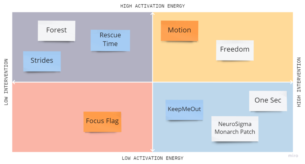
In our competitors — and common to behavior change tools — we saw heavy use of external motivators (restrictions, competition, obligation) to nudge users towards being more productive, as well as information motivators (progress reports, goal trackers, to-do organizers) that relied on awareness translating directly to action.
In our analysis, we discovered that the majority of solutions had limitations. They either addressed only one particular distraction or required a significant effort on the user’s part to produce results. Additionally, these methods lacked the appropriate level of support and intentionality required for sustainable behavior modification, and were unsuccessful in aiding users to achieve their productivity metrics (as per our initial study, on-time task completion).
From this observation, an opportunity arose. Competitors in this field tend to focus on the idea that preventing distractions is the primary factor in enhancing productivity, and they anticipate that users will depend solely on their limited solution for making change.
For our sources, see our survey of competitors and read our competitor blog post.
Baseline Study
To gain initial experimental data, we conducted a behavior observation study for 5 days with 13 participants.
Target Audience and Screener
First, we targeted university students interested in learning about their work/study habits. We launched a screener to filter for those interested in technology-enabled distractions who would be comfortable with self-recordings. Although we did not predict at the time, recording was an extremely relevant choice.
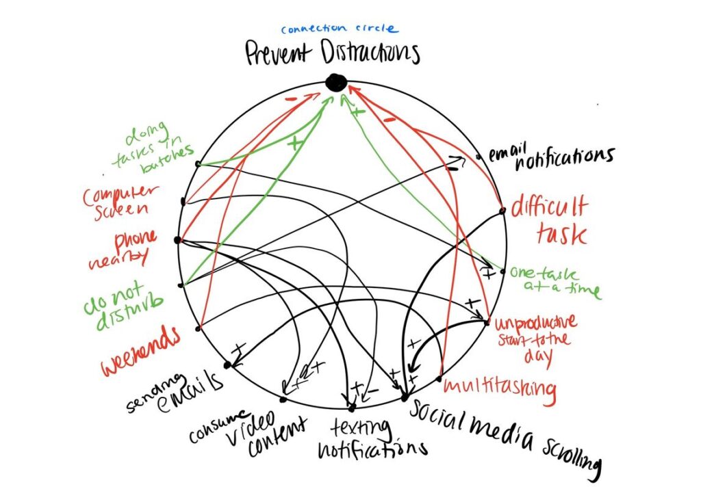
Synthesis: Groupings and Mappings
Based on pre- and post- interviews and study data, we chunked insights with both affinity and frequency groupings and created models to uncover patterned behavior.
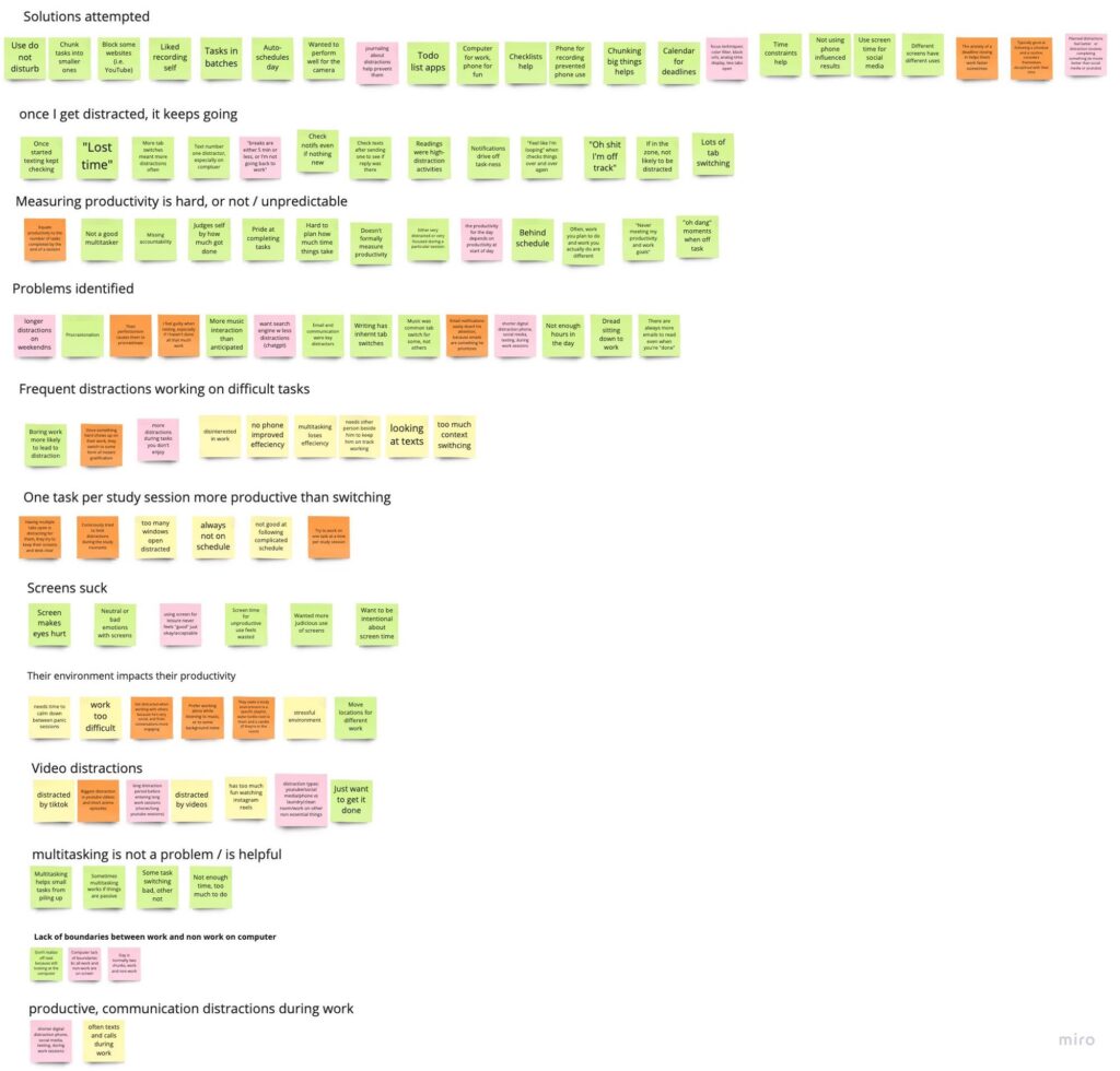
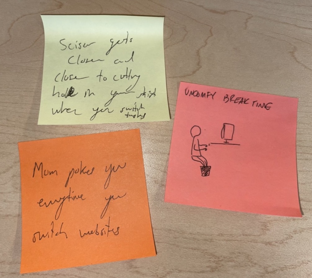
Baseline Study Learnings
We had three main findings:
Users assume the problem is distraction, and the solution is prevention.
- A contradiction arose when participants could identify that they engaged in both productive and unproductive distractions, but then demonized both types equally. They sought out solutions to “fixing productivity” in 2 categories: technological silencing tools and study planning methods.
Measuring productivity is hard.
- The metric for measuring productivity is wildly subjective. Participants measured productivity by “task completed,” which meant that they gave themselves “productivity credit” equally for completing a 10-hour task and a 1-hour task. Most participants did not track time-working and did not factor in productive or restful breaks into their calculations of success.
Participants struggle to change productivity inertia. This insight is two-folded:
- Unproductive inertia: Observationally, participants struggled foremost with derailing distractions. They needed a tool to both a) reel them back in, changing this inertia, and b) transition them back into work.
- Productive inertia: While “on a roll,” participants struggled to take rest when they needed it and/or they also struggled to reward themselves in small doses. Additionally, if they had previously felt unproductive inertia, they may have arrived at a productive state based on self-punishment and now disallow themselves from taking any needed rest. This is the “grindset” mentality.
For more on protocol, data synthesis, and insights, read about our baseline study.
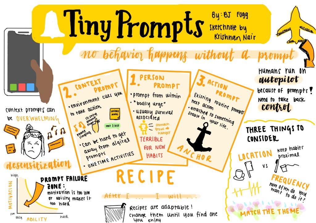
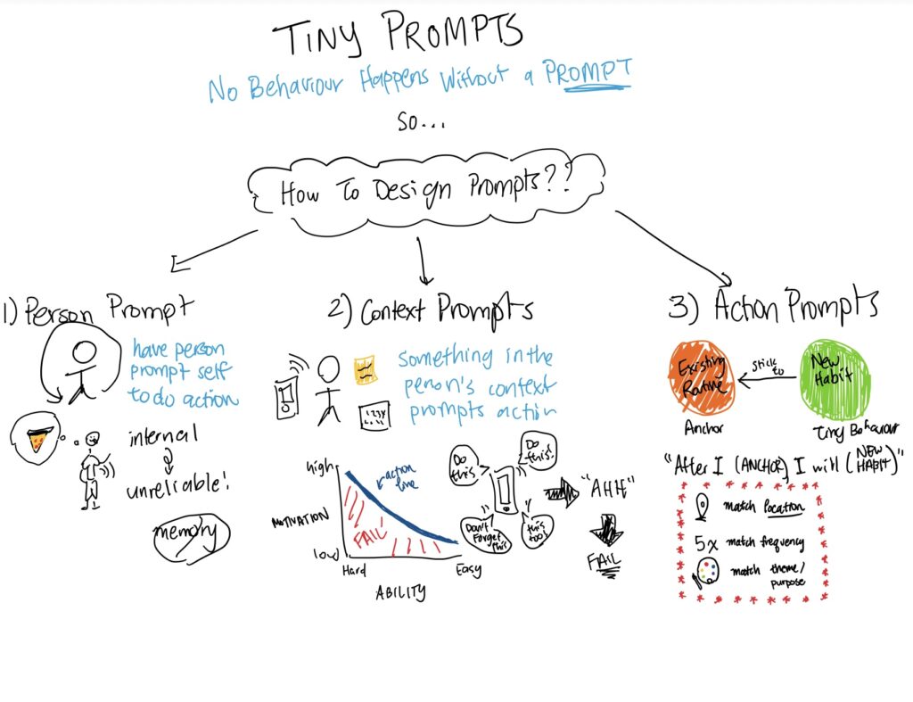
New Paradigm and Open Market: Distraction Recovery
With insights from our observed behavior, academia, and competitors, we identified distraction recovery as the key to better productivity.
As we delved deeper into the intricacies of work and break time, we began formulating the essential qualities of a productivity tool that could bridge this gap in the market. We concluded that our intervention must possess some key characteristics.
- encourage intrinsic motivations through structure and mindfulness instead of making users reliant on a quick-fix solution
- reward both work and break time as contributors to productivity
- help users define their own holistic measurements for productivity (provide an objective time axis, remind users of good work, and give non-penalizing feedback on undesirable behavior)
- encourages frequent and intentional breaks
- measure the “success” of breaks by time, not activity, and reels users back in from derailing distractions
- bake in a sense of mindfulness and sustainable, slow growth into the essence of the product
Synthesis and Sense-Making
As further synthesis of the needfinding stage, we crafted 5 personas and 2 proto-personas (meta-personas) who captured distinct aspects of our target audience. For each proto-persona, we created journey maps and storyboards to gain insight into our target audience’s product needs.
For detailed analysis, see an example of a single persona and our proto-persona and journey map blog post.
Proto-Personas for Differing Motivation Structures
As we continued to analyze our data, two clear profiles began to emerge from our pool of Stanford student participants. Ultimately, both students were hard workers who want the most out of their college experience. However, they differed in some of their underlying motivations, which impacted the pain points experienced by each.
Journey Mapping a Working Micro-Cycle
From each of the proto-personas, we generated journey maps to highlight the cycles and sequences of events our personas might experience in a typical day or work session. These journey maps represent a micro-cycle in each multitasking paradigm, and capture what each proto-persona experiences at key time points.
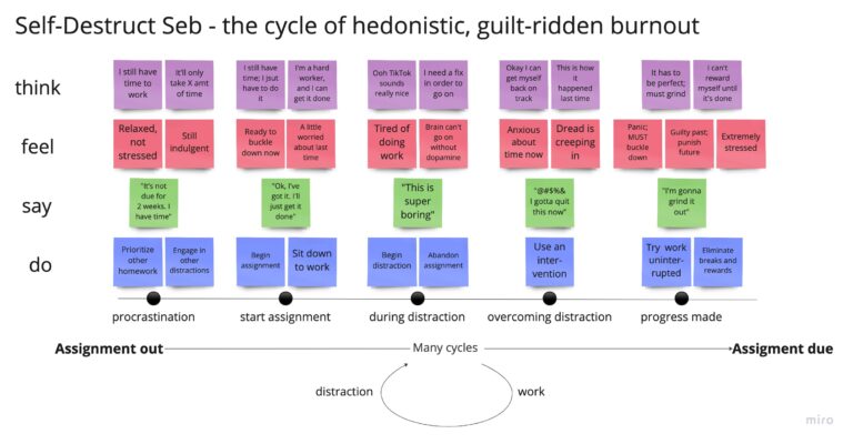
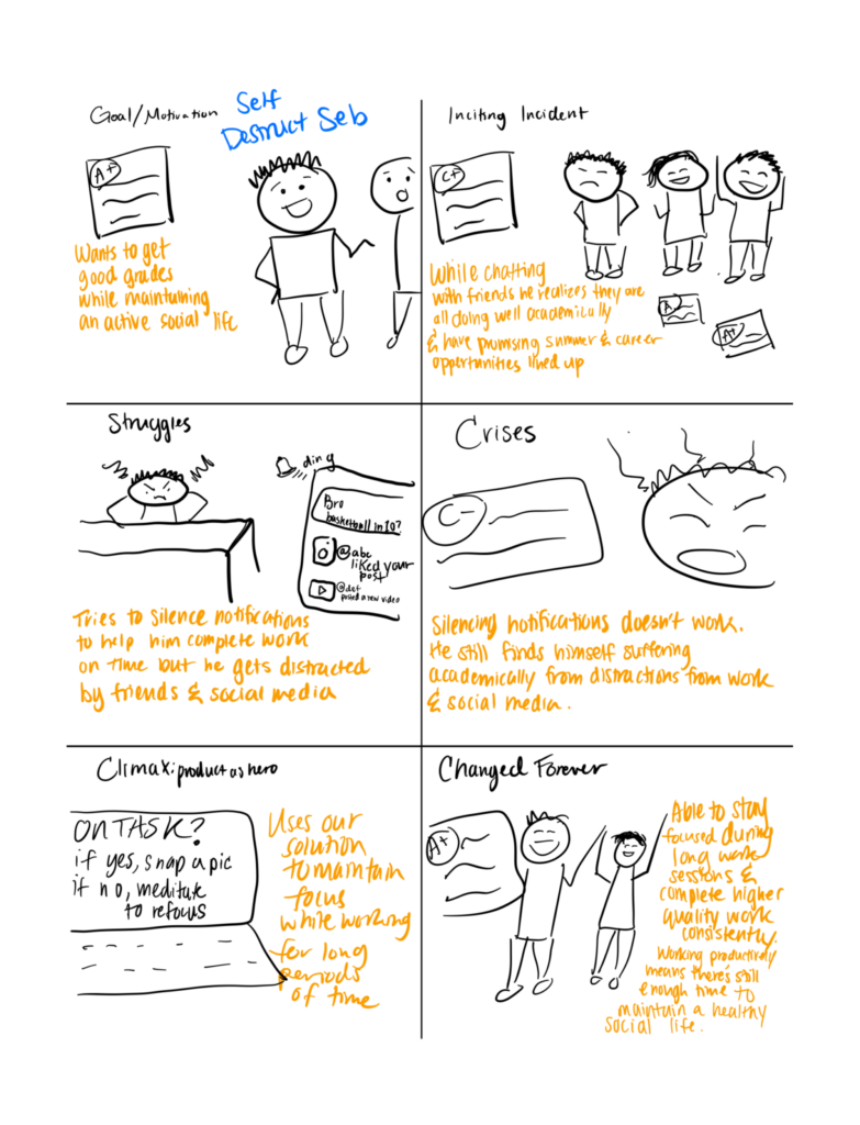
Seb: “The cycle of hedonistic guilt-ridden burnout”
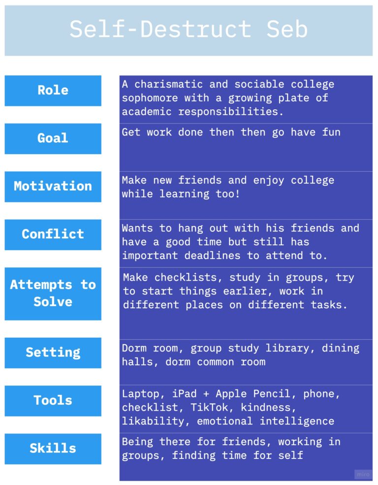
For Seb, we discovered insights around frequent, repeat distractions that led to self-destructive behavior later on. Although Seb could benefit from distraction elimination, it has not worked in the past, so a distraction recovery structure could prove especially useful.
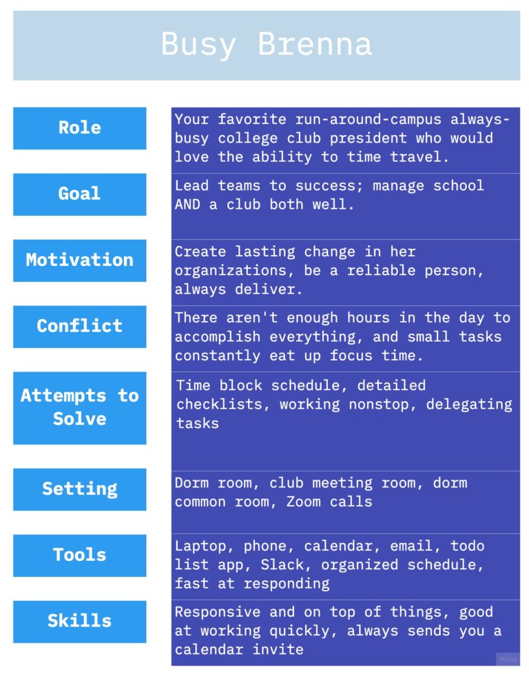
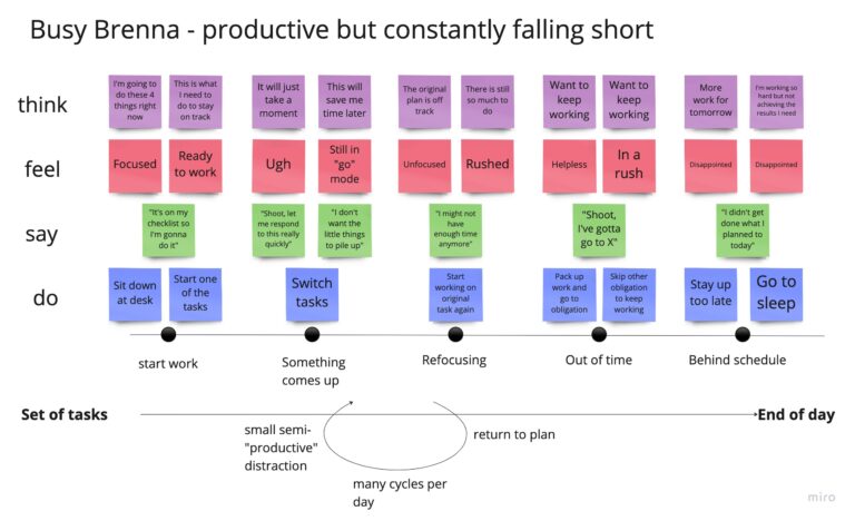
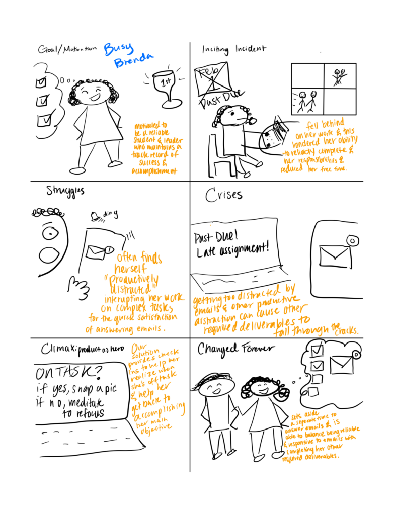
Brenna: “Productive, but constantly falling short”
For Brenna, we discovered insights around productive distractions and an overwhelming schedule. Although distractions are usually productive, Brenna’s productivity is actually diminished by constantly working, so a restful break structure could prove especially useful.
Storyboarding Product Needs
We used storyboarding to gain a better understanding of the product needs of each proto-persona, given that they are driven by different motivations. This exercise helped us solidify our vision of how our solution could provide specific benefits to each user type. At this stage, our key findings largely confirmed our previous assumptions.
Piloting an Intervention
With extensive market, scientific, and behavioral observations synthesized, we were ready to pilot an intervention. In this narrow-scoped experiential prototype, we tested a our time-scaffolding concept with 15 users.
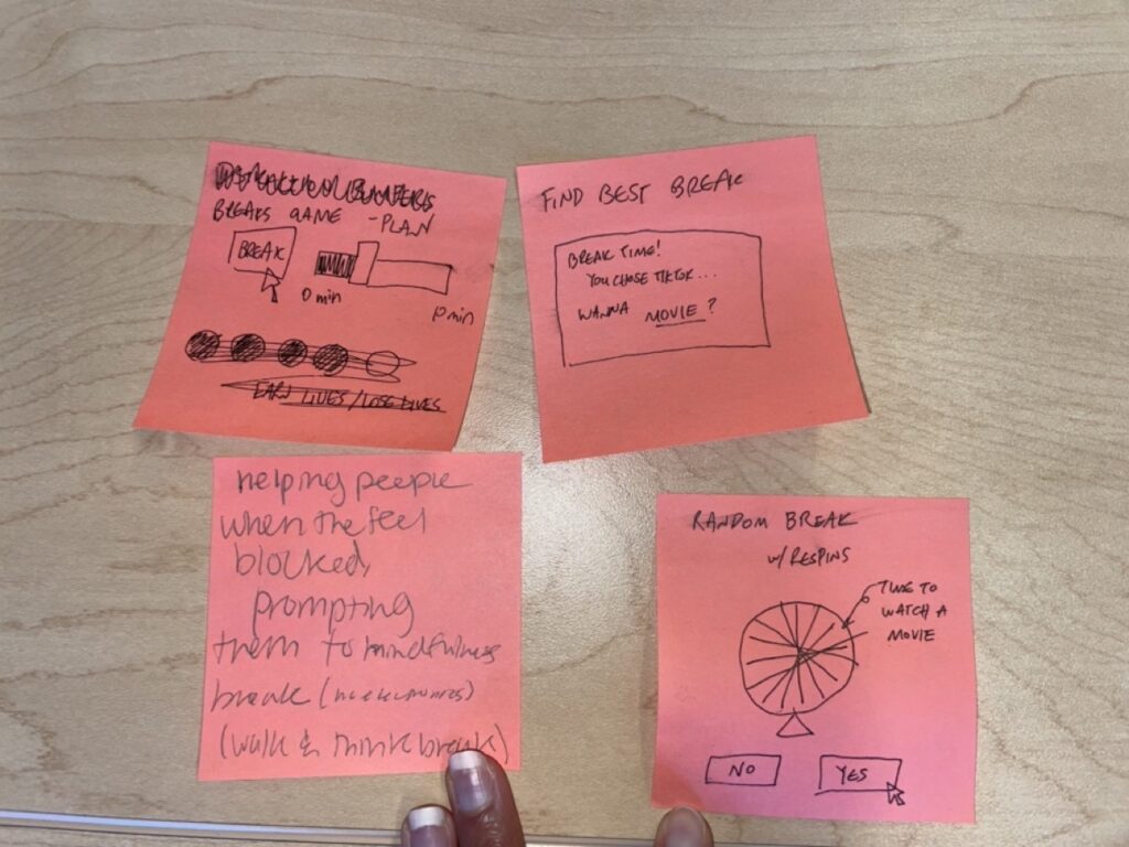
Ideating a Testable Hypothesis
Drawing from the insights gained in earlier stages, we proceeded with a two-phase ideation session. Initially, we generated a list of ideas through a free listing exercise, following which we voted on the most feasible, desirable, and viable options. This process led us to select a makeshift check-in timer that would enable us to test the key aspects of the time-based scaffolding and mindfulness approach we aimed to pursue.
The check-in timer involved participants using random check-ins throughout a fixed-length work session to generate random-sample data. This data was intended to create a profile of their work and break habits and provide insights into how our approach could be refined further.
| Work activity | Chem midterm studying | |
| Session Length | 120 min | |
| Date | 2023-02-12 | |
| Time | 5:40 PM | |
| Random Timer “Max Time” | 60 min | |
| Timestamp | On task during random check in? | If no, what was your distraction? |
| 12:45 PM | FALSE | YouTube |
| 1:01 PM | TRUE | |
| 1:22 PM | TRUE | |
| 1:25 PM | FALSE | |
| 1:30 PM | FALSE | |
| 1:32 PM | FALSE |
Intervention Study Learnings
We derived four major findings from our approach:
- Trend: Meditation is helpful due to a novelty effect, but not universal. Meditation adds intentionality and mindfulness, but successful breaks should be personalized or users will abandon ship.
- Trend: Check-ins must be low-lift and/or backgrounded. Photos, journaling, and other action items are too cumbersome for users who are already working on difficult tasks.
- Tension: Distraction types are highly individual, so specific solutions (like do not disturb functionality) may not address wide user bases. Users primary pain point is structure. They require structure that takes the work out of self-initiating the healthy transitions between work and rest, so they can focus on the hard work.
- Tension: Disruptive time-scaffolding should target breaks, and backgrounded time-scaffolding should target focus time. Our intervention mistakenly prompted users and broke focus, which with a second review of literature, turns out to be disruptive for up to 20 minutes after the disruption ends. While breaks should be encouraged, distraction recovery can leverage disruption during distractions, while work sessions should promote a zero-distraction flow state.
For more on our study protocol, ideation process, and learnings, read our Intervention Study blog post and our Midpoint Summary.
Building Out the Characteristics of a Solution
As part of a robust product cycle, we drove the next portion through testing. We modeled and challenged assumptions, pieced together viable product ideas, and tested for usability throughout.
Design architecture
After synthesis of our intervention study, and informed by 6 weeks of research, we sat down to ideate solutions and map out assumptions before moving to the development of our final product.
Ideation
First we free-listed solutions, pushing ourselves to each end of the feasible and infeasible spectrum. We presented them to each other, and continued to flesh out our ideas through concept sketches.
Feature Decisions
As a result of our research, we believed that we’d discovered appropriate ways to incorporate the evidence from literature and user studies into cohesive features. As we developed the product, we framed the solution as “Productivity meets mindfulness” (work scaffolding that centers accountability and sustainability).
Work Session Interface
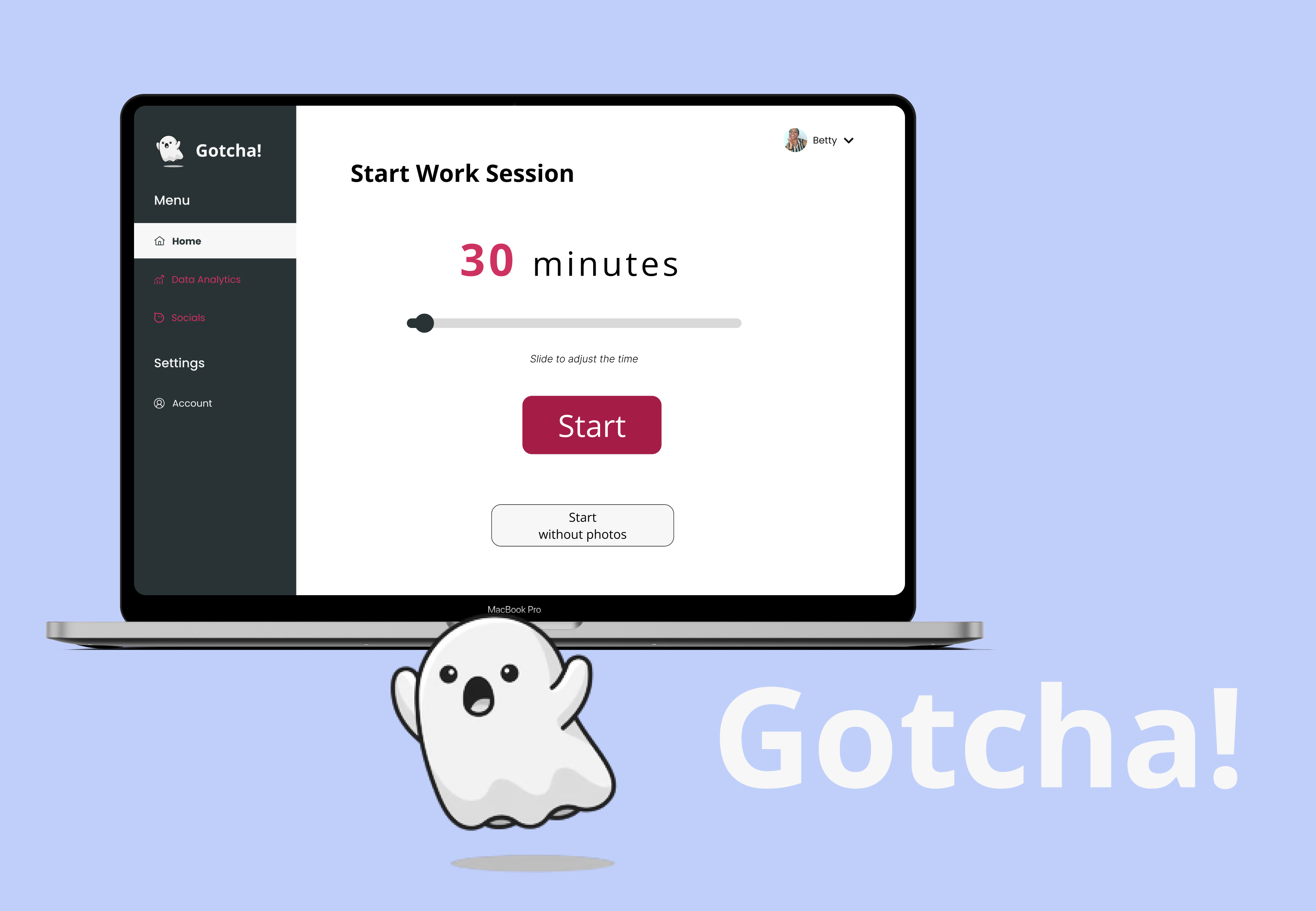
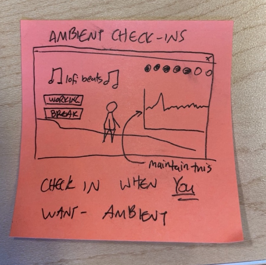
First, we pushed the idea of our ****work session interface. In the work mode, we chose to have users set a timed session (minimum 15 min) that leads them to an ambient interface and only two buttons: Break or Exit.
Random-Interval Photos
While working, we concretized our learnings about virtual accountability in random-interval photos taken through the computer’s webcam. This was consistent with users’ desires to be more aware of their productivity habits and have a virtual body double, and it was smoothly backgrounded the ambient display we were going for in our interface.
Facilitated Breaks
Our intervention study revealed that a random timer was disruptive while working, but effective in reeling people back in during breaks. We flipped this timed model and set a timer during breaks. This way, when a user feels the need for a break, they can initiate one guilt-free and reap the benefits of rest without fear that it would derail their work session. This decision was also motivated by literature that praised the utility of breaks, and by user’s reports that they would not take breaks because they take them naturally. When the user takes a break, they would be able to set a time and activity.
Transition Activity
To preserve the mindfulness aspects, we chose to include an extended loading page coming back from breaks that serves to 1) both force a microscopic transition period (no more than 30 seconds) on the user as they return from a break and 2) to prime the user to be ready to work as the session begins.
Social Rewards
To implement a reward system, we chose to implement a highly limited social portion. When a session ends, the user would confirm work and break photos and be allowed to post one of them to a story. At this time, the social aspect of the app will be unlocked, and the user can view other stories. This portion would have regular chat disabled, and be limited to close friends, so that it does not serve as a derailing distraction itself.
Data Analysis
Finally, as a way to automate analysis, users would have the option to view a data section that contained past sessions from many time-slice views. Here, we balanced user’s expressed desire to have a data analysis portion with scientific literature’s caution against its utility, and we limited the offerings here.
Bubble Map
Next we created a bubble diagram to help us formulate importance relationships between solution elements.
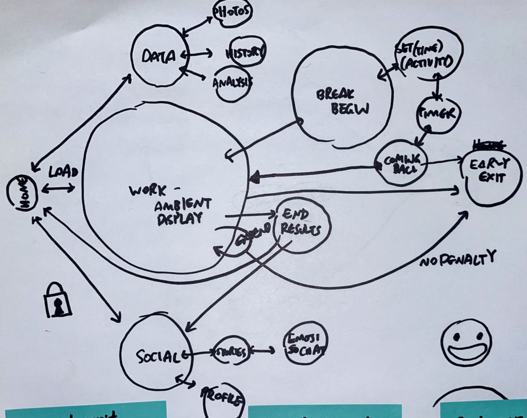
The Bubble Map identified three distinct features of our solution: “work/study mode,” “social feature,” and “data analysis” feature. We recognized that the work/study mode was the primary focus of our solution, and we gave it the most attention on the Bubble Map. When a user entered the work mode, they had the option to work uninterrupted, exit the study session early, or take a break without derailing their progress. We considered facilitating non-derailing work breaks as a key component of our solution, and this was reflected in the size of its circle on the Bubble Map.
In contrast, the data and social media features were secondary to our work session interface, so we placed them off to the side of the Bubble Map.
This helped us to make informed decisions about where to devote our efforts as we developed and tested the solution.
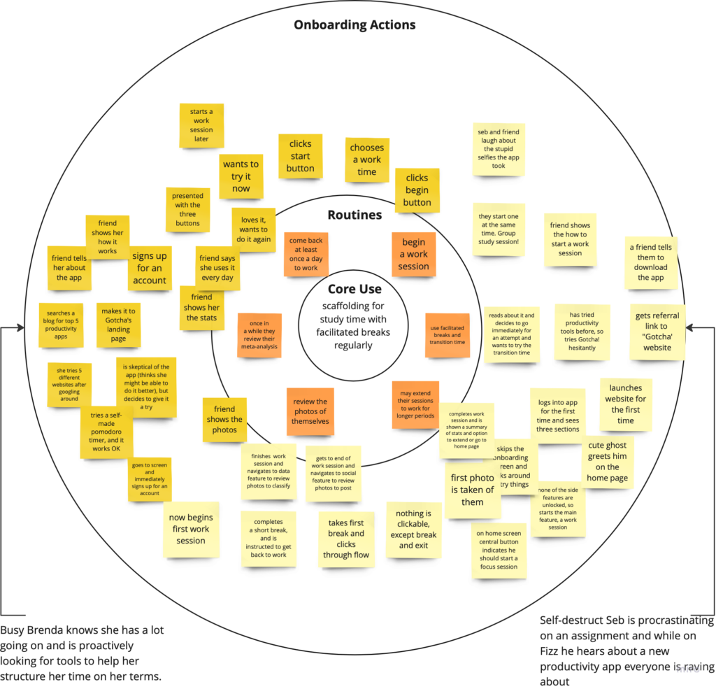
Systems Map
The system map plotted out the use cases for three distinct personas. Later on, we added sticky notes to highlight the features we wanted to keep in our MVP.
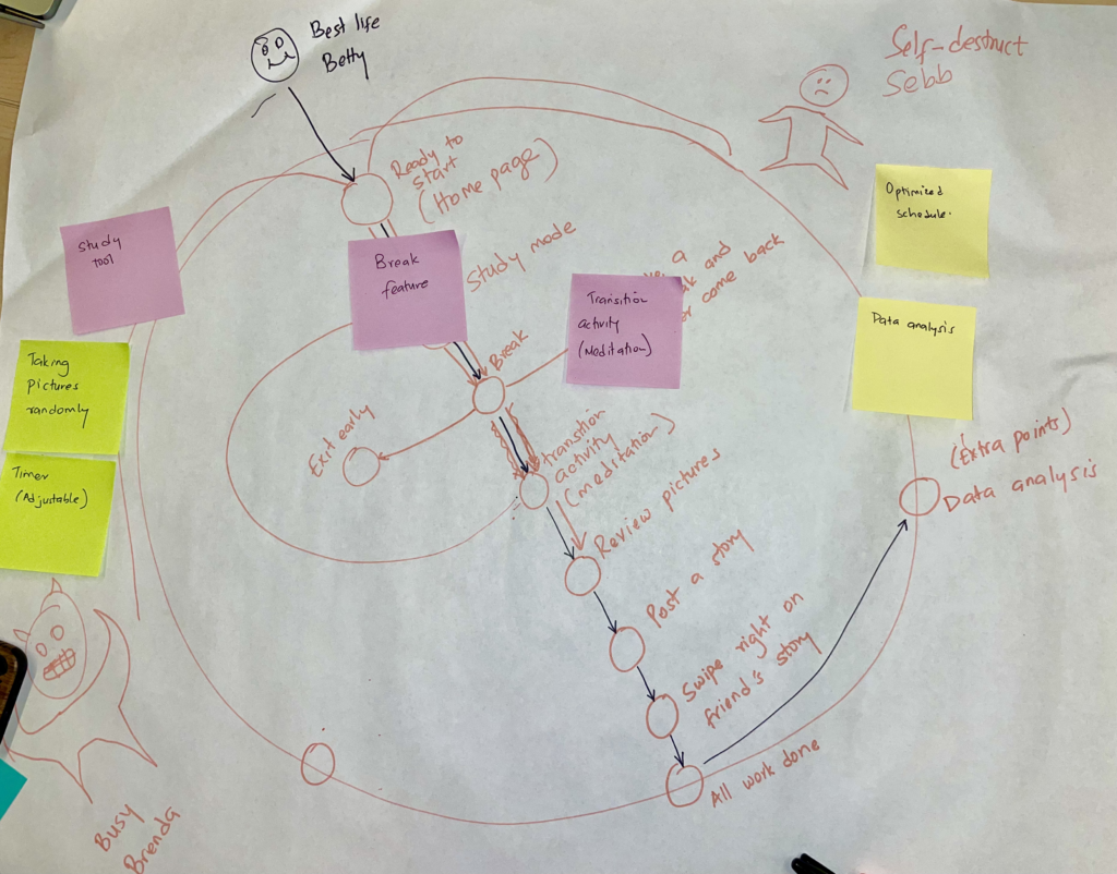
Busy Brenda
Entering at the bottom left, Busy Brenda uses the app to start earlier on one big task, but is at risk of an emergency-exit when she has another important task come up. They get the most use out of the minimum work time, and are motivated by this chunking of large tasks.
Self-Destruct Seb
Entering at the top right, Self-Destruct Seb uses the app while he’s studying but is at risk of taking breaks that lead to abandoning work. They get the most use out of facilitated breaks and scaffolded work sessions, and are highly motivated by the social aspects of the app.
Best Life Betty
Finally, our ideal persona and eventual power user, “Best Life Betty” enters down the middle and uses the app exactly as intended. They work and break, transitioned seamlessly by the interface and feel a boost in productivity because of it. Once completed, they briefly browse the social media content on the app as a reward and analyzes personal data to find trends in their work habits to optimize future sessions.
“Best Life Betty” ****helped improve our later wireflow because they illuminated the ideal user’s journey through the app.
For more on our reasoning, read our Solution Architecture blog post.
Assumption mapping & testing
After determining the feature offerings, we needed to assess whether our choices would achieve what we wanted them to. Guided by the importance relationships, we mapped out the assumptions that each feature made and chose tests to validation tests.
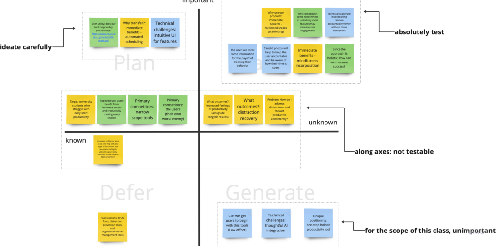
Experiment Setup
We recruited students since that been the target audience of our project. We had approximately 50% new participants and 50% returning participants, for a total of 16. We chose two tests for our main functionality and one test for our secondary functionality.
1. Mindfulness test: Is quick meditation an appropriate method to ease people back into work?
Assumption: Users may not initially welcome meditation, but after a few uses, they may begin to see the benefits of mindfully transitioning between work and break.
Test: To verify this assumption, we instructed participants to either meditate for 30 seconds when coming back from a break, or to transition with their chosen activity.
Metric: We measured short qualitative responses from participants on their thoughts on each method. We knew we’d be right if over 70% of respondents reported that the mindful meditation was more effective at helping them be regain productivity compared to the other method of their choice.
Results: We observed that some participants loved meditating, but others felt uneasy and impatient when meditating. Some wanted to “skip” it or just skipped it. We thus learned that incorporating friction here would not support our interface’s goals. Meditating is an acquired skill, and users require choice here. Therefore, we decided to make meditation encouraged, but not required within the app. Other mindfulness alternatives will be provided.
2. Candid photos: Would people feel uncomfortable with BeReal style candid photos?
Assumption: Users would accept our suggested privacy measures as sufficient, but some would have suggestions for further trust. They would still be willing to use the app’s main functionality.
Test: To verify this, we informed users of the privacy settings (images stored on the local device, ability to hide and delete) and asked participants if the settings would prevent them from using the app.
Metric: As a simple validation test, we measured the affirmative and negative responses and set success at a high majority, 70%, affirmative responses.
Results: We observed that most people said they would use the interface, but a high percentage said they would not be inclined to use such an app. From this, we learned that privacy and distractibility were key concerns for users. People were willing to use the app, but only if we emphasized that they could control the distribution of these photos and that the photos were stored locally. Therefore, we noted privacy for later setting controls and onboarding.
3. Stories as rewards: What type of access would be most rewarding?
Assumption: In social rewards, users would be most attracted to the random-access and full-access reward conditions of other people’s stories, but would complete the most number of tasks in the random setting.
Test: To verify this, we instructed users to complete a meditation task (1 min) and reward them in 3 conditions:
- Full access condition: the user saw n rewards after one task completed.
- Limited access condition: the user saw one of the n rewards for each task completed.
- Random access condition: the user got to choose one reward to flip over for each task completed.
Metric: We measured how many sessions a user completed and collected qualitative responses. We set success at the condition with the highest number of meditations completed.
Results: We observed that many participants only wanted to meditate 1-3 times, and then sometimes were done/uninterested. They reported liking full access better, but were excited about flipping over a card and tended to participate more enthusiastically in random access. Although we determined random-access to be the strongest motivator, as we explore in our Assumption Test Issues, we chose the full-access condition.
Assumption Test Issues
Overall, we were able to effectively test key assumptions. However, we did note a few potential issues:
- During the candid photos test, we were worried about a potential discrepancy between how comfortable participants thought they would be with having their photos taken and how they actually felt during the test. Since it wasn’t feasible for us to redo the test, we decided to modify our final prototype to give users more control over their photos than we had originally planned. Initially, our app was designed to be similar to BeReal, where photos were a crucial aspect of the app, and not taking them would render the app unusable. However, we made changes to allow users to opt in or out of taking photos, making this feature less critical to the app’s success.
- During the stories as rewards test, our main concern was the appeal of the rewards. However, after revisiting the importance relationships outlined in the Bubble Map, we decided to choose the full-access option, which was engaging but not distracting, as it aligned better with the primary focus of the interface – work. Although we still saw value in using stories as a social reward, we wanted to maintain the novelty of ephemerality. Therefore, we decided to de-emphasize the social elements in favor of the primary goal of the interface.
Remaining Assumptions
We were unable to test all of our assumptions before proceeding with prototyping and usability testing, due to the various ways in which users could potentially interact with our product (such as socially or through their productivity/work). Some of the assumptions we were not able to fully test include the following:
- How long would someone engage with the social components of our solution? Would the novelty wear off over time? Given the time constraints of this project, we were not able to develop a test for this assumption as doing so would’ve taken a longer period of time.
- Are there wildly different types of “rewards” we should be offering? We made the decisions to emphasize meditation and social elements in specific contexts and deemphasize them only as “rewards” because we were not able to test this assumption. Mediation serves more as a “transition” activity than a reward and the social component is more optional.
- Is meditation healthy for staying productive? This is a much broader question and we leaned on our literature review to answer it since it was too large of a question for us to test ourselves.
For more on our planning, read our Experience Prototype blog post, and for more on the experiment results, read our Experiment Synthesis blog post.
Solution Building: Atoms to Molecules to Organisms
After completing our testing and research, we developed the minimum viable product (MVP) as a way to demonstrate our solution’s potential. We started by building individual pieces of functionality and gradually combined them to create a cohesive product. Throughout this phase, we conducted testing to ensure the product was user-friendly and effective. Finally, we created a brand identity that reflected the values of our solution. We decided to name it “Gotcha!” to capture the central role of the random-interval photos.
Wire flows of Initial Concept
With yet another ideation session, we connected the solution features in a wire flow, guided by architecture mappings from the previous stage. An arbitrary action colors was chosen to indicate behavioral nudges.
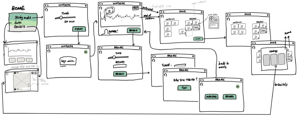
Opening the App
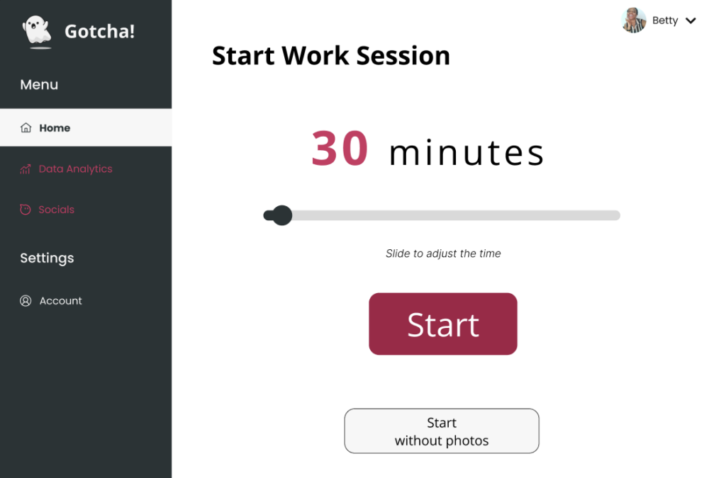
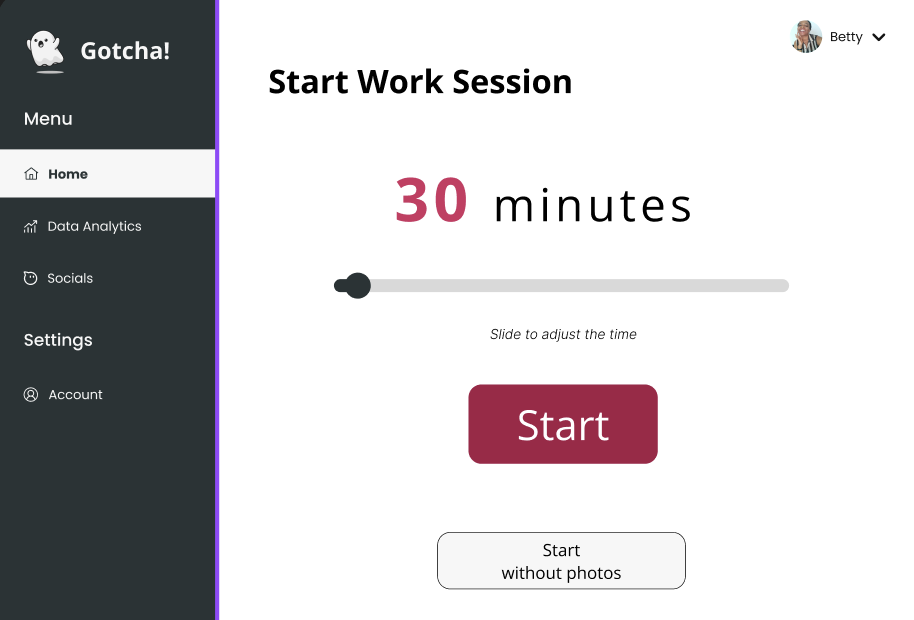
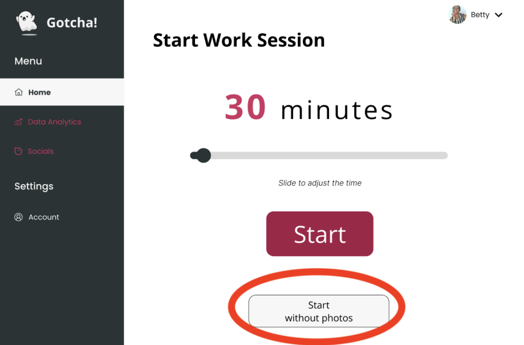
Upon opening the app’s home screen (for repeat users who have completed onboarding), the user is presented with three options: Study/Work mode, Data analysis, and Socials. The second option is not accessible until the user has completed at least one work session. Similarly, the third option is not available until the user completes a minimum work session of 15 minutes each day. The default minimum session time is set to 15 minutes, but users can customize and adjust this time based on their individual objectives at a later stage.
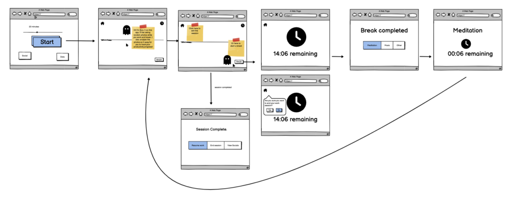
Main feature: Beginning a work session
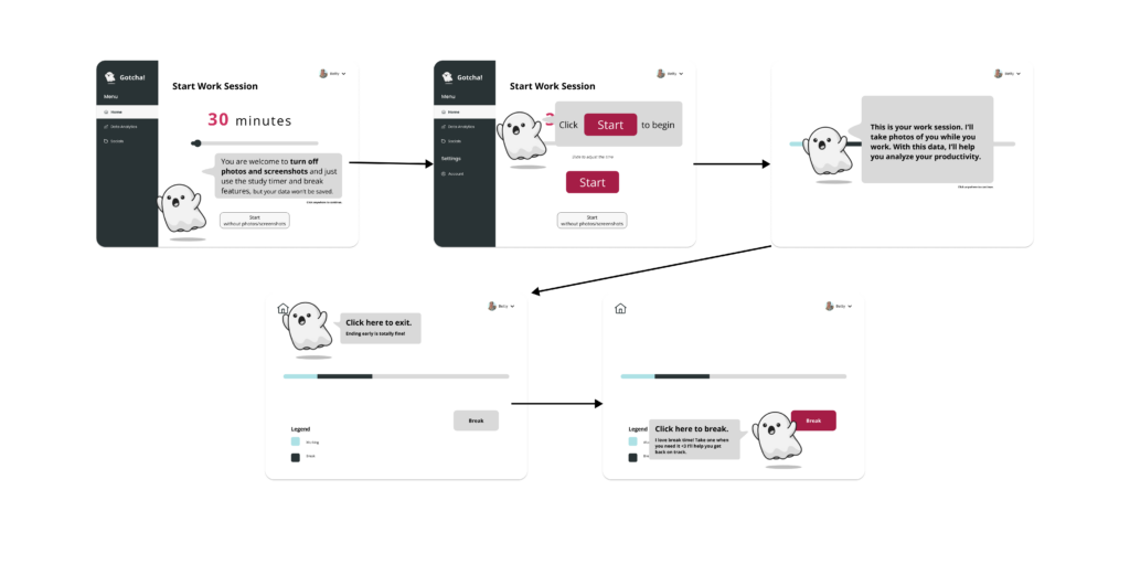
When the user selects the work session option, they will be taken to a screen where they can set the duration of the session. Once they begin the session, the app will switch to a focus mode that displays a progress bar based on the session time. The app will capture pictures of the user at random intervals during the work session, including both work and break periods, using the computer’s webcam.
Taking a break
When the user is in a work session, they have the option to exit the session anytime, but there’s only one other button available, which is “take a break.” Upon clicking this button, the user can specify the activity they plan to do during the break and adjust the duration of the break timer. During the break, a timer counts down, and once it’s over, the user can choose a brief transition activity for 30 seconds (such as meditation) to help them refocus and return to the work mindset. After this, they’ll be redirected back to the main work interface.
Ending a session
If users complete their session as planned, they have the option to extend it without any negative consequences and eventually continue to the exit process. During the exit process, users can view the pictures that were taken, confirm the AI classifications and add extra information if they want. They also have the option to post their favorite picture to their story, but this is not mandatory. Posting the picture is encouraged through daily streaks. If users end their session early, they will not go through the exit process, and additional features will not be accessible.
Secondary features
After completing the minimum work session, users can access secondary features. These include socials, where they can view their friends’ stories and react or send DMs using only emojis, which limit the time spent in a conversation. In the data section, users can access data visualizations that show productivity progress over time, common distractions, and productivity at typical timestamps. In a future version of the app, the AI model would use productivity data to generate an ideal study/work schedule for the user.
Additionally, the app supports other minor task flows, such as adding or removing friends, managing the user’s profile, and modifying default settings. These features are not directly related to the main functionality of the app but would be included in a fully fleshed out version of the MVP.
For more on our reasoning, read our Solution Architecture blog post.
Sketchy Screens
In another round of iteration, we drilled down into each of the features of Gotcha!, applying design principles to support the functionality goals.
Work Mode
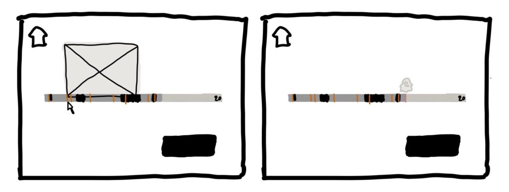
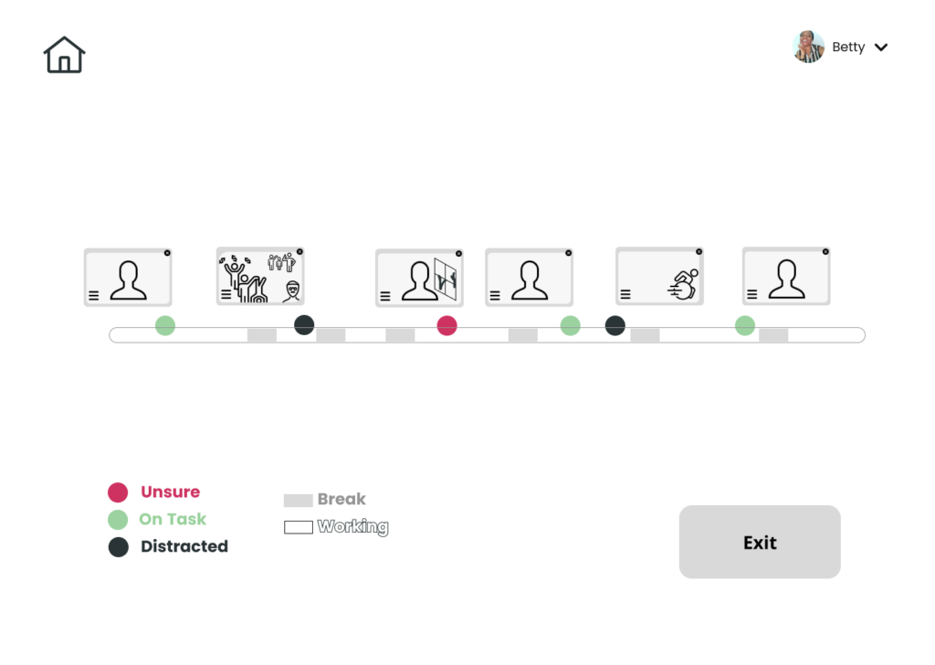
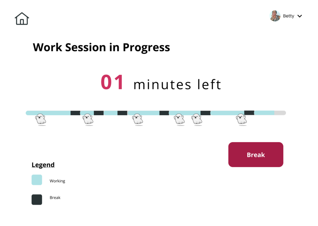
To prioritize visual clarity, we made changes to the design of the work session page. Since this feature is central to our app and should not be distracting, we simplified the design to display easy-to-read visualizations of information (showing breaks or non-break periods with a single marker for each picture) that update seamlessly in the background without any clutter. An almost transparent ghost icon is present to indicate that pictures are being taken, and users can hover over data points at any time, but no other features will distract them.
The only visible buttons in this view are the break button, highlighted in action colors to encourage taking a break, and the exit button, which is de-emphasized and only shown when necessary.
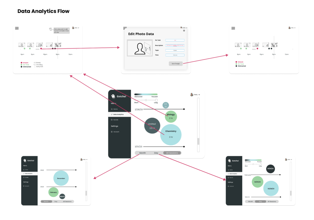
Data Visualization
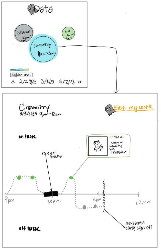
Previously, the data visualization was a rough sketch of the second screen below. However, our refined screen includes clearer visualizations and a ghost mascot to represent an AI character.
The mascot helps users understand that AI is analyzing and classifying their data. On the first screen, there is a bubble display showing different categorizations of data. Similar to Apple iPhotos, you can zoom in or out of the data by togging the day, week, month bar. The color of bubbles represents how focused you were during that work session based on the data classification.
[The following portion was significantly changed based on the results of usability testing.]
After clicking a bubble, on the second screen you can view your binary data points that are either green to represent being on-task or grey to represent off-task. You can click on the data point to see the photo and details on the AI classification of data. Also, on this page, there’s an “edit my work” button in the top right that allows users to reclassify data points individually or in batches and allows users to change data descriptions made by the AI.
Social Feature
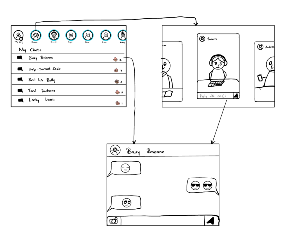
We condensed functionality into common design patterns in the social feature to make it easy to use, with friction only in the important parts. We incorporated this in two ways: emoji chat (users can’t carry on long conversations) and a timer. Since we learned that timers disrupt flow states and are annoying for users in our early experiment, we incorporated it here in reverse to leverage that effect. [The timer was removed after usability testing.] Finally, there’s a streak feature that incentivizes users to complete one work session per day in order to unlock this portion.
Home Base
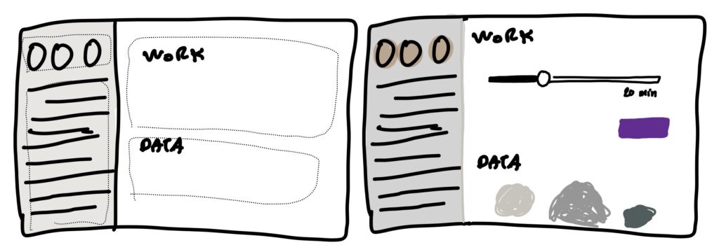
To prioritize functionality importance, we redesigned the home page by making the work section the default view, and dimming the data and social portions. However, this design was later changed to a toggle view, with the home page being the default view. The work session is the most prominent feature, with the only button in action color and a quick-start option that allows users to set the time and start working immediately.
For more on our reasoning, read our Sketchy Screens blog post.
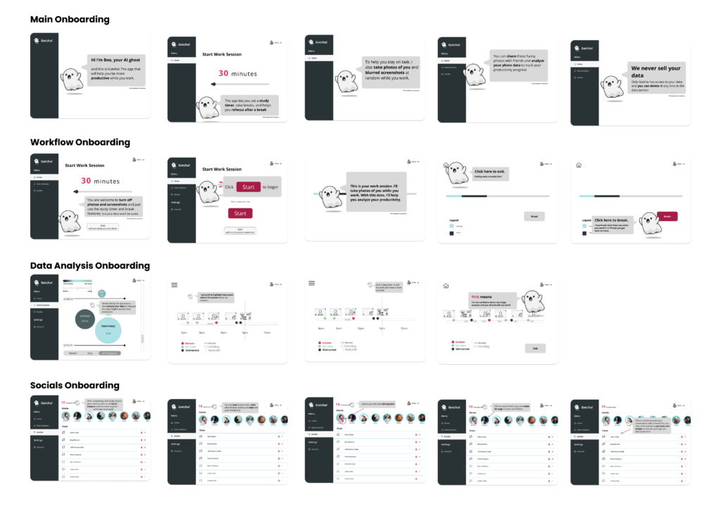
Designing Onboarding: Finding an Entry Point
As a final flow, we mapped out the entry points to our core tasks and designed an Onboarding that would support user’s quick adoption of the interface. Although we added to this during Usability Testing, this was our start point.
In Onboarding, we highlighted the needs of our two proto-personas to design out the onboarding below. As mentioned, these were only initial attempts at constructing a mental model for the user of the Gotcha! app.
Usability Testing
Following the creation of our low-fi mockups, we began work on our med-fi prototype. Throughout the process of creating our med-fi in Figma, we ran usability tests to validate our design choices.
Concepts to Test
We targeted a few specific areas where we wanted to test our site specifically:
- Navigating between different features: we wanted to make sure the components of our site were clear to a new user and they could easily figure out not only how to use the site, but productivity values that they might want to adopt while using it.
- Fulfilling goals: Were users able to effectively fulfill their productivity goals with our app? Was there anything else getting in the way?
- Prompt fatigue: Find any prompts that were unnecessary and simplify the experience of using our site overall
Protocol
We gathered our participants and conducted our usability test on all of the main features of our prototype, testing the following tasks:
- Entering a focus session with the intention to work productively
- Take a break during a focus session
- Exit early from a focus session
- Navigate back to the home page
- Begin a short focus session (i.e. 1 minute) and finish it to unlock the social feature and then explore the social features (i.e. view stories, post a photo, leave a comment)
- Navigate back to the home page
- Begin a short focus session (i.e. 1 minute) and finish it, then navigate to the data analysis feature and edit data that has been classified incorrectly or described inaccurately
- View a friend’s ‘story’ and chat with them
- Check your data and find insights in it
Addressing Feedback
From our usability test, we identified a number of issues with our web app. From there, we sat down as a team and agreed on changes we could make to mitigate each of these issues. Here were our top three biggest issues and the ways we decided to address them in our final prototype.
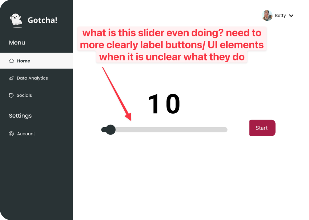
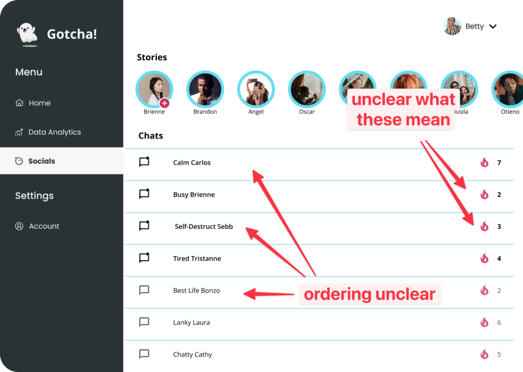
Issue 1: Missing labels on some screens makes navigation difficult.
UI elements like sliders often were simply placed on a page without context or explanation after the initial onboarding. On the social flow specifically, there was significant confusion around use of the social feature regarding whether the streaks showed how often a user spoke to another person, or if it depicted a leaderboard (i.e. “this person has been productive for x days”).
Solution 1: Clearly labeled all buttons, screens and axes.
If we needed to keep the UI clean in some places, we add tooltips with additional context. In an example like the above photo, even adding something like “minute work session” under the “10” went a long way in explaining what everything does.
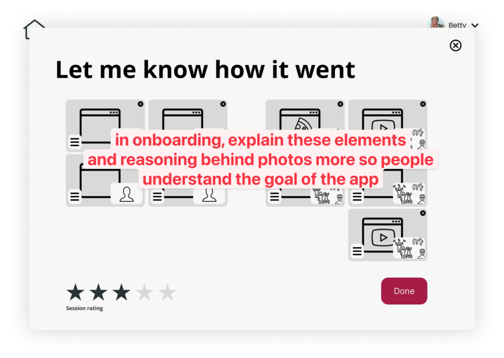
Issue 2: Users lacked understanding of main functionality.
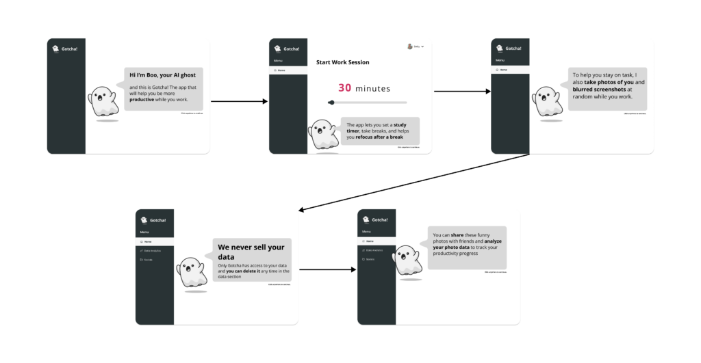
Users felt like they didn’t generally understand some key ideas behind the app such as why the ghost takes pictures (what the motivation behind it was for making them more productive), how they can address any privacy concerns they had, and where their pictures would be used.
Solution 2: We created an onboarding flow which the user encounters during their first session that will address the privacy issue as well as give an overview of the app. We added a setting for photo privacy. We explained the intent in a picture-sharing model during the onboarding so that users could discover why they might want to participate in using the feature.
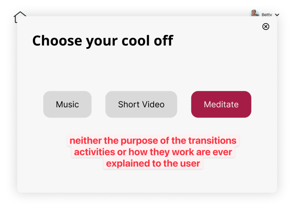
Issue 3: Transition activities were confusing.
There was confusion around the transition activities screen, i.e. users didn’t understand what the three options (music, video, meditate) meant. Additionally, users did not understand the benefit of a transition activity.
Solution 3: Added a clearer transition screen that explains what the different options are and guides the user through whichever one they selected. Also elaborated on our design values for choosing these transition activities and explain in the onboarding the research-backed approach to transitioning back to work
Addressing each of these and other issues was critical to making our website more intuitive to use and helping users to accomplish their goals. We had an opportunity to test our app again at the final class of the year and it was encouraging to see that many of these previous challenges users’ experienced were significantly mitigated. We walked away from that final class fair with some additional bullet points on things we could improve which we then incorporated into our final prototype.
For more on our script and tasks, check out our Usability Testing plan.
Aligned Brand: Mood boards & style tiles
We sought to find a solution that employed color archetypes to subtly convey the values of the product idea. Again, we conducted ideation in two phases: free listing and informed voting.
Mood board
The theme of our final mood board is warm and minimal. We selected a color palette that was zen and was easily associated with mindfulness and meditation, hence the blues and the green. We also added some hints of brighter colors to promote energetic focus and hard work, which were in line with the theme of our solution.
We began to develop our ghost idea more with sample icons and images that fit into the youthful and playful side of the app and this is seen by the different pictures showing cute figures that we intended to turn into some type of mascot for the website. Lastly, we chose designs with clean, rounded fonts (in the sans family) as well as big and rounded images and icons. These are easy to read have a soft/calming connotation, which is suited for our design.
Style tile
Our final UI design kit was settled upon after careful consideration of various design elements. To start, we decided to unite our wellness-themed colors of green and blue to create a consistent and calming visual experience. Additionally, we chose a rich warm color of maroon-purple for our action nudges. This color pops against the rest of the colors, drawing attention to important buttons and functions.
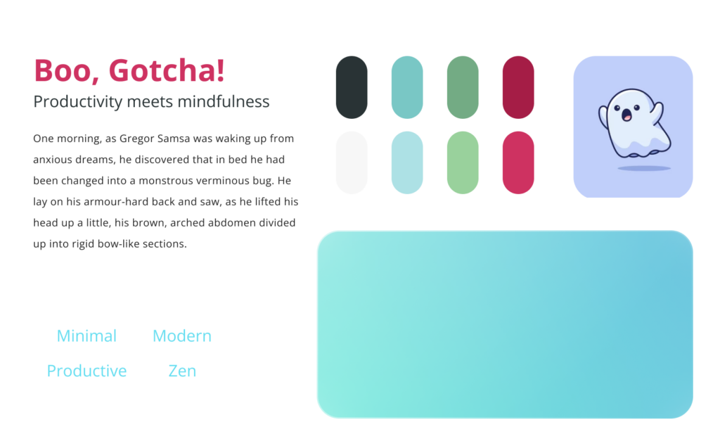
For our font choice, we wanted a modern and clean look, which led us to select a sans serif font. This decision complements our design goals of minimalism and simplicity. To further enhance this clean look, we chose simple, flat UI elements to display our widgets and buttons. This choice helps create a consistent and polished appearance throughout the design.
To add a youthful touch to our design, we included cute icons and images. Moreover, we introduced our mascot “Boo the Ghost” to represent the AI algorithm that works in the background of our solution. This personifies the AI and makes it appear more trustworthy, relatable, and overall cute.
Finally, we opted for rounded edges for our UI elements. This decision was cohesive with our font choice and added a clean and polished look to the design. Altogether, these design choices helped us create a cohesive and visually appealing UI that enhances the user experience.
For more on our branding choices, check out our Mood Board and Style Tile blog post.
Final Prototype
The Grand Tour
View our prototype here: Prototype Link
Onboarding flow
This section provides an overview of the app’s purpose and basic features, as well as app design decisions that prioritize user privacy. It also introduces Boo, the AI ghost, who acts as a guide and data analyst in the app. The team discovered through usability testing and project fairs that there was confusion and concern regarding the decision to take photos in the app and potential privacy implications. To address these concerns, the team created a tutorial that explains the purpose of taking photos, which is to help users stay focused and avoid distractions. They also informed users that they can delete their data and that the team never sells user data.
Work flow
The work flow of the app allows users to set a study timer and take breaks during their study session. While the user is studying, the app’s ghost mascot takes pictures of them at random intervals. This feature was added after a baseline study showed that users who recorded themselves while working were less distracted. The team assumed that the majority of their target audience, which consists of students looking to improve their productivity, would be comfortable with this feature. Additionally, the app includes a text box for users to document what they plan to do during their break. This was added after another study found that users who documented their break plans were more likely to stick to them and avoid unintentional distractions.
Data flow
To provide users with an easy-to-understand summary of their data, we implemented basic visualizations similar to those in Apple Photos. These visualizations allow users to zoom in and out to see data summaries at different levels, such as months, days, and individual sessions. When a user selects an individual session, we diverge from the Apple Photos model and instead display a timeline that includes images from that session, along with a legend to explain the symbols and classifications of the data points.
As we are incorporating an AI element to classify data, we received feedback that the AI should have a way to denote when it is unsure about its classification. To address this concern, we included the color pink for the AI to denote data points where it is unsure about its classification. Additionally, to support user privacy, we added a trash icon that allows users to delete data when editing photo data, if they wish.
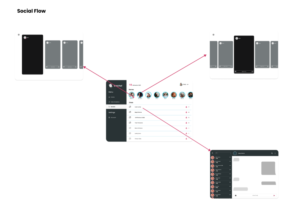
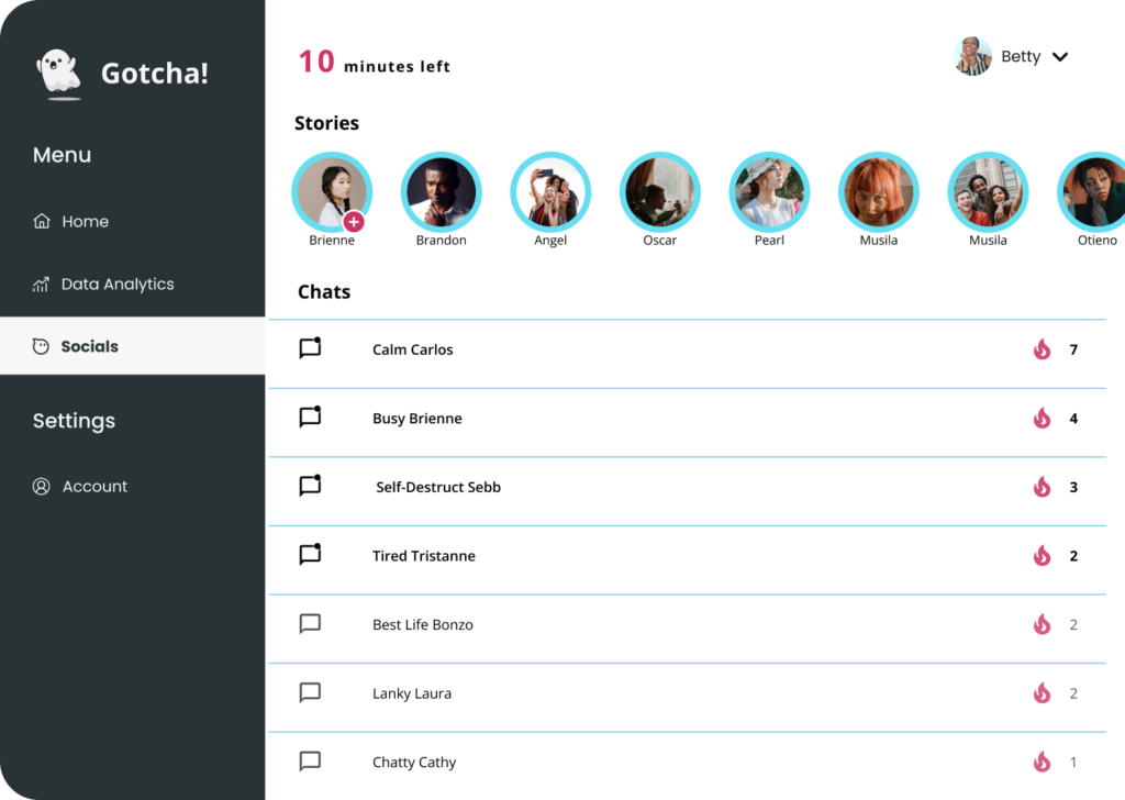
Social flow
The social feature in the app is designed to resemble Instagram stories and direct messages. Users can share updates on their study progress through stories, which disappear after 24 hours. This feature offers users a glimpse into how others are using the app to stay productive. Users can also communicate with each other via the app, but only through images and emojis. This is meant to encourage brief and exciting communication, without the potential for addictive, lengthy conversations. The design decisions behind this feature align with the ethical considerations of gamification, aiming to avoid distractions and excessive engagement.
Final Edits to the Prototype
The design changes are as a result of the feedback we received during the final prototype showcase.
- Added timer to the social feature
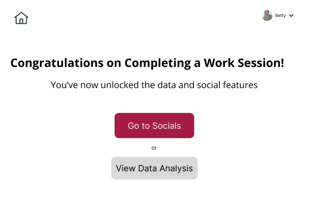
- Added a notification to show that the Social and Data Analytics features have been unlocked after successfully completing a work session. This is an improvement on our previous implementation that redirected users to the Social feature, and this took away from the main purpose of the app
- Created a difference in color to indicate the socials feature and data analysis feature are unlocked once they complete a work session.
4. Updated the review screen for pictures to display the images in a linear timeline similar to the work session timeline
5. Added a main onboarding flow to address privacy concerns on the app, as well as custom onboarding flows for each main feature (Work flow, Data Analysis Flow and Social Flow) in order to explain how to use each feature and to clarify common confusions that came up during testing.
6. Added clear labels for the different screens to make the UI more user friendly
 7. Added an alternate flow that lets them use our app without getting their picture taken because we received feedback during the project fair that this was a feature people were interested in.
8. Added a trash icon when reviewing your data so people can delete their data.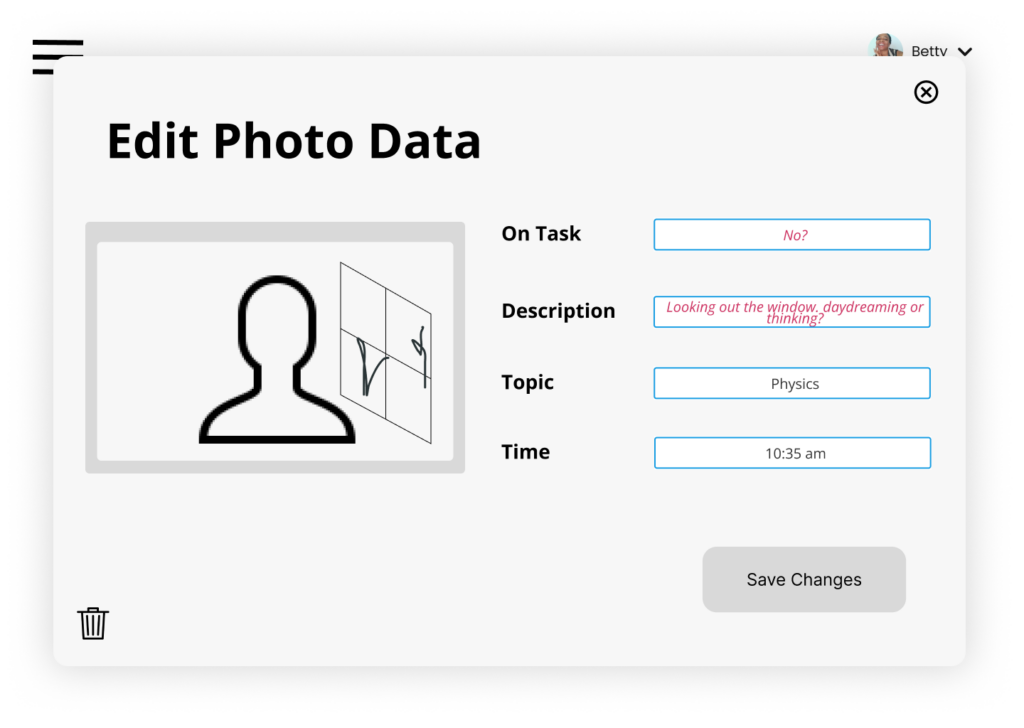
Team Retrospective
Ethical Considerations
Privacy
During the design of our app, our main ethical focus was privacy. The readings “The Web’s New Gold Mine: Your Secrets” and “Why Privacy Matters Even if You Have ‘Nothing to Hide'” emphasize the problems that arise from unobstructed surveillance and data collection on individuals, as well as the unregulated use of data. Surveillance can impact human behavior and free speech, while the unregulated use of data can create a power imbalance between individuals and governments, allowing governments to make decisions that impact individuals’ lives without their input.
To avoid these potential harms of unnecessary data collection and unregulated data use in our app, we followed the guidelines outlined in the research. We aimed to reduce the amount of data collected and be transparent with our users about the collection and use of their data.
To reduce the amount of data collected, we informed our users that we only collect image data and use AI to codify and classify that data for their benefit. We wouldn’t sell the data, and users can delete their data at any time. Additionally, we provided users with the option to use our app without their photo data being collected by offering a “Start without photos” option.
We also aimed to be transparent with our users by providing a summary of our privacy design features in the app tutorial.
Although privacy is a core value of our app, if we encountered a privacy concern such the police approaching us and requesting access our data to assist in solving a crime, we would do everything in our power to avoid giving them data or provide them with anonymized data if possible to avoid threatening the privacy of our users. Also, if we did need to disclose data, we would make it clear to users if we were forced to disclose their data in some way.
Nudging
In Nudging and Manipulation by T.M. Wilkinson, it is discussed that there is a fine line between a nudge and manipulation. Manipulation is defined as intentionally influencing or encouraging people to make decisions in ways that rational persons would not want to make decisions.
As creators of the Gotcha app, we were conscious of this definition and ensured that our design choices aligned with it. For example, we conducted assumption testing to determine whether we should nudge users to meditate as a way to ease them back into work after taking a break. While research suggests that meditation is beneficial for focus and well-being, we found during testing that it is not always preferred. As a result, we incorporated user feedback by allowing people to skip the meditation, but still kept it as the default option. We believe this is not manipulative since a rational person who knows the benefits of meditation would choose to meditate.
As a company, if users found the transition activities disruptive or frequently skipped them, we would assess whether our nudging techniques were being perceived as manipulative, evaluate how to make this feature more useful and less manipulative.
Rewards
The readings about the “Ethics of Rewards” emphasize that providing rewards for certain behaviors can be a strong motivator for creating habits. However, it’s important to be cautious when designing reward systems, particularly in a gamification context, so that users are not encouraged to behave in a way that goes against their own values, interests, or well-being.
When designing our app, we took these concerns into account and created anethical reward system. Our current system unlocks data analysis and social features after the user completes at least one study session per day. We chose to display the reward subtly, by changing the color of elements on the home page, and we consistently provide the reward after the user completes their first session of the day, rather than at random times that might encourage addictive behavior. This approach encourages users to explore the reward at their own pace, without detracting from the app’s focus on effective studying and distraction recovery.
We recognize that our reward system could potentially be misused, which would be an ethical concern. For instance, if users began completing very short and meaningless study sessions just to unlock the rewards, we would need to adjust our system to encourage users to complete at least one quality study session per day. This might involve imposing a time requirement for each session, such as requiring users to work for at least 30 minutes before unlocking the other features.
Conclusion
Main Takeaways
Throughout our design sprints, we practiced industry-standard product design techniques, from need finding to assumption mapping. We learned the risks of operating on hidden assumptions, which undermine the success of our solution. For example, we tested core functionality in our app like user comfort with random-interval photos to validate concepts before pushing forward.
Additionally, we learned strategies to support user behavior change. From scientific literature like the work of BJ Fogg, we implemented theory around gamification and behavior nudges, and considered the ethical implications of doing so.
Vision for Future Iterations of the Product
Blurred Photo functionality
At the moment, our app allows users to either take photos or not take photos. However, we received feedback during the project fair that users would like the option to include blurred screenshots in the data collection process to help the AI determine whether they were on or off task. We would like to conduct an assumption test to determine whether users prefer taking photos, not taking photos, or if they would prefer other options such as taking blurred screenshots or screen captures. This would help us provide more accurate and valuable insights to users. To conduct this assumption test, we would create a survey where users could rank their preferred data collection option from a list that prioritizes options that provide more helpful information for the AI.
Further ethical concerns
The Gotcha! app operates in an economy of information and acknowledges that lazy implementations of security and privacy features can be a great disservice to individual users, as well as historic trust. If Gotcha! were to be created, we would more thoroughly test around privacy concerns and ensure a thoughtful implementation.
How we will approach our next design task
From this project, we gained important insights on how to approach future design tasks. One of the key takeaways is the importance of thoroughly defining and testing assumptions. Identifying assumptions also involves conducting preliminary studies to gather data and ensure that our design process is participatory and engages the user. This is essential to ethical and human-centered product design.
Another important aspect of our approach will be to implement behavior change techniques, such as gamification and rewards, with caution. We understand that it is crucial to consider unintended impacts, and we would follow the golden rule of nudging individuals towards making decisions that a rational person would make, rather than persuading them to make decisions we would not make ourselves. By prioritizing ethical design practices, we can create products that not only achieve their intended goals but also align with the values we strive to see in the world.