
Team 9: Carolina Borbon, Tomy Di Felice, Caroline Gao, Andrea Liao, Annie Ma
(1) Andrea, Account Creation / Login:
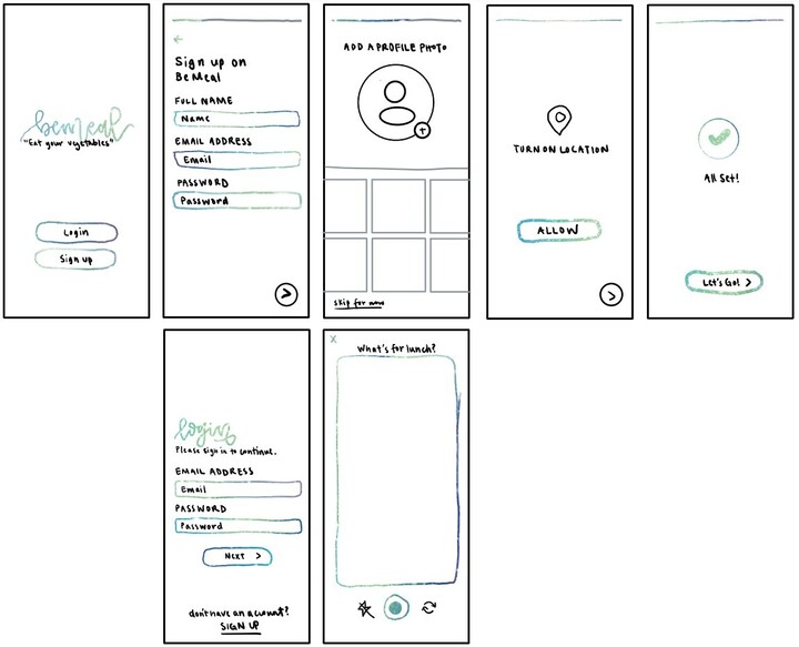
I utilized my analogous color palette to make all action buttons as accessible as possible. To further ease users into the product, I broke down the onboarding process into more micro-steps. By simplifying pages, I found that ease of navigation increased, so I removed options and streamlined the onboarding process, leading to more intuitive navigation. The product’s social aspect is a major part of its appeal, so I can’t truly anticipate user eagerness until there are networks on the platform. To facilitate this, I’ve made it easier to join and add friends after creating an account and onboarding. To incorporate an aspect of socialization, I’ve encouraged users to take pictures of their vegetables within the app and customize their eating experiences with location data.
(2) Tomy, Profile Flow (Friends, Past Memories, Settings):
(A)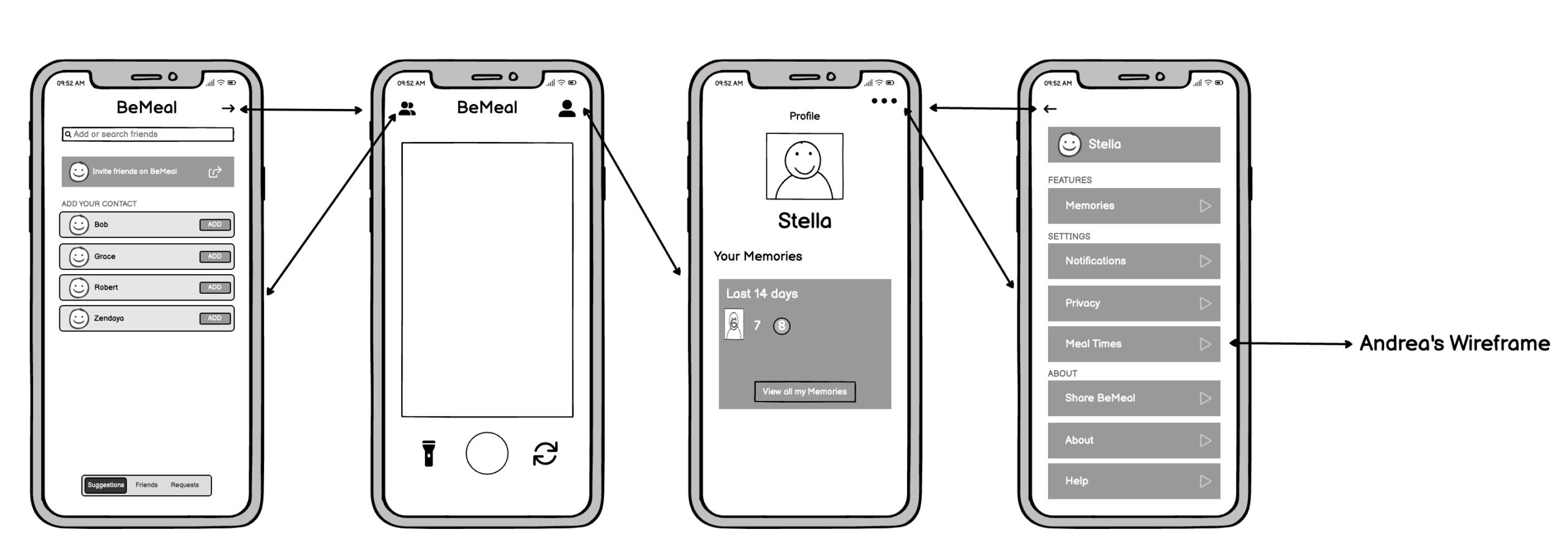
For my first sketchy screen of the profile and friends flow, I wanted to try something simple and familiar, based on our competitor apps (BeReal). I tried to find the key “tabs” (friends and profile) and separate them in the header. The main screen of the app becomes the take picture view, and the friends and profile pages are secondary screens. For the friend section, I played around with a nav bar view to separate suggested friends, current friends, and requests. For the profile section, I wanted to include a “memories” section as well as give the user access to their profile settings. I based the layout on BeReal as well as typical settings pages.
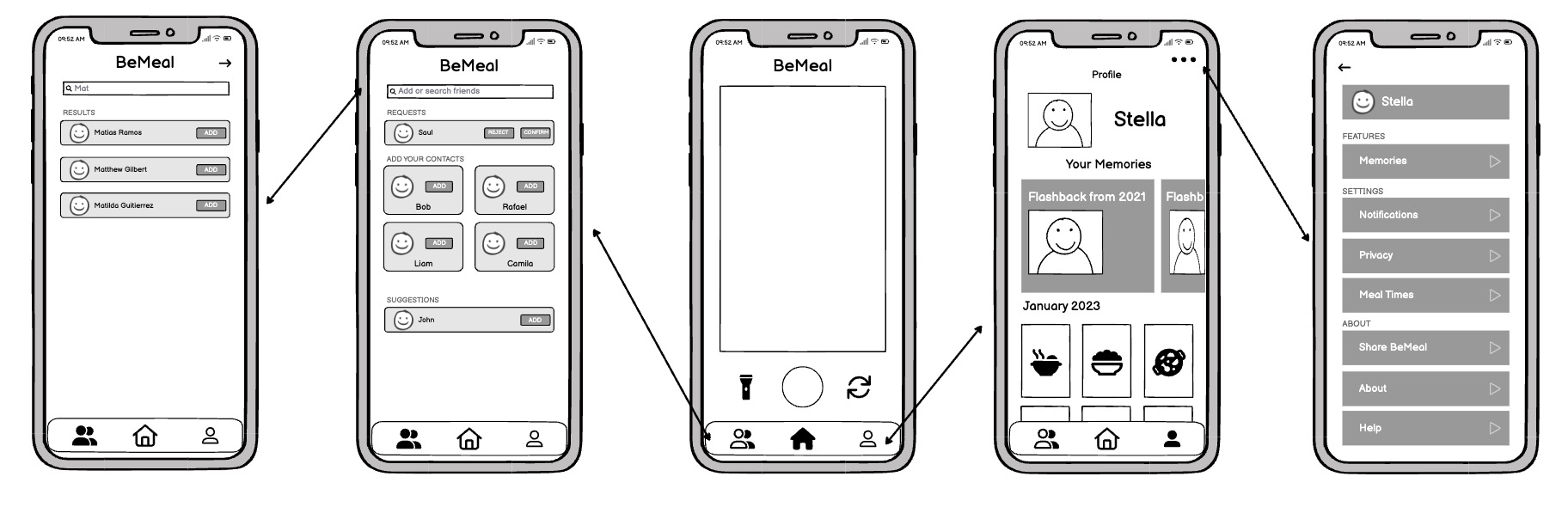
However, after finalizing this first sketchy screen I noticed a few flaws. First of all, one of the biggest drivers of our behavior change is socialization. A big part of this social aspect in our app comes from the friend’s section, which in this first sketch is sort of hidden and in the background by being placed at the top left. It doesn’t feel like a key element of the app. Similarly, being able to access one’s profile and memories, as well as mealtime preference editing seems critical (as learned from Tomy’s Learning Card: Duru). But again this feature is hidden at the top right. For these reasons, I wanted to bring more attention to these pages and decided to play with placing these icons at the bottom of the screen in a nav bar. This divided the app into 3 sections: Friends, Home (taking pictures), and Profile.
I also wanted to play around with the layout in the different tabs. For the friends tab, I played around with different grids to try to condense more information. This can be seen in the “Add your contacts” section. I also got rid of the friends, suggested, and requests nav bar given that I have added a main navbar and this might confuse the user. Instead, I just combined these three sections into the same page like Instagram does. I also explored different layouts on the profile/memories page with inspiration from Snapchat:
(B)
(3) Caroline, On-time BeMeal Post:

A user will receive a push notification when it is time for them to post a spontaneous picture of their meal (remember, users will receive the push notification at the beginning of the meal time range they selected – for example, if a user inputted they typically eat lunch between 12pm – 1:30pm, and the spontaneous meal was lunch that day, the BeMeal notification would show up right around 12pm).
After clicking the notification, the user directly enters the screen where they are prompted to take a photo of their meal. Users have the option to use flash and flip between the front and back camera. We provided these options to increase customization, and the three buttons (flash, capture, and flip camera) form a module! After the photo loads, we confirm with users whether they want to post the photo or try again. In the last screen, we played around with how the user’s own post should look. We opted to minimize users’ own posts (since they just took the picture) to put emphasis on and encourage users to start scrolling and reacting to friends’ posts (i.e. start providing and receiving indirect feedback). The user’s own minimized post is not locked, so it disappears as you scroll; we did this so there is more screen space for friends’ posts. A user can still click on their own post to enlarge it and see its reactions and comments; we did this so that enlargement (as mentioned before) and one’s own reactions and comments don’t take up more space on the feed page, but a user still has easy access to that information. Buttons, reactions, and comments are all placed below a user’s meal picture to follow people’s natural gazes. We opted for a separate comment button (vs directly allowing people to add comments below a picture) so that comments / too much text would not clutter the feed page. We also added a help button in case a user is confused on how to make a post and react to / comment on friends’ posts.
(4) Carolina, React to Friends:
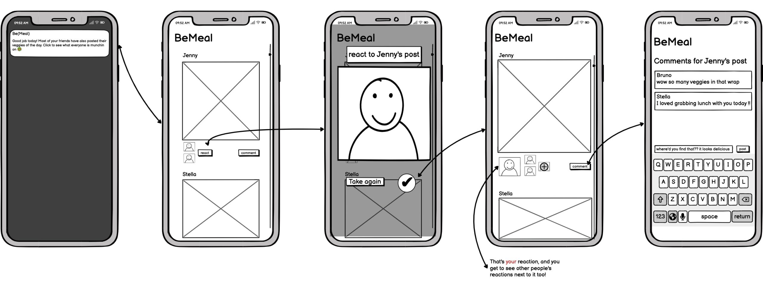 If several of a user’s friends have posted since the user posted / saw their feed, the user will receive a push notification to prompt them to look at their friends’ posts. Otherwise, if the user posted after all / some of their friends, they will start at the second screen after scrolling past their own post. Once we are in the second screen, users have the ability to scroll through all their friends’ meals. Then, they have the option to react with a selfie to each of their friends’ posts. These “reactions” are available to all of the poster’s friends (as seen in screen 2 and 4 of this set of screens). There is always an option to retake the reaction photo which is shown in screen 3. Lastly, once back on the feed, the user also has the option to leave a comment under a friend’s post. These comments are available for viewing to all of the poster’s friends as well.
(5) Annie, Missed BeMeal Post:

I wanted these sketchy screens to focus on the aspect of missing a post, so the first sketchy screen does not include other details that could distract from it. 30 minutes before the next meal time, if the user still has not posted for the most recent meal time, they will receive a notification saying that they have missed the BeMeal. For example, let’s say the user’s set lunchtime is 12pm and their set dinnertime is 6pm. When the lunch notification comes out at 12pm prompting the user to post their meal, the user has until 5:30pm to post. In this example, It is 5:30pm and the user still has not posted their lunch meal. When they open the app, they will be faced with the first sketchy screen. Users will not be able to see their feed with friends’ posts for the most recent mealtime if they miss the posting window. Instead, they will be shown a fun fact and an option to change their meal times. Users will also receive a text with the fun fact. This is to remind the user of BeMeal’s presence in their text messages if, for example, they haven’t been on the app recently.
In the example above, if the time is between 12pm and 5:30pm, the user will see Caroline’s post picture wireframes when they open the app.


Comments
Comments are closed.