
Moodboards
MoodBoard 00
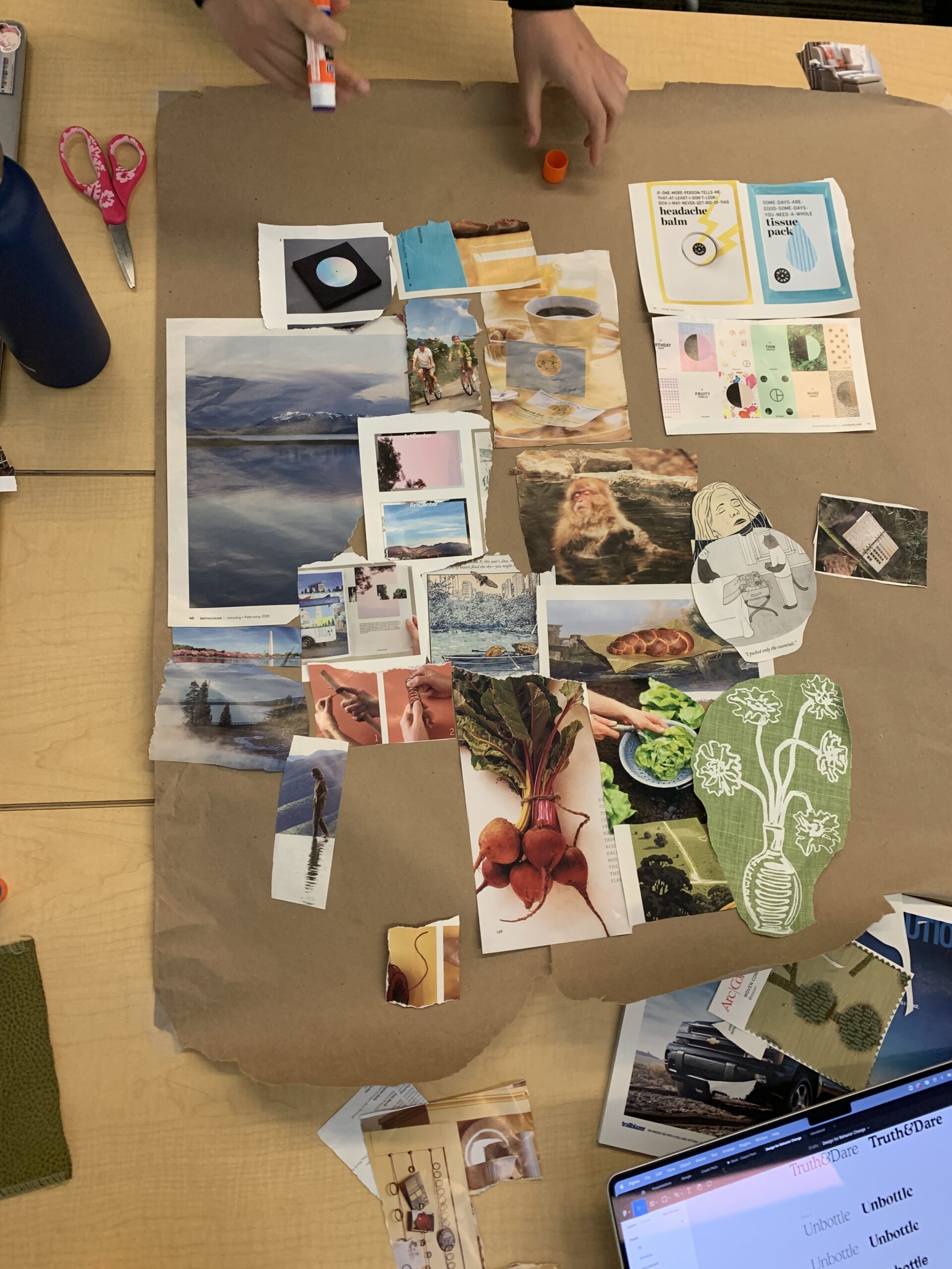
This is our original moodboard constructed using magazines and fabrics from class. When designing our moodboard, we wanted to keep the goal of our app in mind: provide a fun/playful but also relaxing way for users to engage in mindfulness. We wanted to engage both aspects of creativity and introspection in our design.
To do this, we centered our moodboard with what we want our users to feel like: a monkey sleeping in a pool. We want our user to recede into a state of tranquility during their busy day to embrace life. From here, we each took a different interpretation of ways to combine play and tranquility. One common theme was the idea of adventures and nature. Images of hiking along the mountains or through the forest helped us imagine what it feels like to be isolated in nature. One is able to absorb the world around them and escape their routine, while also engaging in athletic pleasure.
We were also attracted to cozy indoor settings with a cup. Scenes with a cup of coffee or a fireplace reminded of us a warm hug that we all need during a stressful day.
We also were intrigued by the use of pastel colors as they are both calm yet also slightly exciting and playful. We noted that we tended to avoid very bright colors as these were overstimulating and drew us too close to being just a game. We wanted to mellow out and use lighter colors to tell the users that this app is designed to be a gentle introduction to mindfulness.
Moodboard 01
This moodboard takes an organic approach to our user. We use greenery in order to create a calming presence, but also use natural tones that provide comfort, warmth and pleasure (such as the dog and bread). We imagine ourselves drinking a cup of matcha and folding origami cranes when looking at this mood board. This helps us achieve liberation, exploration and self-reflection.

MoodBoard 02
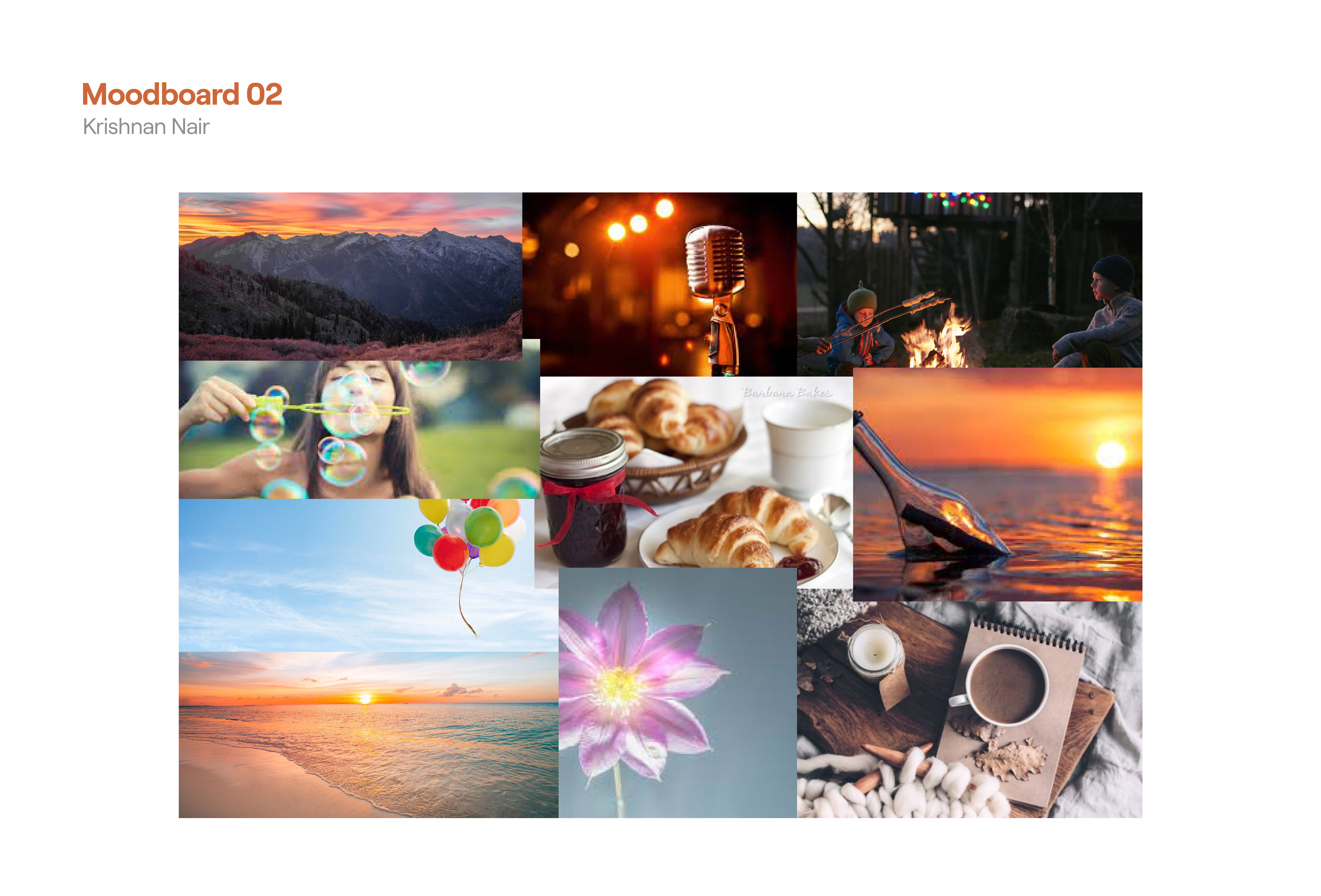
Our second moodboard focused more on play and nature. It leans towards warmer colors and settings of play that are calm and inviting. This includes campfires and open mic poetry nights. We wanted to incorporate aspects of freedom, which is why we included the bubbles and the balloons. At the end of the day, we are also still attached to this calmness, which we capture with the coffee. We believe the coffee and campfire blend well together.
From our various moodboards, we noted that there were many ways to incorporate play and mindfulness. However we wanted to center on light colors that didn’t overwhelm users but created a sense of creativity and entertainment. The majority of our style tiles were inspired by the second moodboard.
Style Tiles
Style Tile 01 – Jacob LeBlanc
We were trying to capture the calming essence of our brand. We wanted to use the dark green as a foresty vibe that users could use as a way to connect to nature as they give their gratitude. With the other two colors, we were trying to move toward an ocean/beach scene that could help calm users who were otherwise stressed. Given the busy lifestyle of our target users, I thought that the app should be “low-effort”, “chill”, and “inviting” to have as little friction integrating into their lives as possible.

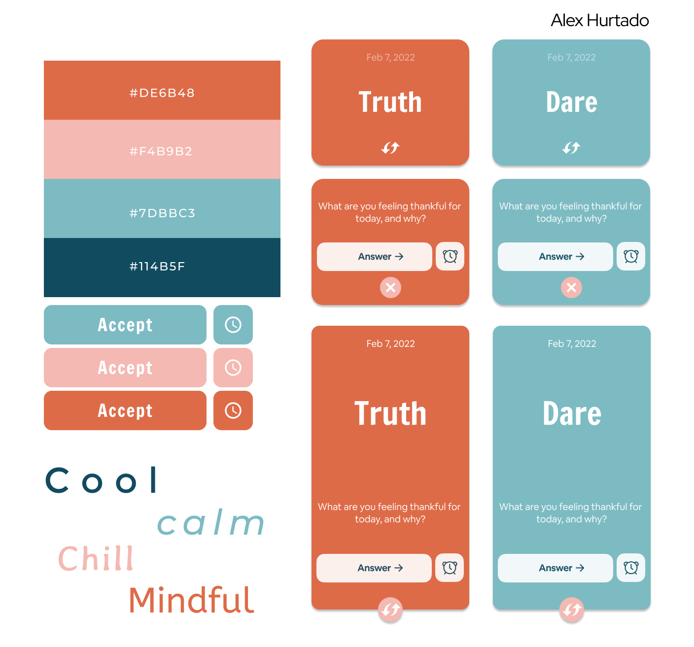
Style Tile 02 – Alex Hurtado
For this style tile, we wanted to capture the essence of dusk above contemplative waters. We juxtapose the coolness of a profound ocean blue with the warmth of the sundown orange above. At the same time, we wished to balance our product’s bright playfulness against a soft calm vibe.
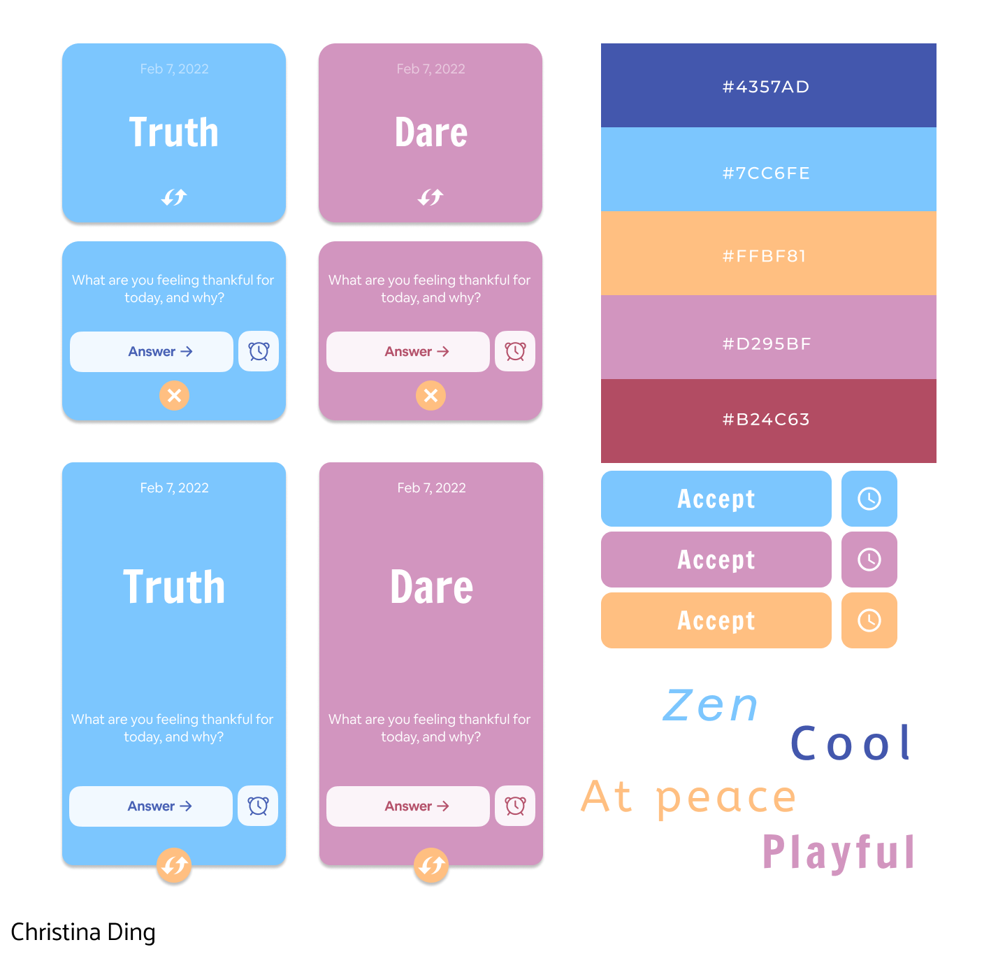
Style Tile 02 – Christina Ding
Our style tile was inspired by the beautiful spectrum of a summer sunset — nice cool blues and soft pinks highlighted by the smooth gold accent. We were motivated to combine the feelings of zen and peace at a meditative sunset with the playfulness of Truth or Dare.
Style Tile 04 – Krishnan Nair
For this style tile, I was imagining the user with waking up in the morning to a warm cup of matcha. They have their dog next to them as they begin to journal. The goal fo this palette was to be playful and inviting, while simultaenously being calm and thoughtful. The goal of our app is to mix play and reflection, which is achieved the light green and pink. I used script fonts in order to create a more personal, low-key note aesthetic to the app.

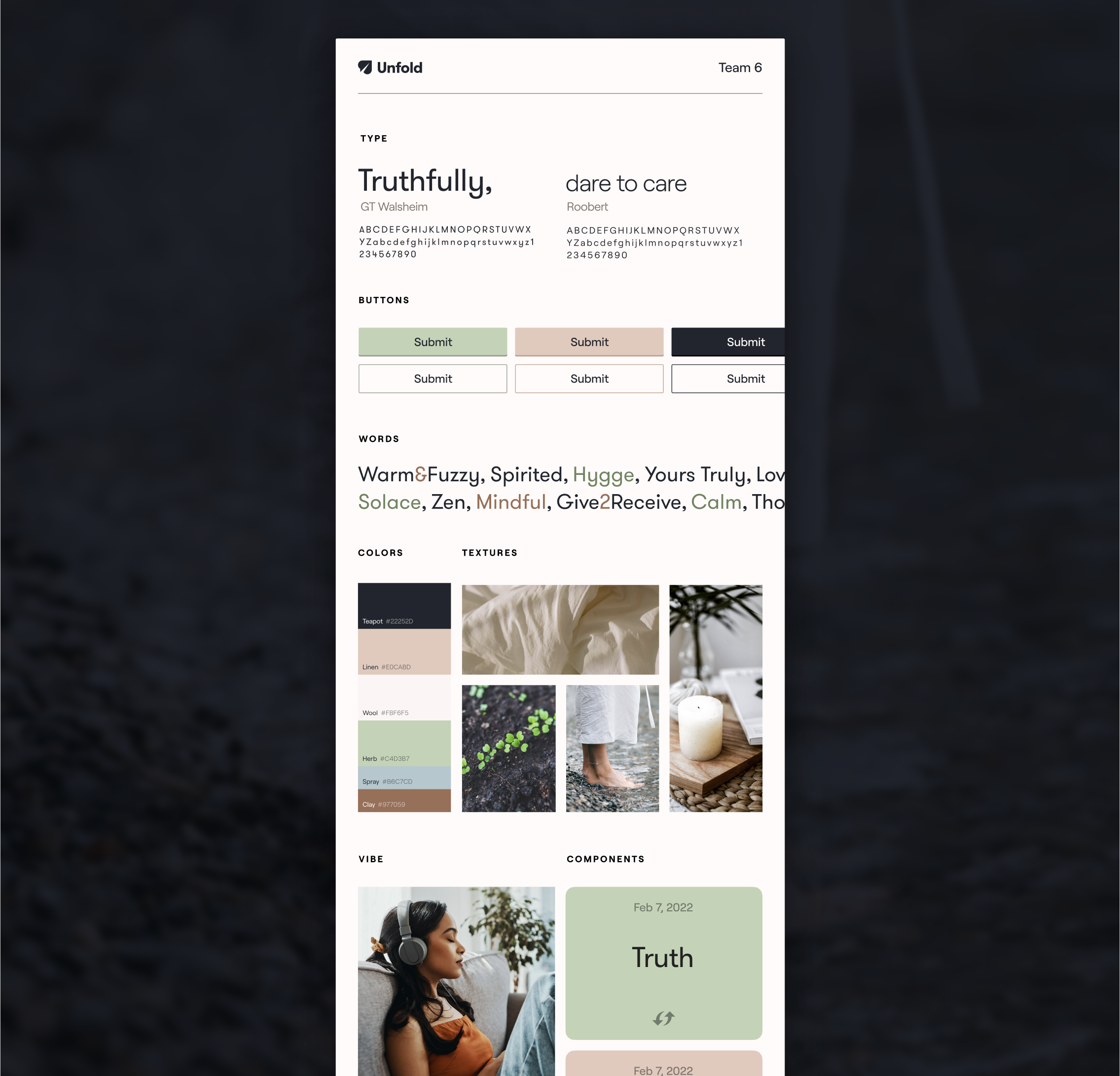
Style Tile 05 – Will Osborn
With this style tile, we tried to capture a fresh, crisp, outdoorsy morning. The soft texture of linen sheets, the quiet ruffle of turning pages, the feeling of smooth pebbles underneath your bare feet. The intention was to convey a lighthearted brand sentiment that’s as simple as it is refreshing. The chosen typefaces, Reckless Neue and Roobert, sport friendly curves while remaining undoubtedly premium.

Final Style Tile
This final style tile is a combination of the fourth and fifth style tiles. Starting with the fonts, we wanted to choose san-serif fonts that aren’t distracting but are still explicit playful. We want to show users that this is a game, but not one that will overwhelm them during their day. We also wanted our color to be reflective of this vibe, so we used lighter colors that are still playful. We found that these colors resembled places of joy and hot drinks (morning coffee at home, small town coffee shop, boba shop with matcha). Our goal was to balance the outdoors/adventure using the green and the comfort at home with the beige color.


Comments
Comments are closed.