

This mood board reflects the idea of “distortion”. The major strategy that we plan to use in order to help users reduce their screen time usage is to distort the experience of apps. In this mood board, there are several different images of distortion and methods that distort the experience of apps including several error windows, half a bicycle, and the mural of a man who seems to be “glitching”. Among these images, we feel that the mural of a man who seems to be “glitching” best represents the purpose of our app by presenting a familiar picture and disturbing it by adding distortions.
While this mood board helps describe the purpose of our app, there is not much here to help inform the overall aesthetics or general feel of the app. We understand that we will need our app to help make users feel good about their reduction of screen time if we want to help them reduce their screen time.
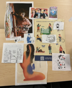
This mood board has several images that span multiple different themes of our app. Towards the upper left and middle, there are images which represent the “successful user”. There is a large image of a painter and another of a celebration. These are the results that we want users to believe will come about with a reduction in unproductive screen time usage. Towards the center, there are two images about authority. These images represent an understanding that our app will need to influence user behavior, not unlike a figure of authority. These images help us think about what role our app will have to play in our user’s life. At the bottom, there is an image of a woman whose silhouette is multiple different colors. This image represents the idea of distortion that we believe will be an effective method of helping users to reduce their screen time usage.
While this mood board explores many different parts of our app, it does not explore any particularly deeply or significantly. We do think that this mood board works as a general overview of what value our final product will provide users and the means that it will use to achieve this goal.
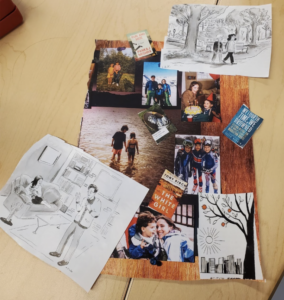
This mood board explores the results that come with a successful reduction of screen time usage. Nearly all of the images share the theme of happiness, the outdoors, and human interaction. We believe that these feelings are exactly what we want our users to believe they can achieve with the help of our app.
An interesting observation of this mood board is that nearly all of the positive pictures involve at least two people. We recognize that there are people in our target audience who want to reduce their screen time usage so that they have more time to themselves and their own development of skills. Although this mood board includes books and activities that one might do alone, it does not do enough to portray alone time. Overall, while this mood board expertly displays the rewards of those who want more human interaction, we still need to remember those users who want to have more quality time alone.
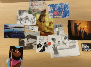
Similar to the previous moodboard, this moodboard also explores the positive effects of what a reduction of screen time could have, but also highlights one of the major problems which motivates our exploration of this space. The center image of a woman on her phone and laptop and the child off to the side highlights a situation where excessive attention to technology can lead to negative consequences.
While this moodboard explores what would motivate a user to start using our app and what would motivate a user to continue using our app, there is not much that describes how users would interact or feel about our app. We believe that in order to keep users motivated, we not only need to be clear about how to convey positive messages about improvements but also provide an app which also invites users to start that process.
Moodboard Reflection:
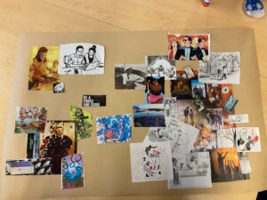
After reviewing our individual moodboards, we identified three patterns, which are demonstrated in our joint board. First, our goal is to get people off of technology. This is demonstrated in the top left hand in the photos of people on phones and devices while ignoring loved ones. Second, we want to accomplish this goal with distortions. This is shown in the bottom left where pop-ups and image distortion is used. Last, we established a goal of getting people up and out. The right side demonstrates all the things someone can do. We want our app to be a reflection and establish a sense of connection with the real world. That is why our app’s intervention will provide a calming, but exciting approach to screen reduction.
Style Titles
Alex’s Style Tile

Nancy’s Style Tile
Amara’s Style Tile

Derek’s Style Tile

Alissa’s Style Tile
Consolidated Style Title
While looking at everyone’s individual style board, there were some common themes between color and font choice. For color, there was the major theme of using pastel colors. The rationale behind this decision was to present our app in a welcoming way. Furthermore, we recognize that a major use case of our app may be to wind down at night before going to sleep. As such, we all strayed away from strong and bright colors. We were also interested in using earthen colors. We felt that doing so would help bring a sense of “relaxation”. We found that the green colors contrasted too heavily with salmon-pink and blue. This combination was considered to be “too neon”. The group settled with incorporating a deep brown to serve as a color which provides an anchor to the more colorful salmon-pink and blue.
For font choices, we settled on using Nunito Sans for headers and Basic for general text. We choose simplistic, but modern fonts to help provide a familiar experience with other apps. Furthermore, we don’t want our font to be too stylized since we do not want users to be distracted when using an app whose purpose is to help stop distractions and reduce screen time usage.


