
Wireflow Connection
How individual wireflows connect: We imagine the overall user experience to typically follow this order: Onboarding flow -> Plan Addition Flow -> Daily Prompt Flow -> Slacking Reminders flow -> Completion flow
Onboarding Flow
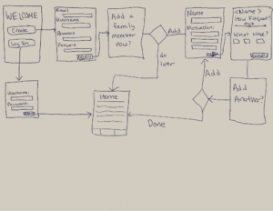
This is the onboarding flow, which will occur when the user firsts downloads the app. The user will have two options – log in to a pre-existing account, or create an account. If they log in to a preexisting account they will go straight to their home page. Otherwise, they will create an account, and then be prompted (but not required) to add a family member and start forming a habit. They aren’t required to immediately add a family member because I wanted onboarding to have a short exit strategy if the user has limited time, and the ability to return later to the task. However, they are also able to set up everything at once if they want to, so that all onboarding can be completed in the first session (eg they can add multiple family members). All onboarding flows end in the same place, at the home page, in order to provide a uniform state for next steps, which would be notifications if family members have been added, or likely a reminder to finish onboarding by adding a family member through the home page if no family members have been added. Note also that the adding a family member flow shown here is shown in more detail below.
Adding a Plan Flow
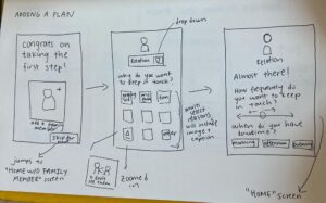
This is a detailed version of what it’s like for users to add their plan (input the family member they’d like to keep in touch with, their desired contact frequency, as well as a habit-building mechanism within the plan).
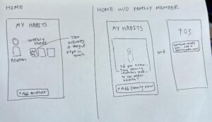
On the first screen, we add a celebration moment where we congratulate the user on taking the first step to keep in touch with family. To reduce friction in data input, we use a simple drop-down menu for family relationship and a quick multi-select for reasons they’d like to keep in touch. A sliding bar denotes frequency and a multi-select denotes when they have downtime. Users also have the option to skip data input to get to the meat of the app (see “HOME w/o family member” screen), although it’d just show an empty screen and reminders/notifications to input a family member since the app doesn’t work well otherwise. On the normal “HOME” screen, users can see their family members at a glance as well as any “streaks” to help them keep in touch and build a habit.
Daily Prompt Flow:
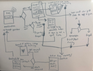
The user first gets a notification from our app where they will make their first choice–open the app or not. I selected this as the first choice as some users may want to utilize this app as more of a reminder with the added motivation (which can be read from just the notification) and then reach out to their family on their own, whereas other users may want to use the rest of the app in more depth. If they do open the app, they will be given a choice to text or call the specified family member and it is meant to be an easy one-click action. On the same page, there is also a choice to reschedule/remind them later if now really isn’t the best time, in order to give the user more freedom of choice. They could have also not clicked on anything and closed out of the app. If they didn’t open the app, they could either just reach out to the family member on their own or they could ignore/forget the notification. All of these endpoints would lead to the same screen at the end of the day: a final check-in to see if the user reached out to the family member. If they did, they will get a reward more focused on the primary intrinsic reward that comes with connecting with family (something along the lines of ‘one step closer to creating a family bond’ that would have to be updated). If the user answers no, then they will be given the option to reschedule this text/call. The cycle then repeats on the next prompt notification time. All of this is to ensure the user has the best chance of reaching out with their busy lives without being too intrusive, and measures should also be taken to account for if the user’s goals/motivations change.
Slacking Reminders Flow
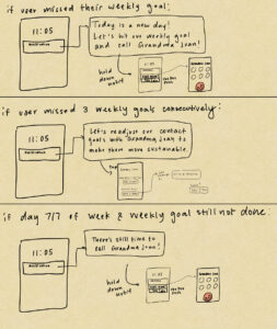
Establishes the concept of setting up a contact goal for family members they would like to improve their contact frequency with. For example, Grandma Joan is a family member who the user would like to contact once a week, instead of their usual once a year. If they consistently fail to meet their contact goal they will be prompted to readjust their goal to a more realistic frequency.
Completion Flow
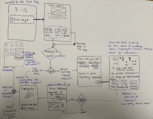
With a greater need for habit-building assistance identified throughout our user research, we decided that rather than leaving our users stuck in the endless loop of reminders and logging without a specific goal, it would be more effective and beneficial to set short-term milestones and work within smaller timeframes. This next flow represents a use case scenario for the user who has reached the final day of their current ‘challenge’ or cycle, who logs for one last time and is then brought through a ‘completion’/’graduation’ process. This end of goal functionality would be critical in structuring the usage of this software and allowing the users to place this app in their medium-to-long-term timeline as they see fit best.
Starting at the top left, the user will be prompted with the daily reminder as in the daily prompt flow. Once they successfully complete and log their interaction for the last day, they will be guided through their ‘data overview’ screen (right-most box). Here would be where it shows numerical data, statistics, comparison with previous cycles, identified trends in regards to when the interactions were made or what prompts or triggers were most successful. The next screen would ask for the reflection for the whole cycle (e.g. month), asking the user to look back to their initial relationship dynamics with the person and their reasons for connecting more. There remains a huge question of how simple or thorough we want to design this overall reflection, which should be addressed to provide flexibility to the users. Finally, the closing page would lead to an option to start another challenge/cycle and to see a more detailed history or data overview. It would be an interesting discussion to figure out if we want to give out a widget token for the completed cycle that stays in their home screen, which could function as a further reminder and incentive.


Comments
Comments are closed.