

Cat Horkay | Minha Kim | Clara MacAvoy | Braedon Silvers | Isabelle Zhou
Final Writeup
CS 247B Winter 2022
Introduction & Problem Finding
Remindful is a smartphone app that helps young adults connect with their family members from afar, with a focus on maintaining family connections once an adult leaves the family home, like for college.
Defining the Problem
Many young adults need help establishing and maintaining virtual contact with their family members due to barriers such as time zones, busy schedules, and communication style barriers (e.g. language, strained relationships).
The transition from adolescence to living independently as an adult is the time to establish lifelong habits. By helping young adults to meet their contact goals with family members, we set them up for success as they navigate familial relationships as adults. There is ample research that shows the benefits of family connections and contact, and we believe that our app can help young adults to nourish relationships that will provide support and benefits for the students.
Secondary Research
From the literature review, we learned that communication is critical, especially to prevent unwanted estrangement and miscommunication. That is a part of why we want to help young adults who seek to improve their relationships by connecting with their families more regularly and purposefully. However, since we imagine ourselves as a reminding and tracking tool, and not a counseling program, we are not focused on facilitating sensitive conversations rooted in more complicated and fundamental conflicts. This led us to focus our app on positive and neutral relationships as we moved forward beyond secondary research.
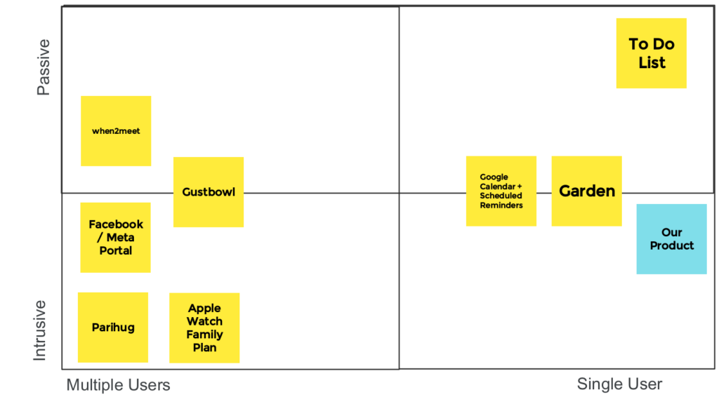
When looking at similar products for comparative research, we sorted them two ways: the level of intrusion (from intrusive to passive), and the one-way vs two-way relationship maintenance (based on the number of users required). There was a clear relationship in the products we viewed: more intrusive usually meant a multi-directional relationship. For our product, we would like to focus on one-way relationships for ease of access, but also be more intrusive than passive. This is because we know from diary studies and interviews that it tends neither to be motivation nor ability that is the largest barrier to maintaining these relationships, but rather lack of sufficient triggers. Thus, something passive such as a To-Do List may not be effective enough at triggering the desired behavior, whereas a more intrusive product may be able to achieve our goal.
Baseline study
From our baseline diary studies and the pre(screener)/post interviews, we learned that family relationships are diverse. Within the college student demographic, some students have more complex relationships than others, and some have stronger motivations to keep in touch than others. We realized that it’d be nearly impossible to build a product that works well for everyone, so we decided to zero in on one specific target user.
We specifically chose to focus on users who aren’t as in contact with their family members but do have the motivation to, so that they would be starting with the ‘motivation’ aspect of the BJ Fogg’s B(ehaviour) = M(otivation) ✕ A(bility) ✕ P(rompt) model. We assumed most young adults already have the ability to access and use smartphones to contact their family, so we believed we had the most leverage in the ‘Prompt’ aspect to help trigger the desired behavior–frequent contact–to happen.
After we narrowed in on these users, we found we had a good baseline (example raw data) to work off: four out of six study participants did not contact their loved one at all over the course of five days and the other two only contacted them once, despite everyone voicing they hoped to contact their loved ones at least once a week.
For sensemaking of all our initial studies and problem research, we made post-it notes to fragment key findings and initial insights, then used quick iterations of various grouping and mapping tools to develop our value proposition: Our mobile app helps busy college students who want to connect more deeply and intentionally with their families by prompting them to contact their loved ones according to their schedules and encouraging to log and reflect for habit formation.
Personas and storyboarding

We initially generated three different personas: A student busy with school, a student with a difficult family relationship, and a grandma who wants to connect more with her grandchildren. We tried to captured their stories through Personas & Journey maps and Ideation & hero storyboards (archive), through which we were able to explore users’ varying goals, abilities, conflicts, routines and scenarios.
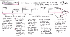
After storyboarding, we chose to narrow our persona to students who are busy with school. This choice led us to focus our design on a one-sided interaction where only the primary user needed to log interactions and the home page was an overview of the core user’s relationships. This is because a two-way use case causes friction since, for example, an elderly grandmother living abroad may not be our target audience, as they may have a different understanding of technology and are less likely to log. We wanted to reduce potential dropoff points and wanted to focus our product to really work well for one target persona.
As a transition from problem finding to solution generation, the initial sets of sketches and brainstorming had a crucial role in bringing our ideas to bridge the gaps in the problem domain into realization.
Solution Finding
Defining the Intervention Study
For our Intervention Study, we wanted a way to test if users would reach out to their desired family members when prompted. Our intervention was meant to act as a breath of fresh air, with a reminder that was actually meaningful to each participant. Over a course of 5 days, we text prompted our participants from the diary study to contact the relative they hoped to keep in touch with more often.
Our intervention study was directly motivated by our synthesis. From our synthesis, we found that college students have a significant amount of friction when it comes to contacting family members due to their busy lives. They also view family relationships as long term, reducing the urgency to reach out. Our intervention study was then motivated by these learnings in the following ways: truly meaningful prompts help remind the user to grow their relationships and they increase the urgency to reach out, and the texts were scheduled based on times when the participant indicated they would prefer to get prompts allowing the timing to fit into their schedules.
What We Learned from the Intervention
Despite the varying nature of relationships (grandparent, sibling, difficult relationship), we were able to see a significant increase in contact frequency due to this intervention. Every single participant increased contact frequency with their selected family member or members. We also saw feedback loops occurring as family members began to initiate contact to reciprocate. This helped confirm assumptions that personalized prompts were effective, at least in the time frame we observed.

If we could do the intervention study all over again, we would have taken Lunar New Year into consideration, as it is traditionally a time for family members to call and catch up with each other. This is interesting for our study because 2 participants cited the timing as an impetus for them to begin keeping in touch with their family members regularly. This is also similar to our findings in our longitudinal study, which suggests that the timing of our product may matter to deliver the most effective results. Next time, we would have tried avoiding holidays and focusing on people’s regular day-to-day routines.
Mapping
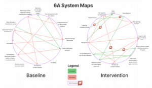
We also explored different types of mapping such as bubble mapping and system path diagrams. Mapping provided a structure that allowed our team to piece together all aspects surrounding our selected behavior. Personally, our team found the Systems Path Diagram to be the most helpful. We were able to see all actors in our ecosystem and easily identify where they can enter or exit our system or product.
We would definitely use the Systems Path Diagram again as it led us to one of the core values of remindful–remindful is designed only to help users build the new habit of connecting with family regularly and then it should be uninstalled. As for all the other maps, I believe each one helped us find new insights, especially when flipping back and forth between maps.
Our Assumptions
From our assumption mapping, we were able to see what we were assuming about our users. Some primary assumptions that would completely change how our app would function were: we believe that college students have the motivation to reach out to their families; people won’t have friction when starting conversations; we believe that our nudges won’t get lost in a sea of notifications.

We then focused on two primary assumptions: 1) students have the motivation to keep in touch with relatives and 2) students will pay attention to notifications. We chose to focus on these two as our user base needs to already have the core intrinsic motivation to reach out to family, we then remind them based on their personal reasons. As for the second assumption, we needed to know if a notification from the app would cut through all the noise of our user’s busy schedule and other apps.
Experiments
We then tested our two assumptions.
- Students have the motivation to keep in touch with relatives – We tested this assumption by surveying college students on whether or not they have at least one family member they are seeking to contact on a more regular basis through an Instagram poll.
- Students will pay attention to notifications – Our initial design was to have our participants turn on their read receipts for our text notifications and see if they care enough to read and open our text messages. However, we reconsidered our design as we realized that getting a text from someone they know falls into a different context than app notifications. After discussing with Christina, we decided to conduct secondary research on different ways people react to different mobile notifications, and use the findings from existing research to test our assumption.
We found both of our hypotheses to be correct: 1) students do have the motivation to reach out (75% of respondents said yes), and 2) text notifications are more effective. These findings led us to focus on text-based notifications and to focus our users down to only those who are already motivated to reach out to their family members.
More information on the experiments and secondary research can be found here: Assumption Experiments and Synthesis.
Designing the Solution
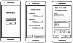
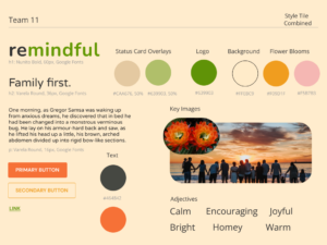
To start off the core design of Remindful, we began with wireflows that gave us a clearer picture of which tasks a user could accomplish and how. The sketchy screens solidified this for functionality. Mood boards and style tiles were made to get an idea of what feel we wanted to evoke in our users. We decided on the adjectives cute, homey, & comforting with an earthy pastel color scheme. Style and functionality were fused in our clickable prototype, which we tested in the usability testing phase to further refine. Our submission prototype can be tested via Figma.


Usability Testing & Moving Forward
As an important part of the iterative design, we went through an evaluation process using this script to assess the usability of our product and aggregated the results in this report as a reference point to make any important and minor interface changes. For example, the most prominent problem found during the usability test was the lack of an onboarding process for new users, which resulted in general confusion about various features and screens of the app. We addressed this by including a graphical introductory tutorial that takes the user through different functionalities and pages. This is our final prototype on Figma

Finally, in our final presentation, we synthesized all of our processes and explain our reasoning behind each stage of the design journey.
Ethical Analysis and Broader Impacts
We approached ethical considerations through three main directions: 1) considering who our user was 2) considering how to build our product and 3) considering how our product would be marketed.
Our User
One of the first ethical concerns that came up for us was that not everyone wants a closer relationship with their family. Some users may have well thought out reasons for not having a relationship with particular family members, and some family relationships may cause distress or harm. To address this concern, we decided to focus our app only on users who actively have a desire to contact family more frequently. We knew we couldn’t create an app for every user, so we decided to focus on the users that already had motivation. We also felt as though our product has the ability to produce a positive change in our users’ lives, and our interaction with users has an ethical basis so long as they consent. There is ample research on the benefits of family ties for young people’s mental health and resilience (as found in our research review), and we believe that if our product was widely adopted, it would have an overall positive effect.
Our Product
In building our product, it was important that we focused on positive experiences which motivated users without fear or discouragement. One of the key aspects for us was creating nudges and notifications which would encourage a user, but not make them feel ashamed if they didn’t contact family members, or give them external validation which might corrupt intrinsic motivations. For example, we built slow-growing flowers to represent progress because it was important to us that we designed a system that focused on gradual growth, rather than gamifying family relationships. Another area of ethics that we discussed, and at times struggled with, was inclusion. This product inherently places a high value on family relationships, and if it became very popular or encouraged on a college campus, that could be alienating to students with complex family ties. Additionally, aspects of our app are visually focused, such as flower growth, which could present disability accommodation issues if proper alternatives for users with screen readers are not built in tandem.
Our Marketing
Although this class didn’t explicitly address monetization, we still felt it was important to think about it from an ethical perspective. It doesn’t matter how ethical of a product you create, if it is then monetized or marketed in a way that goes against those principles, the result will be a less ethical end product. We know that products need to make money, but we were very hesitant to use family relationships to profit – both for ethical reasons, but also for potential considerations of the PR aspects of such a choice. One of the key ways we discussed monetizing this app was marketing it as a mental health tool to colleges, who could then purchase the app for their students. This would allow some separation of the monetization and user base, and prevent users from feeling as though they were being sold in some way. This also ties into discussions of privacy – we felt it was important to key user data private, and to not sell information about family relationships. There would never be a need to expose this data to outside sources from a product perspective, and so the key is to create a business model that also ensures we would never cross the line of violating user trust.
Conclusion
Our Learnings
Change is hard, but possible. Some of us used to view behavior change solely in terms of motivation. Others thought behavior design was simply about creating affordances and nudges for the end-user. But we’ve realized it’s so much more complicated, and there are principles surrounding behavior that can bring about lasting change.
Although we took on a complex task (not as easy as using B=MAP), the design was extremely worthwhile. Taking the different considerations into account towards a common and healthy goal was an enlightening experience. It was especially challenging to examine behavior on a weekly to monthly frequency rather than daily.
This experience opened our eyes to the importance of truly discovering a user’s lifestyle and needs, and thinking several steps ahead to potential ethical implications of technology before building anything that might impact someone’s behavior.
Looking Forward
Our next design for behavior change will have a strong foundation to go forth from. A discussion of individual and team values is a must to ensure fruitful conversations when designing a product. Also, if time allows, focusing more on initial observations would most likely lead to more insights; especially if we could conduct some sort of contextual inquiry and view the participant behaviors and habits in real-time.


