Team Mood Board
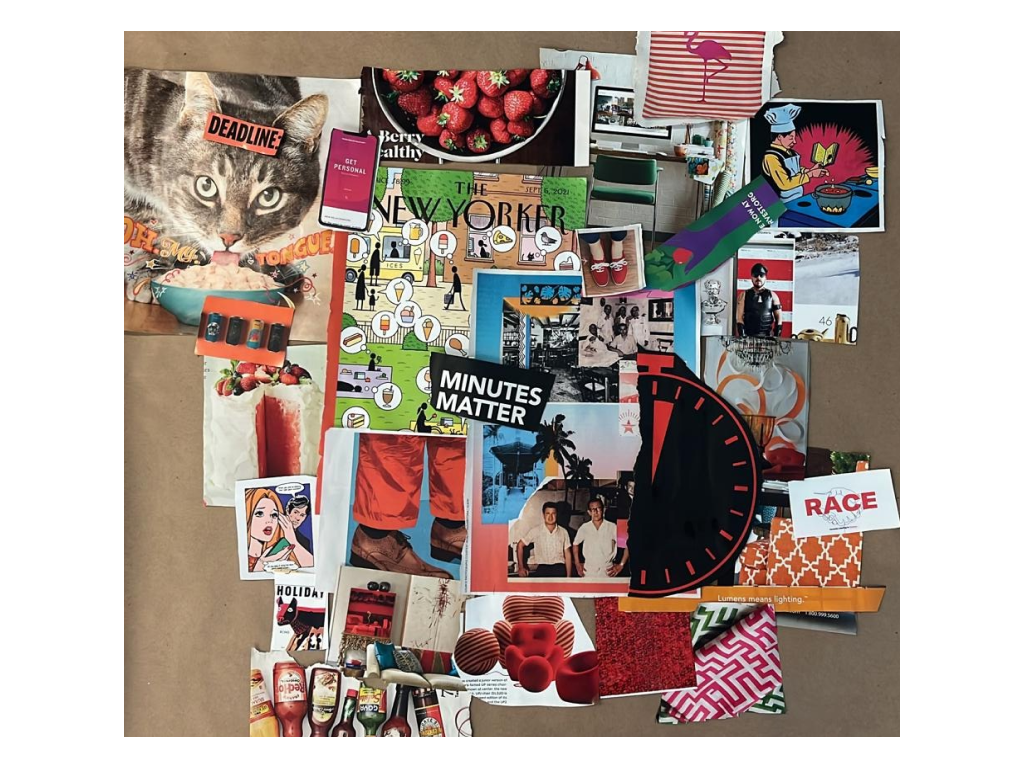
We envisioned a fun engaging casual brand that encouraged users without seeming intimidating. As a team, we worked with physical materials (namely magazines) in class to create a mood board that represented our brand’s personality. We want users to be engaged & active, but not too stressed either, so we chose photos with muted orangey-reds as our primary colors. We also included blues & ceruleans to cool down and balance out the reds. We opted for photos more than illustrations to ground users in the real world rather than immersing them in an imaginary one, and preferably photos that have both a “fun” and “healthy” vibe to keep users both engaged and on track. As for font inspirations, we saw a lot of bold, sans serif fonts that were fun and modern, and thought that these would make our product more in line with our generation of users and convey the tone of we “get them” without going too overboard. Overall, we wanted to get and keep users’ attention, but maintain a fun vibe so we don’t overwhelm them with stress about their responsibilities and/or make them resent us for nagging them. We want them to be inspired to get off social media because of us!
Team Style Tile
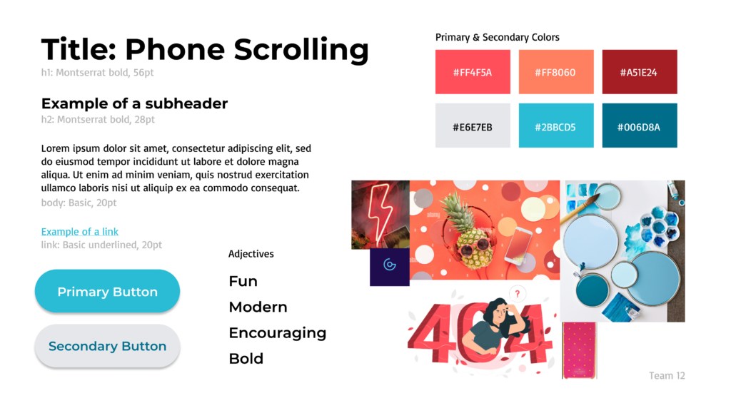
From our mood boards, we proceeded to create a team style tile to explicitly lay out standard UI elements and styling that would be used within our product. Because our product aims to encourage our target users to spend less time on social media – most of whom being young adults who are technically savvy – we believe that the design style should reflect a service that does this. We especially kept in mind the visual landscape of social media and made the style feel like a part of that environment, so that there would be less friction engaging with it.
We also believe that it is critical that our brand be seen as fun and engaging as we hope it will be for users. We chose sans serif fonts to keep the energy more casual and in line with current design trends (Montserrat for the headings and Basic from Figma’s library for the body and link text). We also chose brighter colors for both our primary and secondary colors, with our primary colors being along the lines of bright orangey-red in order to grab the user’s attention, and our secondary colors being blue hues to balance out the intensity of the primary colors chosen. For our buttons, we opted for rounded, ovular shapes to also be in line with current design trends that are commonly seen in social media, as well as giving the product a friendlier, less intimidating aura.