

German’s moodboard: I went for a monochrome mood board because I anticipated our UI to already have a lot of color from photos of food. For the color scheme, I went for lighter colors since dining halls are usually well-lit, so I thought we should do light mode. Upon searching up keywords I associated with our product (sustainability, no waste), green kept coming up.
Jianna’s moodboard: I associate “exciting”, “fun”, and “grounded” with the brand of our app. I wanted it to feel like an approachable dining hall companion that felt distinctly different from nutrition or diet apps, which can feel more limiting or judgemental. To match this brand personality, I chose examples with strong but muted colors to remain approachable and trustworthy. I really loved organic shapes, like leaves, waves, and gradients, to match the easygoing experience I’d like our app to deliver.

Griffin’s moodboard: When I thought of our brand’s personality, I thought of the users we were trying to attract. Our product is for young people who care about sustainability and reducing their food waste, and I think our brand should reward them for that mission with bright colors and fun vibes. Immediately, pink and orange stood out to me in the goldfish photo, and every else kind of filled in. For the iconography, I think thin black strokes and very flat illustration would add to the playful feel. This moodboard is someone I would want to hang out with and borrow their clothes for a night out.
Composite Moodboard and Style Tile:
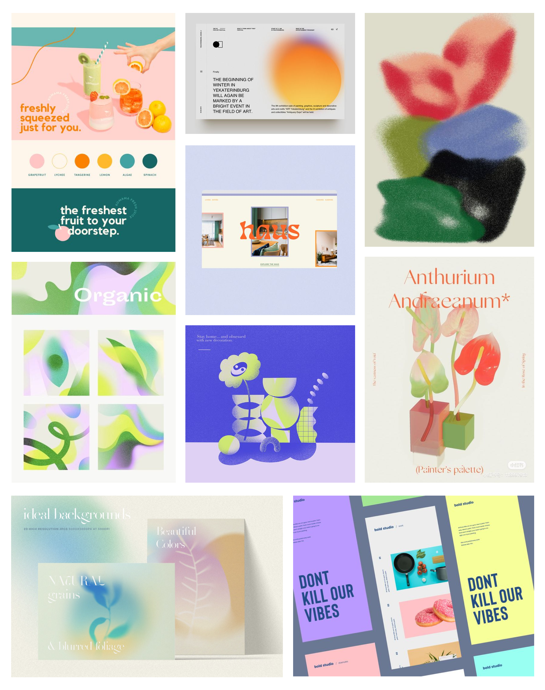
After discussing what we enjoyed from our own moodboards, we each brought images to a composite moodboard that emphasizes pale greens, vibrant turquoise and orange, and some cool and dark greens/blues. We were inspired by the organic feel of the gradients and how youthful the combination of the colors felt. Because there is a lot of pastel, we wanted to make sure the color palette felt grounded by some darker colors and had one accent color that stood out (the orange bursting out of the calla lily). This orange is useful because it appears in foods but does not take away from the fresh feeling of the greens. We added turquoise since it complements the different shades of green and also epitomizes the early 2000s, hopefully creating some nostalgia for our generation that grew up during that era.

The style tile quickly followed from the moodboard. The secondary grays lean closer to blue to add coolness to the palette. Our sans serif fonts are clean and easy to read. Our iconography could be gradient-style or more paper-cute like our third mood image.


Comments
Comments are closed.