
Moodboards
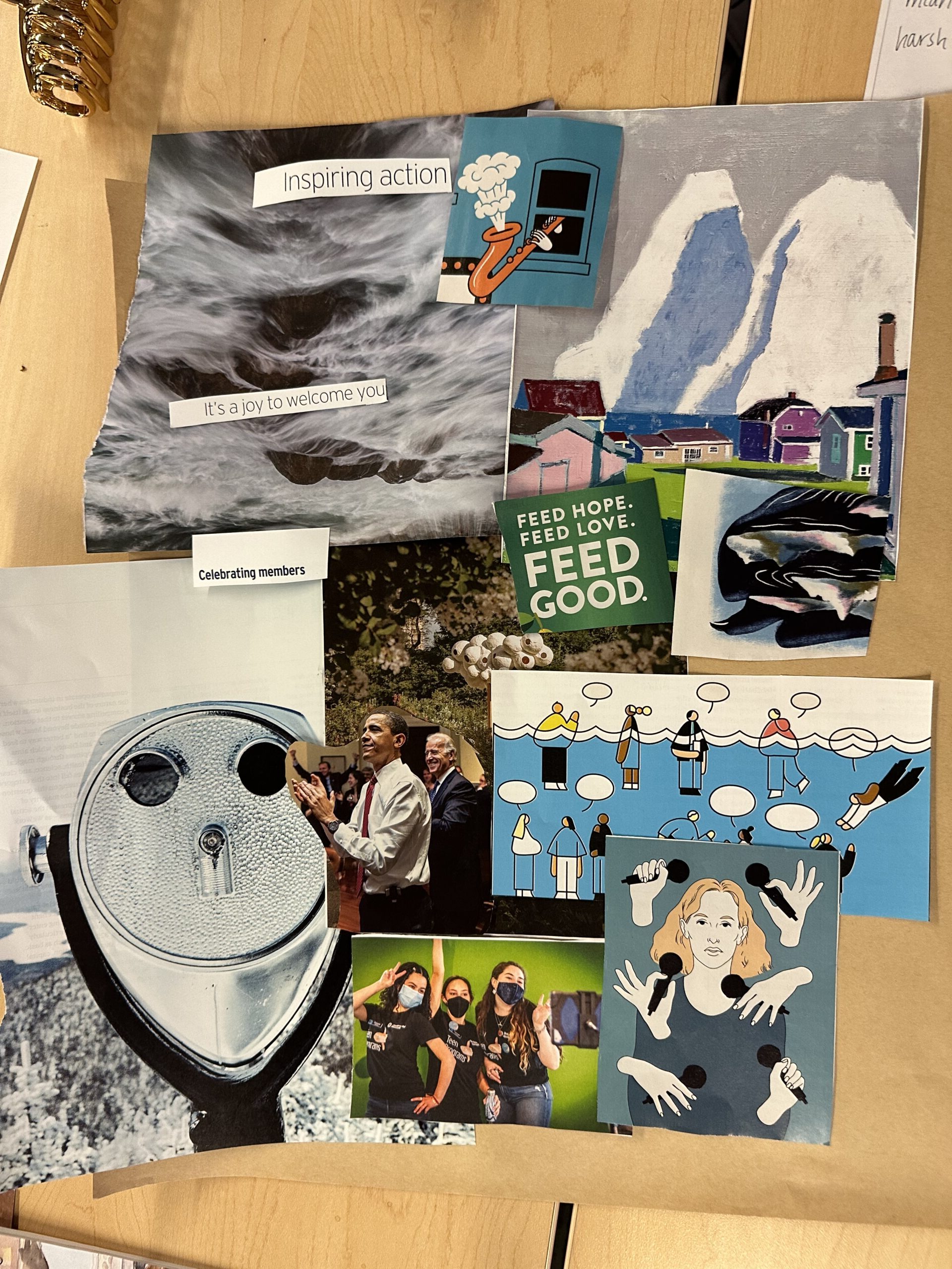
Figure 1: Moodboard 1
Because we want our app to encourage reflection and gratitude, we created this mood board around a cooler, natural color theme to encourage a more meditative state in users. We can see that there are natural images like a calming water texture and artistic mountain landscape which is a nod towards a calm user experience. The binoculars over the snowy landscape suggest introspection and reflection. Furthermore, we included text that mentions joy, celebration, hope, and love which are all core tenants to our complement philosophy. Our main critique for this board, however, is that the overwhelming amount of blue tones and snowy landscapes made the board feel “cold” and somewhat unwelcoming. Despite the relaxing mood that these images create, we want to make sure that users are also feeling welcomed and comfortable. We also thought that the natural scenes pulled too much attention away from the social aspect of our app, which is only really highlighted by a few smaller images of people.
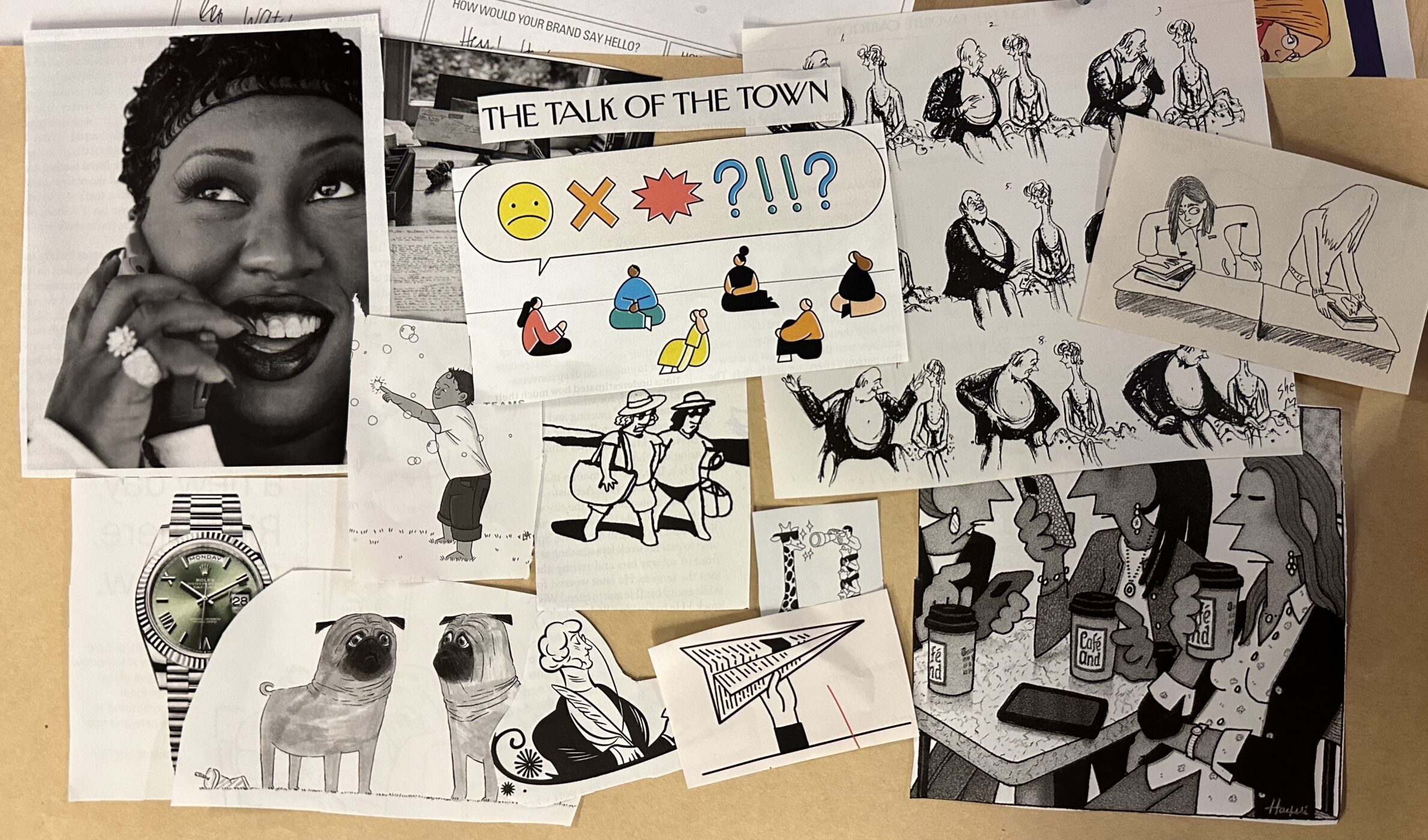
Figure 2: Moodboard 2
This mood board was all about the relationships that our app hopes to strengthen through sending and receiving compliments. Pros of this mood board include explicit representations of these relationships. Some of the images particularly emphasize our problem space that we want to keep in mind when designing our app–we thought of the man and women as starting off having a slightly awkward conversation, and then they get more comfortable with each other at the end. This feeling of comfort is something we want our app to be centered around. We also want to play around with the idea of trying to evoke the same feeling that you get when you read a handwritten note from someone, so the note folded into a paper airplane alludes to this.
Our main critique of this mood board is that it was centered around themes rather than aesthetics. As we want our product to evoke lighthearted, happy feelings, but the black and white tones are bleak and boring. The pop of color in this board, however, could be a nice color palette. We want our users to be able to react to the compliments they’re given, so the one colorful addition gave us some inspiration for that. Nevertheless, we want our app to be mostly colorful rather than black and white.
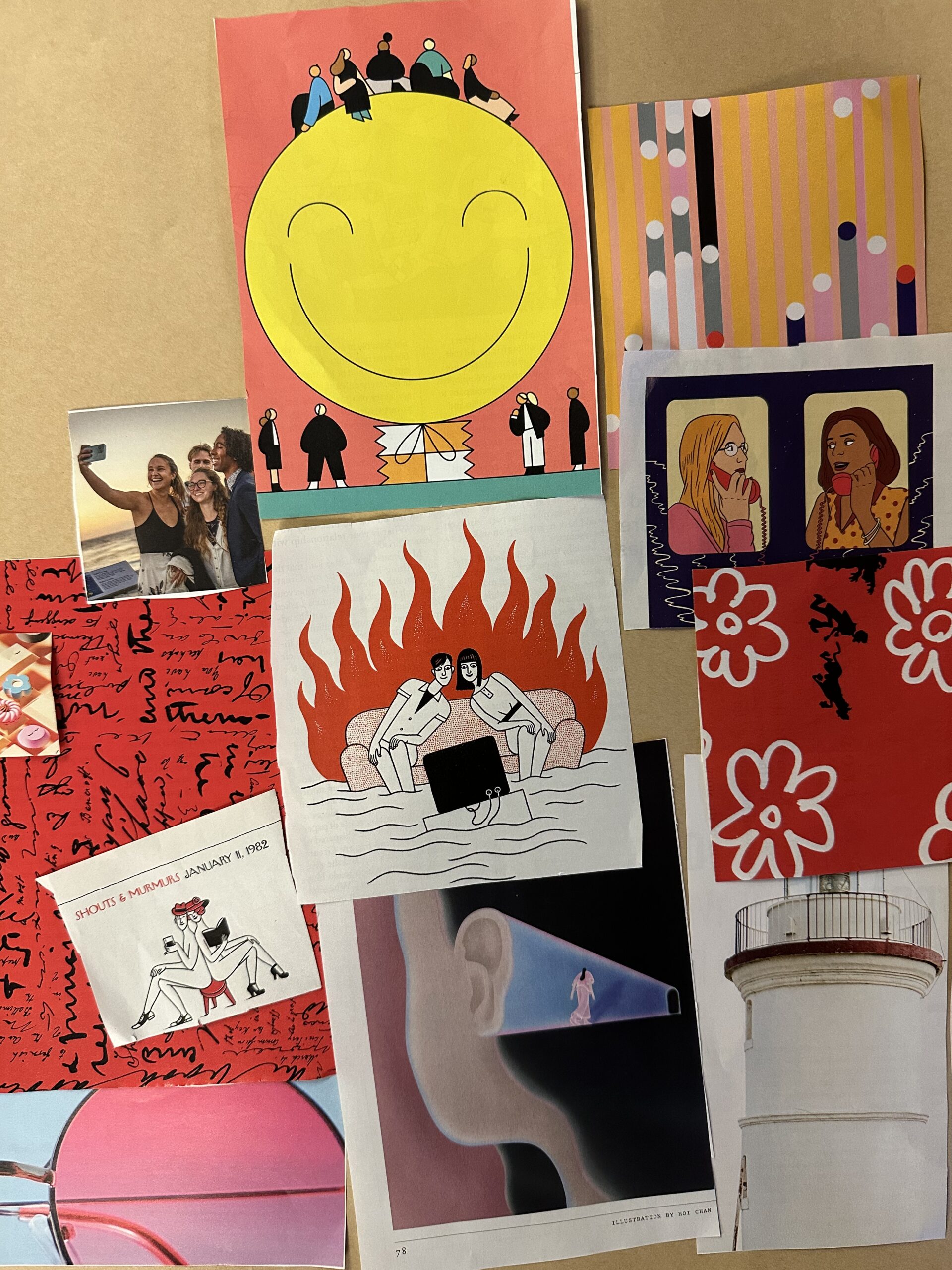
Figure 3: Moodboard 3
Our app is about social connection and gratitude between friends. We hope to create a safe space for users to share kind thoughts. These high-level concepts evoke feelings of warmth and comfort. Pink and red tones are highlighted in this moodboard, as they evoke the coziness, warmth, and friendliness that we hope to create. You’ll see many images in our moodboard of intimate connections between friends: two people leaning together on the couch, or sitting back to back on a stool. There are also images highlighting conversation: two women talking on the phone, a page of handwritten text. We also emphasized happiness in this moodboard: a group sitting on top of a smiley face, a few friends taking a smiling selfie. Overall, these warm tones and images of connection help us convey the emotional core of our app: friendship, love, and warmth.
On the other hand, we thought that the red colors in this moodboard might evoke aggression and anger. The image of the red flames, in particular, could be a sign of danger rather than warmth. We also didn’t necessarily think that physical images of smiles (smiling people, smiling icons) best fit the brand we hope to create. We are focused on gratitude and friendship, but we believe that this can be invoked less explicitly than physical images of smiles and emojis. We hope to convey this emotional core most explicitly through our brand language and app functionality. We concluded that shifting from exclusively red tones to integrate other, balancing colors would decrease the sense of anger/aggression from our moodboard. We also concluded that to us, smiling faces were something we wanted to encode more subtly in our app, rather than plastering our interface with smiling faces that could come off as ingenuine.
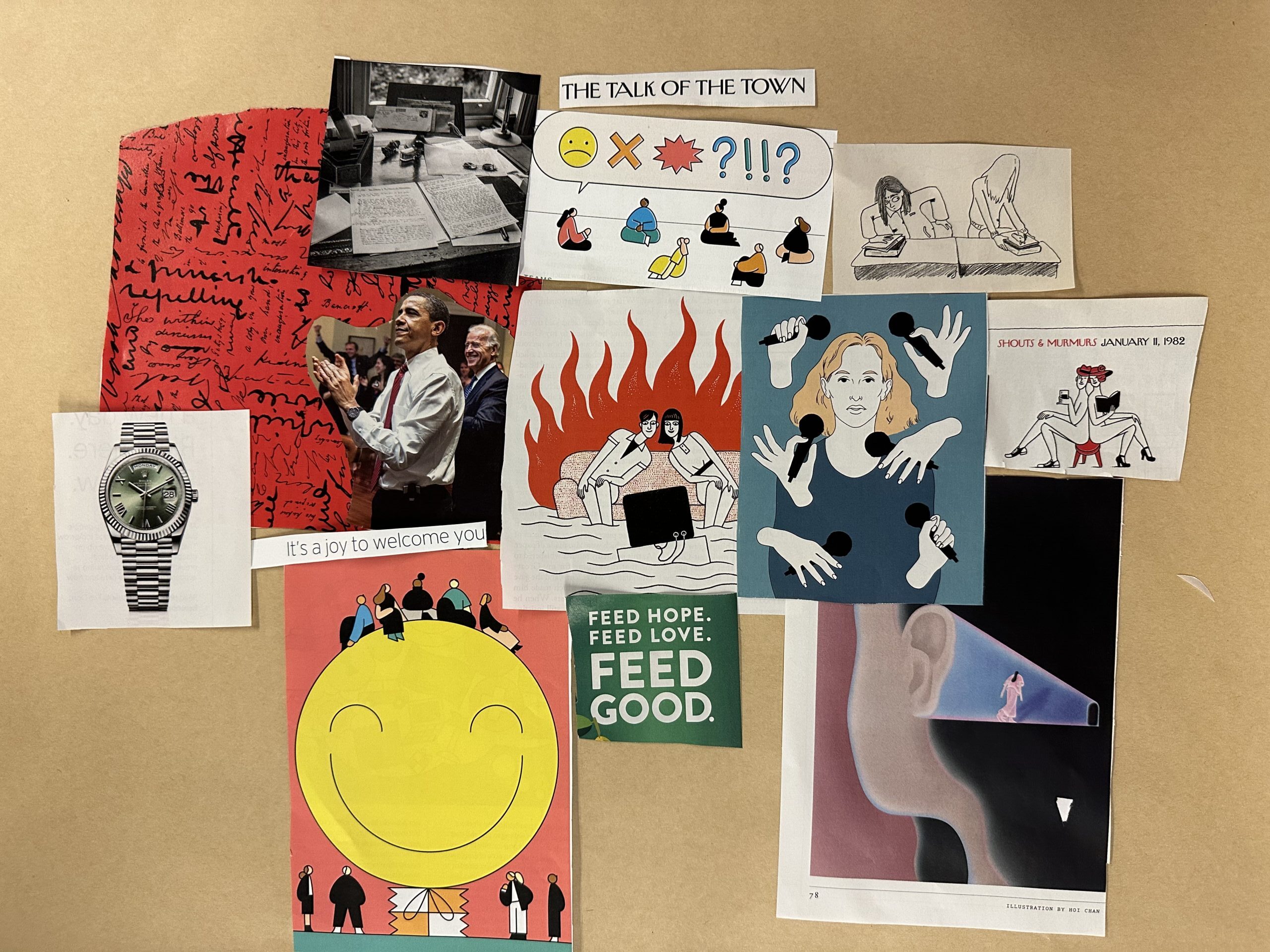
Figure 4: Combined moodboard
After looking at our 3 individual moodboards, we wanted to choose the images that align with the vision of our app, how we want to communicate to users who we are and what we believe in. Our app is centered around happiness, comfort and togetherness. A primary concern that we had in our previous mood boards was that solely sticking to a color theme while organized and clear could evoke the wrong feelings for users. We went through every image and only chose those that were connected to the idea of giving and receiving compliments or elevating someone’s mood. For example, the two friends leaning together on the couch, the people in the circle talking about their emotions and the woman with multiple microphones sharing her thoughts all display a sense of togetherness. We also wanted to incorporate the theme of sending and reading notes which can be seen in the photo of the letter being written and the photo of two people reading.The photo of the watch was separately chosen to illustrate the idea that our idea includes a time aspect to it. This final mood board reflects everything we aspire to build and communicate.
Style Tile
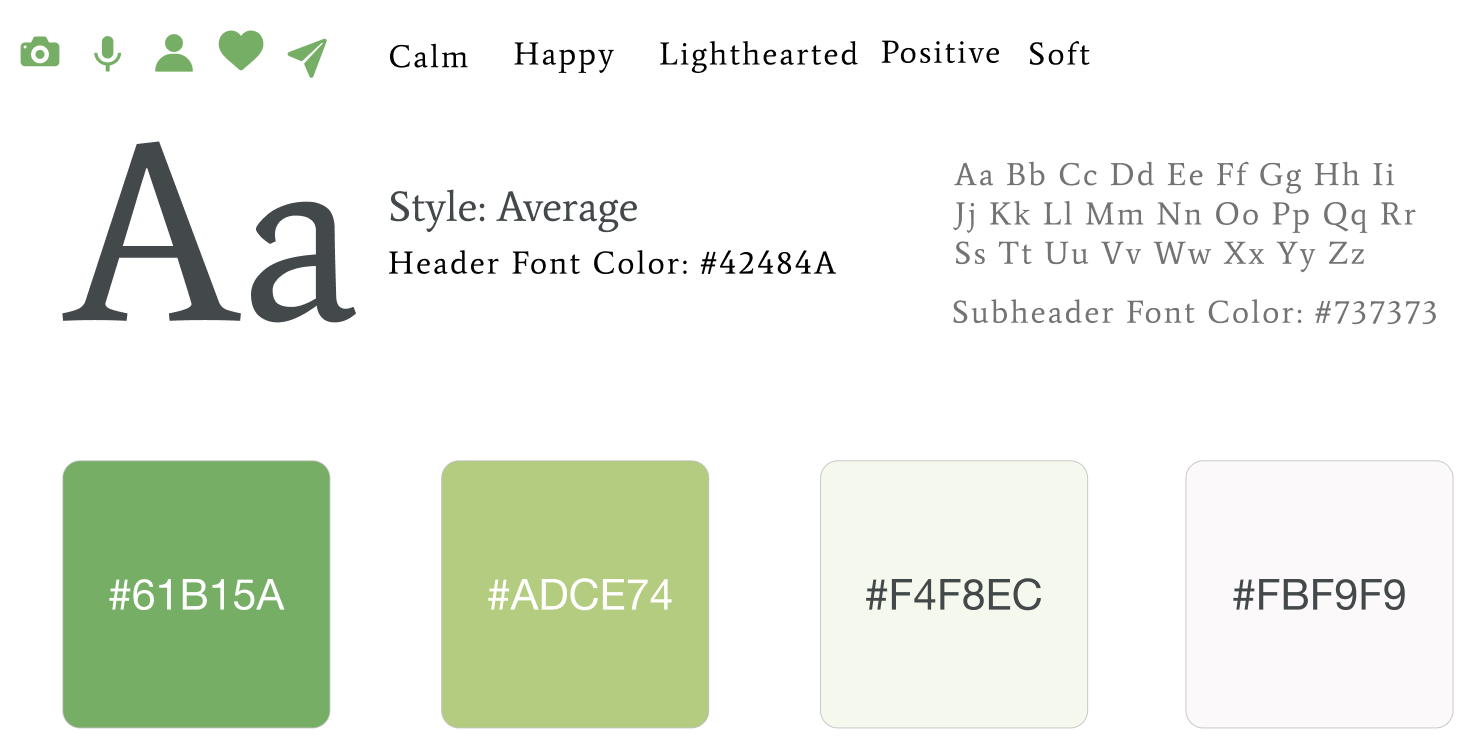
Figure 5: Style tile
Our style tile incorporates some of the green tones that appear in our combined moodboard. We want the vibe of our app to reflect the mood of the people and friends shown in our board. We want our app to encourage the strengthening of friendships, while being lighthearted and fun. Thus, we decided to pull some of the green tones out from our mood board, as green often signifies positivity. The variation of shades elevates the calming feel we hope to achieve in our product, while providing primary and secondary colors we can use to differentiate static items from buttons. Our moodboard alludes to the different mediums that people can use to send compliments — photos, voice, text. These are shown in some of the icons that will appear in our “sending a compliment” flow.


Comments
Comments are closed.