
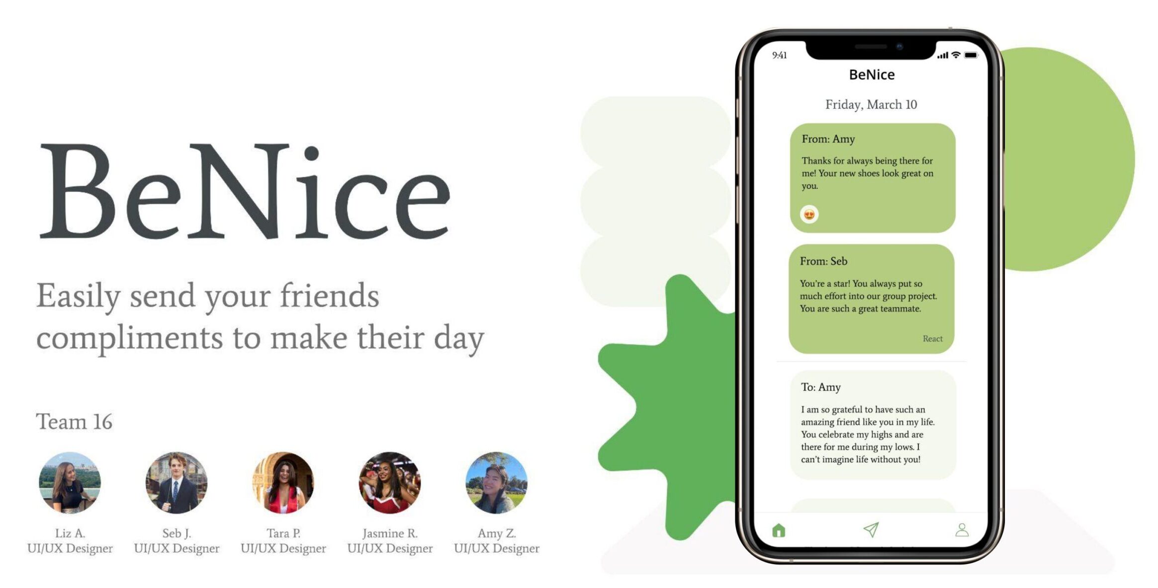
BeNice is an app to help college students more easily give and receive compliments by creating a safe space for authentic compliment sharing and by nudging users to give compliments to uncover compliments they’ve received from friends. Our team worked on this project from January-March 2023.
Problem Finding
Problem Domain: Compliments
Our team chose to tackle compliment giving. We were inspired by the common desire to be kinder in one’s daily life, after seeing it on a list of top New Year’s Resolutions. Giving compliments has been shown to improve both the giver and the receiver’s happiness (Boothby, 2021). We believed that creating an ecosystem of authentic compliments would help foster kindness and connection among college students (amidst the stress and occasional loneliness of college life). We therefore focused our domain specifically on increasing compliment giving amongst college students.
Problem Landscape
From our literature review, we learned the benefits of compliment giving and receiving for individuals and relationships. For the former, compliments can reduce negative self-views, improving the receiver’s self-esteem. For the latter, as compliments allow individuals to express appreciation in relationships, they have the power to deepen them. An important insight is that compliments have a greater positive effect on the receiver when they are perceived as sincere and specific. Thus, we wanted our solution to specifically encourage the delivery of more meaningful compliments. Lastly, we learned that there exists some anxiety around giving certain types of compliments. Individuals can overestimate the awkwardness that can arise from giving a compliment, particularly one that is more heartfelt, despite recognizing how good giving a compliment can make them feel. To address this, we wanted our product to foster a comfortable environment for giving and receiving all types of compliments.
After analyzing relevant literature, we sought to understand other products in the market through competitor research. We mapped our competitors in a 2×2 matrix based on the type of compliment (deep versus surface level) and end (giving versus receiving) that they focus on. Most competitors surround surface level compliments. The ones that focus on deeper thoughts are more introspective; they do not facilitate the delivery of deeper compliments to other individuals. To differentiate our product and address this gap, we set a goal of encouraging the delivery of deeper, more meaningful compliments.
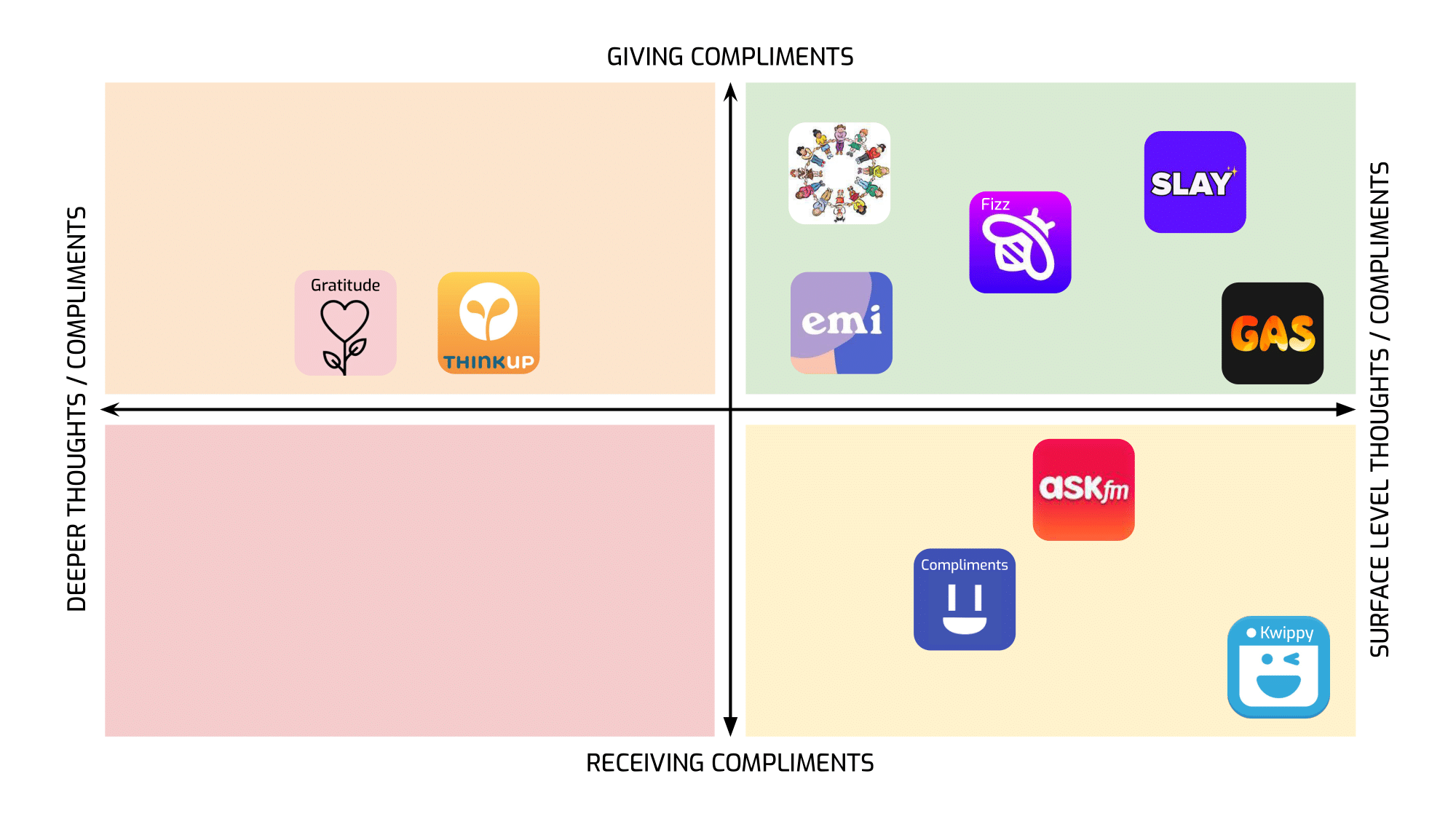 2×2 Comparative Matrix
Baseline Study & Synthesis
Our intent was to study the existing practices of giving and receiving compliments among Stanford students. We selected participants with a screener and had them complete a pre-study interview. Our main goal in this interview was to extract information about college students’ existing habits and feelings around compliments. For the five day duration of the study, participants completed a daily compliment log and a summary of the social situations they were in throughout the day. We wanted to collect specific information on the type, quantity, and feelings associated with compliments that participants gave and received. We knew that compliments were inherently social, and had an intuition that they were context-dependent. Thus, we collected social situation information as well. Finally, participants completed a post-study interview asking them to self-analyze their compliment giving habits. For more detailed information, check out our midpoint writeup.
To draw findings from our data, we generated 120 sticky note insights and created various mappings with them. We began with an affinity grouping; we noticed that many post-its were about comfort and discomfort. This suggested to us that increasing comfort would be an important part of our intervention. Next, we reorganized our affinity groups by frequency. The most common category was compliment context. From this, we gleaned that many social contexts are not conducive to compliment giving. This made us think about how we might create a safe space for compliments to flow. Finally, we constructed a 2×2 matrix with the y-axis [Superficial → Deep], and x-axis [Close → Stranger] (referring to the intimacy of the social situation). We noticed that the vast majority of sticky notes were clustered in the superficial and close zone. We decided to focus on both superficial and deep compliments since both seemed like viable spaces, but with a particular emphasis on deep compliments which may be harder to deliver in person. For more discussion of our findings and diagrams of all mappings, see our synthesis blog post.
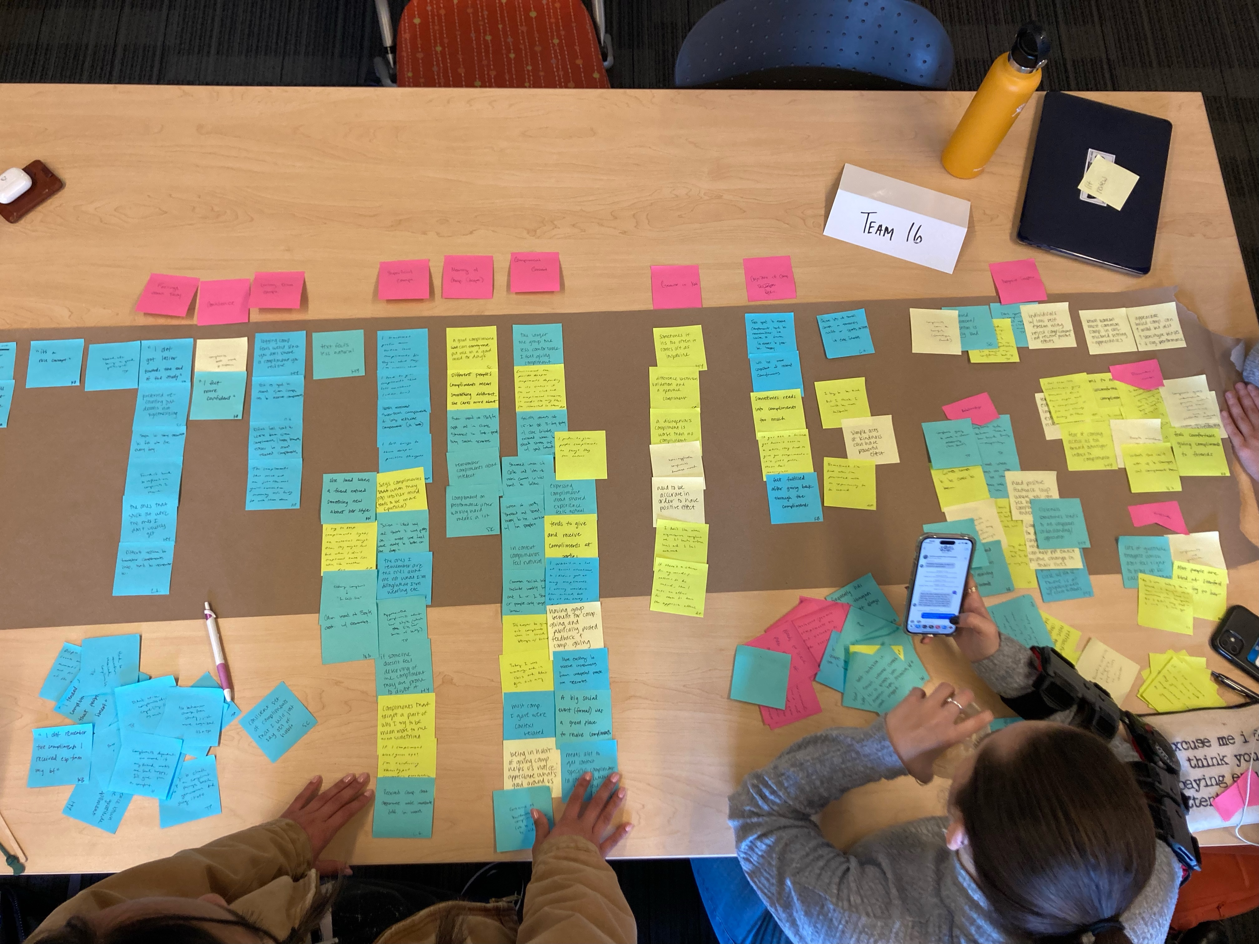
Example Mapping of Insights: Affinity Grouping
Next, we created two conceptual models. First, we made a connection circle to understand what motivates or demotivates giving compliments. We found that if a deeper compliment is given, the recipient is more likely to reciprocate than if a superficial compliment is given. We also found that big social events lead to giving superficial compliments which leads to receiving superficial compliments in response. On the other hand, small and intimate interactions lead to giving deeper compliments which prompts receiving deeper compliments in return. Second, we made a fishbone diagram to tease out the reasons for not giving a compliment. The environment and timing of a social context had the largest impact on whether or not a compliment was given. Environmental factors such as being in class, being at work, being with strangers, and being with acquaintances caused a compliment to not be given.
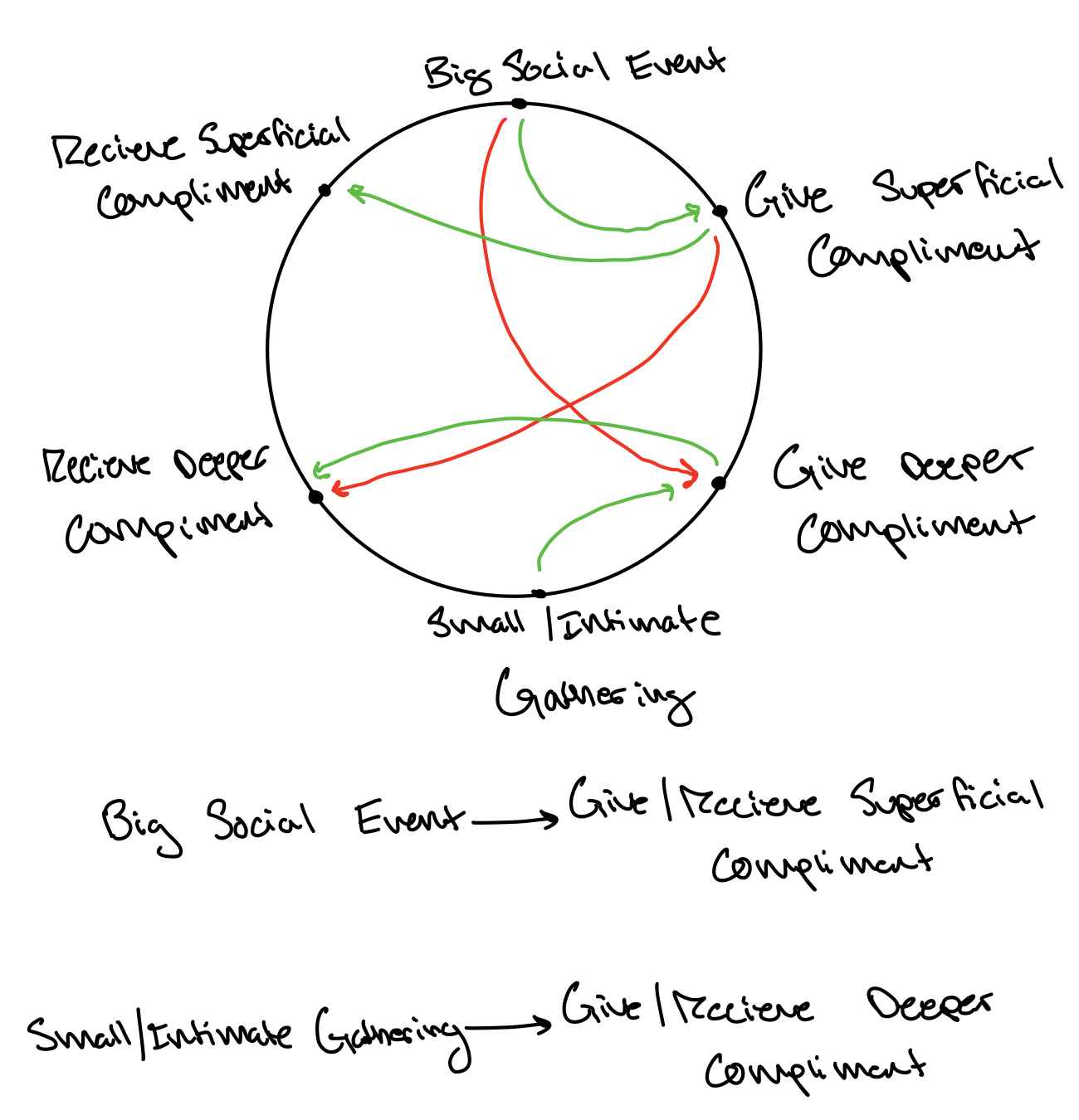
Example Conceptual Model: Connection Circle Highlighting Big Ideas
From this analysis, we narrowed our problem statement in on creating a safe space for compliments to be given without a fear of awkwardness. We wanted to focus especially on compliments between friends. We decided to look at alternative ways to deliver compliments which aren’t anchored in the moment the compliment originates from; if a positive thought provokes a compliment in an inappropriate time, might there be a way to deliver this compliment through a more appropriate medium, or at a more appropriate time? For more details on our analysis, see this blog post.
Personas & Journey Maps
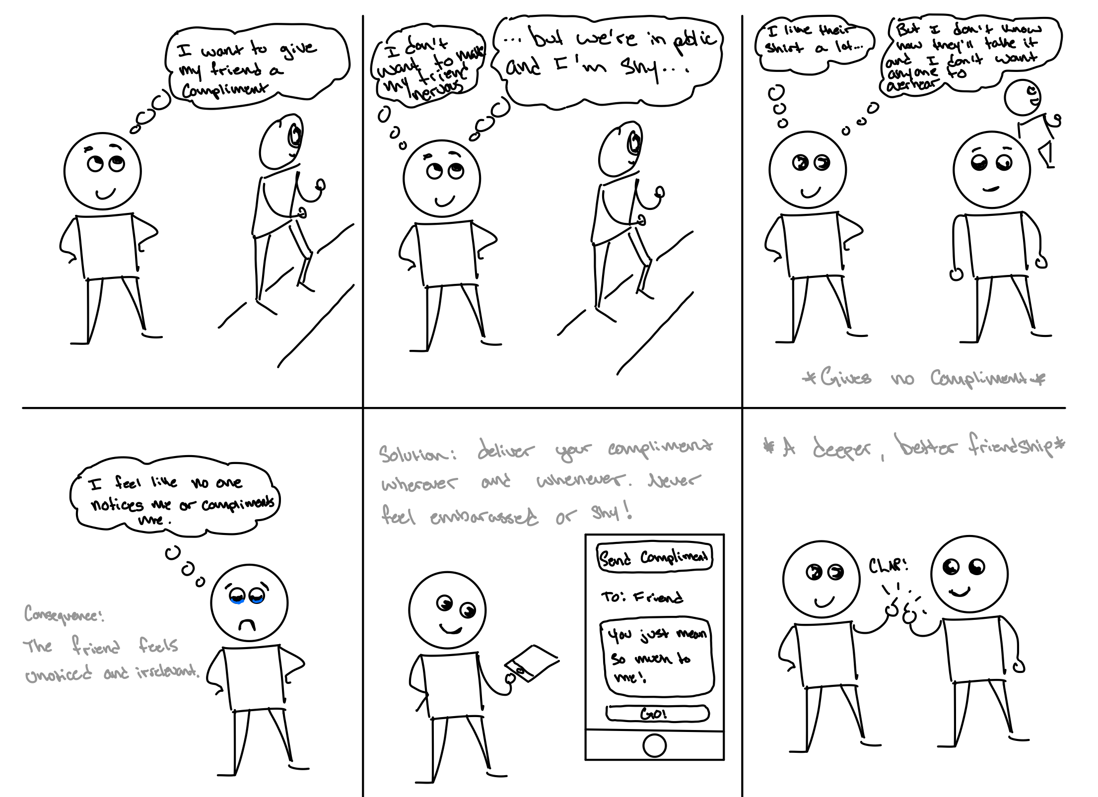
After understanding the pain points from existing literature, competitor market research, and our baseline study, we were able to form a complete picture of our users and their needs, which we turned into two user personas: Grateful Grace and Nervous Nick.
Grateful Grace
We noticed a large overlap between compliment-giving and gratitude during our baseline study with participants feeling uncomfortable expressing gratitude and deeper compliments in the moment. We decided to focus on this persona because many study participants noted wanting to express more meaningful compliments as they felt like it deepens their relationships. Enter our first persona: Grateful Grace, an outgoing and insightful friend. She finds herself giving superficial compliments frequently but tends to feel awkward giving deep compliments in lighthearted situations because she is conscious about not ruining the mood.
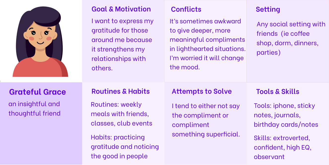
Persona: Grateful Grace
Using this persona, we created the following journey map to identify intervention points throughout a day in Grateful Grace’s life.
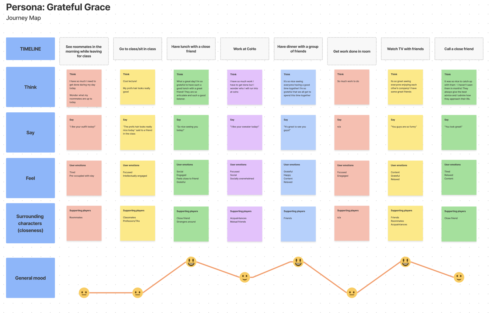
Journey Map: Grateful Grace
From this journey map, we can see that there is a clear divide between what Grace thinks and what she actually ends up saying. Thus, how can we bridge this gap by providing Grace with tools to express what she is thinking?
Nervous Nick
We also noticed that many participants had an overall aversion to giving and receiving any sort of compliment simply because they were nervous about feeling like they were in the “spotlight” of a social interaction and also didn’t want to put others in that situation. We decided to focus on this persona because many study participants reported this “spotlight” effect as being the barrier towards giving out any kind of compliment. Enter our second persona: Nervous Nick, an observant yet reserved friend. He wants to make sure that his friends know how much he appreciates them, but tends to not always share in the moment because he is worried about attracting attention to himself and doesn’t want to make others uncomfortable. He also doesn’t like receiving compliments in front of others because he feels that his reactions are being observed and it makes him nervous.
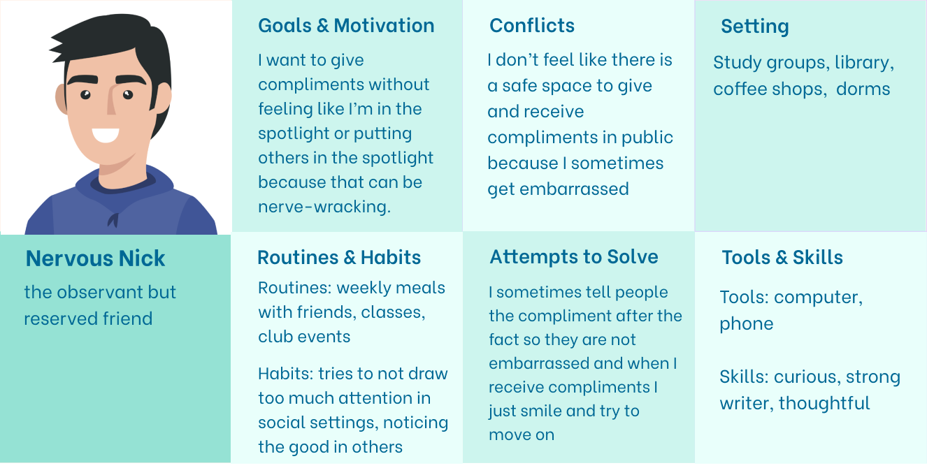
Persona: Nervous Nick
Using this persona, we created the following journey map to identify intervention points throughout a day in Nervous Nick’s life.
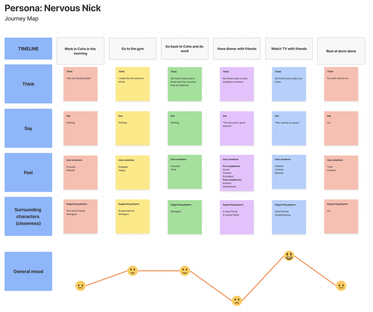
Journey Map: Nervous Nick
From this journey map, we can see that he has a harder time activating himself to vocalize his positive thoughts. Thus, how can we provide Nick with a comfortable, closed environment to share and receive compliments?
These insights from both personas left us wondering if/how we might be able to create a safer space for exchanging compliments, especially deeper compliments. What might it look like for people to give compliments retroactively (thus saving themselves from “ruining the mood”) and/or in a virtual context (thus saving themselves from the “social spotlight”)? With these questions and ideas in mind, we began to explore potential solutions.
Solution Finding
Intervention Study
The goal of our intervention study was to explore compliment giving and receiving in a more structured way. We wanted to see if we could create a space for free and comfortable compliment giving that would encourage authentic and plentiful compliments. We tested this by recruiting 16 participants who were prompted each day to give compliments at a certain time. We also wanted to provide the option for anonymity, as we were interested to see how that would change the type of compliments sent in. See more on our ideation process for our intervention study (including our top 3 ideas) and our methodology in the last section of this blog post.
The main hypothesis that we wanted to test was that people would feel more comfortable giving deep compliments (1) not in-person and (2) in a closed group setting. We also hypothesized that people would be more inclined to give compliments if they knew that compliments were waiting for them. We had three main insights that arose from the study that informed some of our design decisions.
Our first insight was that people gave deep compliments 65% of the time, which is much higher than what we saw with our baseline study. This confirms our hypothesis that people did feel comfortable giving deep compliments within the context of the closed group.
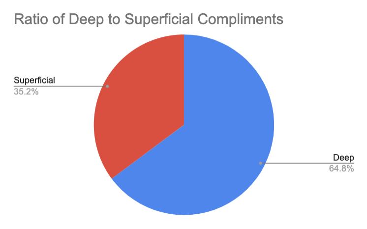
Ratio of Deep Compliments to Superficial Compliments
Second, we noticed that most of the compliments were sent in after we texted each day at 7pm (the nudge) reminding participants to send in compliments if they wanted to view theirs. This reinforces that the nudge prompted the action. From this, we decided to continue with the idea that participants can only receive compliments once they have sent at least one compliment. As participants were encouraged by the thought of compliments waiting for them, we wanted to come up with a way for this to integrate into our final prototype.
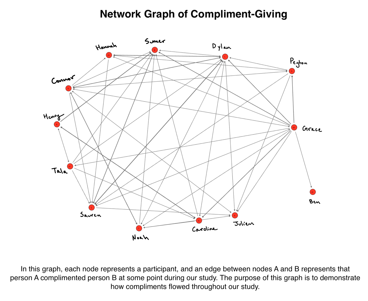 Compliment Network
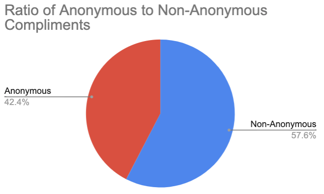
The final insight we gathered was about anonymity. There was tension and different opinions from participants about whether or not they wanted to send and receive anonymous compliments. One participant who only sent in anonymous compliments mentioned that they only sent in compliments because of the option of anonymity. Other participants expressed a mix of curiosity and frustration when they received anonymous compliments. In the figure below, we can see that 58% of our compliments were anonymous. This shows us that it is important to be able to choose whether or not to send a compliment anonymously. Thus, we decided to incorporate this into our final solution.
Ratio of Anonymous Compliments to Non-Anonymous Compliments
Overall, our intervention study was a major success. Participants really enjoyed the overall experience. It was clear they were super excited about receiving their compliments each day. Even though participants were only required to send in one compliment in order to view their received compliments, the majority elected to send in multiple compliments. The positive affirmation we received from our participants increased our excitement in building out our solution.
Design Architecture
We mapped insights from our Intervention Study in a variety of ways. Our most important learnings are detailed below; for more details, view our architecture report.
System Path
The system path highlights the most important functionalities of our app. Drawing out system paths for our different personalities yielded a fluid outline of a user’s flow through different tasks. While drawing these diagrams, we focused on walking through the system in our user’s shoes and reflecting on what the user would want at each step, ignoring our initial ideas of technical interface design.
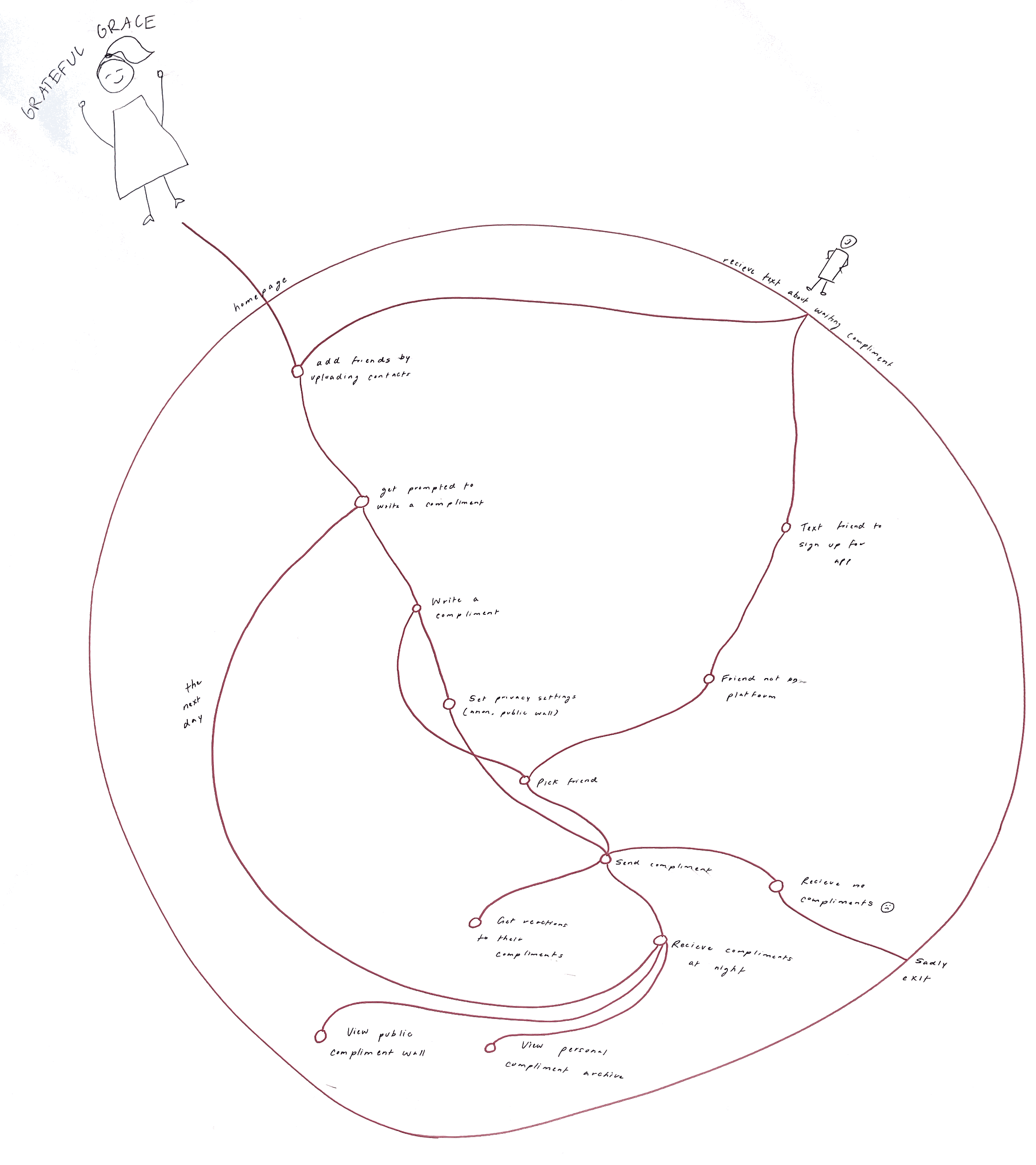
System Path Diagram
Bubble Map
We utilized a bubble map to visualize all tasks and their relation to the two most important functionalities of our app: giving and receiving compliments. We noticed that there is significant overlap between these tasks, but they are distinct in their flows. We learned that it is critical for users to be comfortable with the flows of giving and receiving compliments equally and understand the relationship between them. The consequences for a user failing to understand this relationship is that they will never receive their compliments, most likely leading to them leaving the app.

Bubble Map
Storyboards
Creating system paths and bubble maps were essential in synthesizing our solution’s core functionalities, as well as a cohesive flow between functions. However, to fully understand how to best design such functionalities, it was necessary to walk in our user’s shoes. To bring the needs of the stakeholders into the design of our app, we used storyboards to understand the emotional path a user takes before using our app, while in use, and after use. From our storyboards, we learned what the user would be feeling before using our app (including what would lead them to using the app), what they would want from the app, and what we would want the user to feel after using the app. The system path and bubble map taught us the necessary engineering needs of our app, but the storyboard helped us visualize what emotions we wanted to capture and invoke in our app. These conclusions from our storyboards would later be critical in the branding of our app.
Example Storyboard
Assumption Mapping & Testing
We were able to gain information on many of our assumptions during our baseline and intervention studies, as well as our literature review and competitive analysis. However, there were still some crucial assumptions that we lacked evidence for. Thus, we created the following assumption map to spot the top assumptions that required further testing.

Assumptions Map
We identified two of our most important assumptions to be “WBT we can keep customers engaged by allowing them to react to compliments” and “WBT users will want to see other people’s compliments in a feed”. To read more about our assumption mapping process and rationale for focusing on these two assumptions, see our assumption mapping blog post.
Testing Compliment Reactions
During this assumption test, we tested our hypothesis that we can keep customers engaged by allowing them to react to compliments. To do so, we gave users the opportunity to respond to compliments they received during our intervention study. We observed the user’s decision to react to a compliment, the type of reaction (short, single word, or emoji, versus long form conversation), and how the original complimenter reacted to the reaction. To see a detailed description of how we ran this assumption test, see our experiment synthesis blog post.
This test was conducted on four participants, all of whom opted to send a reaction back to their original complimenter. Most participants (three out of four) noted that it seemed most natural to have a short form conversation following the compliment, while one stated that they prefer the emoji based system used in iMessage.
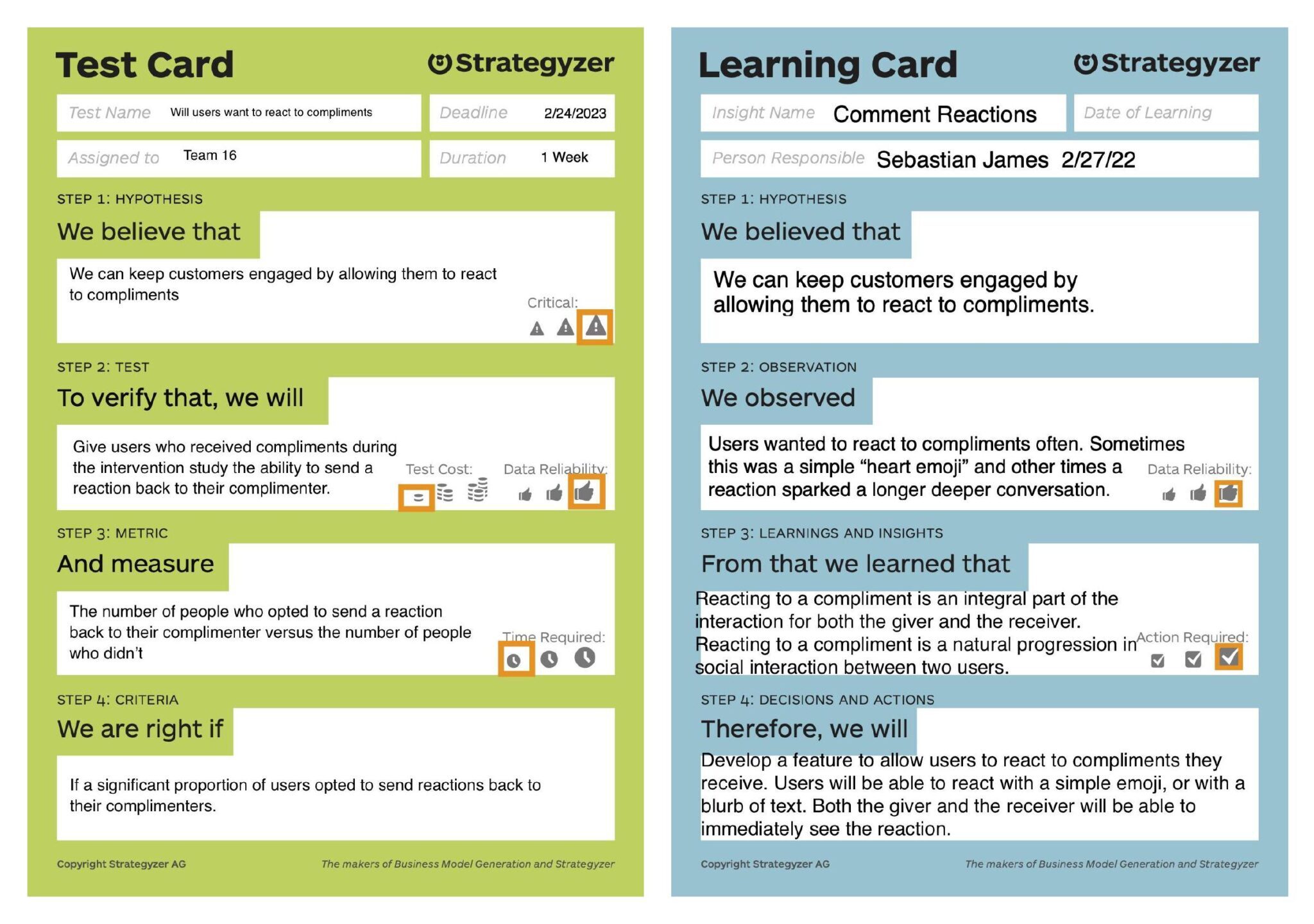
Assumptions Test Card and Learning Card for Test 1: Testing Compliment Reactions
From our results, we see that our hypothesis stands and we have sufficient evidence to develop a feature to allow users to react to compliments they receive. Users will be able to react with a simple emoji, a blurb of text, or a photo. Both the giver and the receiver will be able to immediately see the reaction.
Testing Public Compliment Wall
During this assumption test, we tested our hypothesis that users would want to see a public wall containing compliments sent and received by other friends. To test this hypothesis, we gave participants from our intervention study the opportunity to view a selection of compliments from the study. We made sure to ask for consent from both the compliment sender and compliment receiver to share the compliment. We then added all of the consented compliments to a Google Form where we asked users who view the compliments to submit their name and their reaction to reading the compliments. This Google Form was then released to the entire intervention study group. To see a detailed description of how we ran this assumption test, see our experiment synthesis blog post.
Only one participant of the 16 intervention study participants viewed/submitted the Google Form containing the public compliments. While only one participant viewed this document, he noted a very positive reaction including feelings of gratitude, happiness, and pride in his friendships.
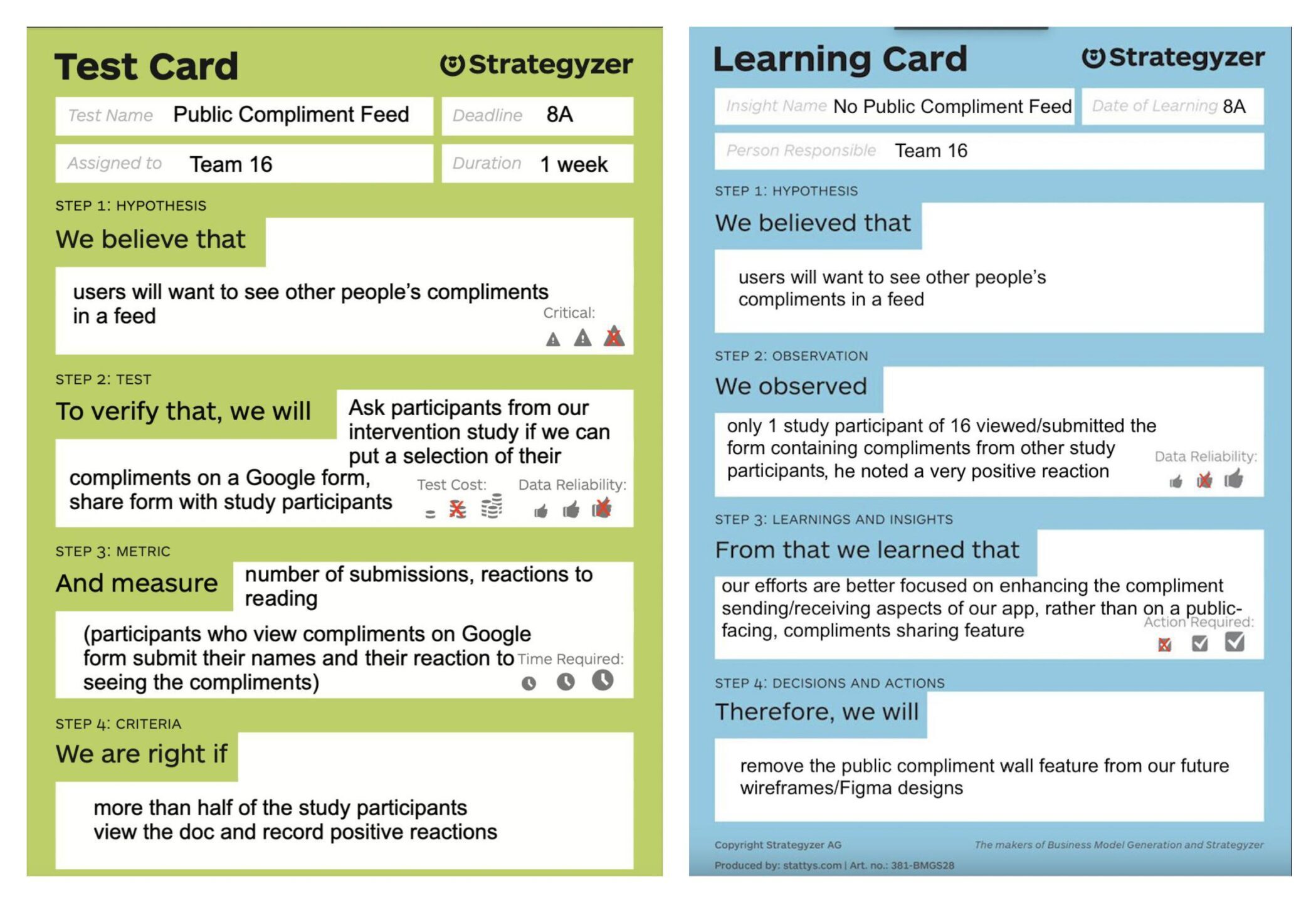
Assumptions Test Card and Learning Card for Test 2: Testing Public Compliment Wall
From our results, we see that our hypothesis is not supported by this particular experiment. While users do have positive reactions to reading these compliments, most users did not care to read and submit the Google Form. This may have been due to the nature of how the compliments were presented to participants as a list instead of a clearly digestible feed or the general aversion towards having to submit a Google Form. In the future, if we were to retest this assumption, we would (1) track if a participant is interested in viewing the public compliment wall through tracking who has viewed a Google Doc containing the compliments (versus requiring them to fill out a form), and (2) organize the list of compliments to more clearly articulate the sender and receiver.
Going forward, our efforts will be focused on enhancing the compliment sending/receiving aspects of our app, rather than focusing on a public compliment wall. Given that our learnings for this experiment were synthesized in parallel with the development of our wireflows and sketchy screens, the public wall is still included in these initial prototypes but will be removed in the final Figma prototype.
Remaining Assumptions
While these two assumptions helped us verify that users are engaged by compliment reactions and that a public compliment wall does not engage users, there are still further assumptions that remain to be tested. We would like to see if users would engage with public compliments in a Google Doc as mentioned above. We would also be interested in testing how each medium of reaction affects how the sender feels to the receiver. Are some reaction mediums perceived as more genuine and thoughtful than others? Does this impact feelings of reciprocity and closeness? Due to time constraints, we were not able to test these remaining assumptions, but kept these uncertainties in mind as we moved to building our final solution.
Building a Solution
Wireflows
We started to build out the visual design for our solution, BeNice, with detailed wireflows of our five most important tasks:
- Onboarding: Signup/Log In, add friends, understand core functionality
- Sending a Compliment: Visit blurred homepage (users are able to make out the number of compliments waiting for them), send a compliment (text, audio, photo) to a friend, visit unblurred homepage after sending in one compliment
- Receiving/Reacting to a Compliment: Look through all compliments and react (text, audio, emojis, photo)
- View Public Compliments: Look through compliments that friends have sent to other friends (note: this feature will be removed in Figma prototype given the results of our assumption testing, as explained in the “testing public compliment wall” section of this report)
- View Past Compliments: Look through compliments you have sent and received from previous days
A more in depth look at our wireflows can be viewed at this blog post.
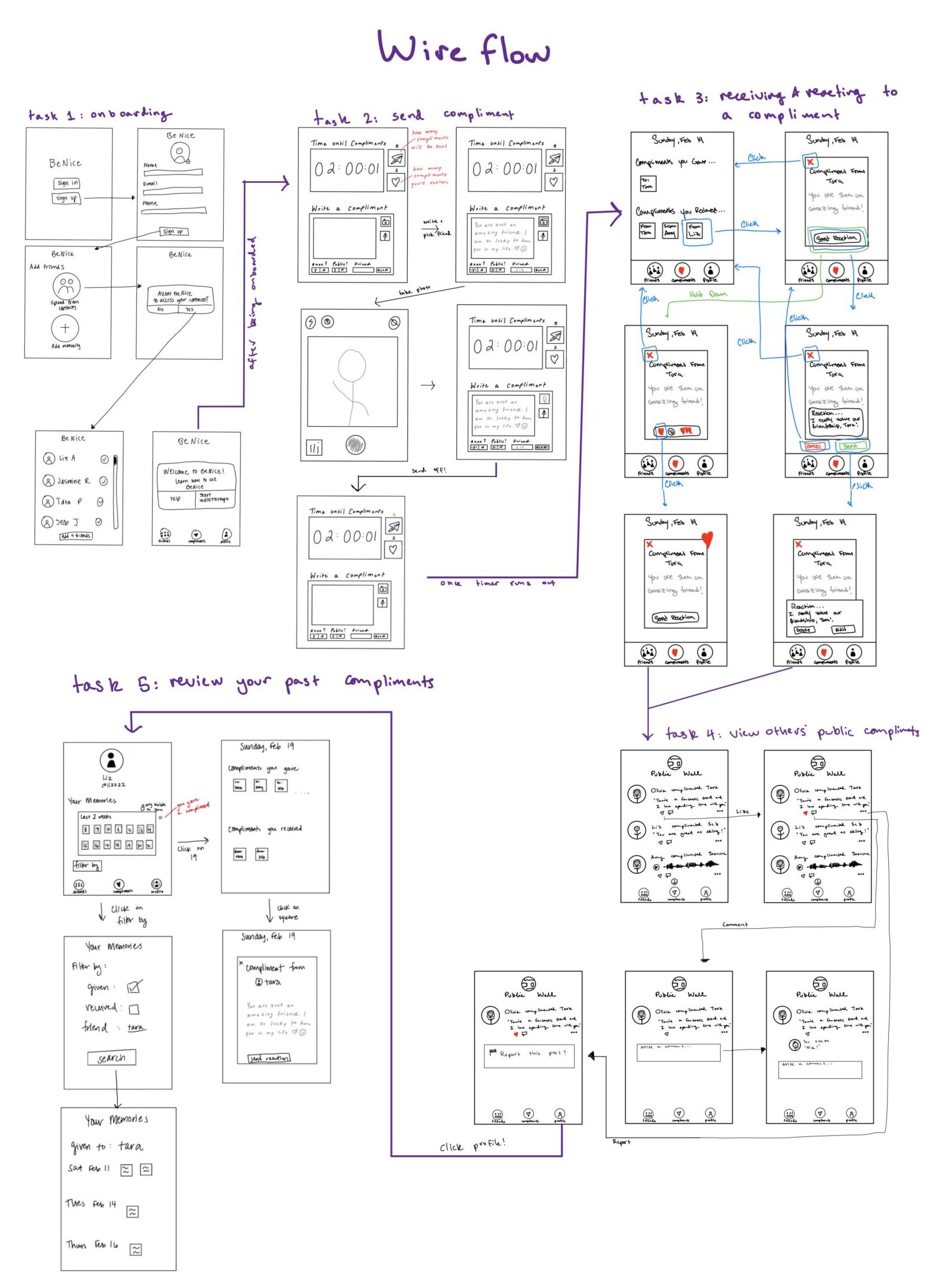
Combined Wireflows Displaying 5 Core Tasks
Branding: Mood Boards & Style Tiles
We wanted our app to encourage reflection and gratitude. As such, we created our first mood board with a calm and natural color theme to encourage a more meditative state in users. The natural landscapes were calming but isolating, the opposite of what we wanted to cultivate in our app. Our second mood board elicited a more prominent connection between people and community. However, the black and white images provided no aesthetic value towards our brand. Thus, our third mood board was full of pink and red tones to evoke coziness, warmth, and friendliness. However, we realized that the red hues in this mood board might evoke aggression and anger. For instance, the flames behind the couch where two people are leaning towards each other could be interpreted as dangerous and intimidating. Our composite mood board displays a balance between imagery and color. We built our style tile around green hues from our composite mood board to promote positivity with a calming palette (a therapist’s office often includes green plants which are soothing to see). Ultimately, our brand is a soothing and grounding voice, an approachable friend, and an uplifting presence. You can read more about our branding process, including our mood board iterative designs, in our blog post here.
Finalized Combined Mood Board
Style Tile
Sketchy Screens
After building out our brand identity, we wanted to create sketchy screens that fleshed out each task flow. We chose to use Balsamiq for the sketchy screens because we wanted to ensure that our screens would translate well to a mobile-app format. We built out the screens for our five core tasks: onboarding, sending a compliment, viewing compliments, reacting to a compliment, and viewing past compliments. Note that these tasks differ slightly from the one’s outlined in our wireflows. After analyzing such wireflows, we felt that these newly defined tasks best captured the most important functionalities of our app.
It was really important for us to understand the flow that a user would take from onboarding to the main app. We decided to create three tabs on our main navigation bar to represent the three most important tasks. The heart icon represents the home screen where users will be able to view compliments. On the compliments tab, users can view the compliments only if they have sent at least one compliment that day. The compliments tab displays both compliments you have received and compliments you have given on the same page. A user can scroll to see more compliments. A user will be able to distinguish between a compliment given and compliment received based on the color of the compliment card (note, this is not depicted in our sketchy screens). On this tab, a user can also react to compliments.The arrow icon in the home bar leads users to the sending a compliment flow. On these screens, users can choose the medium of how they want to send a compliment (text, audio, image), which friend they want to send it to and whether or not they want the compliment to be anonymous. Finally, the profile icon represents the profile flow where you can view past compliments and manage your profile and friends.
Combined Sketchy Screen Flow Displaying 5 Core Tasks
The photo above represents all of the screens we designed. The public compliment feed aspect of viewing compliments will be removed in the Figma prototype given the results of our assumption testing, as explained in the “testing public compliment wall” section. A more detailed view and explanation of each task/flow can be seen in this blog post.
Usability Testing
After building an initial version of our clickable prototype, we had four individuals perform a usability test to identify areas for improvement. We utilized this script, and aggregated the most important results in a usability report. To summarize, users were asked to complete a variety of tasks:
- Create an account (onboarding)
- Send a compliment
- View your compliments from today
- React to a compliment from today
- View your compliment archive
Note that for actual testing, some of the core tasks listed above were further broken down to see how users utilized various options (e.g., sending a compliment with just text versus with text and a photo). The most prominent issues found during our usability tests surrounded unclear transitions and misalignment with industry standards:
- Post-onboarding landing page: Immediately after creating a new account, users were taken to the home screen without a clear idea of the app’s purpose or how it works.
- Forced sequencing in sending flow: When sending a compliment, users were forced to add text before adding a photo, though they felt like they should be able to add various mediums to their compliment in any order.
- Icon meaning misalignment: Our original home screen was denoted by a heart icon. As this is typically associated with “favorites” or “likes”, this did not align with industry standards.
By adding additional screens, elements, and connections, we addressed all of the issues found during testing, including the top three listed above. Such fixes can be seen in our final prototype.
Prototype
Our final Figma prototype addresses all of the main issues found in our usability tests and includes all of the built-out screens for each of our five core tasks.
Overview of 5 Core Tasks in Final Prototype
Ethics
Ethics and Rewards
Our project originated from the desire to create “BeReal but for compliments!” However, this can create a problematic ethical conundrum with reward based habit building. In class we discussed if it is unethical to use rewards as motivators on our users. The Reward chapter from Good Habits, Bad Habits: The Science of Making Positive Changes that Stick states that if we aren’t getting even a minor reward for doing something, it will be impossible to get that habit to start operating on its own. The original domain for our project, compliments, was born from a New Year’s Resolution to give more compliments to make others and yourself happier. As anyone who has tried and failed to enforce a new habit as a New Year’s Resolution will say, rewards are a powerful motivator for continuing a habit, and a lack of reward is a primary pitfall for failing to build new behavior. The reward from giving and receiving a compliment is (hopefully) happiness. However, there are ethical implications which come with changing the dynamic of compliment giving and receiving into a transaction by only rewarding a user with a compliment once they deliver one to someone else.
In the early stages of our project, our team was discussing the conditions for releasing a compliment to a user. Our baseline study showed that people rarely go out of their way to deliver a compliment. This isn’t to say they aren’t thinking positively about the people around them, but delivering that compliment into the world is rarely a completed task. As such, we felt it would be beneficial to encourage compliment giving by withholding compliments until a user has given a compliment to someone else. After all, is it really ethical to always take and never to give? One can think about this transaction as “take-a-penny, leave-a-penny.” Users can either pay it forward and give a compliment by their own volition and potentially receive a compliment naturally, or they can “unlock” their compliments by giving one to a friend they care for.
Ethics and Privacy, Ethical Interfaces
With any application which handles a user’s personal information, and potentially private information they are sharing with others, there are considerable ethical consequences of privacy violations. In order to best understand how to convey our integrity with regards to user privacy, we needed to define the role of our interface in the compliment giving and receiving interaction. The reading Technically Wrong raised questions about the responsibilities that designers assume to ensure that interfaces do not perpetuate or promote harmful stereotypes. Our app is an interface which transmits compliments and reactions between users. We do not assume anything about a user, nor do we present information to a user based on an algorithm. From this stance, we found our product to be non-invasive to users’ privacy. As discussed in Solove: Why Privacy Matters Even if You Have “Nothing to Hide”, privacy is an all encompassing bubble around a user. Each user has their “privacy bubble” and it is the role of the designer and interface to maintain a separation between bubbles of different users. The implication of a violation of privacy in our app would be disastrous. The article highlights the importance of the idea of privacy and the tradeoff between a user’s own understanding of their privacy on a platform and their willingness to engage in the platform. If a user were to believe that their privacy was violated, their engagement with our platform would decrease greatly, if not completely. Users have direct agency over who they interact and share information with while our app simply acts as the vessel to do so.
Ethics of Persuasive and Pervasive Technologies
The Ethics of Persuasive Technologies in Pervasive Industry Platforms: The Need for a Robust Management and Governance Framework by Gustav Borgefalk and Nick de Leon argues that persuasive technology communities are uniquely positioned to deal with the ethical and moral challenges of pervasive industry platforms. Our brand is vulnerable to violating ethics of persuasive technology as we persuade users to give compliments in order to receive what others have said to them. However, the authors of this paper emphasize that the persuasive technology community utilizes coercion and deception in their design. When first brainstorming our solution, we made sure to steer away from compliment giving models which emphasize “likes”, “upvotes” or “anonymity” to completely remove coercion and deception from our app.
If BeNice were to become a pervasive industry platform, we would be required to define our stance on the persuasiveness of our application. As mentioned in the Ethics and Privacy, Ethical Interfaces section, we do not present information to a user based on an algorithm. Whereas companies such as Meta and TikTok have built algorithms designed to be addicting and all-consuming, we argue that the unique time delay functionality of our app actively combats the pervasiveness seen in other social media platforms. Our platform allows users to submit compliments at any time during the day, and only in the evening are compliments released if the receiving user has also given a compliment that same day. There is a clear separation between creation and consumption which we argue prevents pervasive use in users’ lives.
Broader Impact of BeNice
The adjectives we chose for our product in the style tile were “calm”, “happy”, “lighthearted”, “positive”, and “soft”. BeNice was never intended to skirt the boundaries of ethics, nor did we ever want to utilize deception and coercion. Rather, this project was born from a desire to allow friends to compliment each other for the small things, the big things, and everything in between. We sought to provide an interface to do so without manipulating users with infinite scrolling algorithms. It is our hope that our pure intentions translate to users to build a relationship of trust and security and maintain the integrity of our brand.
Conclusion
Completing this project from start to finish taught us that no one part can be done without some dependency before it. It would have been impossible to build a cohesive prototype without clearly defining our brand in the style tile. It would have been difficult to build the style tile without pulling information from our mood boards. The effect of one stage on the next is cumulative. Furthermore, the baseline study gave us invaluable insight into our final intervention. We learned that users don’t struggle with thinking of compliments, but rather with delivering them. We learned that users prefer compliments to be private, and our assumption tests showed that compliments often prompt reactions which users would like to deliver. It is easy to see the Figma prototype and forget about the analysis, synthesis, and ideation that brought us there. Any approach to a future behavior design effort will include aspects from ethics, to nudging and manipulation, to anchoring, to journey maps.
Our instructor, Christina Wodtke, was an invaluable resource over the course of this project. Her industry experience and the guest speakers she brought in gave us insight into avoiding common pitfalls when conceiving a new brand, and the keys to success. Additionally, values of ethical integrity underlined the work that we did. If we were to continue working on this project, we would have liked to build out our Figma prototype as a mobile application which we could launch in our Stanford community. This may have included building out some additional features to enhance the user experience, such asking an anonymous compliment giver to reveal their identity, sending video compliments, and filtering past compliments based on giver or recipient. This project originated from our intent to build up positivity in ourselves and in those around us; we would have liked to see this project through to do just that.


