
Moodboards
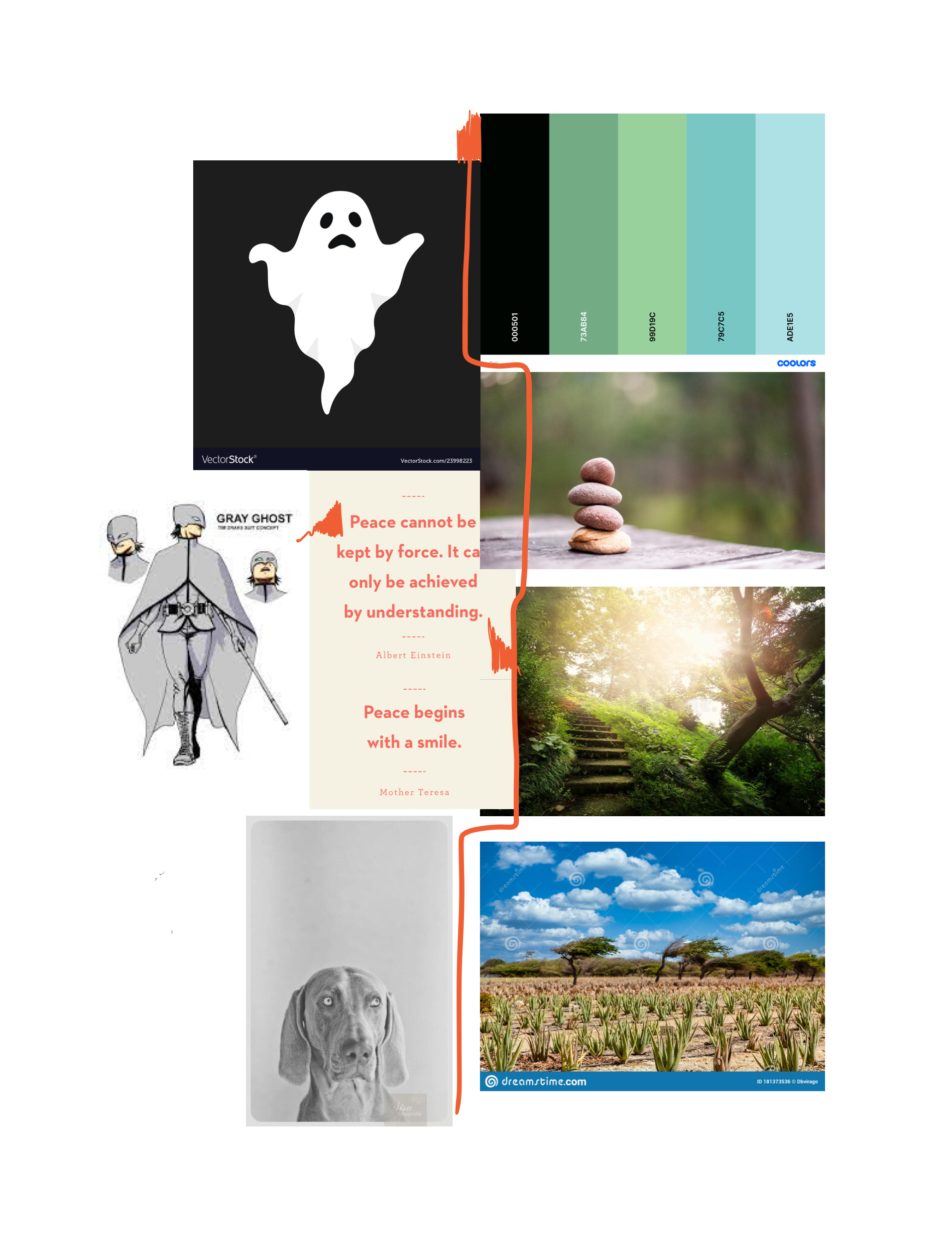
Lily: Grounded Focus
This moodboard uses the typical calm colors of green and blue that makes focus apps easily identifiable. Because Gotcha! seeks to fade into the background, I used more dark tones to and more blacks to simulate a dark “focus mode”. And finally, with a splash of richness during focus, I added deep purple tones to represent the inner strength that sustained focus requires. The images balance the clarity themes of stereotypical focus app vibes with a rich accent color to represent the strong inner commitment necessary for holistic change.
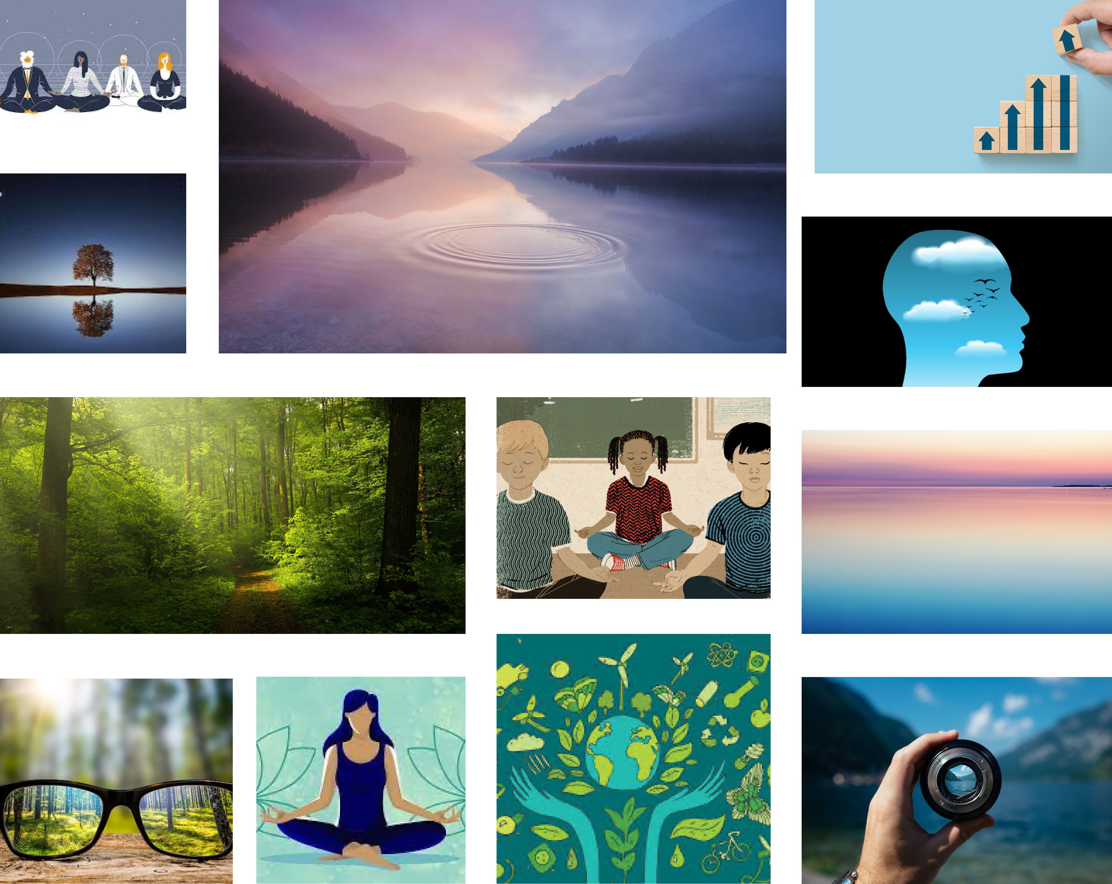
Taylore: Calm but Present
The theme for my mood board is calm but present.
I choose blues and greens because I think these are great calming colors that remind people of nature and make us feel happy and at ease. I also incorporated black and grey base colors because I think we could have a cute ghost mascot for our app Gotcha that appears whenever the app is taking a picture or gathering data. The ghost can also be a manifestation of the AI working to classify data so people understand there’s a computer program analyzing their data. I want the ghost to have the traditional halloweeen sheet ghost look, but it’s better if it’s a grey color and texture similar to the images below the cartoon ghost. Finally I wanted a coral, reddish orange color as a highlight color to accent. Red is a nice complement to the greys and blacks and establishes a unique element to the blue-green palette besides black that is playful. Additionally, reddish orange raises attention and awareness. We can use orange on places where attention is required or when the user needs to be present and pay attention.
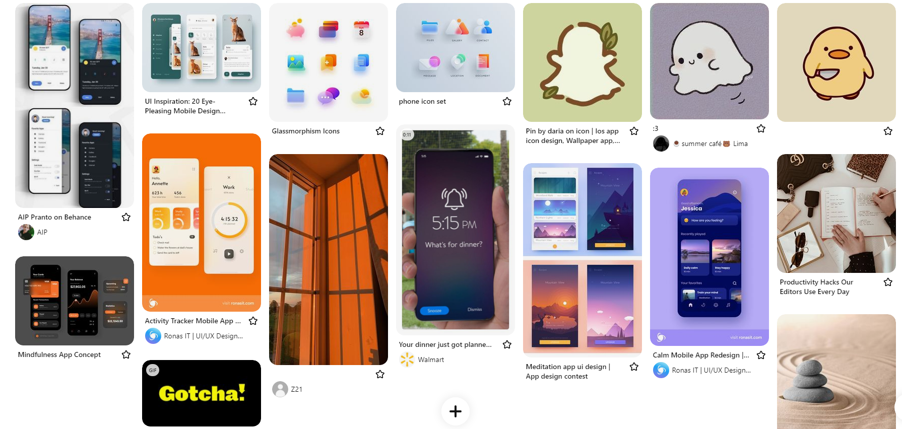
Shirley: Warm and Minimal
The theme of this moodboard is warm and minimal. I selected a color palette that was zen and was easily associated with mindfulness and meditation, hence the blues and the green. I also added in orange and yellow because of the cultural meaning behind this colors (energetic, focus, hard working) which were in line with the theme of our solution. I also added in sample icons and images that fit into the youthful and playful side of the app and this is seen by the different pictures showing cute figures that could be used as “mascots” in our UI. I also selected icons that used glassmorphism because of its clean and minimal look, and its ability to blur the items in the background. This can be useful for popups and widgets in our product, because the blurring effect helps to draw a users focus to a single element on the screen at a time. Lastly, I also chose designs with clean, rounded fonts (in the sans family) as well as big and rounded images and icons. These are easy to read have a soft/calming connotation, which is suited for our design.
Style Tiles Designs
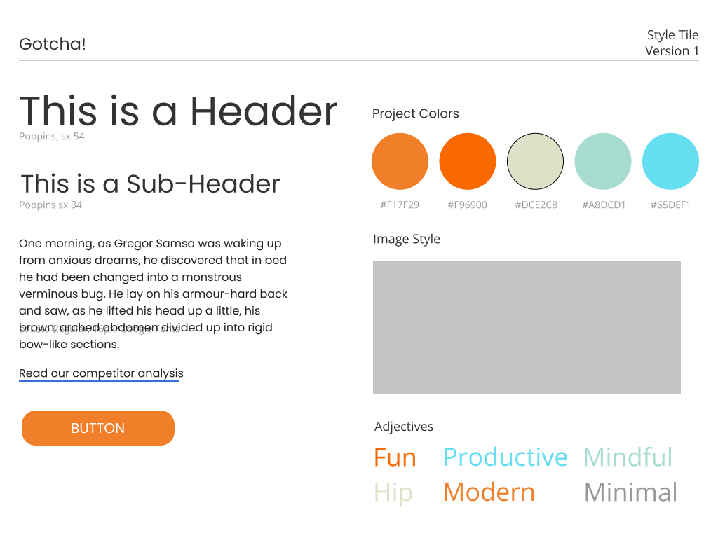
Sam
Shirley
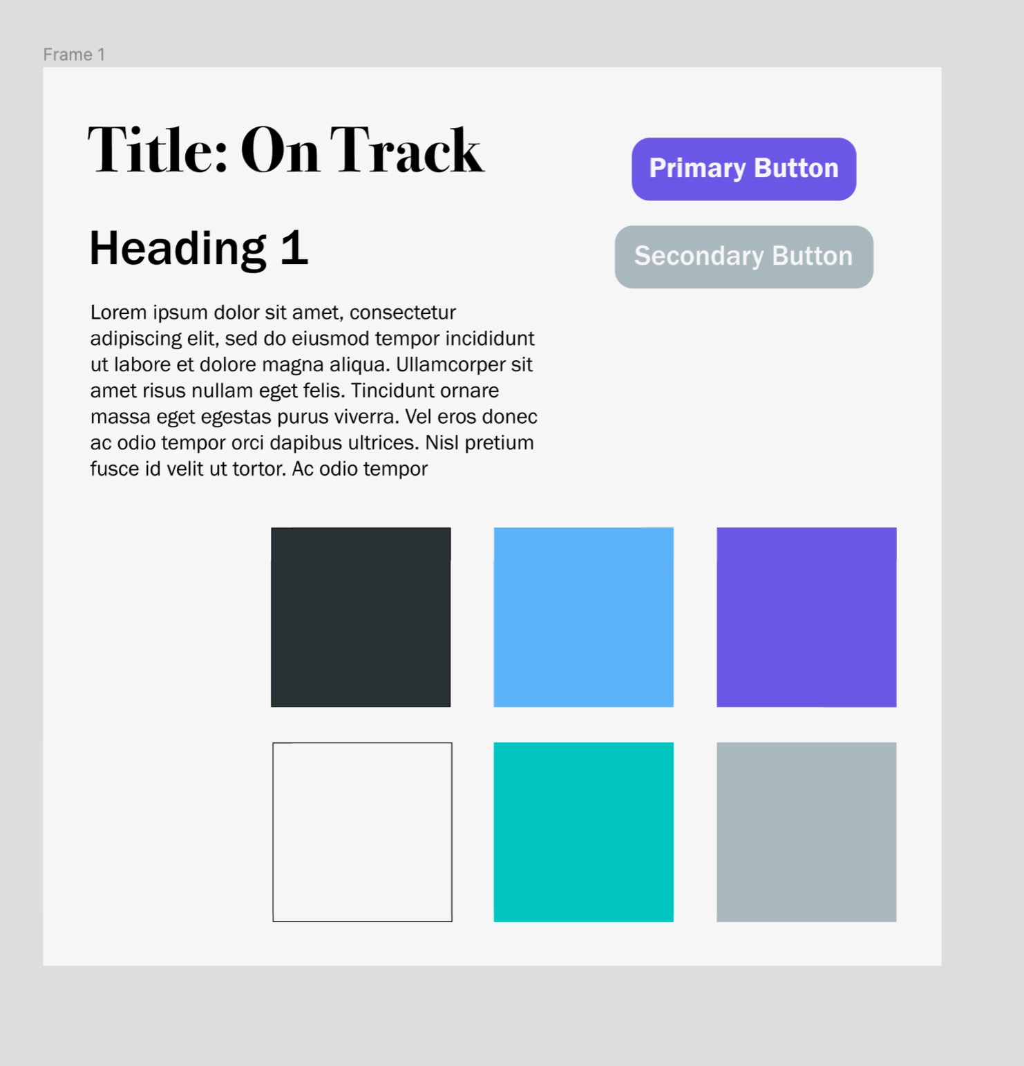
Final UI Kit
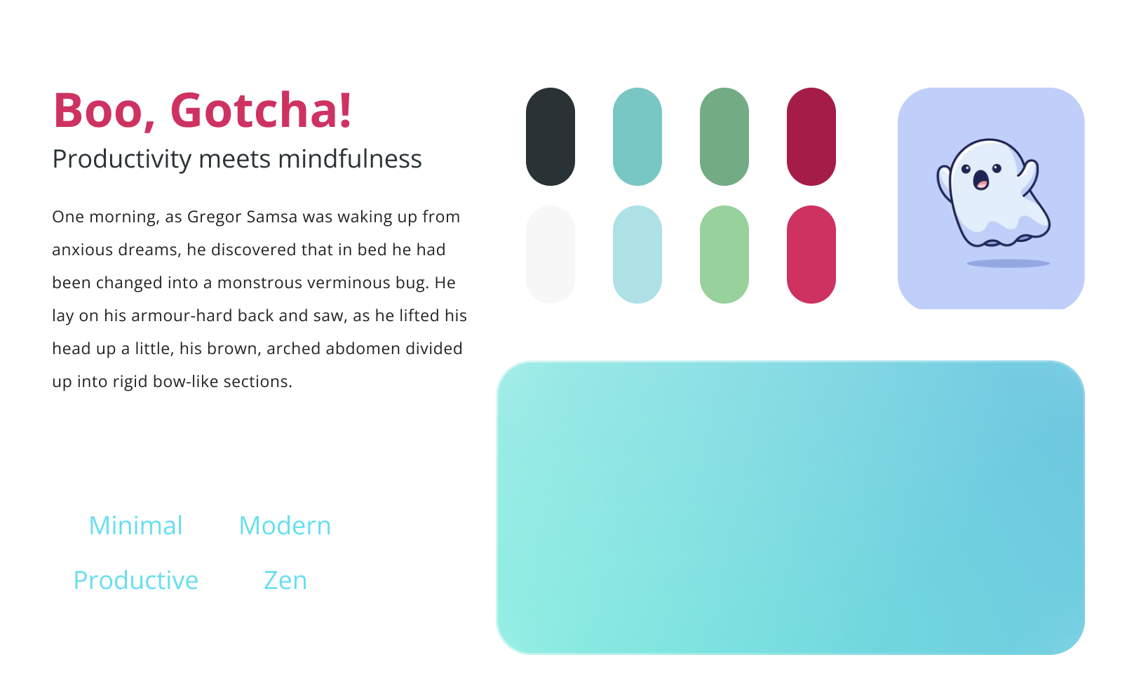
Our final UI design kit was settled upon after careful consideration of various design elements. To start with, we decided to unite our wellness-themed colors of green and blue to create a consistent and calming visual experience. Additionally, we chose a rich warm color of maroon-purple for our action nudges. This color pops against the rest of the colors, drawing attention to important buttons and functions.
For our font choice, we wanted a modern and clean look, which led us to select a sans serif font. This decision complements our design goals of minimalism and simplicity. To further enhance this clean look, we chose Glassmorphism to display our widgets and buttons. This choice helps create a consistent and polished appearance throughout the design.
To add a youthful touch to our design, we included cute icons and images. Moreover, we introduced our mascot “Boo the Ghost” to represent the AI algorithm that works in the background of our solution. This personifies the AI and makes it appear more trustworthy, relatable, and overall cute.
Finally, we opted for rounded edges for our UI elements. This decision was cohesive with our font choice and added a clean and polished look to the design. Altogether, these design choices helped us create a cohesive and visually appealing UI that enhances the user experience.


Comments
Comments are closed.