
Work Mode
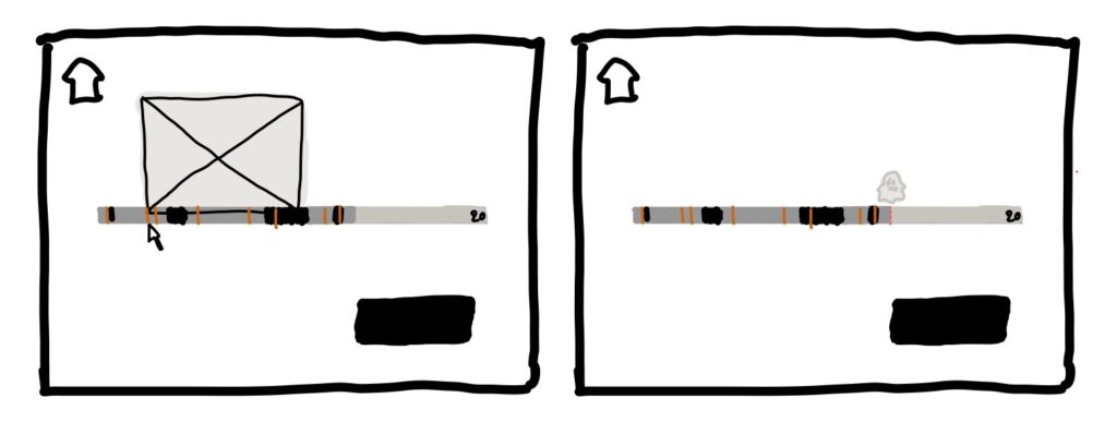
In the name of visual importance, we redesigned the work session page. This is the core feature of our app and it is meant to be undistracting. We simplified the design to easy to read information visualization (breaks or not break segments, with one mark type for a picture) that is updated in the background, with no clutter. A faint ghost icon indicates that a picture is being taken, and the user can mouse over data points at any time, but there are no other features to distract them.
The only buttons in this view are the break button, in action colors, to promote the taking of a facilitated break, or the de-emphasized exit button if necessary.
Data Visualization Feature
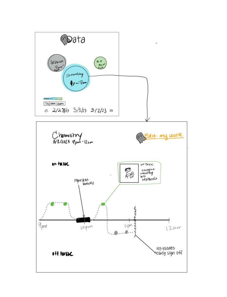
Previously, the data visualization was a rough sketch of the second screen below. However, our refined sketchy screen includes clearer visualizations and a ghost mascot to represent an AI character. The mascot is meant to help users understand that an AI is analyzing and classifying their data. Overall we also tried to maximize whitespace and maintain a hierarchy where the most important things are the largest and front and center. On the first screen, there is a bubble display showing different categorizations of data. Similar to Apple Photos, you can zoom in or out of the data by togging the day, week, month bar. When looking at the day view, you see different work sessions from that day. When looking at the week view, each bubble will represent a day during the week where data is collected. The month view will have bubbles where each bubble represents a different week. The color coding of bubbles represents how focused you were during that work session based on the data classification. Grey means you were mostly distracted, and green means “on-task”.
After clicking a bubble, on the second screen you can view your binary data points that are either green to represent being on-task or grey to represent off-task. You can click on the data point to see the photo and details on the AI classification of data. Also, on this page, there’s an edit button in the top right that allows users to reclassify data points individually or in batches and allows users to change data descriptions made by the AI.
Social Feature
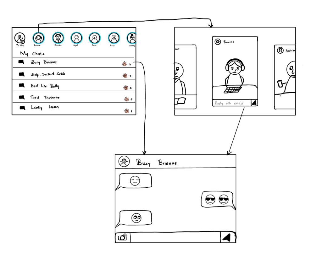
We condensed functionality into common design patterns in the social feature to make it easy to use, with friction only in the important parts. We incorporated this in two ways: emoji chat (users can’t carry on long conversations) and a timer. Since we learned that timers disrupt flow states and are annoying for users in our early experiment, we incorporated it here in reverse to leverage that effect. Finally, there’s a streak feature that incentivizes users to complete one work session per day in order to unlock this portion.
Home Screen
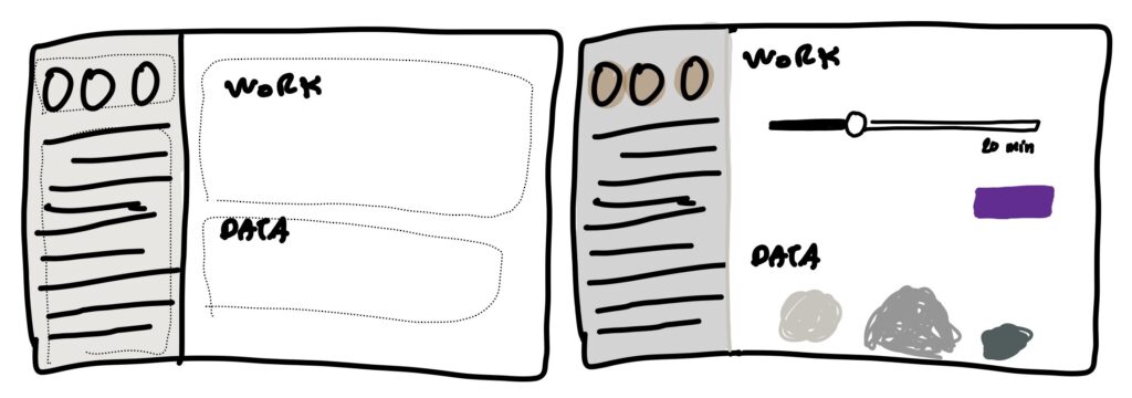
Again for visual hierarchy, we chose which portions were most important to our functionality. First work, then data, and a side feature of socials. We grayed out the sidebar and intend for it to be unlocked after one minimum-length session. The data section below is similarly grayed out, but accessible at any moment (only grayed out to be undistracting). Finally, the work session is at the forefront, with the only action color and a quick-start: set the time and get working.


Comments
Comments are closed.