
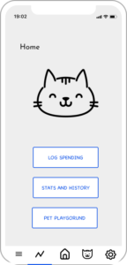
HOMEPAGE
The home page was intended to be clear and simple, drawing attention to the main functionalities of the app by using bold, obvious buttons that lead them to the 3 main branches of our happy system path. All other functionality is enabled through the tabs at the bottom of the page which are intended to point towards settings, pet health and other features that might not be accessed as frequently as the 3 main options mentioned above.
We created a visual hierarchy by putting “LOG SPENDING” on top of the other button which helps draw users’ attention to this button. The pet image takes about half of the screen, since it plays an important role in our App and we want the users to see their pet immediately when they first enter this page.
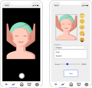
LOGGING
We wanted to make the number of clicks to log a spending as few as possible while still enabling the user to enter all available surrounding details. This includes reactions, pricing and more. Users just get to the photo page as soon as they hit the log spending button. Following this, they can annotate the way they would a journal entry for instance and save the entry, taking them back to the homepage.
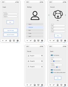
SETTINGS
On the settings page, we also used the idea of a grid system where each setting belongs to a single “box”. We explored adding a different amount of white space in each box and decided to go with relatively narrow boxes since they look cleaner. This philosophy also applies to each individual settings page (Account, Friends, etc). On the setting page for Goals, we use a bold color for the switches to give them higher visual priority and encourage users to toggle them.
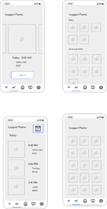
STATS AND HISTORY
On the History page, we applied the idea of proximity & grouping where we put the photo, spending description and amount of each entry on one line, with some space from other entries. The proximity helps users understand that these images and texts belong to one “group”. We did similar things for Logged Photos, where photos from each day are grouped together, following the date. We explored different layout and found this approach looks better then putting all previous photos together on one page (as shown in the bottom 2 screens).
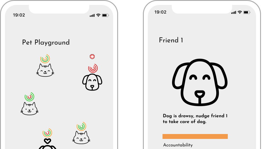
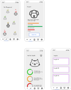
PET PLAYGROUND
We decided not to use a grid system on the pet playground page since we want to simulate a “playground” where pets spread over the entire screen. But we still apply the idea of proximity by putting each pet close to their “rings” that represent their well-being (i.e. how well their users did in terms of tracking their spendings). On the pet health details page, we put the ring/bar together with the text description of them so that users immediately know what they represent.
As we develop this interface we aim to make it simpler to navigate and interface with, sticking to our priorities in terms of simplicity, accountability and usability
Comments
Comments are closed.