
Step 1 – Individual Moodboards
Moodboard 1 (Ahsan and Jason)

We see nature as the opposite of technology or any man made industrial innovations. Nature helps us to be mindful, clear our thoughts. Nature doesn’t quench our thirst for digital devices, however, it prevents the thirst to be there in the first place. Therefore, when we envisioned a tool for keeping users away from the phone, we compared it with nature, greenery, blue sky or ocean. We also envision the tool as something that provides the users with freedom from the digital prison. Thus we associate it with the free spirit as well. Therefore, our moodboard has a lot of content related to nature and free spirit.
Moodboard 2 (Jessica and Jasmine)

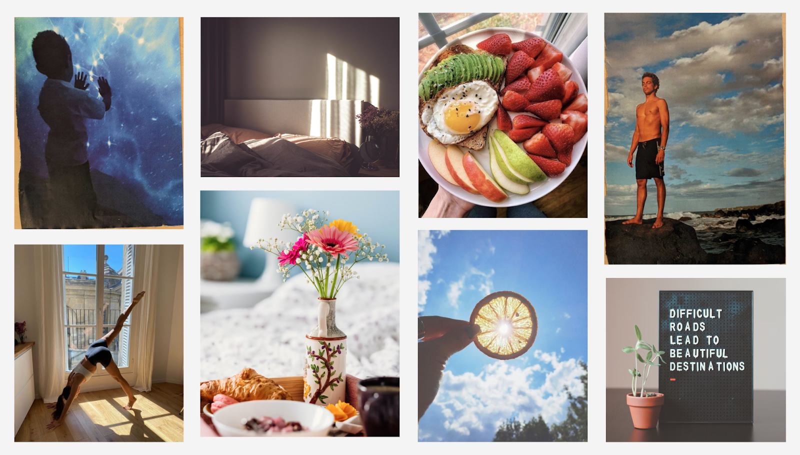
Every morning is a fresh start. When we imagine a morning routine, we think of things that help us start the day off right – items, actions, and thoughts that refresh our minds and bodies and get us motivated to have a great rest of our day. These include built in habits such as exercise, yoga, meditation, and a healthy breakfast. They also include being outdoors and seeing sunshine and nature. We envision soft but bright colors including baby blues, yellows, greens, and reds/oranges that bring about a calm but energizing aura. We see mornings as a chance for someone to start over if they’ve been struggling, or as a constant to help users who have been maintaining a healthy routine.
Step 2 – Narrow Down
We combined the two moodboards by carefully considering what colors, settings, and activities we hope the final moodboard to convey. To help us make decisions about the final moodboard, we revisited the brand personality and adjectives that we had planned out in class on Wednesday.
Firstly, because our app is meant to be used primarily in the morning, and more precisely in the early morning when the user has just woken up, we felt that the images that show a sunny day out should definitely be on the final moodboard.
Secondly, because our app’s purpose is to help keep the user focused as they go about their morning routine, we wanted to include images that signaled a focused state. Therefore, we included images that depict a person mindfully engaged in an activity, such as yoga and meditation (and even the little boy who seems to be fascinated by what’s in front of him).
Thirdly, because nutrition is especially important for the morning, we kept the images that show a delicious breakfast. These images add warmth as well as energy to the moodboard because of the vibrant colors (red, green, and yellow) in them.
Lastly, we wanted our app to be a friendly and encouraging companion to the user, so we kept the image with a motivational quote “Difficult roads lead to beautiful destinations.”
Step 3 – Style Tile

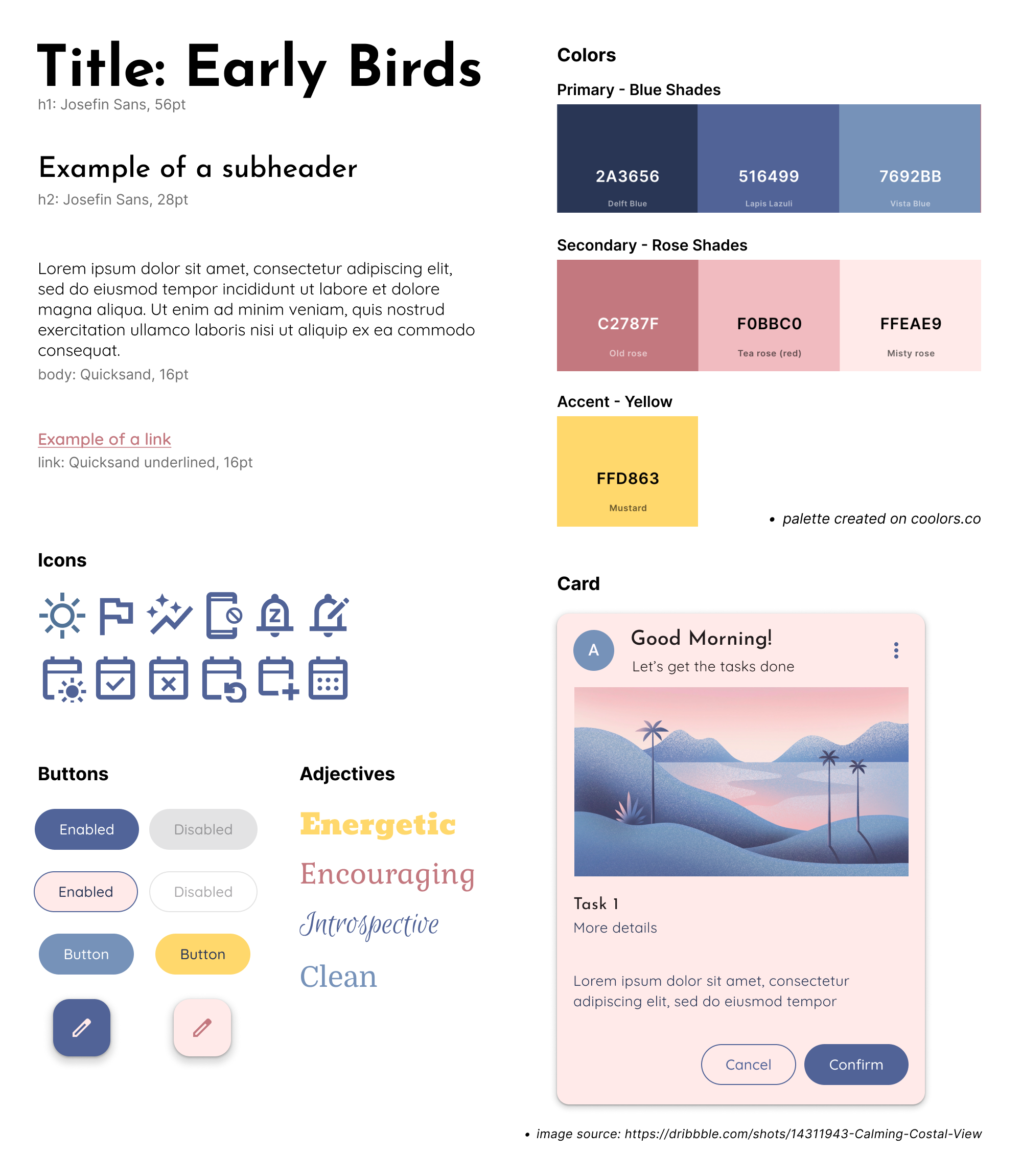
Color Palette
We took the longest time trying to finalize our primary and secondary colors because our moodboard offers a lot of different color palette options. Two colors came immediately to mind for primary and secondary color options – blue and yellow – as our app is morning-themed. We immediately agreed to use blue as our primary color. However, yellow is too bright a color to be used as even a secondary color, so we considered other options such as green and red that are present on our moodboard.
When exploring secondary color options, we kept in mind that we wanted our app personality to be both energetic and calming, because our app is meant to be used in the morning and promotes mindfulness (with regards to the completion of morning routine goals). In addition, we wanted our app to be warm and encouraging as we plan to send the user motivational messages to keep them on a streak with their morning routine. Therefore, we finally decided to use a rosy pink as our secondary color, as it adds warmth to the blue. We also decided to make yellow our accent color to make certain elements of the app stand out, and add some energy to the overall feel of the color scheme.
Font
It is common practice to choose two different fonts that serve different purposes but work well together, so we chose a font that we thought was suitable for headers/titles and another font for body text. We chose “Josefin Sans” as the header font because it looks quite unique and somewhat playful but still looks professional (especially how the “e” is slightly tilted). We chose “Quicksand” for body text because it’s easy to read and modern.
Icons
We used Google’s Materials Symbols and Icons tool to select relevant icons to our app. Primarily, we picked the icons that would be useful for our four main features – morning routine tasks/goals, app blocker, notification blocker, and streaks.


Comments
Comments are closed.