Proximity
Proximity shows that the closer objects are to one another, the more we perceive them as related. For example, on Amazon’s home page in the screenshot below, the user can see from a glance that there are two groupings of items (those in the top row and those in the bottom row) just based on how closely the images are displayed side by side, as well as a gap to separate the two rows.

Alignment
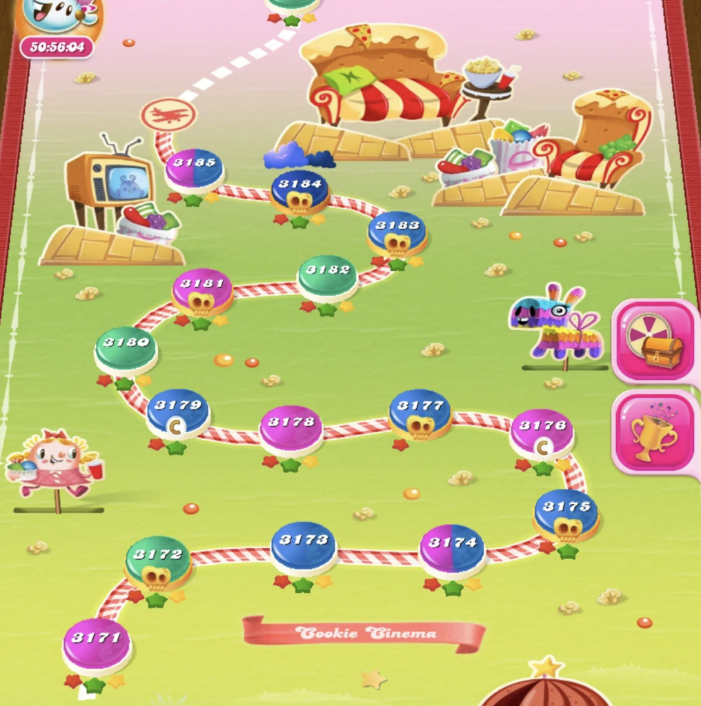
Also known as “continuity”, this principle states thats elements that are connected by some uniform visual property (like a line or curve) are more likely to be perceived as related. What’s especially interesting is that the shape of elements connecting has a much stronger impression than if the elements were grouped by color instead. For example, opening the Candy Crush app will display a map of levels to the user. Even though the levels themselves are of different colors, they are perceived to be related to one another due to them all being on the same line.
Contrast
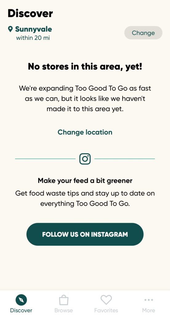
Also known as the “focal point principle,” this principle states that anything that visually stands out will catch the viewer’s attention first. For example, in the app Too Good To Go, if you’re in a location that doesn’t produce a lot of results in your feed, they have a dark green button contrasting against their pale background. This really draws the eye of the user and essentially urges them to follow the company’s Instagram page in order to keep up to date.
Similarity
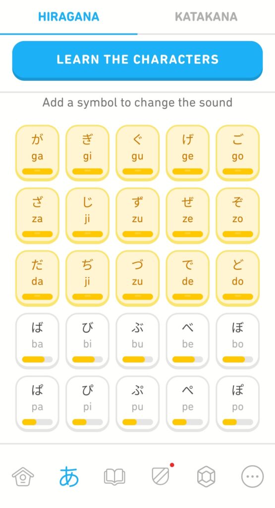
The similarity principle states that elements that appear to look the same as one another are perceived to be grouped together and have a similar purpose. For example, if you were to learn the Hiragana characters in Japanese, Duolingo displays all of them using the same rectangular shape, same sizing, and same curved corners. Even in this screenshot, the user can see that all of the yellow-colored boxes are similar and thus mentally grouped together, whereas the white-colored boxes serve a different purpose.
Good Font Pairing
A good font pairing not only helps give designs more contrast and hierarchy, but they are also chosen to give a sense of harmony and distinction. However, one needs to be careful not to choose typefaces that compete too much with one another, as that will be more counterproductive and sometimes even indistinguishable (e.g. Arial and Roboto). A common pattern of font pairings would be to use a serif and sans serif font, such as with the Washington Post below. Each article has a header that uses a serif font, while the body text uses a sans serif font. Even the text “The Washington Post” at the top is very distinct from the rest of the page.

Good Color Palette
There’s a lot of color palettes out there, and many companies would reference color theory and the color wheel to help with choosing a good one. There are many different variations that colors can be paired up within a color palette, such as primaries, secondaries, complements, analogous, etc., and each type of palette communicates a very different message to the audience. For example, Brilliant Earth uses a color palette that is primarily this muted, earthy green color, and this color is paired with a very warm pink-beige color. Brilliant Earth’s mission focuses around sustainability in its jewelry, and so the shade of green they have chosen illustrates this. However, its lighter pairing gives a sense of elegance that is commonly attributed with engagement rings. While very subtle, this can be argued to be a complementary palette (at its core, it’s a variation of the red-green complement).

Grid
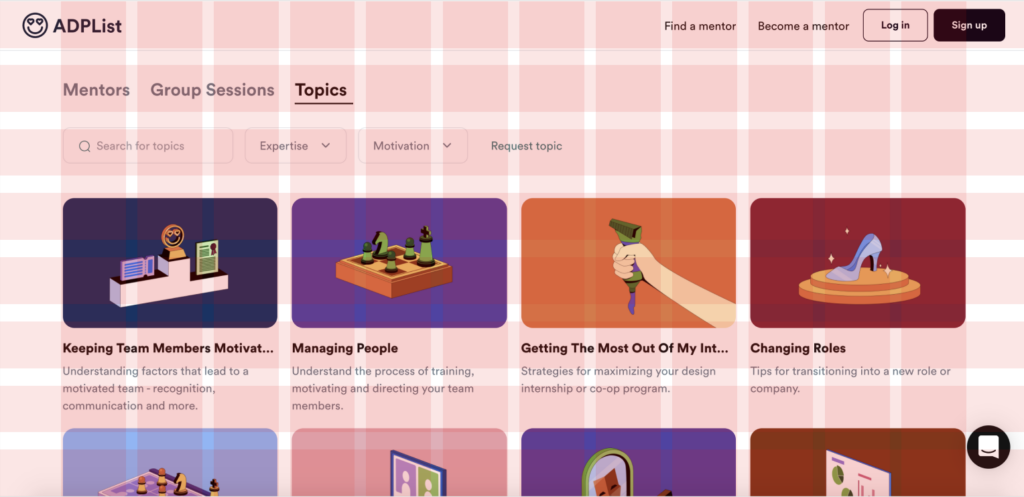
For the grid, I used the “Topics” page of a site called ADPList, a mentorship site for designers. It’s not the most perfectly aligned grid (especially with the rows), but you can see how the page is laid out by the columns and rows shown.

Lock icon
I wasn’t sure what this meant in the assignment specs (was it added by mistake? Or was it meant to be a password lock icon?) Assuming it’s meant to represent passwords, here’s an example of a screen with the login and password entry field. I always liked how polished Microsoft’s lock screen looked.
