
Overview
Our project is aimed at helping college students and young professionals incorporate more breaks into their work sessions in order to ameliorate or prevent bodily pain/discomfort. This includes attempting to reduce/break up sedentary behavior, but also involves other concepts like eye care and headache prevention. We aim to do this with a browser extension.
After generating wireflows and bubble maps for our browser extension, we are now thinking about our solution’s personality, identity, and aesthetics. In order to bring these ideas to life, we created mood boards and style tiles.
Individual Mood Boards & Style Tiles
Catherine
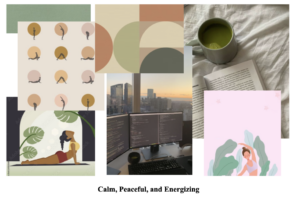
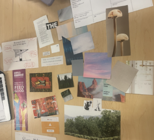
For my mood board, I wanted to have a clean, peaceful, and inspirational theme. I also aimed to strike a balance between fun/light-hearted and more serious reflection/motivation. I want users to enjoy and have fun with our browser extension, but I also want it to be taken seriously as a tool by users. Although stretching is not the only movement that our product aims to promote, I included some simple, minimalistic stretching images to create a relaxing atmosphere to counterbalance the hectic work days and class days that our users experience. As for colors, I went for a natural, growth-minded vibe because I want users to feel encouraged to make changes for their health while also feeling safe and secure when using our product. In addition, we’ve talked a lot as a group about making a product that blends and integrates seamlessly into our users’ routines, so I chose to include green as a primary color to signify a sense of our product being a natural part of users’ lives.
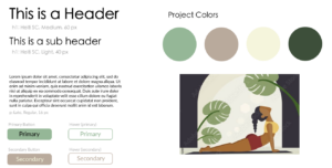
For my style tile, I pulled colors from my mood board and added a key image from my mood board. In addition, for the fonts, I wanted to use a fun, rounded font for the header and sub-header, but a more basic and clean font for the paragraph text.
Karina
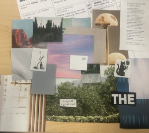
For my mood board, I gathered inspiration from natural environments like forests, skies, and sunsets. By incorporating a mindful and calming color palette, I aimed to emphasize the rejuvenating and peaceful qualities of our environment, with a particular focus on neutral and greenish hues. I also incorporated minimalist design elements like thin lettering and san-serif fonts to create a clean and uncluttered look.
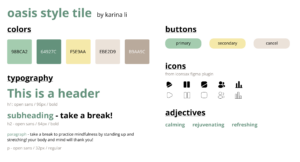
I named our browser extension Oasis to capture the rejuvenating and peaceful essence of an oasis, mirroring the breaks that we encourage users to take after long and challenging work sessions. To convey this, I opted for a gentle green and yellow color scheme that evokes the natural and serene qualities of an oasis. For the font, I selected the clean and versatile san-serif typeface, Source Sans Pro, for its readability across all devices.
Kwoba
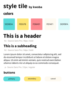
I used vivid colors in my mood board and style tiles because I believe that the high contrast they create would be helpful in helping to isolate certain aspects of our design such as the different buttons, and in doing so help capture the users attention. I added blue specifically because I wanted to communicate an element of tranquility, as taking breaks from work is meant to be peaceful and tranquil. I also picked certain images for the mood board because I believe that the positive messaging would be helpful in getting the users to relax during their break sessions.
Romuald
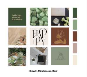
To invoke the feelings of growth and wellness, I felt that the color green would be the optimal color choice as it is a shade most associated with nature and development. The term “growth” captures the essence of our product quite well, as it is representative of one of our group’s goals of encouraging users to be less sedentary, and more active for the furtherance of their health. In addition, I decided to pair the color green with more warmer colors such as brown to introduce the notion of “care”, as we hope for users to be more attentive to their bodily needs and take more care of their well-being. Moreover, tan colors were used to capture the idea of mindfulness which is congruent with our group’s goal of encouraging users to be more mindful of their daily activities.
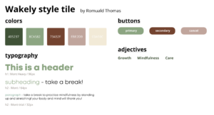
In terms of my style tile, I chose the name Wakely to present the idea that our application alongside its reminder system, can be used as some sort of “wakeup call” for our users, prompting them to be more attentive with their bodily needs, and be more proactive about their health. The color scheme for the buttons were meant to remain consistent with the initial colors of green, brown, and tan to further instill the thoughts of growth, mindfulness, and care all throughout the application. In regard to the selected typography, I chose Mont as the type of font, making text more readable and easily discernible among other components on the application.
Synthesized Mood Board
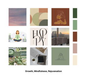
Combining each team member’s ideas, we created a synthesized mood board. We wanted to prioritize the green aesthetic that was common across all of our mood boards. Because green is associated with peace and health, which was also reflected in our individual mood boards, we made sure to include green imagery in our synthesized mood board. We also thought it was important to show elements of mental and physical health, as well as include workplace imagery combined with some elements of nature to evoke a sense of growth.
Synthesized Style Tile
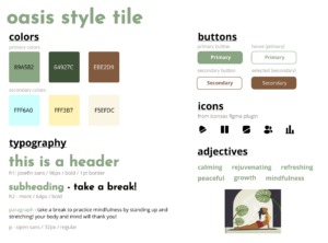
To synthesize our final style tile, we each presented our individual style tiles and discussed our thought process behind them. Across all of the individual style tiles, we noticed the use of earth tones—even Kwoba’s style tile, which stands out from the rest, had some yellow and beige. Green also emerged as the primary color to evoke a sense of growth, safety, peace, and rejuvenation. Pulling from colors from each individual style tile, we ended up with a palette of green and brown earth tones, as well as a light blue to create a sense of tranquility. In addition, we recognize that only using earth tones may end up making the product look too “muted,” so the blue provides a nice pop of color.
As for our buttons, we mostly pulled from Catherine’s individual buttons, adjusting the colors to match our final palette. Our buttons are not completely rounded or circular in order to maintain some sense of structure. We wanted to keep the hover effects to ensure a responsive UI.
We also incorporated the icons that Karina found, as well as the header and sub-header font that Romuald utilized in his style tile (Mont) because it is bubbly and feels youthful, but is still easy to read. For the paragraph text, we chose Open Sans because it is a clean sans that looks similar to Mont, but a bit more toned down and more professional looking for some balance.


Comments
Comments are closed.