
Introduction


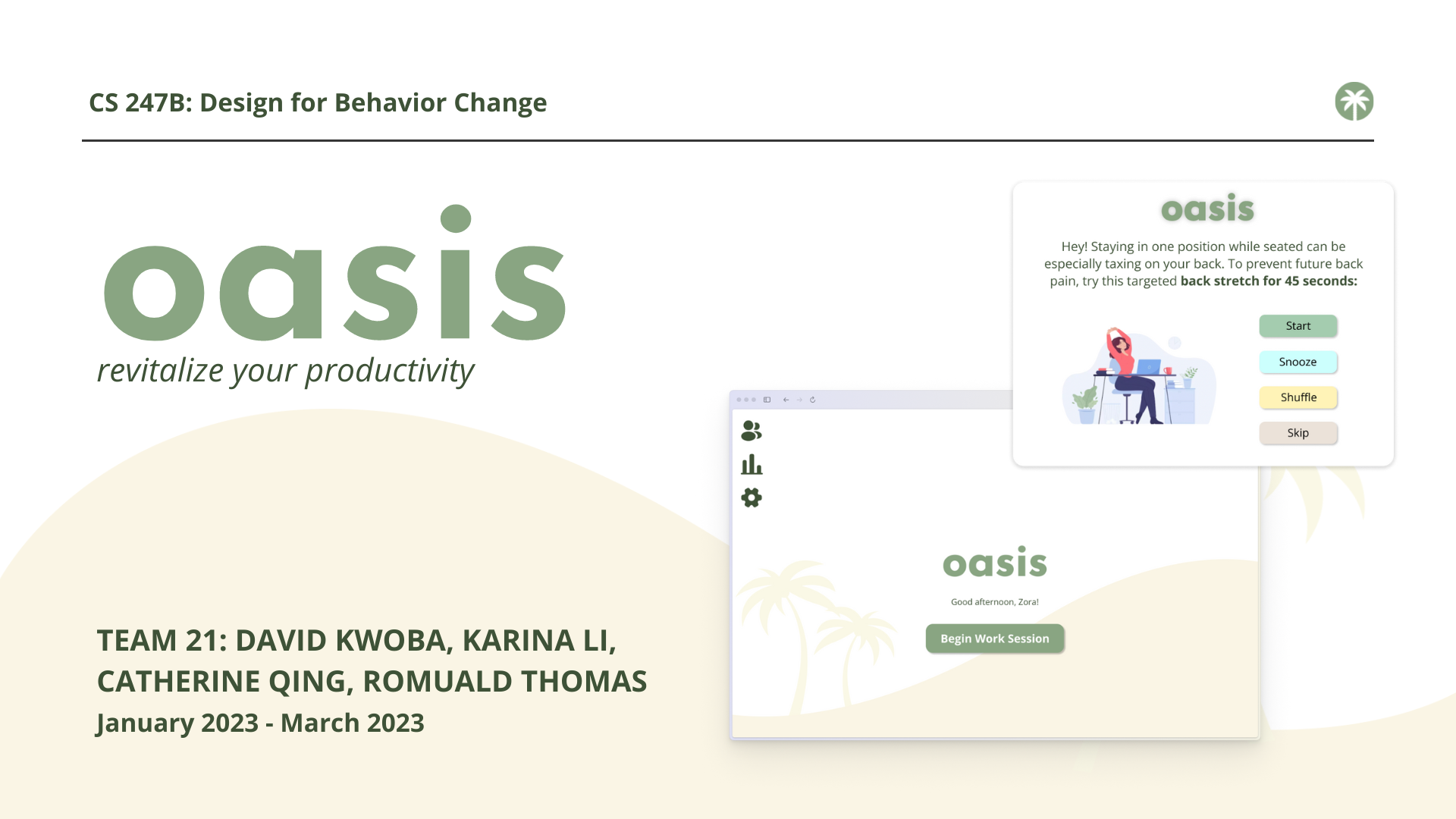
This quarter, our team’s goal was to innovate and design a solution that encourages college students and young professionals to take more breaks throughout their work sessions. In pursuit of this, we created Oasis, a browser extension that is seamlessly integrated within users’ workflow. In order to foster a healthier vision of productivity, Oasis suggests bite-size actions that target various aspects of well-being and are suitable for work and class environments.
Problem Finding
As a team of college students, we noticed that we all struggled with spending hours at a time doing homework and studying at our computers, as well as related issues like poor posture. When reflecting on our daily routines, our personal experiences motivated us to explore how to encourage people to take more breaks from doing work. This led us to the following problem domain: college students and young professionals need a way to ameliorate or prevent bodily pain associated with doing work for prolonged periods of time without taking breaks. Ultimately, we are interested in how to successfully encourage these users to take more breaks during their work sessions.
Enriching Our Knowledge: Literature Review & Comparative Research
We began by delving into academic research on different methods of reducing sedentary behavior in the workplace. Our literature review revealed that sedentary behavior is becoming a significant public health issue, especially as the number of people working office jobs increases, making our design challenge important to tackle. Research has also found that taking breaks increases productivity and mental health and well-being. The literature review also showed substantial evidence demonstrating the success of prompting software and persuasive mobile apps as a way to combat this behavior. One insight influencing our product development is the effectiveness of an intervention combining education with a break prompting software on reducing long sitting periods at work. Another insight is the concept of incorporating non-purposeful movement breaks at work. In line with these insights, we aimed for our intervention to prompt participants to take more breaks and engage in both purposeful and non-purposeful action, while also educating them about the importance of reducing sedentary behavior with the use of facts and statistics.
In order to gain insight on our opportunity space, our team also investigated existing products and apps. Our comparative analysis revealed that current solutions in the market tend to be disruptive of users’ workflow, and many are solely focused on actions like stretching. Further, a prevalent weakness we observed is the oversimplification of the break-taking process, raising the question of how to effectively capture users’ attention and maintain user engagement. Thus, there remains a need for a product that both leverages a more holistic view of wellness (i.e., incorporates solutions targeting multiple aspects of wellness) and more seamlessly integrates into users’ existing workflows.
Baseline Study & Synthesis
To better understand people’s existing break-taking behaviors and what does/does not motivate them to take breaks, we recruited 5 college students and young professionals and had them log their behavior during and after their work sessions. These participants fall within our target audience, as both populations’ routines involve prolonged computer usage for their work/studies. You can find more details about the study design here.
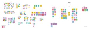
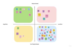
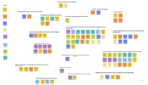
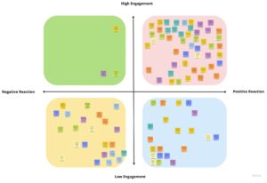
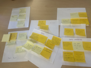
After 5 days of data collection, we synthesized our findings, we used affinity mapping and a 2×2 matrix, shown below. You can view both of the images below in Miro more clearly here.
These methods revealed some key insights:
- Although people express a desire to take more breaks during work sessions, physical breaks are laborious and rarely taken relative to phone breaks.
- People prioritize their work sessions, such that they do not like disruptions to their work flow.
- People are generally not responsive to reminder notifications, especially when the action item is large, but positivity/encouragement in the notification can help.
These insights also indicated that people are not very responsive to doing large action items, informing our decision to focus on low effort, physical breaks for our intervention such that we encourage users to do simple but effective physical actions. In addition, our baseline study allowed us to see that the harms of working without breaks are not limited to physical health, but they also impact people’s mental health. Prior to these insights, we were largely focused on reducing sedentary behavior. However, we then refined our problem statement and goal to also include mitigating or preventing mental health issues, such as burnout. In addition, by focusing on low effort, physical breaks, we don’t necessarily mean physical as in doing a stretch (it could also be something like looking away from the computer)—we just want to focus on encouraging breaks outside of phone or social media usage.
Personas & Journey Maps
Utilizing insights from our baseline study, we created two personas—Student Zora and New Grad Frank. We focused on these personas because they highlight the behaviors and traits observed in our baseline study participants.
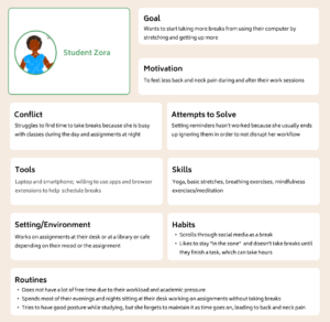
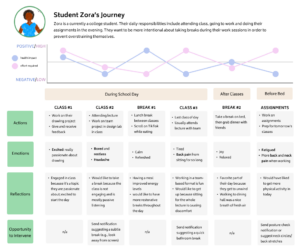
From Student Zora’s journey map, we learned that their main goal is to reduce their pain by taking more breaks from using their computer, but Zora struggles with a busy schedule and does not like disruptions to their workflow.
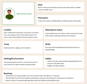
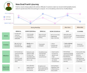
From New Grad Frank’s journey map, we learned that his main goal is to take care of his body to prevent pain. However, he has difficulty finding opportunities to take breaks at work without embarrassing himself.
Solution Finding
Intervention Study
Using these personas and journey maps, we did time mapping and created a connection circle to identify intervention opportunities that informed our 3 intervention study ideas. Backed by secondary research, we decided to implement the fear/hope approach. Our rationale for choosing this is rooted in psychological research finding that fear appeals are effective when moderate amounts of fear are present, and when they are paired with recommended actions for the audience (Tannenbaum et al., 2015). To see the details about our intervention ideation, see this blog post.
We designed our intervention with the goal of answering the following research questions:
- To what extent can fear appeals be used to motivate users to take action towards taking breaks from their work?
- What are users’ preferences in terms of frequency of notifications and timing of notifications?
We hypothesized that users fear appeals would spark action amongst users and that users would prefer spaced out notifications.
To test these hypotheses, we recruited 8 participants representing a mix of participants from the baseline study and new ones, as well as a mix of college students and workers. We enacted a notification-based system, where we sent participants 3 text messages throughout the day for 5 days. These messages began with a statement about a negative effect of a behavior related to not taking enough breaks, followed by enthusiastic suggested action items to counteract or prevent that effect. Participants were asked to log how the notification made them feel, what actions they took after receiving the notification, why they did/did not listen to the reminder, and how doing/not doing the action made them feel.
After data collection, we synthesized our findings utilizing affinity mapping and a 2×2 matrix categorizing users’ actions based on their level of engagement with our notification and whether their reaction was positive or negative. You can view the images below in more detail on Miro.
We found these key insights:
- Participants saw and felt benefits and positive impacts of following the suggested actions in the reminders (e.g., feeling more energetic, awake, relaxed).
- Reminders made participants more aware of their habits and health, and participants mostly felt positively about the reminders.
- Some participants felt motivated to do the recommendations because the reminders came from a friend (us).
We also saw some tensions and contradictions, such as users sometimes being in situations where they cannot engage with reminders (e.g., in a meeting). Participants also reported that the fear factor was too strong in some messages.
Because the fear/hope messages were successful in increasing break-taking behavior, we decided to continue with this concept at the core of our product design. The insights also highlighted the potential of social accountability to increase break-taking behavior during work sessions, so we also considered incorporating a social element in our product allowing friends to remind each other to take breaks. We also planned to address the tensions and contradictions identified. For example, we revisited and edited our messages to ensure that there was no triggering content.
Building a Solution
Design Architecture
Following our intervention study and synthesis, we took those insights and started ideating different solutions and features.
Story Mapping
We began with story mapping, drawing out a storyboard (shown below) for a user trying to take more breaks at work.
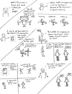
From this storyboard, we learned that despite internal desires to make changes to one’s behavior/routine, sometimes there needs to be an extra push, especially one that instills a sense of urgency or more of a call to action for users. User-initiated efforts to change their own behavior are not the most effective, so our product could serve as a source of reminders for users to take breaks from work by providing various small actions as stepping blocks towards taking better care of their health.
Ideation
From here, we identified some primary features we wanted to include in our final product to help users like the one in our storyboard to increase their break-taking behavior:
- Incorporating a social aspect to our solution (e.g., friends can send each other reminders or nudge each other)
- Allowing users to input their schedule or set intervals at which they would like to receive notifications (e.g., every hour)
- Providing a way for users to track their progress and set goals
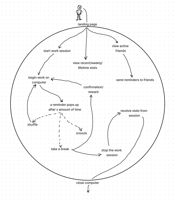
System Path
We also decided to create a system path that works for both of our personas, as they both have the same “starting point” of opening the landing page. While creating this system path, we prioritized giving options to the user after a break notification pops up (snooze, shuffle, take a break).
 Bubble Map
We also displayed the different features of our product on a bubble map. In our bubble map, we wanted to emphasize how each of the features interacted with each other, specifically how the landing page and extension icon popup page led to all of the other menus.
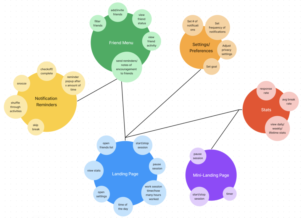
We were then able to determine the optimal arrangement for various notification pop-ups, extension icon pop-ups, friend and statistics features in our browser extension. This also helped us determine which features we wanted to prioritize most for our wireflows and design. Our aim was to avoid overwhelming the user with an excessive number of distractions while ensuring that the user experience remains unimpaired.
You can read more about our process here.
Assumption Testing
As our team engaged in solution ideation and brainstormed features to include in our solution, we discussed and mapped what is feasible, desirable, and viable.
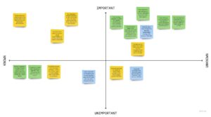
From the important and unknown quadrant, our team decided it was imperative to conduct the following assumption tests:
1. The impact of a wide variety of suggested break actions versus consistent ones on user engagement
To test this, we recruited 3 new participants and sent each 5 break reminders over the course of 1 day—2 of them received notifications with a variety of action items, while 1 of them received reminders with the same type of actions. We examined the number of reminders they followed through with, why they skipped the ones that they did, and their emotions/reactions to the notifications.
This test revealed that participants who received a variety of message content had higher engagement and willingness to participate in the break reminders. This fueled our decision to implement a wide variety of recommended actions, ranging from physical stretches to water breaks, eye breaks, mental breaks, etc., in our solution. If we were to do this test again, we would recruit the same number of participants in each condition.
2. Whether people want to use our product with their friends (e.g., send/receive break reminders from friends)
To test this, we recruited 3 participants from the intervention study. Each participant also recruited a friend to participate. A group chat including the experimenter and each pair of participants was created, where the experimenter sent 3 break reminders a day and participants were encouraged to send reminders to and share their progress with each other over the course of 2 days. We looked at whether participants were more likely to take breaks when prompted by their friends, their experience with doing this activity with a friend, and their reactions to the notifications they received.
We found that having a social aspect of our product where people can send their friends break reminders can be enjoyable and motivating for some users, but others prefer to use the product on their own. We also noticed that participants sometimes struggled to come up with reminder messages. To accommodate these different preferences, we decided to make adding and engaging with friends an optional part of our solution. We also decided to add a feature that provides a few pre-generated reminder messages that users can choose from to send to their friends so that they do not have to come up with their own message every time.
Due to limited time constraints, we were unable to test these assumptions over an extended period of time. This puts into question the longevity of our results and whether users would remain engaged with the application in the long-term, as behavioral change tends to be a gradual process. In that regard, given the constraints of our team’s study, we continued to operate under the assumption that the results collected from testing would remain consistent throughout all periods of time. Thus, if we were to perform these tests again, we would measure the effects across at least 2 weeks. In addition, another assumption that remains is that users will not become desensitized to the “fear” aspect of the reminder messages. Given the scope of the project, our team was unable to test this idea, so we continued to operate under the assumption that users’ reception and engagement would remain stable over time.
You can read more about our solution finding and assumption mapping process here. A more in-depth synthesis of assumption test results can also be found at this link.
Wireflows and Sketchy Screens
With the architecture of our solution in mind, we created wireflows, focusing on how each feature was embedded into the typical workflow of someone using an Internet browser. In doing so, we aimed for a happy path that allows users to engage in our break reminders without much disruption to their workflow, as we want users to have flexibility while using our product.
We also created a set of sketchy screens for different parts of the browser extension flow in order to balance tradeoffs between different UI layouts and configurations.
Branding
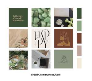
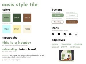
Our next step was branding our solution. We created moodboards and style tiles, which embodied our solution’s personality and aesthetic, eventually deciding on a palette of green, brown, and beige/cream earth tones to represent growth and relaxation, as well as a light blue to create a sense of tranquility. Ultimately, we named our browser extension Oasis to capture the rejuvenating and peaceful essence of an oasis (an area with water and greenery in the middle of a desert), mirroring the breaks that we encourage users to take during long and challenging work sessions. Read more about our decision-making and synthesis process here!
Usability Testing
For usability testing, we had users complete the following tasks:
- Complete the onboarding process
- Explore break suggestion options
- View your break statistics
- Send a friend a reminder
Based on our findings and user feedback, the 3 biggest issues we identified were as follows:
- Confusion About Statistics Screens: We received feedback indicating confusion about what the graphs represent, as well as what their main takeaways were supposed to be. To address this, we added more axis labels and titles so users are able to better understand the page. We also added a brief overview to provide more information and guidance. We additionally made design changes to make the pages more intuitive, such as rearranging the statistics in the top row and adding a calendar date-picker for users.
- Limited Reminder Preference Options: Accessibility issues were raised about the types of breaks listed in our preferences. Users also generally wanted to see more options. Thus, we added more options for types of physical stretches and mental stretches to provide users with more options. To reflect this, we added more break reminders to be accessed through the “Shuffle” button to demonstrate the diversity of reminders.
- Lack of Transition/Confirmation Screens: Participants noted abrupt jumps between screens that were jarring. Specifically, this was seen in the onboarding process and after users clicked “I’m Done” on a break action. To tackle the lack of indication that onboarding was completed before directing users to the main landing page, we created an additional confirmation screen notifying the user that they have completed onboarding. This allows for a smoother transition between the screens. We added a similar confirmatory screen to transition users from the break pop-up back to their work session.
These tests provided insight on screens that were not intuitive for users, as well as potential accessibility issues. Overall, it was clear that there was a need for clearer instruction and more guidance to make navigation more efficient. To read about other issues and bugs we discovered through usability testing, view our usability report.
If we were to move forward, we would also consider providing users the option to create their own profile rather than syncing their Google account. We would have also liked to conduct A/B testing to compare different designs, such as colors, page layouts, scrolling vs no scrolling, etc.
Prototype
Our clickable prototype can be found here—feel free to explore! Our prototype features 3 flows: onboarding, main, and extension popup.
Onboarding
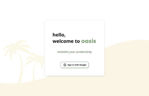
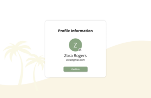
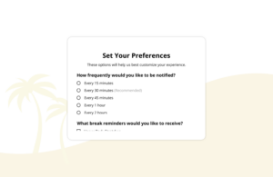
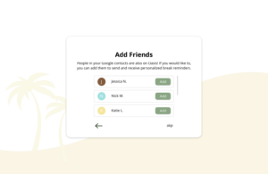
Because onboarding is a process that is mostly pertinent at the beginning, we created a separate flow for it. As a browser extension, onboarding involves syncing the user’s Google account and setting preferences for notification frequency and type. Users also have the option to add friends.
Main
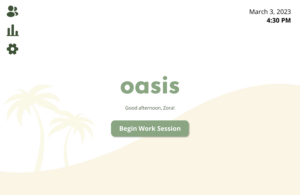
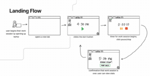
The main flow showcases the landing page, which is what is shown every time users open a new tab in their browser. Because we wanted users to have control over when they receive notifications, they can start and end their work sessions manually. We also thought this would be more efficient than users having to input their schedules and times that they would like to receive notifications from Oasis. From this landing page, the friends portal/side menu, users’ statistics, and settings can all be accessed.
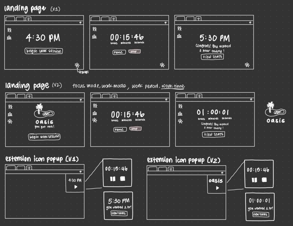
Extension Popup
![]()
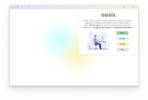
Many browser extensions can be interacted with from the browser toolbar, so we also wanted to simulate this experience for Oasis users. Thus, this flow starts with a placeholder screen that is meant to represent whatever tab users may have open as they are doing work (e.g., Google Docs, email). To begin the flow, one must click on the Oasis icon on the toolbar, which launches a mini version of the main landing page. Through this flow, timed pop-up notifications will appear, which is representative of the experience of receiving break reminders throughout a work session. To demonstrate the variety of reminders, we implemented reminders with 4 different types of break actions—you can see them all with the “Shuffle” button.
Ethics
Taking into consideration the reading “The Invisible Work of Accessibility: How Blind Employees Manage Accessibility in Mixed-Ability Workplaces” by Branham and Kane, we thought about how to make our product accessible. We recognized that some of our target users would be individuals living with physical and cognitive disabilities, which would impact how they interact with our product. Not wanting to unintentionally exclude users, we thought about how the break actions suggested by Oasis could account for that range. For instance, how can we accommodate a user who uses a wheelchair receiving a notification telling them to stretch their legs or telling them to get up? Our solution to improve the accessibility of Oasis was twofold: 1) implement a “Shuffle” option that allows users to receive a new suggested action, and 2) allow users to set their preferences for the types of break reminders they’d like to receive. This way, users are able to explore different types of break actions on the fly, as well as tailor their break notification content to their unique needs beforehand.
Additionally, in line with the principles of universal design outlined in the reading “Design Values: Hardcoding Liberation” by Costanza-Chock et al., we made certain features secondary during the design of our prototype, only leaving certain key features as part of our main flow. For example, we made it easier for users to opt out of the social aspect of our product after we discovered that some users did not generally want to share information about their work habits with their friends. We wanted to make Oasis a welcoming and safe space for users who also prefer individual journeys. By applying the principle of universal design, we were able to evaluate how different features of our prototype are utilized by different users in order to facilitate the creation of a prototype that took into account the perspectives of a variety of users.
Our team also thought about the ethics of persuasive technology, making a conscious effort to reduce the intrusiveness of our application by limiting the space of which it occupies on a user’s screen. In doing so, our team wanted to avoid the exploitation of our users’ attention, a fundamental design flaw present in a multitude of modern day platforms (Borgefalk & de Leon, 2019). Moreover, the inclusion of “Skip” and “Snooze” buttons further enabled our application to be less disruptive of users’ workflows, as it provided a simple and direct method for users to dismiss any distractions. These buttons also give users agency as they use our browser extension. As a browser extension, our application is also able to be minimized to only appear as a button on the search bar, further reducing the obtrusiveness of Oasis.
Ultimately, our solution could contribute to fostering a healthier work environment for college students and young professionals. The hustle and grind culture that is so prevalent amongst both populations can be harmful, as it often promotes sacrificing personal needs for the sake of being productive. As a result, Oasis can tackle this norm of non-stop work by reminding and encouraging people to take care of their physical and mental well-being while working. Oasis helps to promote people’s humanity, rather than their productivity. We believe that doing so can prevent burnout and improve people’s relationship with their work and work environment, reducing the impacts of the toxicity associated with the grind mentality.
Conclusion
Primarily, we learned that behavior change is complex, and it can look different for everyone. This project opened our eyes to how nuanced behavior change is, especially when making ethical considerations. On that note, this project opened our eyes to how critical it is to think about ethical issues, as well as design justice, at every step of the design process, not just the beginning. In addition, oftentimes, we got bogged down on the small details of our design and solution and forgot to take a step back and look at the bigger picture, so we learned the importance of not losing sight of the overarching purpose or mission of our work and making design decisions that align with those aims.
If we had more time to continue working on this project, we would like to investigate the effectiveness of having break reminders come from an avatar or mascot. It would be interesting to see how adding different personalities to the reminder messages can impact user behavior and reactions. Further, it would be beneficial to observe users and how they respond to/engage with notifications from other apps in order to better inform our notification system, content, and design. With additional time, we also hope to develop our clickable prototype into a working browser extension, with which we would conduct further usability tests with. With this feedback, we can continue to improve and refine Oasis.


