Each of our team members created a set of sketchy screens for different parts of Oasis’ Chrome extension flows.
Onboarding Flow
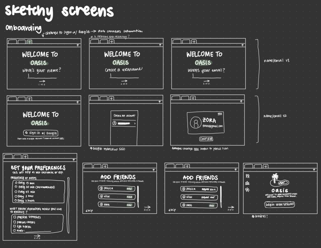
In our exploration of the onboarding flow, we considered various methods for users to input their name, profile picture, and email address. Initially, we had a flow where the user manually entered each value separately. However, we discovered that this process was time-consuming and opted for an alternative where users could conveniently sync their information with their Google account since our product is a Chrome extension.
Furthermore, in the subsequent stages of the onboarding process, we allowed users to personalize their preferences and add friends who are also using the app. Based on peer feedback, we ensured that each step was clearly defined by adding more instructions and descriptions to the onboarding screens. We also incorporated a progress indicator at the bottom of each screen to create a sense of accomplishment for the user.
Landing Screens
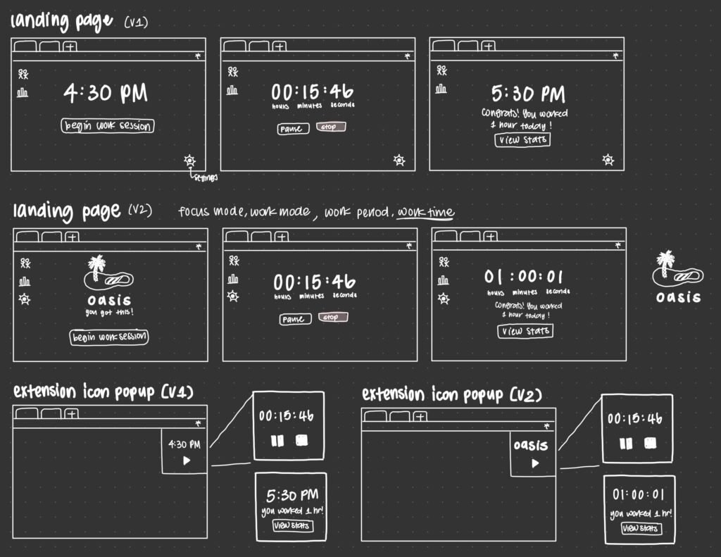
On the main landing screen, which is displayed each time a user opens a new tab in Chrome, we implemented the start/pause/stop buttons and timer functionality. In the first version, we displayed the current time when the timer was not running. However, in the second version, we opted for a more visually appealing design by emphasizing the Oasis branding with the logo and a motivational message. We found that the Oasis branding was much easier on the eyes compared to displaying the time, which could be confusing due to its similarity to the timer text that is displayed once a work session is started (number and colons).
As for the extension icon pop-up that appears from clicking on the icon in the toolbar, we made similar changes to both versions to optimize its appearance within the limited space available. Instead of using buttons with full text, we replaced them with larger icons to better fit the small size of the extension popup.
Notifications Pop-Up Reminder Screens
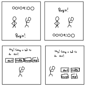
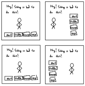
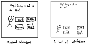
For this portion of our team’s application, we wanted to follow a similar model that was practiced during our intervention and assumptions tests where we send users a message informing them of the harm of prolonged sitting and follow that up with an encouraging stretching suggestion or some type of minimal-effort movement. In doing so, this stood as the focal feature of the notification pop-up sketchy screens. As a team, we collectively decided that it would be best to offer users the ability to request a different suggested action in the event where the user was not satisfied with the initial suggestion. We also viewed this as a way to tackle an accessibility issue, as there may be some cases where the user is unable to physically perform some stretches or actions, so we made sure to provide users the ability and option to see a different suggestion. In addition, for situations where the user is unable to take a break (e.g., in the middle of a meeting), we also presented the option of enabling the user to either snooze or skip a suggested stretching activity. In doing so, users would be able to engage with the activity after a timer (e.g., 8 minutes), or until their next break reminder appears (this is dependent on the user’s preferences, which is chosen in the setting section). In moments where the notification is not active, the pop-up screen was designed to appear on the top left of the user’s screen as a tab in order to not be too intrusive to their work flow.
Statistics Screen
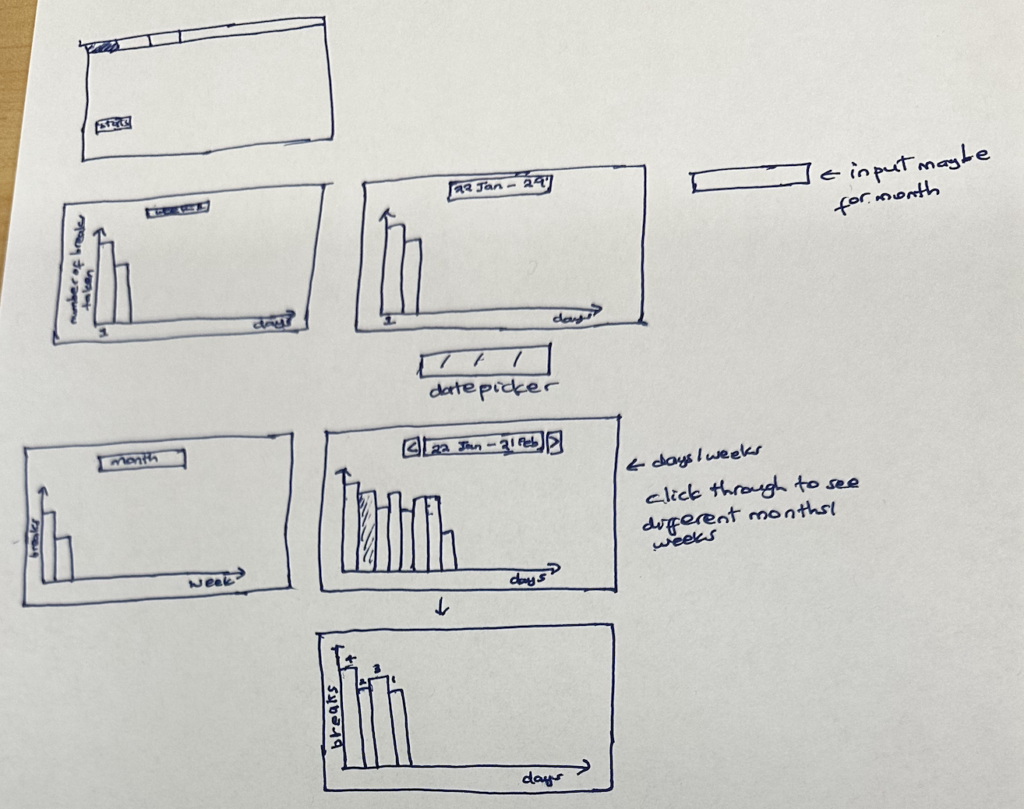
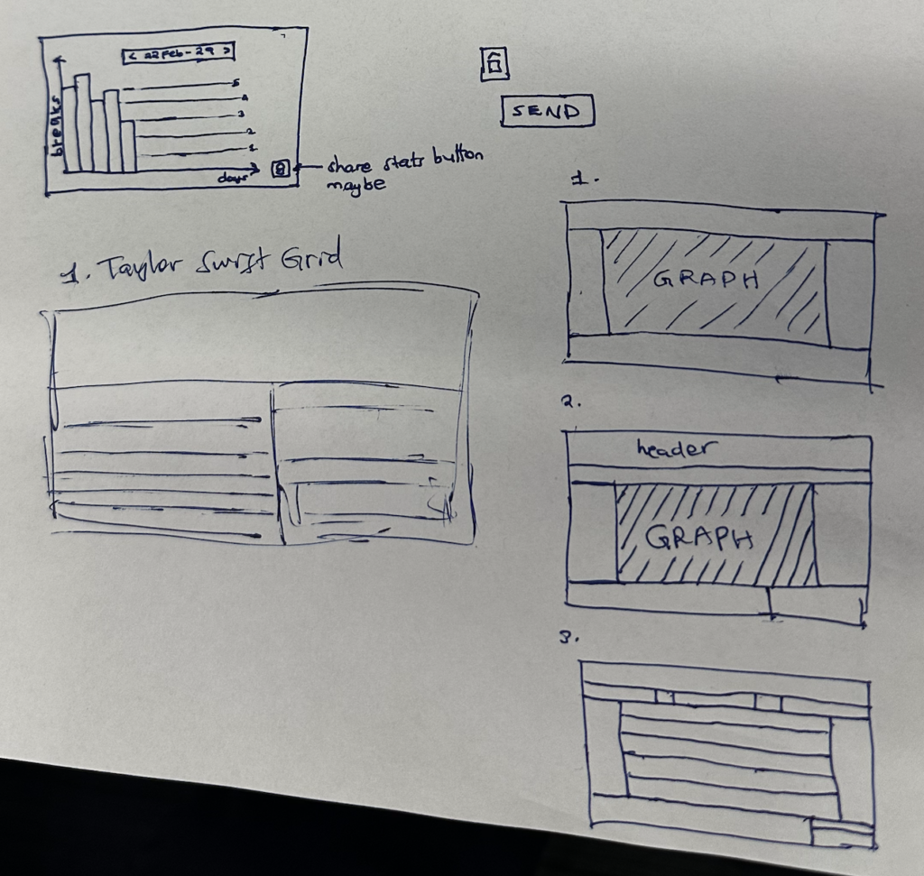
We designed this page to provide users with an overview of the number of breaks they’d taken as a way of helping them keep track of their goals. Initially, we had the stats located in the notifications but ended up changing this by having them located on the landing page to provide easy access to users. We also incorporated a feature that helps users view their current stats after each work session on the View Stats page which pops up once a user has completed their work session.
The Stats page opens up into the daily stats page which provides a visual timeline of the number of breaks the user has successfully taken on that day. The user can also input a specific day into the date picker in order to see the number of breaks they completed on that day. The weekly stats page provides a similar overview of the number of breaks they completed for each day that week, while the monthly stats page provides an overview of the number of breaks they completed during each day of that specific month, with the ability to input date ranges for each section.
Friends Flow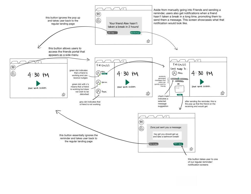
These screens showcase how users can interact with friends on our interface to send them reminders, making the user experience more enjoyable and personable. However, based on our assumptions testing, we found that not everyone is inclined to or interested in involving friends in the user experience. As a result, we didn’t want the “Friends” portal to seem like a primary focus of our product and thus designed it as more of a side menu than a central part of the browser extension.
The “Friends” icon in the top left corner of the landing page is one way to access this social feature, as it opens up a side menu displaying a list of users’ friends and their status. Users can only send nudges/reminders to their friends who are actively working and not on “do not disturb.” If they decide to manually nudge a friend, they are taken to a page where they can choose from a couple of pre-generated reminder messages or write their own message to send. Initially, we only had the text box, but based on feedback and assumption testing, we decided to add the generated messages for efficiency. Another way for users to access this page is through a pop-up notification from the system. If a user hasn’t taken a break in a long period of time, our system would send a notification to all of their friends prompting them to remind that user. If users decide to remind a friend, they click the “Remind them!” button and would be taken to the same page with the pre-generated messages and text box. Finally, the screen on the bottom right shows the view for the user receiving a reminder message from a friend. They can either ignore the message, or they can choose to take a break, which would take them to a reminder pop-up (refer to Romuald’s screens).

Comments
Comments are closed.