
Project Date
January 9, 2023 — March 18, 2023
Team Members
From left to right: Claire Muscat (PM), Christina Kwak (UX Researcher), Monique Ouk (UX Researcher), Nick Feffer (Designer), Hyunseok Hwang (Designer)
Overview
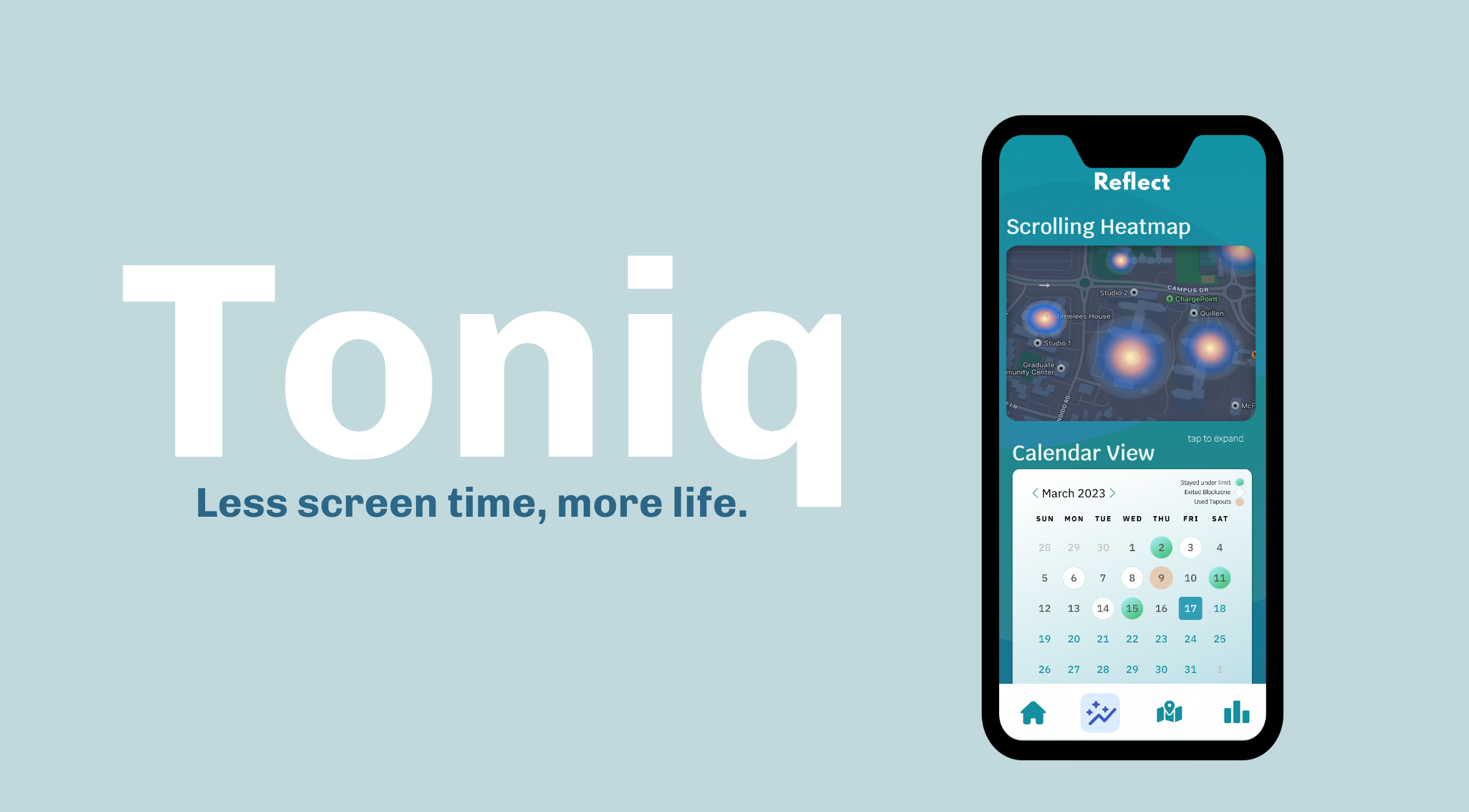
Throughout this quarter, our team worked towards creating something that can help people spend less time on addictive apps such as Instagram and TikTok. After extensive user research and multiple design iterations, we ultimately developed Toniq, an intervention app that reduces people’s screen time by addressing their need for stimulation. By implementing a physical “blockzone” that users must exit in order to keep scrolling, Toniq nudges its users to change environments which will lead to other forms of stimulation and less desire to open the blocked apps.
Link to our final clickable prototype.
Problem Finding
Billions of people use social media today — and many of us are addicted. Applications such TikTok, Instagram, and YouTube all provide users with short-form content and employ predictive algorithms that provide users with an ongoing stream of videos catered to personal preferences. Many people, including ourselves, recognize their addiction and that they want to break the habit but don’t know how. We’re excited about this problem space because of our own social media addiction and desire to change.
The Problem Space
Before trying to design or build anything, we first conducted a literature review on excessive scrolling and then analyzed many existing solutions in this problem space.
We had three major takeaways after reviewing 10 articles:
- There’s a distinction between social media addiction and classic forms of addiction (gambling, nicotine, etc).
- People were forced to spend unprecedented amounts of time on screens during the pandemic. Screen times jumped dramatically during this period as their attention was splintered between work-life and home-life.
- Strategies for lowering screen time include: mechanic-based interventions, notification-based interventions, accountability-based approaches, and exercise-based interventions.
For more details and insights from our literature review, you can follow the link here.
We conducted user studies on 10 different mobile apps that help manage screen time, which can be summarized by this chart: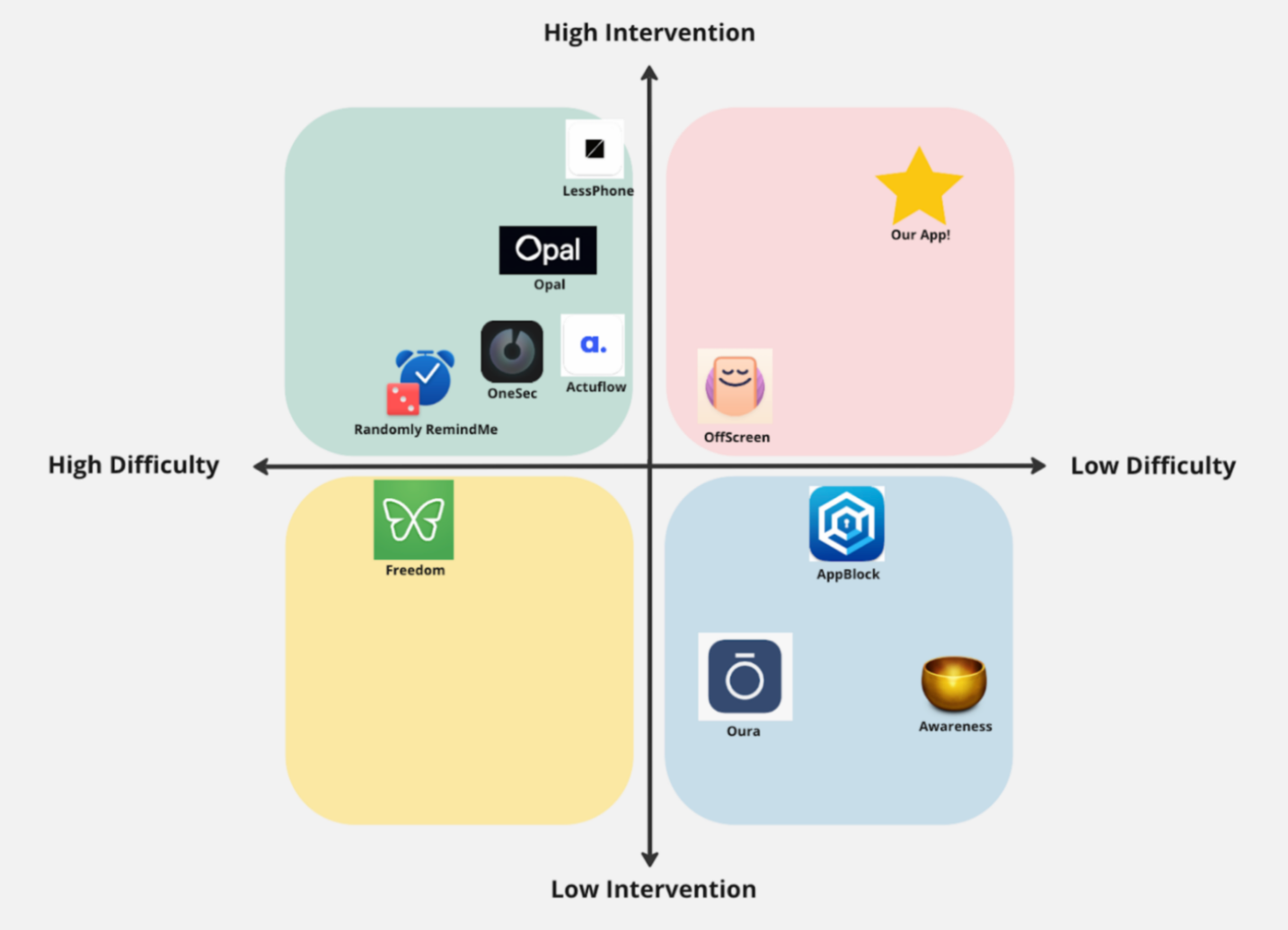
From our comparative analysis of the existing apps:
- Common weaknesses that can discourage a user from using the app effectively:
- Easy-to-use intervention bypassing mechanism
- Relying solely on contextual prompts to change user behavior
- Very heavy onboarding (e.g. heavy manual user inputs) can lead to user friction
- Common strengths:
- Applying friction when users are attempting to remove the blocking functionality
- Meaningful synthesized data from screen usage
- Active interventions such as locking users out of the app
Baseline Study & Synthesis
Target Audience
Our target users were individuals that felt unsatisfied with their social media usage and wanted to lower their social media screen time. To find participants, we sent out screeners to assess how much time people spent on their phone in general, how much time was spent on social media/short-form content applications, how satisfied they felt with their screen time (1-5), if they’ve tried changing their screen time before, etc. Because the screener filtered people that spend a lot of time on IG/TikTok/Youtube Shorts and are unhappy with it, we effectively found people that would want to use and benefit from our ideal product.
Methods
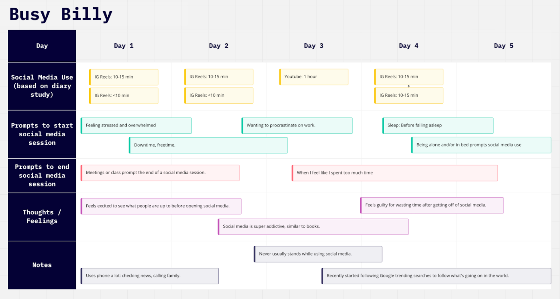
For our baseline study, we selected eight individuals that want to reduce their social media consumption and screen time. We first conducted pre-study interviews to gather insights on our participants’ current scrolling habits as well as their existing relationship with behavior change. We then conducted a five-day diary study, during which they logged every time they consumed short-form content and completed a short questionnaire afterwards. The questionnaire collected data on how long the session lasted, what setting the participant was in while scrolling, and sentiment data on how they felt during and after scrolling.
Synthesis
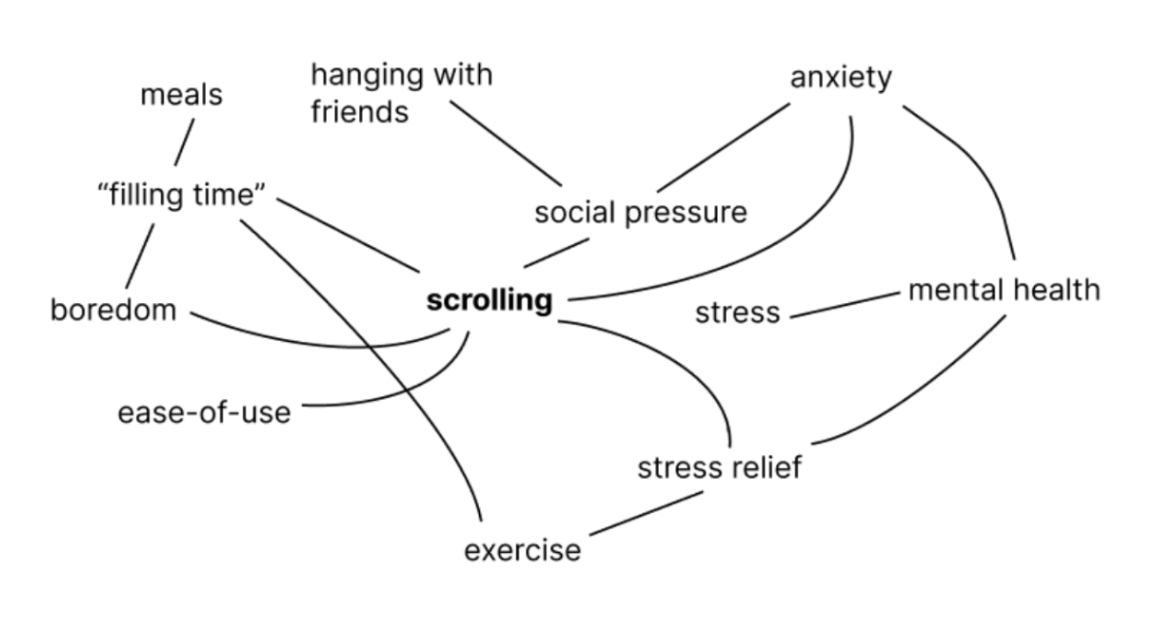
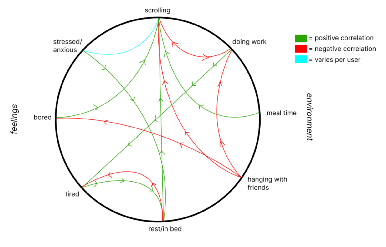
To synthesize all of the data we got from the study, we started out by fragmenting all user data so it would be easy for us to start categorizing. We categorized our data from the stickies by affinity mapping and frequency mapping. Both forms of mapping allowed us to figure out the most surprising patterns that we wouldn’t have guessed — in this case, the fact that some participants avoid opening reels in public because they find it embarrassing.
We then broke down our data into various visual diagrams:
1) Mind-mapping
2) Fishbone Diagram

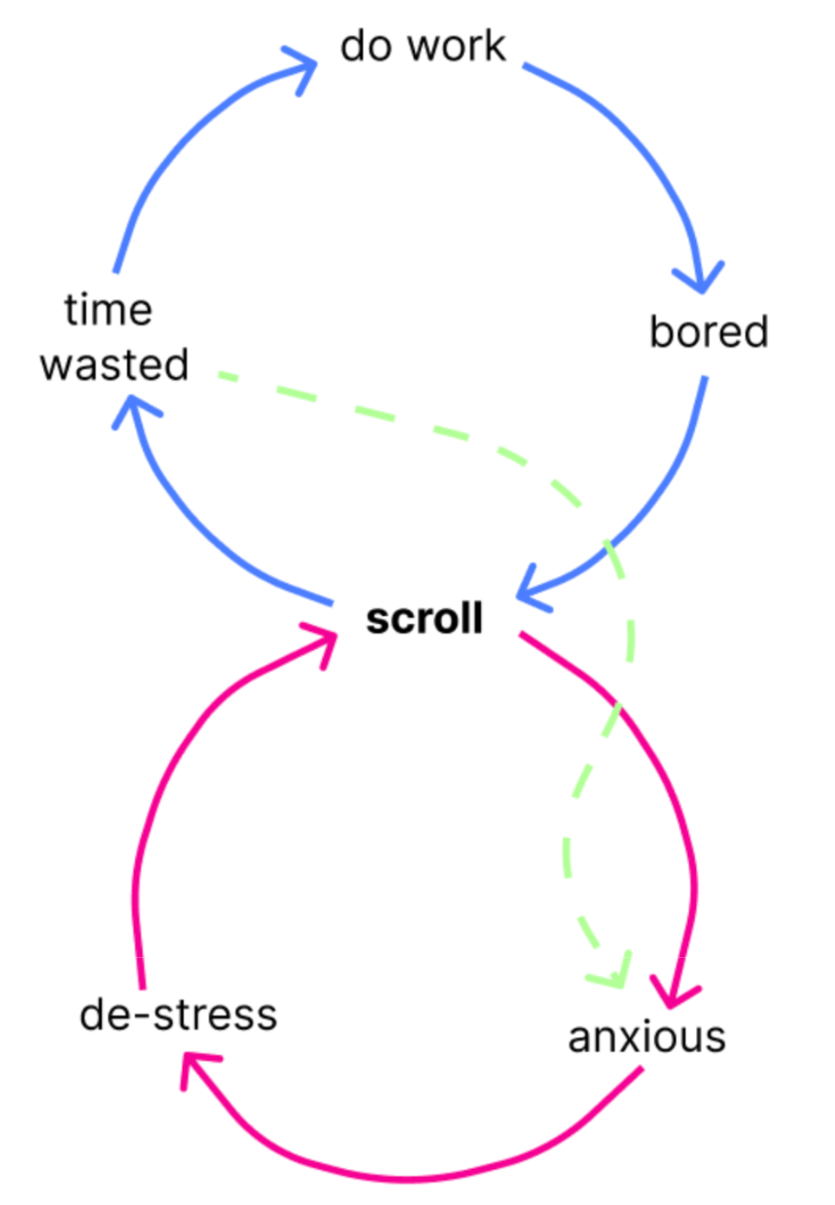
3) Feedback Loops
Insights
Each visual diagram helps us emphasize the most important factors towards scrolling.
- People are very likely to scroll when they are bored.
- People use scrolling as a way to avoid work which then leads to more stress later.
- People scroll more when they’re alone or stationary (often lying down).
- People scroll less when they’re around others or in any situation that can cause social pressure.
For a more detailed analysis on each of our models and all of the insights we found, please refer to this blog post.
Moving Forward:
All of the insights from our baseline study led us to recognize the power of social pressure and ask the question: how, then, can we capitalize on social pressure or get people to avoid being alone? The next phase of our project would be focused on exploring how to best harness the power of social pressure for reducing scroll time.
Personas & Journey Maps


For a more detailed analysis of our personas, please see the “Personas and Journey Map” section of this blog post.
Solution Finding
Intervention Study
For a more thorough discussion of the intervention studies considered, please see this blog post analyzing pros and cons of different study ideas.
Ultimately, we chose to pursue a game-like leaderboard for our intervention study. We were excited by this idea and how it capitalizes on the power of external social pressure instead of exclusively internal motivations of the individual causing behavior change. This idea allows for external pressures to be spun into a fun, positive light via a friendly competition.
Goals
Capitalize on the power of friendly competition and social pressure to reduce scrolling time
Target Audience
- People who care about what others think of their screen time (especially short-form content apps)
- People who are competitive
Hypothesis
Individuals will decide to spend less time on short-form content apps and their phones in general if they know they are competing against other people for the lowest screen time and time spent scrolling.
Methodology
We had 8 participants. Our intervention plan was in the form of a daily leaderboard that “compared” the participants’ scrolling times and included participants being sent daily ranking updates. Participants were updated via text of their ranking.
Analysis
1) Affinity Mapping

2) Fishbone

3) Connection Circle
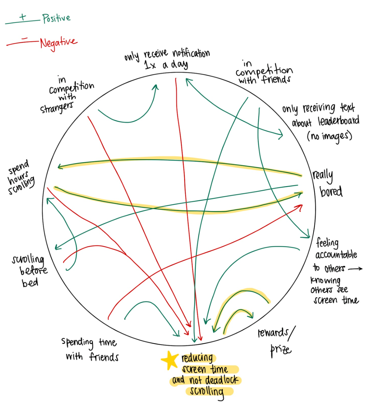
Key Insights
- People are generally competitive but the power of games and competition is maximized when the participants know one another
- People respond well to prompts and need more touch points via notifications and real-time feedback throughout the day
- People get bored easily and lose interest → retention and ultimately behavior change only occurs if users are engaged and have sustained motivation
Moving Forward
Although our intervention study confirmed that people are compelled by competition to lower their scrolling time, the compulsion varies on how well the individuals know the people they are competing against. Now that we had tested our hypothesis about social pressure, we decided to spend some time exploring another area of interest: the power of environment on behavior.
For a detailed look at our intervention study results and synthesis, you can follow the link here.
Design architecture
System Map

Our system map allowed us to think through and understand:
- Various motivations for those choosing to use our app
- Actions users could do once on our app
- Various touch points between our app and our users
- Reasons users might decide to leave our app
- Ways to keep users engage
Bubble Map

Using our bubble map, we began to lay out the different methods in our solution for how to help users break the habit of endless scrolling. Our two main methods were:
- Leveraging social aspects and social pressure
- Providing users with alternatives to scrolling
We fleshed out each of these methods to determine concrete components to include in our prototype. The bubble map allowed us to hone in on specific features to further develop and iterate on.
To read more about our design architecture through our various mapping techniques and what we learned, read our design architecture blog post.
Assumption Mapping and Testing

Our key assumptions that we decided to test were:
- Users will lower their screen time if given engaging alternate activities
- Users will lower their screen time if forced to move before continuing their scroll session
For more on how and why we chose our assumption tests, read this.
Assumption 1
Test:
To test our first assumption, we created a paper prototype designed to test 1) the willingness of users to complete an alternative activity as opposed to continuing scrolling and 2) what activities are most desirable to end users. It simulated a 5 minute scrolling experience for end users and then asked the user whether they wanted to “Continue scrolling” or “Do something fun”. The user would then be prompted to complete an alternative activity or get a list of local places to try for food or entertainment.
Key Insights:
- From that we learned that, people were more inclined to be recommended an alternate activity (either their own goals or activities near them) than keep scrolling after their screen time limit expired.
- We also learned that people were more interested in exploring new activities in their area than in being prompted to spend time working on the goals they had set out for themselves when onboarding.
- There is some allure in the phrase “Explore” even though they were confused about what exactly it meant. Obviously, if they continued to use the app, the only confusion would be during the first use.
Therefore we decided to:
- Have a dynamic list of alternate activities presented to the user when they choose not to continue scrolling
- Change the “Explore” button to clear up confusion while still providing intrigue and mystery to inspire the user to click this button as opposed to continuing to scroll
- Instead of making users choose between “Work on one of my goals” and “Try something new near me”, we will combine both the user-entered goals as well as the location-based recommendations into one list that will be updated / changed each time they decide to do an alternative action instead of scrolling
Assumption 2
Test:
To test our second assumption, we conducted a user survey to gauge users’ willingness to physically move in order to keep scrolling. We asked questions about how far individuals would be willing to move and what types of activities they would be willing to do in order to keep scrolling. We also asked questions to determine in what contexts users would be willing to move and in what contexts users would choose to stay put and stop scrolling
Key Insights from testing assumption 2:
- From that we learned that the users’ decision to move somewhere to “unlock” more scrolling time truly depends on their current environment / setting, who they are with, time of day, and exhaustion
Therefore we decided to:
- Integrate our “forced movement to unlock more scrolling time” feature with specific combinations of time of day and location. We could “push” the user into forced movement when we know that they’re in a particular location at a given time of day where they truly feel like there’s nothing else to do and they have the energy level to move around. We will also begin considering how to potentially gauge a users’ energy / exhaustion levels since this plays into the users’ decision to move around to unlock scrolling
One flaw in our first assumption test is the fact that it is hard to simulate the situation for which we are making our app. It is hard to simulate a long scroll session that is being done alone using a paper prototype where the individual knows they are being observed and their actions are being recorded. This problem is hard to avoid without a higher-fidelity prototype. Additionally, in the future, we would like to test our first assumption over a multi-day period. We noticed that all participants chose not to keep scrolling and to explore nature options in their area. If we were to run this again, we think spanning the study over several days would allow us to better understand user patterns and control for the allure of trying something new (in lieu of scrolling) that is likely to wear off with continued use of the app.
After running the above tests, the assumption regarding the difference in efficacy of competition for a friend group versus a random group of people remained. We did, however, talk to past study participants that confirmed that leaderboards are much more effective when they are used among friends and not strangers.
For more information about the results and synthesis of our assumption tests, see this blog post.
Building a Solution
Storyboard
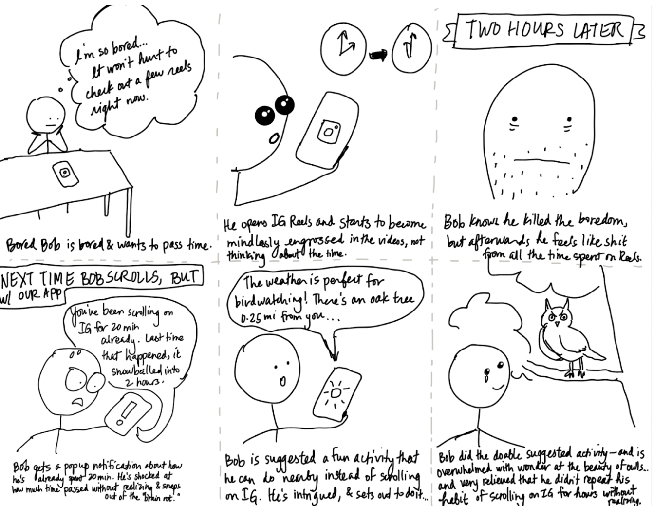
Wireflow to Sketchy Screens
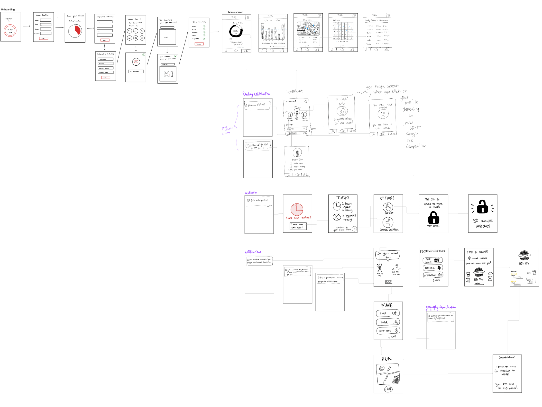
The insights we synthesized from our story map, bubble map, and system paths were crucial to starting our wireflows since our app has many moving parts. A user’s happiest path has them setting screen time limits for specific apps, setting up their blockzone (the mile radius they’ll have to exit to unlock more screen time), and actually exiting the blockzone when they reach their screen time limit. Our app provides suggestions on what to do based on user location, so it’s much easier for the user to get up and go somewhere to do something fun!
All of the moving parts is what makes our app great, since we’re helping reduce screen time for people with different needs (e.g. people who need competition have the leaderboard, people who are more incentivized to change from shame have the option to “Tap Out”, and people who tend to scroll from boredom and lack of stimulation have extremely easy access to a list of things they can do in their current location).
Click for an in-depth explanation on the sketchy screens based on our wireflow.
Example sketchy screens:
In general, all of our sketchy screens were designed pretty minimally. We wanted to avoid anything frivolous or beyond the core functions of the app, since we don’t want our users to sink time into their phone in general.
Branding — Mood Boards & Style Tiles
Before really diving into the design of our app, we began envisioning the mood and emotions that we want Toniq to convey. We want to be as helpful as possible, within the bounds that we’re given; Toniq should be fun and motivating for our users. It. Toniq would love positive talk, trying new things, and exploring. Toniq hates dead-locked scrolling which is the behavior that it’s trying to be the solution to. Toniq loves the success of its users and is excited for every step forward that they make. On the other side, we want our users to feel positive about their future trajectory and their ability to decrease their screen time. We also want them to feel extra motivated every time they see our app.
After brainstorming the “vibe” that we want, we began putting our moodboard together.
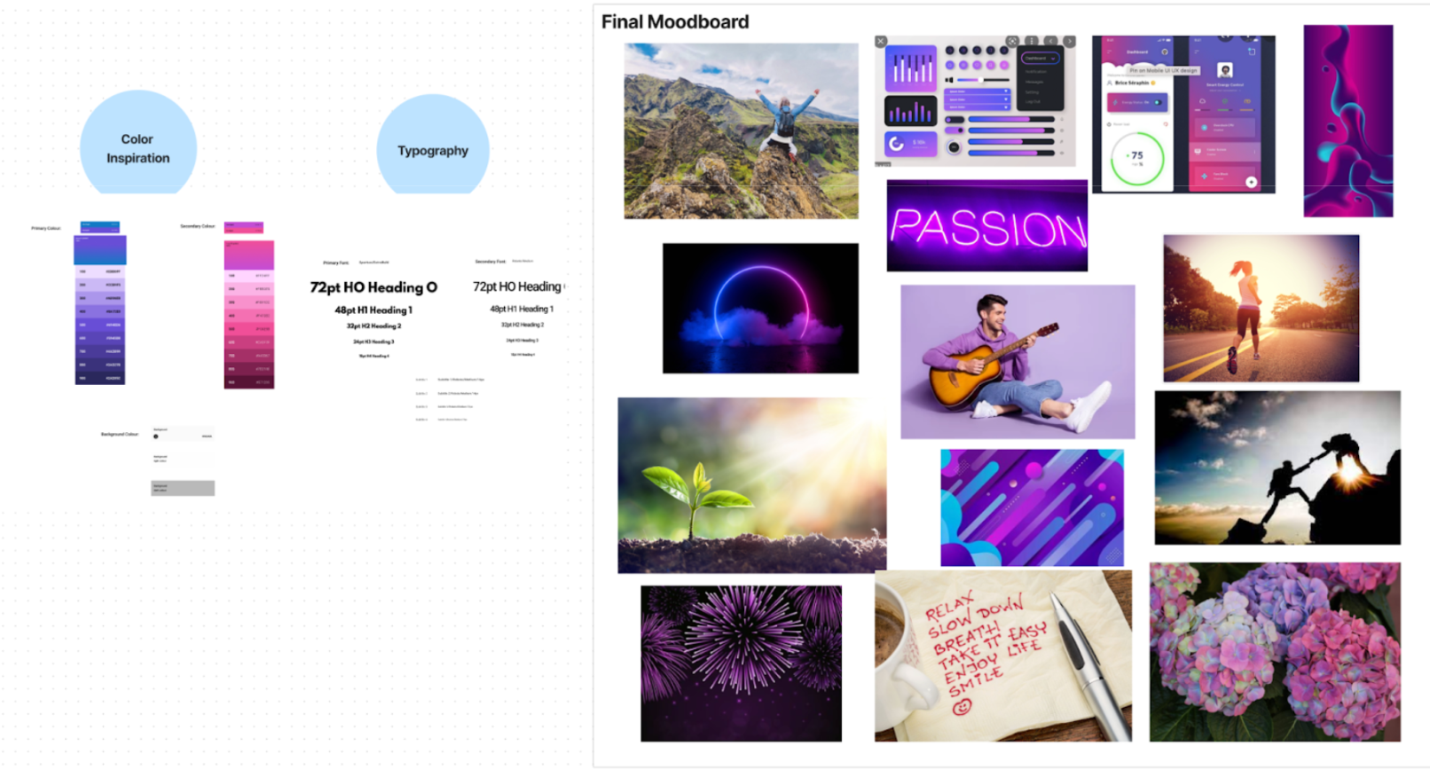
One important note is the color scheme that we went for in our mood board. For most screen time and productivity apps, the colors are calming and bright, but we realized that our app, indirectly, acts as an alternative to social media apps, and thus we wanted to have popping colors. The use of these vibrant colors to satisfy the visual needs of our users.
Another important note for our mood board is the motivation and passion that we want to highlight. We found images that brought to life some of the phrases that we hope to bring to life such as “empowering” and “growth” and “community”. This is the feeling and strength that we want to convey to our users.
Usability Testing
We wanted our users to walk through the 3 most fundamental tasks during our usability testing:
- Onboarding (setting up screen time and the apps they want to block)
- Use of app intervention when they hit their screen time limit
- Find personal analytics data and ranking information
Our three biggest issues were:
- Word choice — lack of clarity led to confusion during onboarding. Users weren’t sure how the “goals” and “blockzone” features functioned in the app.
For these pages, we are planning to reword the descriptions to include our working definitions which are that goals are alternative to scrolling and blockzones which are areas in which the user wants to implement the time limits. - Location privacy — we didn’t have a popup notification that ensured location sharing was opt-in.
To address this issue, we’ll make it clear that the user chooses to share their location with Toniq during the onboarding process. - Location search bar — it’s possible for the user to set locations that they’re not actually in (e.g. using a VPN).
The current iteration of our app had a method of setting locations for blockzones based on the current location that the user was in. Since users can fake location, it’s better for Toniq to implement a search bar so Toniq can be effective in many different locations.
Moving forward, we must always consider any potential ethical issue from the features we are designing. The development of our app raises a number of ethical issues that should be addressed. The type of social motivation and gamification that we use could harm users who are dependent on short form scrolling content and result in a high amount of screen time which is the opposite of what we want. This feeling of failure can create a cycle that inhibits users from attempting to reduce their screen time. Additionally, depending on the extent of personal data shared on the app, including location tracking, privacy concerns may be present. Thus, it is imperative to ensure that strict controls are in place concerning who can access what data, particularly when it comes to tracking data. Moreover, users should be regularly prompted to grant permission for these types of activities. The user should also receive full transparency about how their data is stored and used.
Prototype
Tutorial flow:
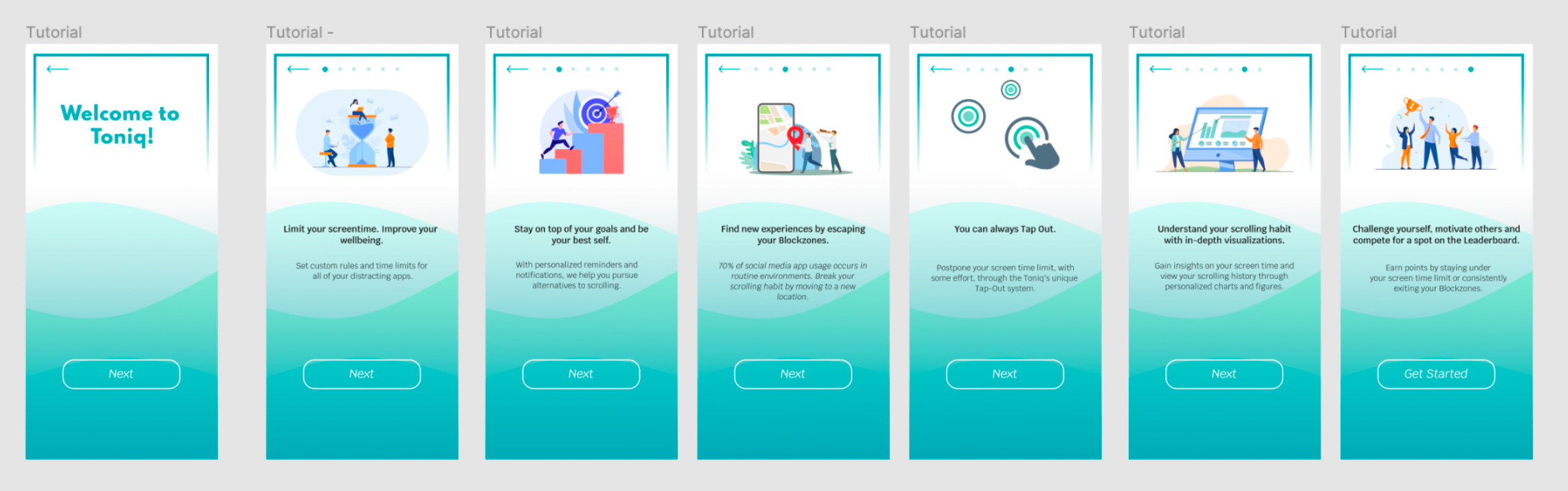
When the user first signs up on Toniq, they’ll immediately get an overview of Toniq, such as its goal to reduce screen time through innovative interventions such as relocating environments and “tapping out” to unlock more scrolling. The tutorial was designed to give the user a fundamental understanding of what the app offers and how they’ll engage with it.
Onboarding flow – setting screen time:

After receiving the tutorial, the user is then prompted to create their account and set screen times for specific apps. Toniq only asks for crucial information that can personalize their experience (such as the suggested location-based activities that Toniq will show the user).
Onboarding flow – setting blockzone:

Once the user has set their screen times, they’re now prompted to set their “blockzone” — the mile radius that they’ll have to exit in order to regain scrolling access. After user testing and research, we’ve now made it possible for the user to set multiple default blockzones so provide more autonomy for the user (and decrease the chances of them faking location or using VPN).
Example intervention flow – tap out and relocation:
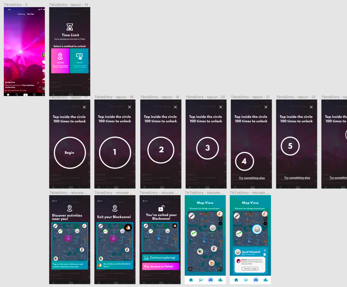
The intervention flow shows what happens when a user reaches their screen limit while scrolling on a “blocked” app. Once they hit their limit, they can either “Tap Out” or physically exit their blockzone to unlock more screen time. The “Tap Out” feature was designed with as much friction as possible to discourage the user from choosing this option; the user has to tap the circle a given number of times, but the circle moves to make it difficult. Everything is black and white to be as visually monotonous and therefore non-stimulating as possible. On the other hand, users are incentivized to exit their blockzone by discovering local activities.
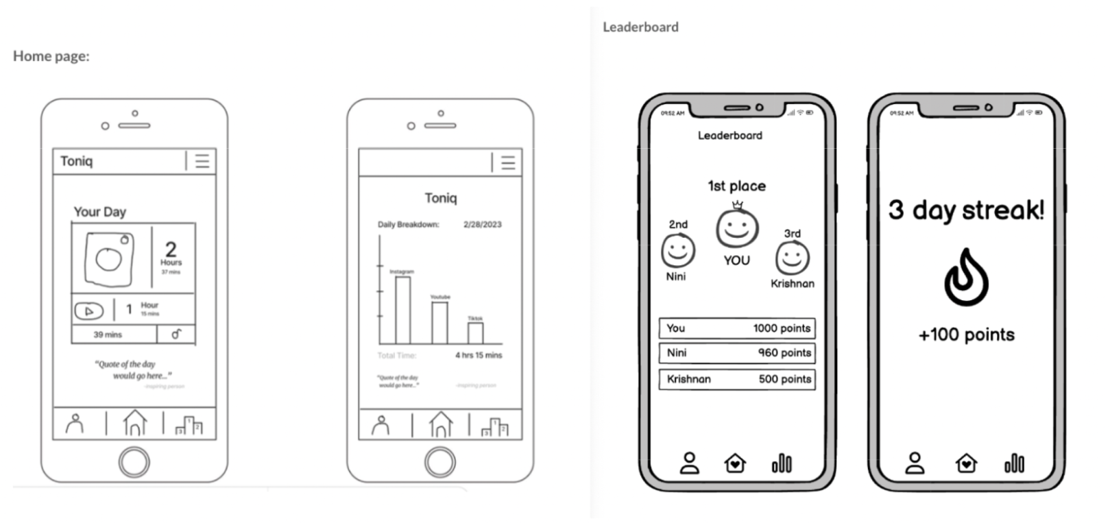
Leaderboard flow:

The leaderboard flow exists for users who thrive on gamification and a sense of competition. Everything the user does ultimately affects their position on the leaderboard. For example, completing a “tap out” causes the user to lose points whereas successfully exiting the blockzone will increase their points. Because we want to make Toniq as effective as possible for people who respond best to competition, we wanted to make our leaderboard very stimulating and aesthetically pleasing to incentivize the user into checking/using the leaderboard. Doing so would nudge the user to follow the best actions to keep their screen time low.
Ethics
Nudging and Manipulation
T.M. Wilkinson’s piece entitled “Nudging and Manipulation” discussed the use of nudges for behavior change and how to use them ethically so as not to manipulate individuals. Wilkinson claims that while effective, manipulation infringes on the autonomy of individuals and should thus be avoided as a behavior change tactic. He did argue, however, that nudges had a special “escape clause” and did not necessarily have to fall under the category of manipulation. As discussed in class, nudges are powerful ways to gently guide users towards a specific action, and we even talked through several examples of good-faith nudges that respected user autonomy versus more coercive nudges. As we began to design Toniq, we kept these conversations in mind, especially when thinking about our notification system and language used in our app in general. Notifications obviously fall into the “nudge category”, but we wanted to be mindful of the language we used. Ultimately, we decided to use encouraging language in our notification messaging paired with a promise of a good reward if scrolling was stopped. When giving users the option to “continue scrolling” or “try something else”, we also carefully crafted the language to offer positive reinforcement as opposed to negative feedback. In providing the user with a choice, we honored their autonomy, but we also utilized specific language to help guide them towards remembering their goals and helping them avoid deadlock scrolling.
Privacy
Daniel Solove’s article “Why Privacy Matters Even if You Have ‘Nothing to Hide’” examines the nothing-to-hide argument that is so pervasive in conversations surrounding privacy and explains why it is completely fallacious. Through our discussion of this article and reflecting on the value of privacy in our digital age, we were reminded of every technologist’s responsibility to uphold this value of privacy and do everything in their power to protect it. During onboarding, like most applications, our app requires some personal information to be input. When designing our app, we brainstormed what information users should input as part of their profile and made sure not to require users to enter any unnecessary, personal data so as not to infringe on their privacy. Additionally, our application makes use of ongoing location data being collected and used in several features of the app. In clicking “Allow” for the location services, users are handing over their personal location data and expressing their trust in us to only use it when necessary and keep it safe from potential bad actors. In class when we discussed pre-mortem and disaster scenarios, our team also made sure to focus one of our scenarios around data privacy. We discussed safeguards, such as anonymized data and storage using hash functions, that could be put in place to secure data and ensure privacy for users.
Rewards
The “Rewards” chapter from Good Habits, Bad Habits taught us about different types of rewards, optimal timing of rewards, and the power rewards hold in causing behavior change. Even before discussing this in class, each student could probably point to a time in their life where the promise of a reward gave them the motivation to complete some task or when an unexpected reward after some action surprised them and subsequently made them want to do that action again. A large part of our application hinges on the use of rewards, and we specifically use intrinsic rewards. Intrinsic rewards, as defined in the reading, are rewards that are part of a specific behavior. In Toniq, we reward users with points when they choose to stop scrolling once their scrolling limit has been met (as opposed to using tap-outs to continue), when they don’t hit their scrolling limit for the day, and when they reach one of their goals they enter when onboarding. These points correspond to the leaderboard that users participate in with their friends, and thus act as rewards that are intended to motivate users to get off of their phones and spend less time scrolling. When using rewards in design, however, it is critical for the motivations to be non-exploitative. Rewards are often used in gamification, and there can be negative effects for users such as stress or hostility. In our app, we are careful to create an environment for friendly competition and encouragement between user with the same goal of decreasing scroll time with positive rewards to nudge them towards spending less time on their phones.
Ethics and Beyond
One important ethical implication is in regards to data privacy. The ways in which apps handle their user data is an extremely critical problem that all developers and companies need to discuss. There is no one size fits all solution but the ethical implications of having tracking and location data for users are quite large. Social interactions can also become a problem at scale if people are not careful with their location permissions. Like snapmaps which allow any friend to see the location of others, our app may cross into the boundaries of having personal information available at all times to others. In these cases, it’s extremely important to have user consent and methods for them to remove sharing permissions on a case by case basis.
Another important ethical consideration beyond the current scope would be in regard to the mental health implications of a gamified app that relies on social motivation. We would like to include a setting that turns off the social comparison aspect of the app for people who may become overwhelmed by their personal struggles and not want to see themselves compared to others.
Conclusion
Through this experience, our group has realized the importance of aligning motivations in order to achieve successful outcomes. We have also come to recognize that projects with tangible, real-world implications are more motivating and require a higher level of commitment than school projects, but it was good to work on a problem where all of us have felt the need. We all agreed that screen time usage was a problem because we’d all felt it ourselves – especially the addictive nature of short form scrolling content. Additionally, we’ve found the benefits of working with a group of people who we enjoy spending time with, as this promotes an atmosphere of collaboration and efficiency. It was great to work together on this project.
If we had more to continue working on this project, we would want to turn it into an actual app. Our research showed us some great insights that make our app unique and differentiated from competitors that are on the market at the moment. The location based scrolling insight is a crucial piece of the puzzle. Furthermore, our final prototype is in very good shape and has great design and aesthetic considerations. It has also been iterated on, and is ready to be made into a programmed app.
In future similar situations, I will use iterative testing to identify potential issues or areas of improvement before the product is too far along in the process. This can save time, energy, and resources and ensure the product or service is designed for the end user. Additionally, user tests can confirm the product meets user needs especially with the creation and choice of specific personas. By researching the target user group’s characteristics and needs, we can create a product tailored to their exact needs and anticipate potential problems. This will guarantee the application is effective and provides a great user experience.


