
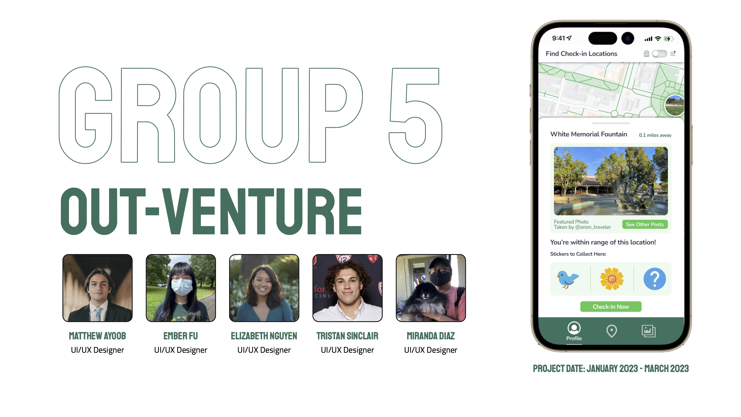
Project Summary
The mission of OutVenture is to promote physical and mental health by increasing outdoor activity amongst college students. After conducting multiple studies, we’ve developed a model that combines both gamification and community, to incentivize participation in our outdoor check-ins and keep users engaged. In using this model, we hope to increase the healthy behavior of spending time outdoors and help students adopt a healthier lifestyle.
Problem Finding (The Challenge)
Justification for choosing a problem
When searching for a problem, our discussion was focused on topics that affect people like us: college students with busy schedules, anxiety inducing workloads, and social pressures. We discussed various problems and their significance to us, and we discovered that the idea of spending more time outdoors resonated with everyone.
Importance of the problem
The challenge to increase college students’ time spent outdoors is important because of the mental health crisis that continues to worsen. A 2015 study conducted on 116,468 college students found that in the previous 12 months, 37% of students had felt so depressed it was difficult for them to function and 59% had overwhelming anxiety (Rakow & Eells, Nature Rx : Improving College-Student Mental Health). These statistics are powerful and scary, students need help.
What is known about the problem?
Now focused on the behavior of going outdoors, we conducted a literature review to investigate the benefits of time spent outdoors and what motivates people to get outside. During our literature review, we confirmed our belief that spending time outdoors has numerous health benefits, both physically and mentally. We also found studies focused on methods used to increase time spent outdoors which highlighted the importance of gamification to increase short-term use, and also how social features can lead to long-term engagement.
During our competitive analysis, we found successful apps that aligned with our vision for OutVenture. Some of these include Pokemon Go, Geocaching, and Strava. These are successful brands, however, we identified gaps in their feature sets we believed our app could fill. Pokemon Go and Geocaching have limited social engagement with their focus being primarily on gamification, while Strava focuses on their exercise tracking and social encouragement. Our research indicates that gamification can be effective in increasing user engagement in the short term, but social engagement is crucial for long-term success. By combining these features and learning from the success of these apps, we believe our app can provide a unique and comprehensive solution.
Read more about our literature review and comparative analysis here.
Baseline Study & Synthesis
We had 14 participants move forward into the baseline study because they met the criteria of our target audience: busy college students who were interested in spending more time outside but were thwarted by their daily lives. To structure our study, we went back to our original challenge of helping ease the stress of busy students and seeing if our hypothesis about bringing them outside as a de-stressor could help. Our study monitored when users would go outside: whether it was for transit or other reasons. We wanted additional information about their reasons for going outdoors, activities while outside, and other people they were with. Another central question we asked was about their moods before and after they went outside to understand what kind of impact being outdoors had on our participants in varying contexts. In the interviews, we also asked about past experiences and particularly memorable moments outside to find more insights.
When analyzing the data from this study, we found that participants shared interest in being social outside. They also wanted clear reasons for going outside (gaming/relief/socialization) rather than spontaneity. In addition, participants who went outside for self-motivated purposes rather than extrinsic forces like class or work experienced the accomplishment of goals like refreshing their mind or being close with nature.
Read more about our Baseline Study and Synthesis here.
Personas & Journey Maps
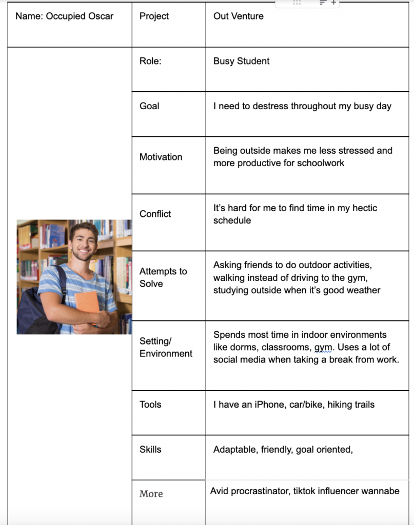
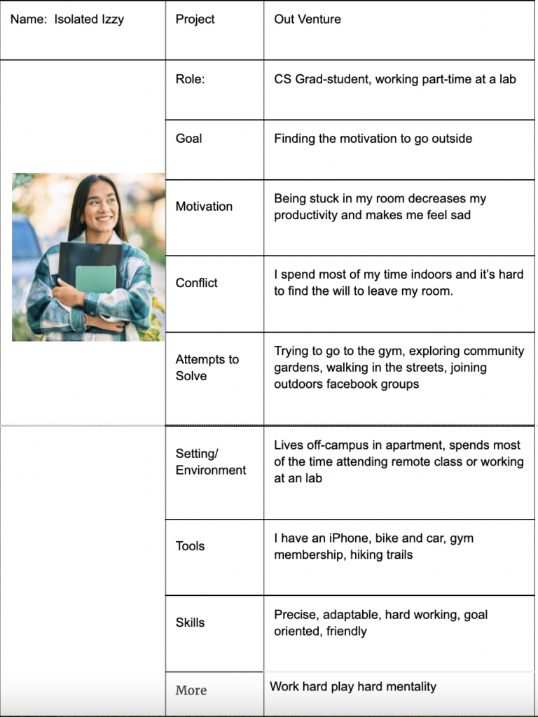
Our team focused on two target personas. The first is Occupied Oscar, a busy university student who enjoys being outside but struggles to find time in their busy day. The other persona is Isolated Izzy who is an anxious graduate student. They spend most of their day indoors and need motivation to get outside. These personas came about through insights from our baseline study in which we noticed that many students had particularly hectic schedules and marked feeling stressed/anxious throughout the day. We thought that focusing our app around their needs would help focus the app’s strategy on getting people outdoors throughout their daily routine.
When our team thought about our intervention study, it seemed difficult to find enough people who matched our graduate student persona since a majority of the people in the team had networks in the undergraduate student body. Due to this feasibility issue, we decided to focus on the first persona for most of our study and tackle research for Isolated Izzy for future iterations of our research.

Our journey maps gave us clear times that we could intervene within the personas’ daily routines. For example, we highlighted times after dinner, during commutes to class/work, and after work sessions. We also noted from our journey map that the average student will spend time re-connecting with friends and family after studying. From this insight, we wanted our intervention to have a social component that could help motivate students to get outside more frequently to successfully integrate the solution into their schedules.
Read our full Personas & Journey Maps here.
Solution Finding
Intervention Study
Intervention Study Ideation
In preparation for our intervention study, we came up with three possible study ideas which are outlined below:
- We ask users to visit a specific location each day and have them send us a photo of the location once they have visited.
- We ask users to take a short clip of them enjoying nature and post it to a shared platform at some point during the day.
- We look at people’s schedules and send them texts to remind people to go outside during a time that they should be free. The text will include health benefits associated with going outside.
Final Decision
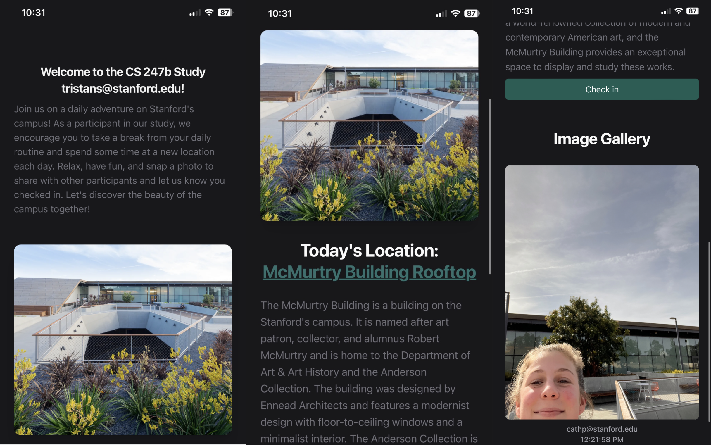
For our intervention study, we decided to create an app that gave users a location on campus to visit each day. We asked users to check-in at the location by taking a photo and adding it to a public feed. Each member of our team would send text reminders throughout the day to the participants.
We thought this direction could be effective at building users’ motivation given that our synthesis identified that people enjoyed having a clear reason for going outside. Moreover, by nudging people to complete a task outside that isn’t time sensitive, we allow users to choose when going outside fits into their schedule and give them the option to wait until contextual deterrents are resolved since our interviews showed that contextual deterrents (like bad weather) were why people stayed inside.
The goal of our intervention study was to build community amongst the users and use this sense of community as motivation for participation. Through our synthesis, we saw that being with friends and feeling a part of the greater community was a reason that people would go outside. We hoped a feed of photos from the community would be a way to get people to feel connected and get outside.
Protocol and Data Collection
Participants: 10 total
Demographics: 10 Stanford students (3 overlapping from the baseline study)
Selection: We found people by asking friends to join the study.
| Tuesday | Wednesday | Thursday | Friday | |
| # of users who participated | 1 | 3 | 3 | 4 |
| % participation | 10% | 30% | 30% | 40% |
| # days participated | 0 | 1 | 2 | 3 | 4 |
| # of users | 3 | 5 | 1 | 0 | 1 |
Insight #1: Distance from location mattered: Participants did not want to go to the first day of the study which was located at the McMurtry Building because it was “just too far” and “out of the way”
Insight #2: Solution needs more focus on action prompting: Going forward, it was important that our solution find ways to encourage users to use the app on their way to class or lunch, anchoring app usage with another task to make it easier to prompt.
Insight #3: Solution needs continuous rewards: Most participants only checked-in to the daily location once because there weren’t continuous rewards after the novelty of the first visit.
While the social aspects of our intervention study were promising, they showed the need for more gamification in our solution, particularly when it comes to rewarding participation. We want to build out a reward system that will encourage continued use beyond the first check-in. We also want to provide more daily location options to make it easier for people to anchor spending time outside to other activities in their daily lives regardless of where they might be.
For more detail, look to the Intervention Study section of this blog post.
Design Architecture
System Path
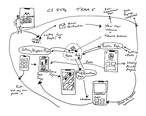
During the creation and refinement of our system path, an important characteristic that we discovered was what pages our users would visit frequently and how they would move between these pages. We settled on three main areas in which users would use our app: Activity Feed, User Profile, and Location Page. We also considered possible frustration/exit points which could lead users to leave the app like a lack of new posts from other users. We could avoid reaching this exit point by offering users more rewards for posting on days when there is a slow in-flow of new content.
Bubble Map
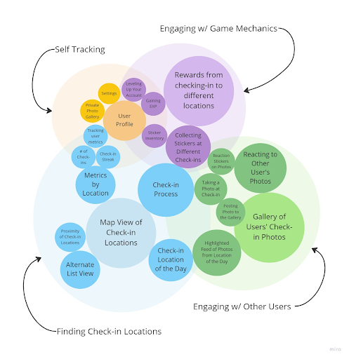
Note: The size of a bubble corresponds to the relative importance of that feature. The spacing between bubbles conveys the relatedness of different features.
Our team aimed to complete a bubble map focused on four core components of our app. This helped us understand how we were going to balance the social and gamified components of our solution. A key takeaway from the bubble map was how there was a disconnect between gaining exp and the rest of the app. Later in our development, we decided to replace exp with a metric that is less abstract but equally rewarding to build up. We decided to track the number of miles that users have walked. Overall, the bubble map was useful for visualizing important key features of our solution and understanding how they overlap with each other.
For more detail, look to this blog post.
Assumption Mapping & Testing
We had two top assumptions in which our team needed to validate our solution.
1. We believe that users are more motivated to go outside for narrative and collection purposes rather than for purposes tied to socialization.
In order to test our hypothesis, we worked with four participants. The participants were split evenly into two groups. One group was given the task to socialize with a friend at the location. The second group was given the purpose of collecting a sticker reward wrapped in narrative language.
During the experiment, we found that participants went outdoors in order to receive a sticker reward at higher rates than those with the intent to socialize. This affirmed our belief that gamification was an important and effective feature. While these results were beneficial, it is important to note this study was conducted on a small scale and for a short duration.
2. We believe that the distance from a user to a location will impact their engagement with the activity. Then further the distance, the less likely for them to engage.
For this assumption test, we used two groups of three participants, with each group living in the same vicinity of each other. Each group was instructed to visit a specific location on campus, with one group given a location with a more significant distance (5-8 minute bike ride away) and another was given a location within a close proximity (~2 minute walk away).
The results from the experiment did indeed back our hypothesis, the group with a closer location had a 100% success rate while the group with the out of the way location had only one of three participants go to the location. These results clearly indicate that distance and effort is a factor, but again, the drawbacks of this experiment was the number of participants and the duration of the study.
To read more about our assumption mapping and testing, check out our blog post on our assumption map here and our testing here.
Building a Solution
Wireflows to Sketchy Screens
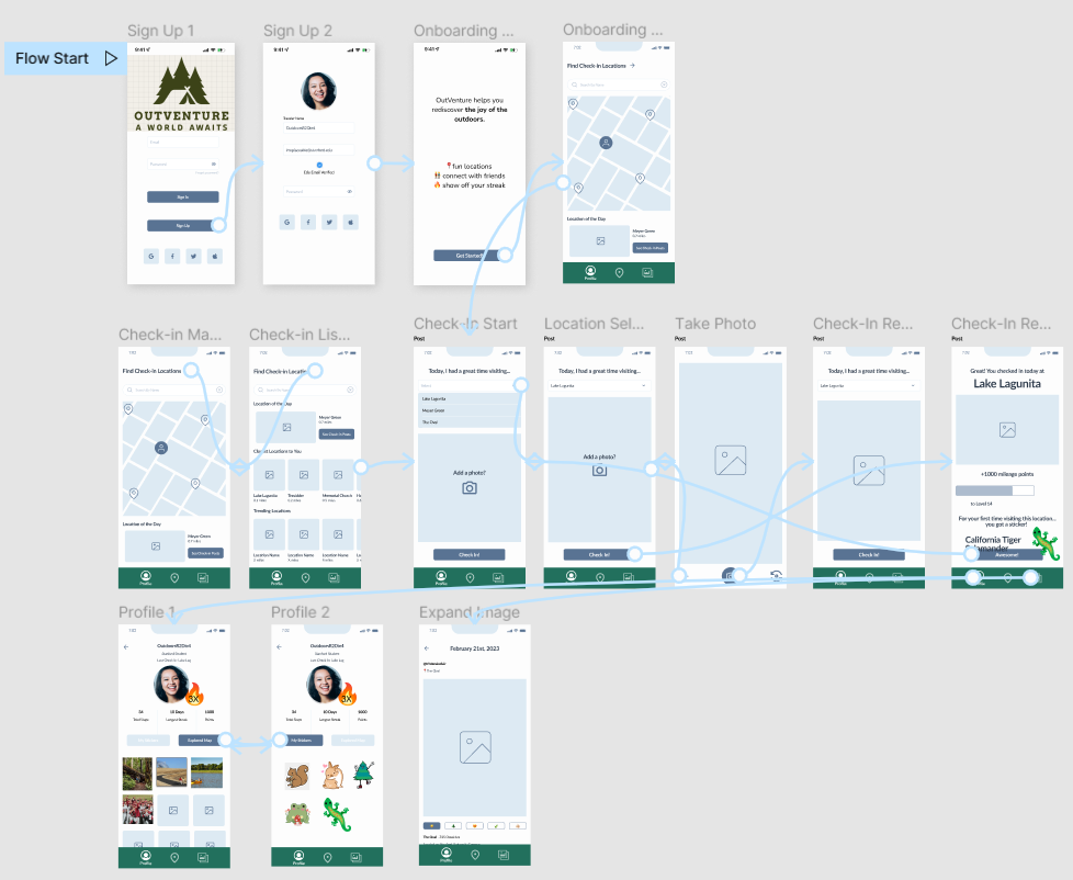
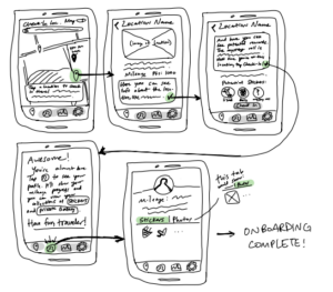
In our wireflow process, our team inadvertently went further than the very low fidelity wireflows needed. After outlining what sub-flows we wanted in our app, we made low-to-mid fidelity wireframe iterations of each flow. The overall path we were aiming for followed having users sign up or log in, check in at a location, post their photo, gain a reward, and then have options to browse the public image gallery or view their updated profile. These last options could also be directly navigated to from a user logging in, for the shorter daily path of wanting the social affirmation or personal accomplishment feedback of their app usage thus far. See more about this wireflow process here.
After incorporating our main feedback, we would later put further emphasis on the sticker collection incentive throughout, add photo viewing and settings to the user profile subflow, and most significantly, merge the check-in flow with the finding locations flow. Upon revisiting, our reasoning was that this made more sense as an entry point to check-in and was more intuitive than having a separate icon in the navigation bar. The final happy path can be visualized as below.
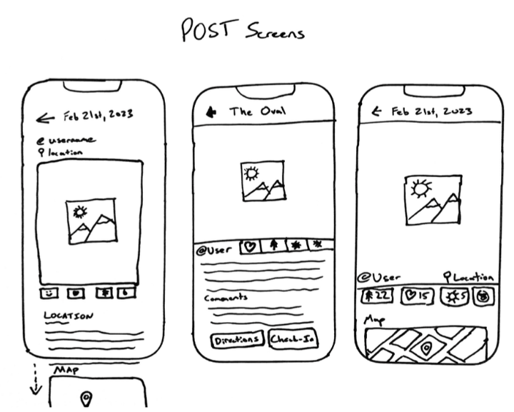
As for our sketchy screens, in summary we each made screens for the aforementioned flows that we worked on. Some of the main UI decisions included having the viewable personal sticker gallery alongside a personal photo gallery as two clickable tabs in profile, so that the user can switch views between what personal info they want to see easily: collection of rewards or photo memories. We decided to go with emphasizing the location photo in the public image gallery to encourage viewing users to also go to the location. Finally, we also decided that the rewards screen should primarily focus on showing the photo preview to affirm the user’s task and once again, encourage posting. Stickers are deemphasized in this layout, but to retain significance, once the button to show the sticker reward is clicked, there would be a separate temporary overlay with sticker focus.
Below are some of our sketchy screens. Click on them to see the full image! You can see all of them as well as more details about them here.

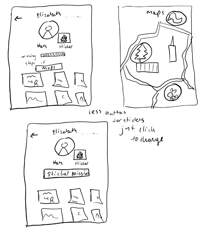
In addition, we later also explored more sketchy screens for our Onboarding flow specifically, as seen below.
Branding: Mood Boards & Style Tiles
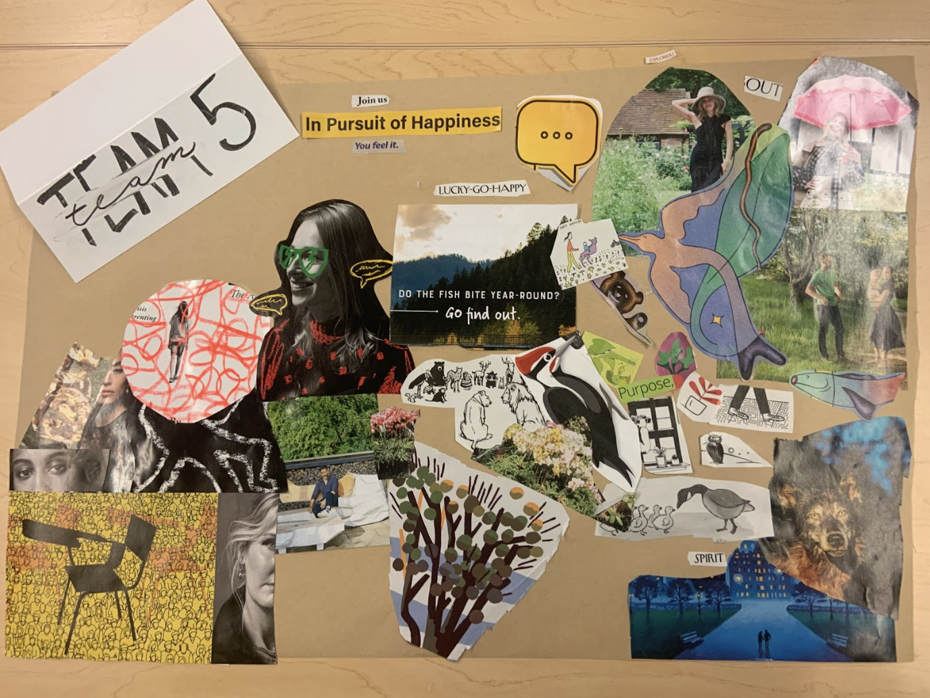
After brainstorming a few mood boards to help the product come to life, our team focused on creating a product that is joyful and calming to use. We wanted our app to have a nature-loving and open personality that invites users to come on an adventure outside that could inspire mindfulness and calm. While using the app, we hope that users will feel a mix of excitement and groundedness. We imagined our app to seamlessly prompt our user on an adventure without taking away from calming properties of the natural surroundings.
Our final mood board represents the transition from a stressed and anxious state of mind to what we wanted our user to feel after going on an adventure with our app. On the bottom left corner, we see images of dark colors and faces in isolation. As we move up to the upper right corner, there are visuals of animals and nature which leads us to a happy state of being outdoors. Our style tile encapsulates these desires for our app to transition our users to a happy and calm mood with practical design choices like an earth-toned color scheme that includes some joyful colors. The cartoonish stickers also elicit feelings of joy and fun while our fonts are clear to read.

Usability Testing
For usability testing, we delineated five key tasks we wanted the user to accomplish. They were to (1) onboard onto the app, (2) check-in at a location, (3) view check-in locations around them, (4) scroll through their activity feed, and (5) view their profile and settings.
Generalizing our salient issues, there were 3 primary things we wanted to address.
- Onboarding did not differentiate itself from the other UI elements, which confused users. Alongside this, we were not taking advantage of the opportunity to show a potential user what they can accomplish and enjoy in our application during onboarding.
- For addressing this, we tweaked the value prop screen to feel less like an advertisement, shifting towards getting the user excited for the flows to come. We also made the onboarding bubbles pop to differentiate them from the standard UI.
- Potential users were confused about what checking-in at a location entailed.
- To address this, we elaborated on proximity, range of locations, etc. The Figma is now more intuitive to understand the incentive and feasibility of checking-in at a location spot.
- Potential users did not understand mileage points.
- As a core part of our gamification approach, clarifying this was essential. To address the issue, we renamed the total cumulative miles traveled in the user profile to something more intuitive – “Miles Traveled”. Additionally, when a photo is posted, it reiterates the mileage system’s importance by noting “You traveled X miles”.
Moving forward, tangibly, we want to continue to clarify the sticker concept, which was one of the main feedback points from the project expo. Also, intangibly, we want to ponder what a power user looks like. How do we continue to incentivize app engagement when a user has collected most stickers? What does engagement with the app look like in a more suburban area or are we limiting it to college campuses. We’ve previously left our target demographic slightly vague to have a larger potential market share, but deliberating and deciding on this will go a long way.
Prototype
Altogether, we created a clickable prototype for our app. You can view the final prototype here.
Our prototype went through several changes from draft versions. Extending from our wireflows and low/mid wireframes, we implemented flows for Sign Up/Login, Onboarding, Location View, Check In, Profile, and Activity Feed. In the below sections, you can follow our decision process for these flows and the changes we made through feedback and iteration.
Sign Up/Login


We wanted our Signup flow to be simple and clean, providing quick login through common portals like Google or just adding a username, email, and password. The process should be as easy as possible to encourage user sign-up, and as users can be anonymous in our app, we decided to exclude fields like full name or other unnecessary personal information.
In our final version, we increased the color contrast on our buttons to be more accessible and easier to read. We considered adding other ways to login like Duopush, but felt the current lineup was the most ubiquitous as not everyone in our audience uses Duopush. We do want the app to target general students/young professionals and not just Stanford students, though our current prototype focuses on the Stanford location.
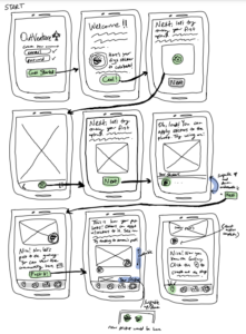
Onboarding
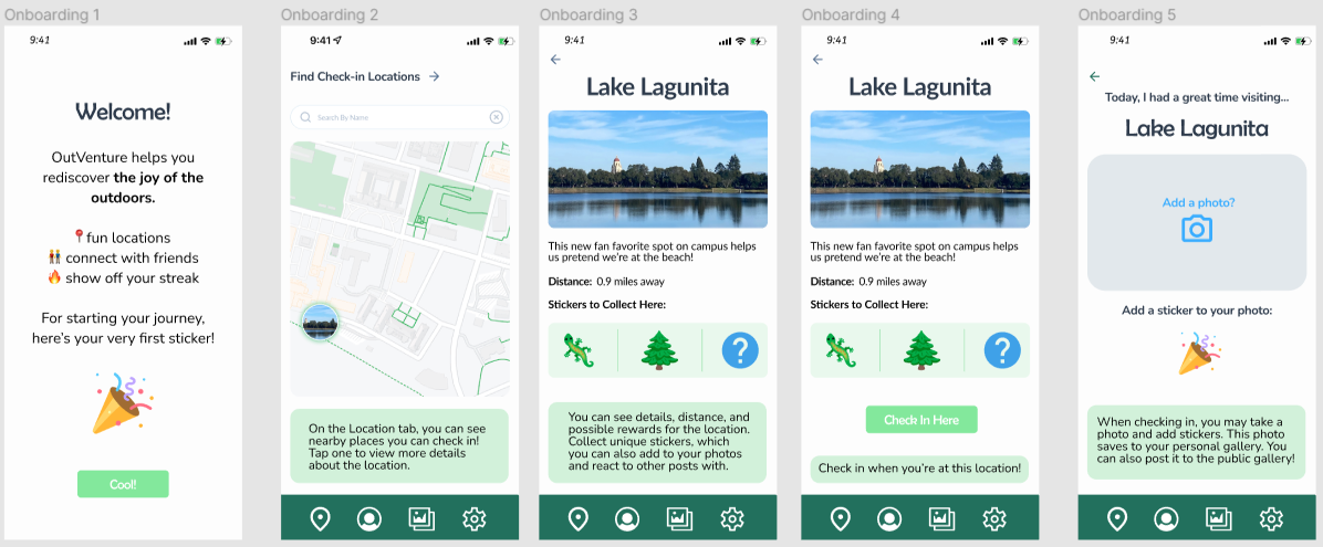


In our Onboarding flow, we wanted to take the user step-by-step through the main use of the app–finding locations and checking in at them. Through the messages, we explain how to use each part of the interface, how to interpret the information shown on specific location pages, and the significance of stickers.
The most important feedback here was making this flow clear as onboarding and not just a standard part of the app, as the draft messages blend in with the regularUI. We remedied this by making the messages a temporary overlay with a dimmed background, disappearing as the user clicks through the flow. We also cleaned up the explanations.
Location View
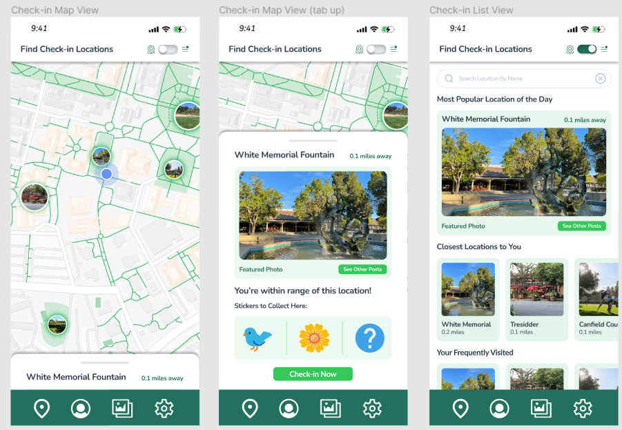
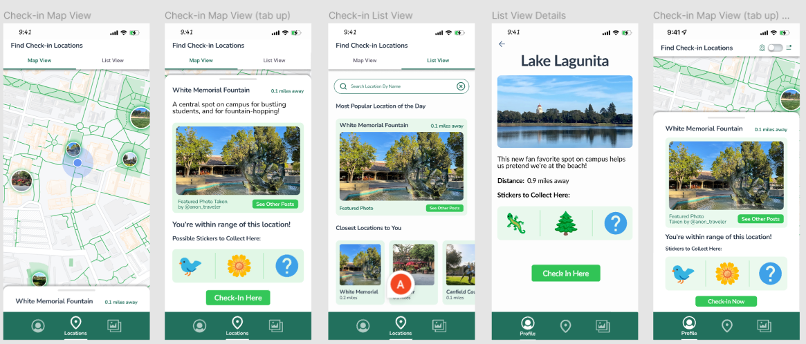
Our location map flow emulates the familiar UI design of Google maps, with the icons of specific location check-in spots shown. We wanted this to be the default way to view the map as users can directly see where locations are relative to themselves, and easily pull up more details by tapping on the location icon. Alternatively, we also provided a list view for users wanting to view and explore the information for all locations. Useful categorizations besides proximity could also include popularity for the day or personal frequency.
In our final version, we increased the radius around the user’s location in the map view to better emphasize that they can currently check in to locations within that proximity. We elaborated on the different views and changed the way to switch between them from a switch to tabs, as this was more intuitive.
Check In
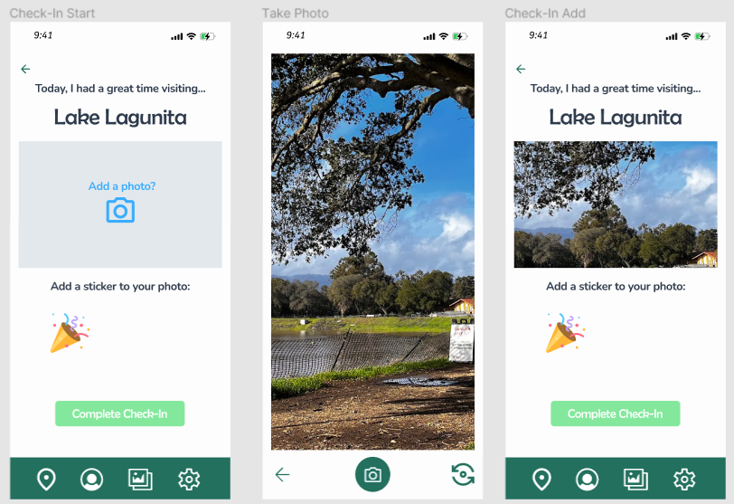

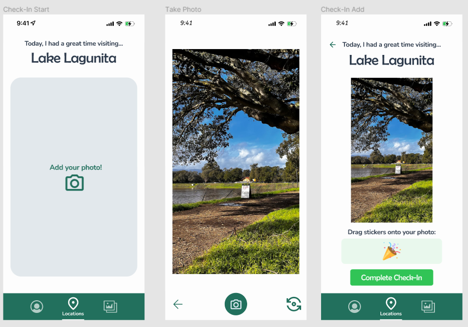

We intended for our check-in screens to provide an easy, intuitive way to check-in following the natural order users would take, given this would be a daily task. Hence, the location is automatically given, and users need only add a photo. After taking a photo, they may optionally add stickers to the photo. We cleaned up the way to add stickers to the photos and updated the layout to give a more accurate preview of the photo the user had taken in the final version.
Most significantly, we also tweaked the rewards screens. For our app overall, we found that mileage points were confusing and not tied to anything else important, so we decided to remove the middleman and report to the user the distance they traveled directly. Instead for our game aspect, we focused more emphasis on sticker collection, and emphasize this with a separate overlay for the sticker reward and interactivity with the mystery sticker, for instance. Upon checking in, we also ask the user if they would like the photo to also be available on the public feed, using color to encourage users to do so.
Profile


We wanted our profile page to show the user their personal accomplishments within the app. This thus includes tracked metrics, personal sticker collection, and personal photo gallery. Initially, we had ideated several kinds of metrics, including “mileage”/distance traveled, how many days users had been consistent on the app as a “streak”, and the number of locations visited.
Our final version does away with the streak metric as it is unclear what the importance of this is in the context of our app. We focused this instead on the number of stickers collected to synergize with the display and the sticker gamification in our app overall. We also moved Settings into the profile, rather than having it as a separate piece in the navigation bar. We decided to make this change as it was more intuitive and also associated with the user’s personalization.
Activity Feed


Finally, our public image gallery flow shows other users’ posts with sticker reaction interactivity. We emphasized the location images as the main goal of this section is to encourage the user to visit the viewed locations. The ability to react with stickers also adds a feeling of community and usefulness for sticker collection.
To keep with the anonymity of our app as well as it not being the primary focus of sticker reactions, we decided not to show which specific users were behind them. However, we added numerical indications for each sticker to give a better idea of general engagement. We also changed the title from Image Gallery to Activity Feed to give a better sense of what this flow was and differentiate it from the user’s personal image gallery.
Ethics
In an ever changing technology landscape, it is increasingly important to consider the ethical impacts of progress. Especially in a class focused on finding solutions for behavioral change, there is a distinct need to consider if the desired behavioral change is something that brings positive impact to the lives of individuals. Researcher Borgefalk argues that “persuasive technology research community is uniquely positioned to deal with the ethical and moral challenges with pervasive industry platforms and that it has a responsibility to address and act on these challenges” (Borgefalk 157). Individuals wanting to create persuasive technology have the responsibility to challenge these industry powers and keep ethical considerations in mind while creating their own solutions. For our team specifically, we have discussed various design choices that impact our ethical “footprint” while researching a solution to bring users to be active outdoors.
One of the issues our team has brought up is the distinct data privacy problem while handling user’s location data and also their pictures. Since users have the ability to post on public feeds that show their check-in locations, this public data could aid negative behaviors like stalking where people could trace someone’s recent location. A previous reading “From Why Privacy Matters Even if You Have ‘Nothing to Hide’”done on data security says that “aggregation emerges from the fusion of small bits of seemingly innocuous data. When combined, the information becomes much more telling” (Solove 5). A potential stalker could trace routes of check-in locations to find patterns of transit in different parts of the day and discern potential characteristics from the individual. In order to combat this issue, our app will have users confirm whether or not they want individuals to start and continue following their activities. In addition, the app always asks the users whether or not they want to post their check-in photo to their feed for their followers to see. These checks will enhance data security and empower users to make decisions for themselves.
Another important aspect of our solution to consider is the gamification aspect to encourage walking outdoors and the subsequent rewards that come out of the completed tasks. An article from Fast Company investigates the dark sides to gamification and notes the experiences for Disney employees. A union organizer speaks out on the issue saying “‘The scoreboard incentivises competition,’ said Topete. ‘Our human competitiveness, whatever makes us like games, whatever keeps us wanting to win, it’s a similar thing that was happening. Even if you didn’t want to.’” (Gabrielle 8). These experiences illuminate on the negative impacts on gamification where employees were motivated to work longer hours through gamification. In order to ensure that our reward system would not take advantage of people, we sought to include benign rewards like collectable, cute stickers when the user goes to a certain location. In addition, we made sure to avoid using gamification to increase productivity or monitor certain behaviors. We made sure while onboarding the user to maintain transparency about the system of collecting stickers before they start using the app.
More broadly, our app has the potential to cause positive behavior impact by encouraging users to be more active outdoors. Our solution brings users outside with the premise of collecting fun stickers and helps them feel more connected with friends. This solution is timely due to the current mental health crisis where individuals can often feel “stuck” inside their environments. However, currently our app promotes an emphasis on mobility and ableism, sending users to various far locations and rewarding them to visit farther places. How can accommodate users who have limited mobility and not exclude them from the potential benefits of using the app? Can we imagine different versions that bring people outdoors without the need to move long distances? These questions motivate our future designs to envision a more inclusive design for individuals with different mobility considerations.
Conclusion
We believe we accomplished the learning objectives set forth by the teaching staff throughout the development of OutVenture. From the start, learning about behavior monitoring, targeting the right audience, conducting research, and to the finish, ideating and iterating on our ideas, and polishing our final product, we were able to create positive progress on our app. This class has been a valuable learning experience, and we feel confident in the principles of behavior design we’ve learned this quarter.
If we had more time to continue developing our project, we would increase the amount of time dedicated to collecting user data: potentially conducting more assumption mapping and testing or even iterating upon our intervention study with a larger test pool of users. We had success testing and gained valuable information from insightful interviews, which we valued in our creation process. Furthermore, we would love to spend more time usability testing and iterating on our clickable prototype. With this portion of the project only being the last few weeks of the quarter, we wish we could have had more time to dive deeper into the prototyping phase!
Developing a product is not a 10 week endeavor, it’s a continual process that takes time, effort and persistence. However, in this short time, CS 247b has been an incredible learning experience that has equipped us with new skills to apply in our future projects and potentially our future careers. We are grateful for the opportunities we’ve had to learn, grow, and collaborate with our peers and instructors.


