
Towards More Meaningful Breaks
By: Arjun, Michael, and Serena
Chapter 1 – Our Call to Adventure
🚩 The Problem
Our team is tackling break time: specifically, how we can help people engage in activities that are restorative and energizing during their unstructured work/study breaks. Like most ideas, this came from a deeply personal place. All of our team members had one experience or another where they finally logged off of that exhausting Zoom class, and had 15 minutes before they hopped on another one. And at this moment, we were all faced with the same choice – spend that time relaxing, recharging…rejuvenating as some literature puts it! Or jump on the most easily accessible social media app. And far too many times, we chose the latter. So, the behavior we sought to change was that instinctive drive to open social media during 15 minute breaks, and hopefully substitute that behavior with something more meaningful.
🧙🏽♂️ Learning from the Experts – Lit Reviews and Comparative Analysis
From our lit review, we didn’t find the “magic bullet” that we were hoping for – that one break time activity that would miraculously make everyone equally energized. But we did learn some insights that would help us. First is the idea of recovery, a measure of how much activity not only energizes someone in the moment, but afterwards as well. Meditation is a high recovery activity, for example, as it clears your mind for whatever you have next. We also learned of something that’s distinctly not a high recovery activity – purely productive tasks. “Activities that resemble chores are less beneficial when it comes to recovery,” one source said. Instead, other sources hinted towards creative practices as potential sources for high recovery activities.
We then turned to a comparative analysis to see the strategies employed by actual apps on the market. Most apps tend to focus on a specific break time activity (language learning for Duolingo, meditation for Calm, etc), and then try to hold users in that one app. Here’s what we learned:
- Visual Continuity, and the idea of “building” something with your habit (in Forest’s example…building a forest) is powerful – From Forest
- Social accountability is another powerful tool to hold yourself to your break substitution – from Forest and Duolingo
- Small, actionable activities significantly reduce activation energy – From Duolingo
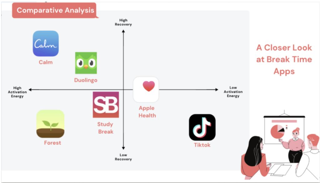
Our 2×2
But, most significantly, we found that there is no app that was both high in recovery yet had extremely low activation energies. Maybe we can change that.
😊 Learning from our Peers – Synthesizing our Baseline Study
All the while, we were conducting our baseline study in an effort to get tangible evidence of how people spend their breaks. We didn’t get much more specific than this – we didn’t want to prime our participants in advance on what a “good” or “bad” break was – we just wanted to observe the status quo. We went for a simple paper tracker. The idea – you have a log right by your desk, and every time you take a break, you simply write down what you spent the most time doing, and how long your break was. Simple. And if you miss one? No worries, you can go back in and fill it at night. Here’s what we learned:
While some people enjoy using social media on their breaks, most people are actively trying to cut back on their social media usage – but fail to do so. Common phrases we heard in our baseline study and in our post-interview survey were “Oh wow looking at my time spent on social media is really sad” and “I really need to do something else besides use TikTok.” In our post-interviews, we tried to dive into these goals and motivations, and there was one blocker that showed up over and over again. The uncertainty. You can spend as much or as little time on TikTok as possible, and there’s no thoughts required. But a walk? Who knows if you’ll come back in time for your next class. Starting a doodle? What do you draw? What will you use?
But, over the course of our baseline study, we did discover a few “shining stars” – people who wanted to decrease their social media usage during breaks AND had successfully done so. So what did they do? One activity was keeping a handy list of “Things to do during breaks.”
So we then began thinking – how can we take that, and apply it to more people?
Personas
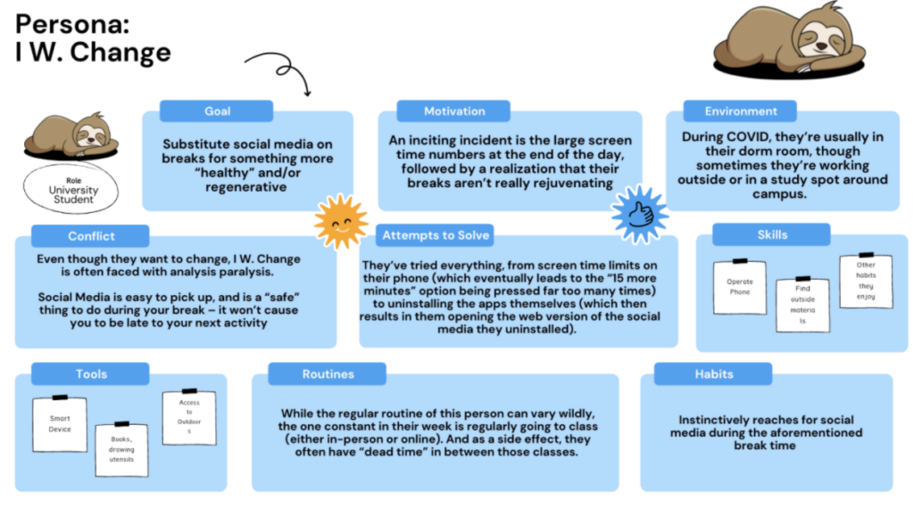
From our baseline study, we were also able to parse out 2 distinct types of people. Or in other words, personas. First, we have I W Change – someone who wants to change their habits, who has tried hack after hack to make their breaks more meaningful but simply hasn’t been able to do so. Here’s some more about them ->
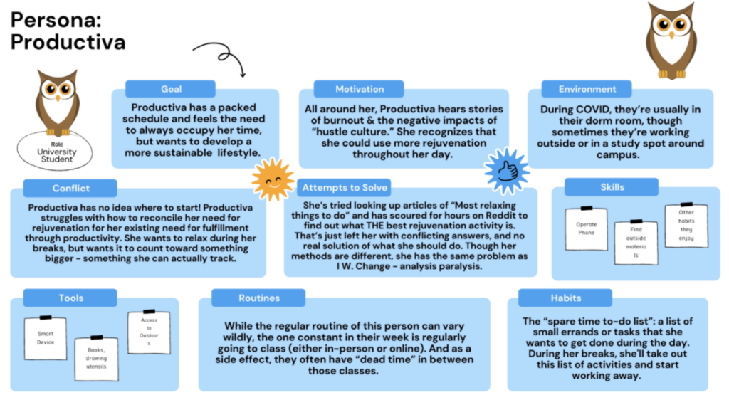
Our other persona is Productiva. Much like I W. Change, they want to change and spend their breaks more meaningfully. Unfortunately, their blocker is the break itself – they either have no time in their day to take a break, or feel guilty if they’re not purely “productive” during their break. Here’s a deep dive on Productiva ->
You can learn more about each Persona and their Journey Maps at our blog post linked here (https://highercommonsense.com/cs247b/journey-maps-and-provisional-personas-write-up/).
Chapter 2 – The Intervention
🔬 Research Questions
Over the course of what we’ve learned so far – 2 methods in particular have stood out as ways to enable and enforce more meaningful breaks. If we had unlimited resources and unlimited time, we’d methodically isolate variables, and attempt to determine just how effective each method is. But, we don’t! So here are the two research questions we’ll seek to answer over this intervention.
Question 1 – Lowering Activation Energy: Will offering people a tailor-made list of alternative break time activities reduce the urge to use social media during their breaks?
This solution was motivated by the baseline study participant (described earlier) who would keep track of a list of todos, and would keep them on hand for whenever she had a break. While this exact act is a bit more productivity oriented than what we’re aiming for, the idea of having a list of meaningful break ideas readily available as a means of lowering the activation energy it takes lower their activation energy is something we want to test out.
Question 2 – Social Accountability: Will the social mechanism of a public group accountability mechanism encourage them to choose the alternative break time activities over social media?
This solution was motivated by a mixture of our own intervention, and a pattern we saw appearing over and over again through our competitive analysis.
🗺️ Our Intervention Plan
We designed an intervention that’ll hopefully answer both of these questions at once. The premise is simple – we, the researchers, do the work of coming up with alternative break time activities for the participant to do – lowering the activation energy. After a pre-interview where we learn about the participant’s goals and motivations, we give them a list of 3 mini activities (mini defined as <15 minutes) during their breaks. Over the next 5 days, the goal is complete activities from this list during their breaks.
Additionally, we designed a social accountability component to increase the motivation to complete the alternative break time activity. We put each participant in a group with the other participants of the study. Every day, we asked them to send just a quick picture of them completing the break time activity to the group chat. At the end of the day, we did a quick tally of who has and hasn’t posted to the group chat.
Our results can be explore here: https://highercommonsense.com/cs247b/towards-more-meaningful-breaks-our-intervention/, where we go in-depth through connection maps and such. Some major takeaways:
- When we say lower activation energy, it *really* needs to be lowered. We’re talking being told “go outside for a 10 minute walk since you have 15 minutes between classes” level granularity.
- As such, the curation of timely notifications is key. In response to this, we plan to integrate directly with the user’s calendar to identify breaks in their schedule, and send them reminder prompts. These will be soft nudges to encourage the use of our app when they need it most.
Chapter 3 – Making some Maps
📍 Mapping
System Path: In the figure below, we outline the system path for our MVP features. As you can see, we have the user flow for starting the app, adding activities, sharing with friends, and checking their dashboard. From the system path, we learned that our setup process was too long and needed to be shortened. We have to decrease the friction necessary to get the users onboarded while also ensuring that they understand what our application is designed to do. Moreover, we learned that our app should be designed around three central features. The first is how to easily onboard any new user onto the platform. The second is how to ensure that the user does their activities and logs them and finally and perhaps with the most difficulty designing a social network around doing the breaks.
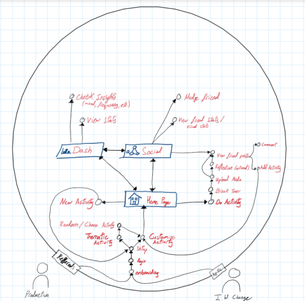
We found the system path to be one of the most useful mapping methods as it helped us identify how users flow in and out of the app and how we can facilitate their interactions. It also identifies points of exit that the user might leave the app. Thus, for those points we want to ensure that the user leaves with the energy and the positive impact that would convince them to come back to the app.
Thus, we think we would definitely use the system path mapping method again as it truly helped us identify our key features and the most vital paths our users are going to take.
Bubble Map: For our bubble map, we discussed where every aspect of the MVP application lives and the sections under each they reside. From this exercise, we learned how to better group our pages and how to better structure our system map. It also really helped us identify how to split the tasks between the team since every team member can focus on building on part of the user experience and then we discuss together.
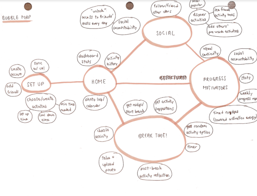
We found that this was very useful for also brainstorming ideas once we came up with the categories. For instance, in the progress motivators, we found that maybe visual continuity and social accountability might be inspiring for some, but also things like statistics and weekly progress reports might be inspiring for others.
I think we would develop a bubble map again, especially in sync with developing our system map. We think this approach can help us think about the structure as well as the content of the app in a very fluid sense without getting bogged down in the actual user interface.
In summary, we found maps to be a very useful tool to tell spatial and temporal stories. Those stories helped us build a better product and also helped us iron out our disagreements. Across journey maps, system path diagrams and as mentioned below our assumption mapping, we discovered that we had different understandings of our own product. We would use the same words to describe very different phenomena.
🤔 Assumptions Map
As we unpacked our assumptions, we found a lot of common themes. Firstly, while looking at what things are feasible, desirable and viable, we discovered that there are a lot of points where we and the user might have conflicting interests. Even though we were trying to help our users as much as possible, there were still some ethical considerations. For instance, the question of storing their data or nudging them to join a social network. Questions that we thought were very easily answerable, we found that they were almost impossible to answer.
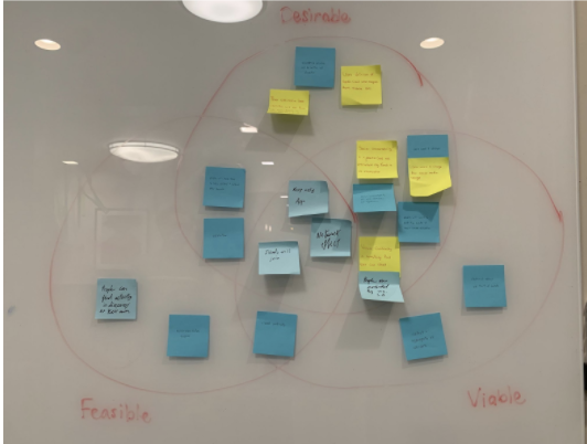
Secondly, in our assumption mapping, we plotted a 2×2 with severity of the issue on one axis and knowledge about the assumption on the other axis. We discovered that the network effect was one of the most severe issues that we did not know much about. We discovered that having a discover section might turn out to be extremely harmful to our users as they can be exposed to “activity influencers” that attempt to show off their talent. This will not only discourage our users from doing their activity, it will also lower their self-esteem.
Thus, after synthesizing this information, we decided that there were three main questions we would like to answer.
1) Does Visual Continuity (i.e a tree that grows as you complete more and more activities) prompt individuals to do an activity more?
2) Some people reported their alternative break time activity becoming just another habit that they had to do. Does adding a “random activity” option and gamifying the process a bit help people more spontaneously complete an alternative activity?
3) Lastly, a core assumption of our app is that the activities we recommend are restful, not stressful. Otherwise, what would be the point? To test this, we plan on adding a reflection component to our intervention, to gauge just how restful our recommended activities are.
We chose to specifically focus on those questions because we thought that they were the assumptions that we knew the least about and their results would impact the project the most.
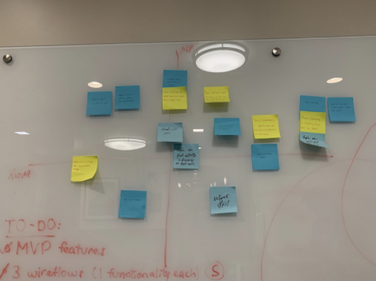
Assumption Testing
Assumptions to Test: After considering for (a) the degree of uncertainty and (b) the degree of significance, we decided on these three assumptions to further investigate:
- Our suggested break activities are actually restorative.
- Random activity suggestions are an effective source of motivation to complete an activity during breaktime.
- Visual continuity is an effective source of motivation to consistently complete an activity over multiple days.
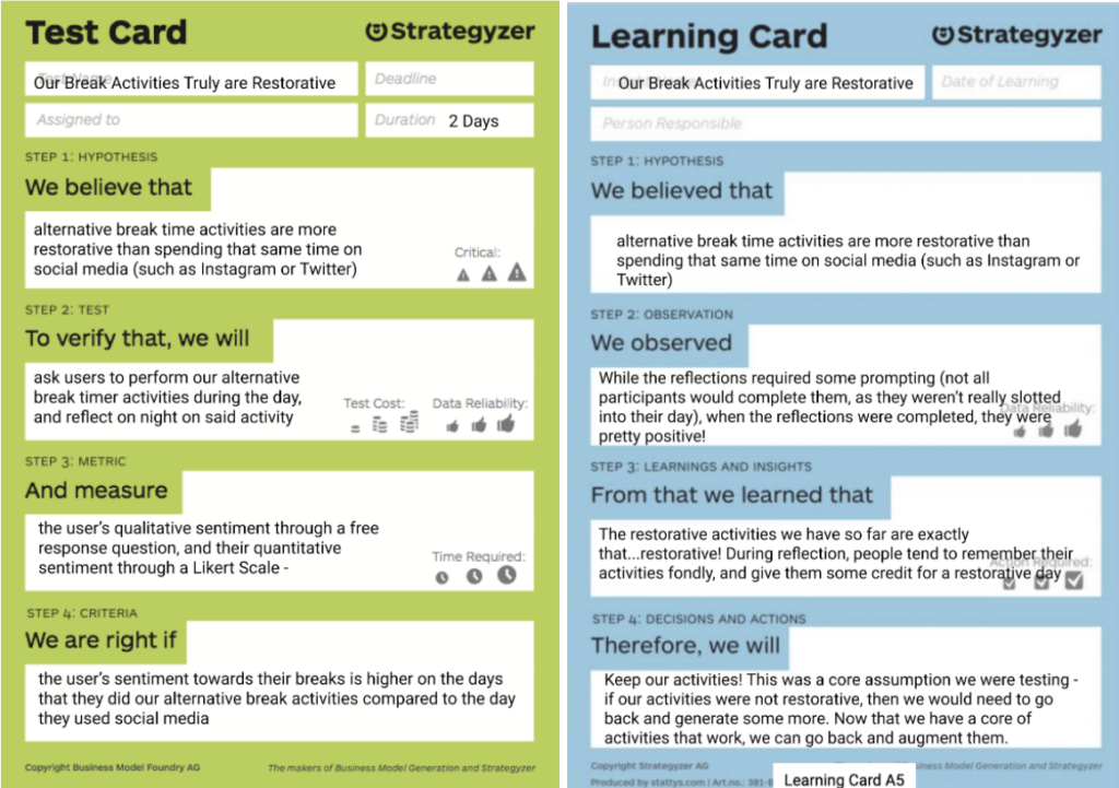
We decided the best way to test these assumptions was to conduct a “mini-intervention” study. This was because our participants were already used to the format, and thus could be onboarded quickly. In addition, 2 of our assumptions required longitudinal depth, and the intervention study was the best vehicle to get that information.
Below are our hypotheses and the findings from our Assumption Test for each assumption:
Assumption #1: Our breaks are restorative.
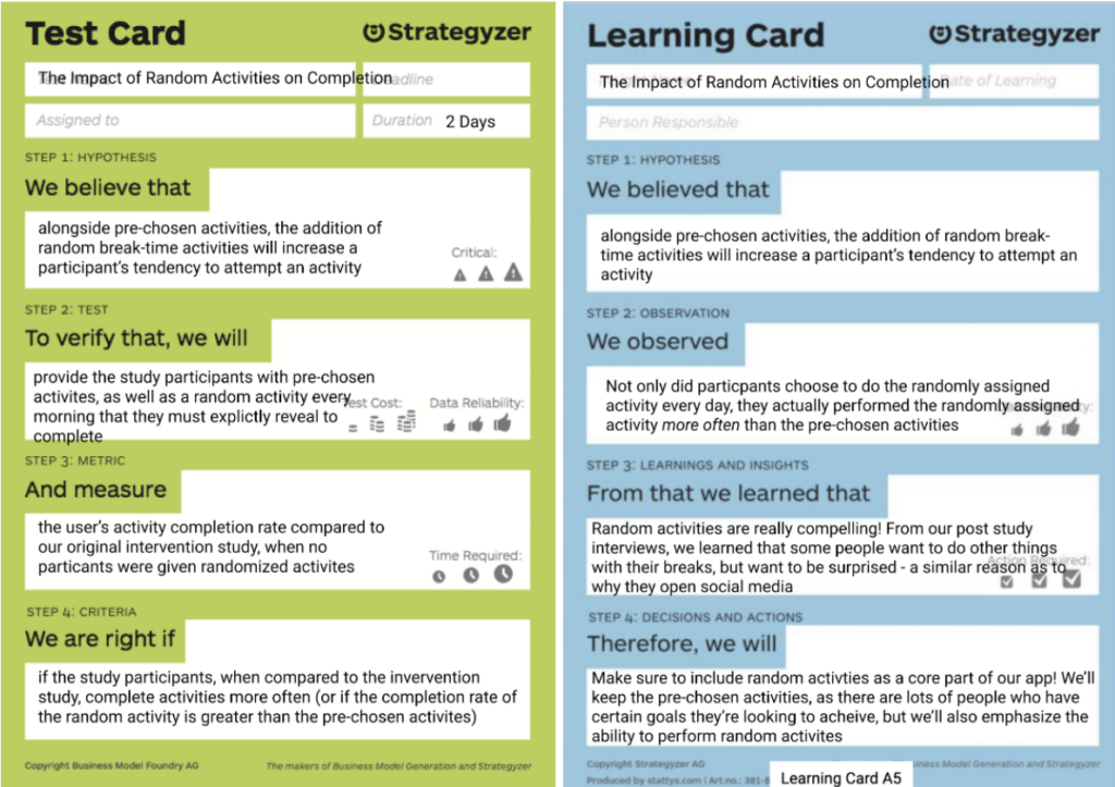
Assumption #2: Random activity option as motivation during breaktime.
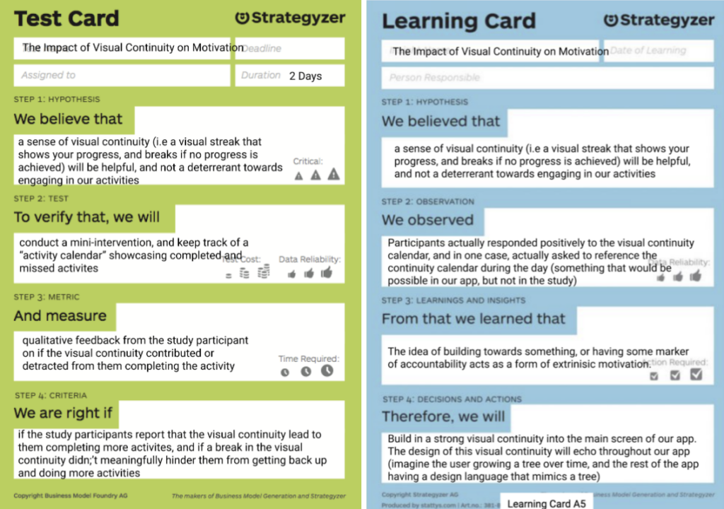
Assumption #3: Visual continuity as motivation for longitudinal consistency in activity completion.
As shown in our Learning Cards, our Assumption Test was super helpful for shedding more light on each of our assumptions! We came away with the following main takeaways and action items from our experiments results:
- Our activity suggestions were indeed perceived as restorative by our users! Some accredited the completion of one of our suggested activities to their day being restorative. This gave us confidence to move forward in designing our solution with our existing repository of restorative activities.
- The random activity option was compelling to our users! Similar to the appeal of social media (i.e. not knowing what you’re going to get), some people didn’t want to have to go through the effort of choosing what they did. They wanted to be surprised, and providing the option to get a random activity worked like a charm! Thus, we definitely wanted to incorporate this into our design moving forward.
- The Visual Continuity calendar worked well as a form of extrinsic motivation for our users to complete a breaktime activity. It worked similarly to Snapchat streaks, keeping our users accountable through the idea of “building” something over time. Moving forward, we also planned to interweave this visual continuity concept into our app.
Chapter 4 – Designing the Solution
In the early stages of our solution design, we identified three essential tasks that comprised the crux of our app:
- Add your own breaktime activities of interest
- Do an activity
- Share your activity once completed
As such, we created our first wireflows for these three essential elements, which can be found here: https://highercommonsense.com/cs247b/team-10-wireflows/.
Our next step: finding our brand. This involved a long, but very enjoyable process of unbounded brainstorming and collaborative refinement. Below is the moodboard we created as a team, which helped us begin to visualize the vague ideas of growth and rejuvenation we had talked about:
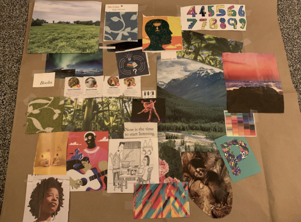
From this, we honed in on a few key themes and emotions for our brand: flow, invigorating, inspiring, rejuvenating, restorative, and vibrant. We then took these ideas even further and, through multiple iterations, eventually landed on our final style tile:
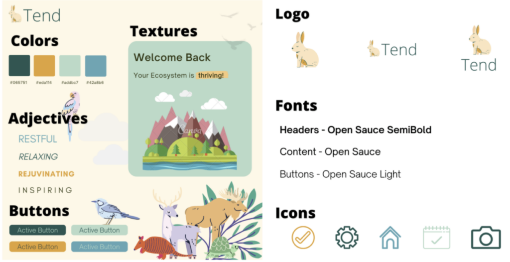
In line with the themes and emotions we extracted from our moodboard, we came up with an aesthetic for our brand that we like to call: “nature with a vibrant pop.” Another key and very intentional decision in our branding was the name of our app: Tend. Our aim is to convey a very specific meaning: short, but regular and sustainable periods of attention towards a goal. The type of effort that one applies toward tending, say a garden or flame, is exactly the kind of attention and energy we want our users to channel into their break times. Our vision is to help our users engage briefly, but meaningfully, with things that have a larger purpose: restoration, rejuvenation, and longer-term benefit.
With our brand solidified and ready to go, we then incorporated it into our app design. This was when we made the transition from hand-drawn wireflows into sketchy screens on Figma (https://highercommonsense.com/cs247b/team-10-sketchy-screens/) of the same core tasks. After this, we integrated our findings from the Assumption Test to create our first clickable prototype!
Clickable Prototype: https://highercommonsense.com/cs247b/team-10-prototype-version-1/
We then performed a usability test in class, and from it, identified a number of problems. The full report can be found here: https://highercommonsense.com/cs247b/team-10-user-testing-writeup/. However, some problems were more severe than others; below is a list of the most pressing problems that we found and made it our first priority to fix:
- Issue: As the user progresses through the Choose/Create Activity Flow, they are unable to go back and reverse a decision that they made. For example, once a user is specifying their activity, they have no option to go back and choose a different activity.
- Solution: Add back buttons to every screen and make sure it’s possible to reverse any action that the user might take.
- Issue: When the user tester looked at the icons on the bottom of the screen, they were completely confused as to what each of them did. The icons are generic such that they recognized them, but the tester was unsure as to what the icons actually meant in the context of our app.
- Solution: First, label the icons with the screens/flows that they take you to, so the user is not left guessing based on ambiguous icons. Second, Once the user is taken to that flow, the screen can be clearly labeled based on what button they clicked. For example, if they click the profile button, the profile screen that they’re taken to clearly shows the word “Profile” up at the top.
- Issue: When we designed our Choose Activity Screen, we designed it around someone choosing or creating their first activity. And thus, it is very “handholdy,” and takes quite a few steps to actually choose that activity. One of our usability testers rightly brought up that he could see himself wanting to add an activity relatively quickly.
- Solution: To enable quick searching and finding of activities, introduce a search bar to the top of the chosen activity flow, such that someone can be a maximum of 2 or 3 clicks away from any activity. The user can still go through the hierarchy, but if they know what they’re looking for, they can go straight to the search bar.
We additionally made tons of revisions based on a thorough revision of some of the ethics discussions we had in class, but one specific one to point out is our choice of default activities. We tried to select categories and activities such that regardless of ability, a user would be able to perform at least one activity that appeared on the initial list. Nothing would be more off putting than logging into the app, and seeing that none of the first few activities were for you, and we tried to counter that as much as possible.
Each of these problems, along with the rest of the issues discussed in our Usability Test report, were solved for in our final clickable prototype, which can be found below.
Final Clickable Prototype here! https://www.figma.com/proto/XaemR5gvnSVXXx2j589wUu/Wireframes?node-id=671%3A3432&scaling=min-zoom&page-id=671%3A2798&starting-point-node-id=671%3A3432.
We’re super proud of how far we’ve come since our first wireflows, but there are definitely still things we would love to either add or flesh out in more detail in the future.
Chapter 5 – The End?
And there we have it – the present day. We’ve absolutely loved the process that led us here, and we’re super happy with what we’ve made! If it were actually an app, we’d definitely use it. That being said, our app is far from finished, and if we were to turn this into an actual product, there’s still a few things we’d want to address.
- Nudges – As we talk about in our Mapping chapter, we put a lot of thought into our notification cycles, and what would make the most sense in terms of reminding users to “hop” back on into the app. All this has been from studies or our own intuition, and there is still work to be done on whether these notifications would work in a real world setting (i.e the notifications are coming from the app, and not from “your friend” as they were in our studies).
- Continuity – Our implementation of visual continuity is something that can always get better. Much like a game, there are always things to optimize, beautify, tweak the game mechanics of, etc. Immediately, we’d want to finalize the schedule of rewards for the visual continuity – how long would it take to get to the “best” looking village? How long would that take to decay? How does the leniency policy work?
- Generation of Activities – And lastly, like many other projects, ours relies on an assumption that there are interesting enough activity suggestions to make our app worth using. Sure, users can insert their own activities, but the premise of our app is that people don’t know how to meaningfully spend their breaks, and are downloading Tend to help answer that question. We have some initial suggestions, but to truly launch, we’d need to crowdsource a much bigger and broader list of activities.
What we took away from this and our next design effort
There are so, so many things we learned and would want to take to our next design project. We’re nearing the end of our report here, so definitely check out each of our individual reflections to learn more. But overall, we learned 3 big things
- Maps – lots of them. One of our biggest takeaways from the class was on the idea of systems thinking, and different ways to take that abstract concept and turn it into reality.
- Usability Guidelines – Much of the feedback we received on our usability testing could apply to apps beyond Tend. Things like “Clarity of buttons,” and “Lots of Back Buttons,” are just rules of thumbs in general, and are something that we will definitely use when designing apps going forward.
- Sketchy Screens – As a team that’s made wireframes before in different capacities because “that’s how it’s done,” the concept of sketchy screens was honestly amazing to see. They capture everything that a wireframe captures (or at least all the good parts), while also being much easier to create and leaving latitude for the designer to come in and do their magic (even if we are also the designers).
In Broader Society
Overall, we believe a world in which people take more meaningful breaks is a good one, whether it be because of Tend or not. As we discussed in the beginning of our report, sometimes the actions we take aren’t the ones we wish we took, they’re the actions that are easiest. Tons of people in our pre-study interviews mentioned that they wished they spent their breaks more meaningfully, -> few actually were able to do so. Directly citing our class discussion on well-being and universal values, our app helps promote self-direction – it gives control back to the user in how they spend their breaks. It also does so by injecting a bit of stimulation through the concept of “random activities,” that turn Tend from another habit formation app to something more fun and gamified.


