
I. Problem Finding
When searching for a behavior to change, we realized that scrolling was a common issue for all of us – and was chosen for our Measuring Me Take 2’s by 3 of our teammates, Eli, Jasmine, and Sujude. In our research we investigated the quick success of TikTok and the idea that binge scrolling was exacerbated by the stay-at-home effects of COVID. As we considered which aspects of phone usage we thought were most problematic, we decided to hone in on phone scrolling behaviors.
Baseline Study
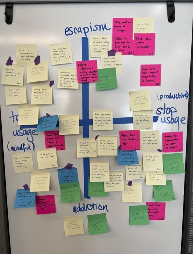
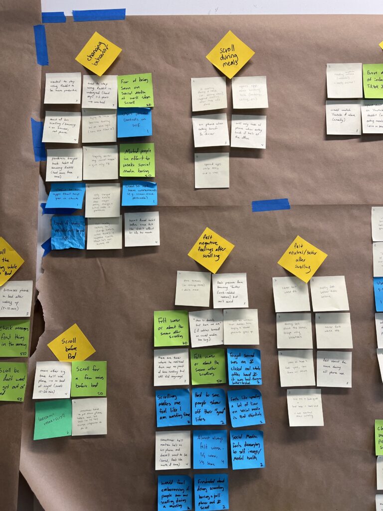
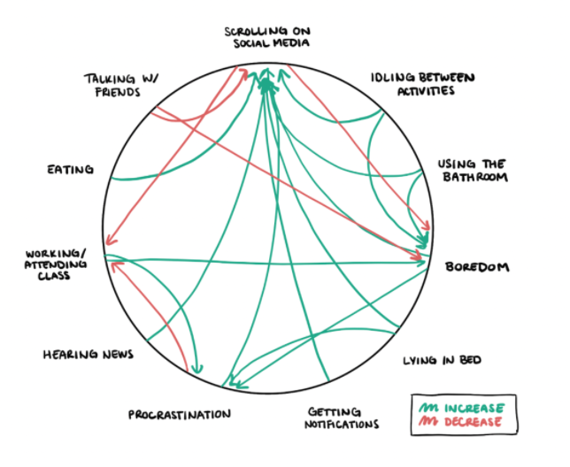
Our baseline study consisted of a pre and post interview and a survey for participants to complete whenever they scrolled. We asked them to share usage metrics, how they felt afterwards, and what led them to start/stop scrolling. This study led to a lot of insights: we learned that people tend to scroll for either a mindful break, or out of habit, and they tend to either want to stop usage and replace it with something, or just be more intentional with their usage. This informed our 2×2 for this class. We were able to find lots of great trends as well, like a negative feeling after usage, and that time spent scrolling varied wildly (from 5 minutes to two hours!) if not time-boxed. In future studies, we were really able to investigate mindless and intentional scrolling, and the effect of time-boxed scrolling.
Personas, Journey Mapping, and Story Boards
The study also led us to our personas:
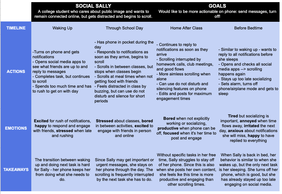
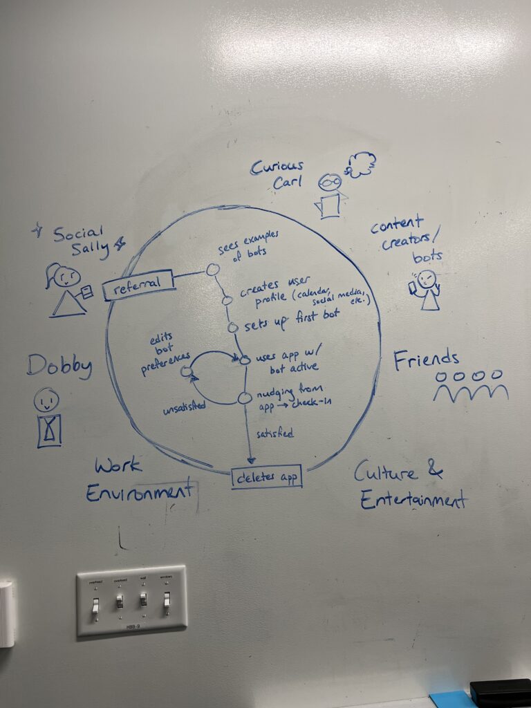
- Social Sally, who uses social media for socializing and entertainment
- Curious Carl, who likes to use social media to learn
- Dobby, a professional who scrolls during short breaks
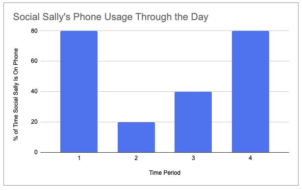
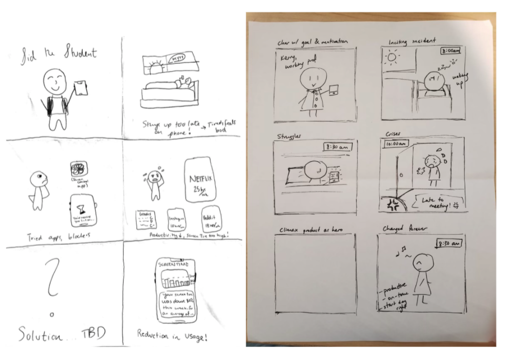
These personas came out when we tried to categorize certain usage patterns. When creating our journey maps for each user in that assignment, we struggled to understand what we should focus on, but we realized what to include and created the following journey map afterwards for the persona we thought about most – Social Sally.
We also developed storyboards, to help the team decide where to focus within our problem and solution space.
Literature Review
Through our research on user scrolling habits, we found concerning trends around the ease of addiction to scrolling. In general the benefits of connecting with others and entertainment outweighed the costs, but users still consistently felt bad about using scrolling – for many, it was a guilty pleasure. As part of our research, we also found that scrolling follows a “variable ratio” reinforcement schedule, making it more addictive in comparison to consistent reinforcement. We thought that scrolling is here to stay, but this began to make us think about options to change scrolling behavior from the inside.
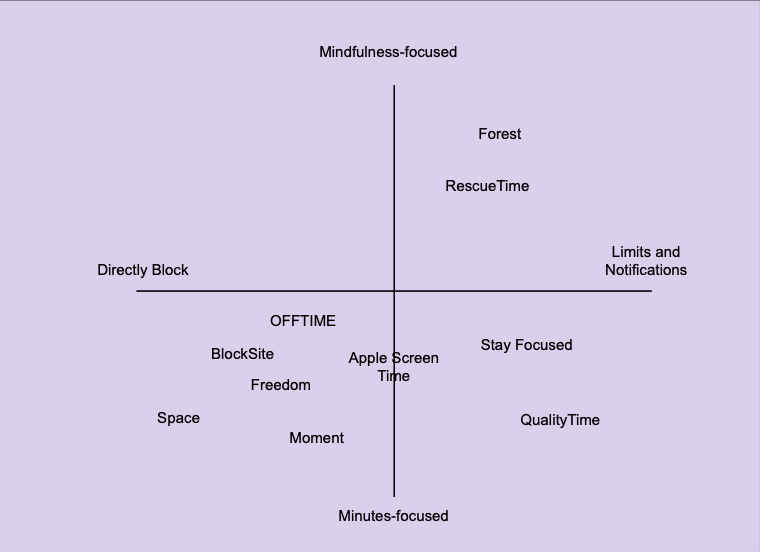
Comparative Research
In our comparative research, we mostly looked at apps that directly blocked users from accessing sites after a certain time period. While we did some more analysis on our blog post, our 2×2 shows that a majority of services focused on directly blocking apps after a certain number of minutes, rather than focusing on mindfulness or alternatives. Most of them are also external to the apps that they block. This made us think – how can we potentially directly change scrolling, not just block out entire apps?
II. Solution Finding
Ideating and Picking an Intervention
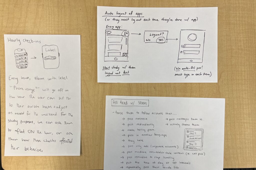
After we completed our study synthesis, literature review, and our comparative research, we had some idea of where we wanted to go with her intervention. We knew that our product should not be similar to any of the blocking products that already exist. We also knew that we wanted to focus on scrolling behavior in particular, not general phone usage. During our brainstorm in class following our research, we came up with four categories of product: mindfulness, altering feed content, gamification, and automatic restrictions.
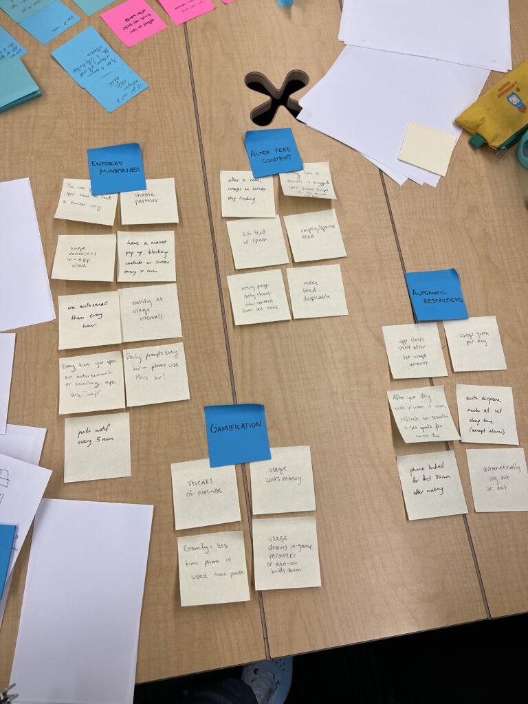
The three ideas we were most interested in were hourly notifications to reflect on mindful phone usage, auto logout from apps, and filling our media feeds with spam. After we drew these out onto our cards and got feedback from the teaching team, we realized that the spam option was both the most novel for this problem and the most interesting for us personally. It related heavily to our findings from the synthesis around directly focusing on scrolling, and we also didn’t see any comparable ideas during our research.
Intervention Study
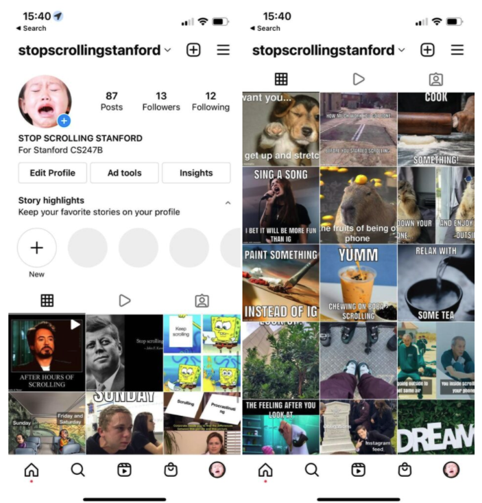
For our intervention study, we created an Instagram account @stopscrollingstanford to simulate what a bot created by our solution might look like and had our 6 study participants follow the account. Over a 5-day period, we posted memes to the account (around 1-2 per hour) either urging the viewer to stop scrolling or suggesting other activities they could do instead, and had participants track their social media usage as before. We found that the bot was not as influential as we had hoped — partly because participants rarely saw the bot’s suggestions in the right time or place to act on them, and partly because participants often saw the posts during break times when they had no desire to stop scrolling. If we were to run the test again, we might try to make the content more specific to our followers’ interests and better aligned with their schedules.
Mapping
Drawing a variety of bubble maps helped us to settle on an ideal structure for our website, as well as narrow down its most important functions: sign-in and onboarding; creating a bot; editing a bot; connecting a calendar; and connecting a social media account. Drawing our first set of wireframes helped us understand the most important functionalities we wanted to implement – enrolling and editing settings.
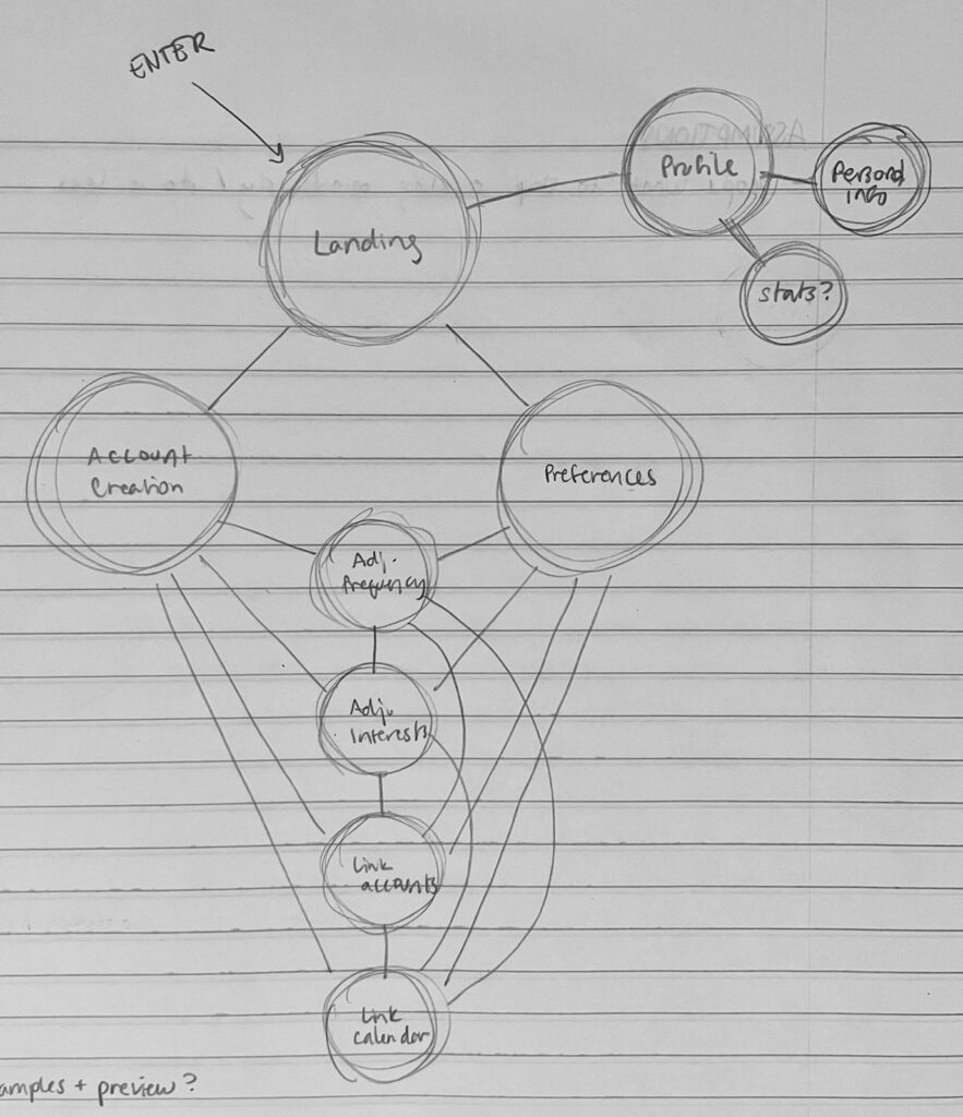
Our system path diagram helped us visualize the entire user journey, from entry to exit. This map was the most helpful as we thought about overall user experience, and we used it to frame out our prototype in the next steps.
Assumption Mapping
After that, our assumption mapping identified the following assumptions that would need to be tested before moving forward:
- People’s schedules are consistent enough for a scheduled bot to be useful.
- When checking social media, people browse their feed just as much as, if not more than, stories.
- People read the content they scroll past on social media.
To test these assumptions, we ran two concurrent tests, which resulted in 3 key findings:
- While free and busy blocks of time are reasonably predictable, any more granular scheduling is unreliable.
- Posts and stories are viewed with about equal frequency, so both could be useful in our solution.
- While stories are read slightly more often than posts, generally less than half of the people who see either type of content actually read or act on it, meaning we can’t rely on any individual post inspiring change.
III. Designing the Solution
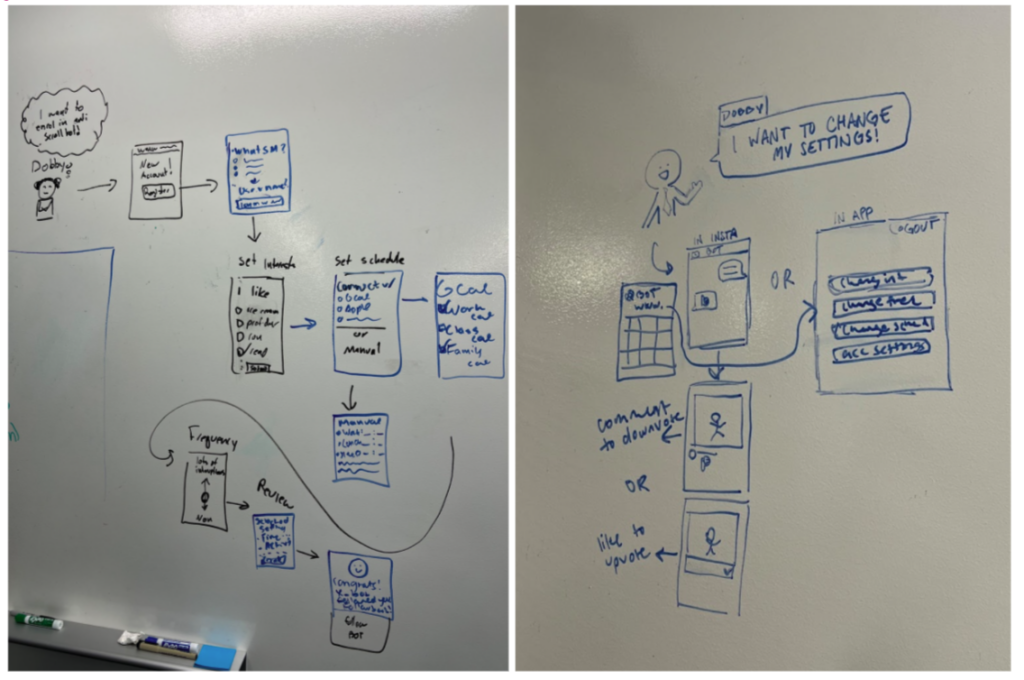
Following our intervention study, our team began to design a solution that could help users in minimizing their phone scrolling. To start off designing our solution, we imagined how our target users would interact with our concept at different points in the process. In doing so, we created five rough wireflows to illustrate their process, which revolved around login, setting topic preferences, entering a schedule, updating preferences, and interacting with the bot on Instagram.
After creating our wireflows, we created our team’s mood board and style tile.
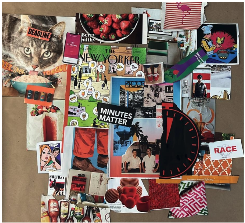
We created our mood board using cutouts from magazines as inspiration, and then created our style tile to outline the core look and feel of the app based on what we felt from our mood board. In doing so, we also explored and defined what our brand is, as described below:
- Positioning – Casually cool
- Promise – Make you laugh while helping you change your habits
- Personas – Fun and hip?
- Product – Casual tech for the average person
- Personality – Casual funny
- Pricing – Free but asks for donations to support project (think When2meet)
Another aspect in designing our solution was creating sketchy screens to lay out our navigation strategy and flow. The screens were developed independently and then combined into a cohesive outline as a group. Using our sketchy screens and style tile, we created the first version of our clickable prototype. We built flows that allow first-time users to create a bot and flows for editing an existing bot. This prototype was used in our initial usability test.
We then performed usability testing of our first prototype with three students. From this, we identified 9 main areas for improvement, which are listed in our Usability Report. Out of these 9 issues identified, the one issue we were unable to fully fix was due to the limitations of Figma (i.e. being unable to click and drag to select an area), but we updated that component visually based on our usability testing feedback and were also able to address the remaining 8 issues. Our 3 most severe issues and their respective solutions are:
- Not enough context for why in the wizard. Our fix is to include a tutorial popup window that details what the user will be expected to input in each step and how the information supports the bot.
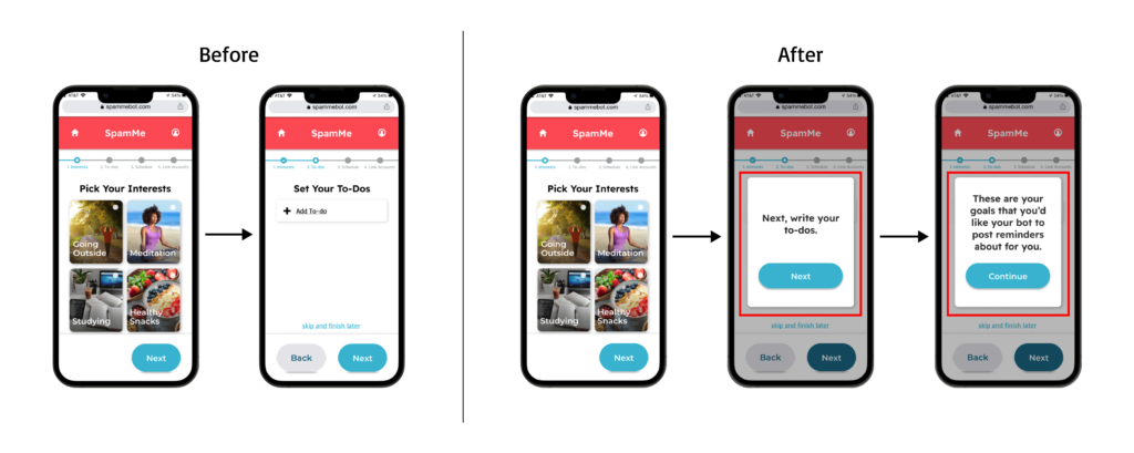
Figure 16: Before and after screens for issue and fix #1 - Product offering was not clear from the home page. Our fix is to include a “learn more” section below the signup button with description of the product.
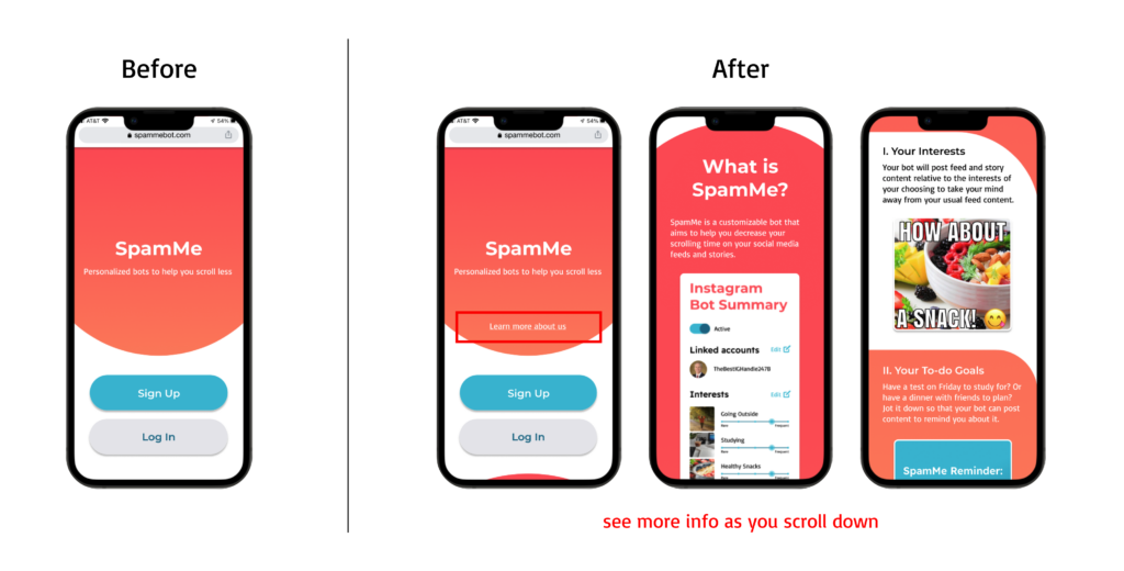
Figure 17: Before and after screens for issue and fix #2 - The edit icon in settings did not signify editing. Our fix is to add the label “Edit” next to the icon to make it more clear that it’s how the user can access the editing flow.
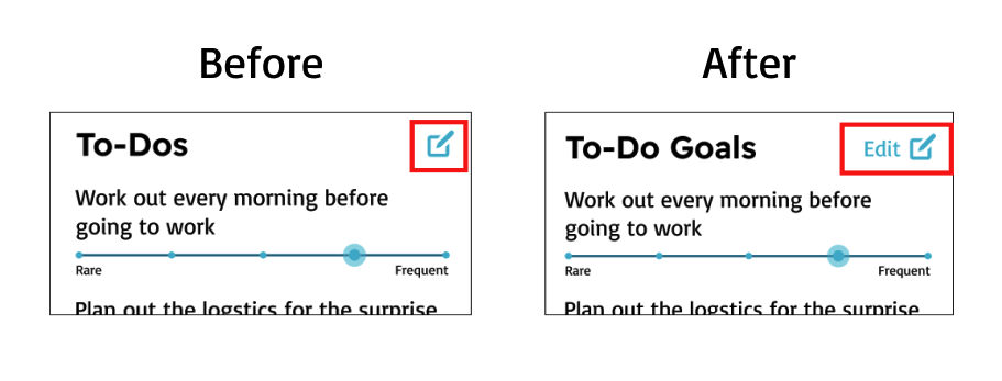
Figure 18: Before and after screens for issue and fix #3
IV. Final Prototype
From the teaching team’s feedback and usability testing results, we updated our prototype to this final version. In addition, we also added overlays and flows to illustrate error states (e.g. invalid Instagram account and not entering schedules).
Although the prototype showcases the main flows of our concepts, there are more details to work out. One key area that we would like to design next is how interactions with the bot on Instagram affect its settings and how we ensure that the user understands how interactions with the bot affect their account. We would also like to do further usability tests to better understand how to succinctly communicate our solution’s concept and make the rather long onboarding wizard feel streamlined and less tedious.
V. Ethics
Ethical considerations played a large role in our design process. From week 3’s discussion about nudging and manipulation, we discussed how almost anything online can be viewed as a form of manipulation on the user. However, we also discussed the importance of consent and transparency when it comes to using a product. For our users, we want them to know in advance what they are registering for via our landing page. We also allow our users to opt-in to be nudged on their social media accounts by our bots in order to give them more control in deciding to use our solution.
Week 4’s discussion around privacy was extremely important to our product, especially since our solution has users sign up and share information such as their social media accounts and calendars. We do not intend on selling or reusing the data outside of the main mission of this project of creating a spam bot. In addition, we do not intend to share a user’s data with other parties, nor track locations or record identifying attributes to our spam bot. We want the content to be specific, but not too specific where an outsider following SpamMe’s bot would have identifying information for the user who created the bot.
From week 6 & 8’s discussion on design justice, we discussed how our solution could potentially leave out certain user groups. For instance, those who do not speak English or own a smartphone. We also discussed how our solution does not contain accessibility features for those who are visually impaired or blind. While these are less than ideal, we want to have a potential MVP to our Social Sally persona users, as they were our target user group. If the product expands in the future, we would then begin to incorporate more affordances and features to be more inclusive of a product. In addition, because our solution is meant to be customizable, we hope that our solution can reach a large range of users who can then easily be able to tailor our solution to their specific needs.
Lastly from week 7’s design for well-being, we know that social media is intended to be addictive to users and decrease time spent on other aspects of life. In discussing our solution, we believe that SpamMe promotes well-being through a hedonism lens, as well as granting our users more autonomy. All good things (content consumption) should be balanced with other needs for a fulfilling life. This project may pose a risk to well-being if the bot comes off as degrading, callous, or personally insulting. If successful, social media could have less of a hold on our free time if this change was widely accepted. This can then increase a user’s sense of autonomy when scrolling and reduce unwanted screen time on certain apps.
VI. Conclusion
As a group, we learned how hard it is to make substantial change for a behavior that is not an immediate threat to a user’s health, or that is a “nice to have” change and not a “need to have” change. We see the larger societal trend of people always being connected to media as another barrier to our ability to meaningfully reduce scrolling. Social media is also built to be addictive and pushes users down a “rabbit hole” with endless easily consumed content.
In our next behavior design efforts, we would hone in on a user persona earlier and scale down the variety of users that we initially target. Ideally pre and post scrolling activities and feelings about social media will be more similar between participants. This narrowed focus would make our future efforts more successful.
Overall, we had a lot of fun this quarter and appreciate the love and care of the teaching team! We all hope to cross paths again soon.


