
Introduction
Project name: Palendar
When: January – March 2023


Project summary
Palendar is an app developed over the course of 10 weeks by Safiyah Lakhany (UX researcher), Millie Lin (product manager), Erfan Rostami (UX researcher), Helen He (UX designer), and Ni Yan (UX designer). Through a rigorous need-finding process, our team discovered a desire from students for more social interaction, but a forgetfulness in making time for it. Palendar allows for easy scheduling of hangouts with friends.
Goal
To help seniors strengthen their social connections and form more meaningful connections. Graduating seniors are at a transitional stage in life—soon friends they see around campus may no longer be in their geographical area. Maintaining friendships can be difficult, but the difficulty only increases with distance. By ensuring seniors have strong social connections, they are more likely to stay in touch with friends after graduating.
Results
Palendar is a mobile app that allows friends to easily schedule meetup times by automatically finding mutual availabilities through accessing user’s existing calendars. Palendar relies on a notification system to serve as “anchors,” reminding users to schedule meetups based on their social interaction goals.
Problem Finding
Several members of our project group are graduating seniors. When reflecting on our own personal relationships, we had a desire to strengthen these relationships before transitioning into the next stage of life. This inspired us to further explore the problem space of social interaction. Through various need-finding studies, we were able to narrow our problem space: enabling users to strengthen relationships by easily scheduling social interaction.
What is Known
A key finding from the longest running study on happiness, the Harvard development study, is that the largest predictor of happiness is personal connection/friendship. Social relationships are an integral part of mental and physical health. With the importance of relationships in mind, we conducted a literature review to further explore the problem space. Key findings include:
- A study by the International Association for Relationship Research found that the number of hours spent with a friend was a direct predictor of closeness
- The 5 main relationship management strategies discovered by this study are positivity, assurances, understanding, relationship talk, self-disclosure, social networks, and sharing tasks.
With the studies mentioned above in mind, we set out to find other apps on the market for facilitating friendship. Through our Comparative Research, we compared 10 different apps that currently exist.
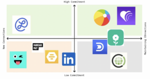
We noticed the following:
- Apps focusing on introducing new people usually tend to have a bigger audience base and expose users to many people.
- In this segment, we also see a contrarian rise of apps offering highly curated matches based on personal data to cut through the noise of meeting many people.
- Apps focused on enhancing existing relationships are divided into 2 categories:
- 1) Tools for making staying in touch easier such as helping with reaching out
- 2) Suggest activities to keep the participants entertained and learning about each other
Our team decided to focus on maintaining existing relationships, since there are many solutions that already exist for meeting new people. A key gap in existing solutions is a lack of focus on in person interaction: many apps encourage people to interact more in the virtual space, we want to instead facilitate in-person interaction.
Baseline Study and Synthesis
Our target audience are undergrad and grad students who are graduating in a year and want to strengthen social connections. We recruited 7 such participants from campus based on this criteria to join our baseline study over the course of 5 days. A comprehensive protocol of screener, pre-interview, baseline study and post-interview can be found here.
In order to find out whether our users are more interested in making new friends or hanging out with old friends, the daily questionnaire separately asked questions about participants’ interaction with new people and old friends. Questions include their motivation to socialize, their favorite social activities, obstacles they meet, and how they wish to change. Our goal is to capture our users’ preference for different activities and the core obstacle that we should handle for users.
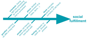
We used fragmenting, grouping and mapping techniques to synthesize baseline study raw data. The full analysis is in this blog post. Grouping gives us the most insights. As shown below, responses fall into these categories: scenarios, motivations, habits, difficulties, and feelings .
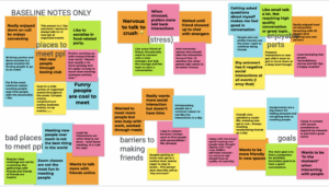
First, we find that users have a stronger need for hanging out with existing friends than making new ones, so we decided to focus on existing connections. When we zoom into their daily life, we find that users prefer to socialize in relaxing environments like dining halls. They like talking to interesting people and making good use of spare time. However, some feel nervous and hesitant to reach out, while others are too busy to meet up spontaneously.
These two types later become our major personas as discussed in the next section. At this point we decided to 1) build a spare-time cross-comparison feature to let users see each others’ availability easily, and 2) allow users to send out invitations in-app using message templates to reduce social pressure.
Personas and Journey Maps
We worked on several personas and journey maps to garner customer insights.
Persona 1: Somewhat Awkward Sam

Persona 2: Time-Constrained Taylor

Key Insights
We found that both personas want to intentionally or spontaneously reconnect with people before undergrad ends. But the most difficult moment in each persona’s respective journey was different.
Time-Constrained Taylor dreads planning the social interaction. They’re excited to meet, but more so frustrated by the back-and-forth logistics texting to actually schedule a time.
Socially Awkward Sam suffers during the social interaction. Overwhelmed and uncertain, they have multiple thoughts at once, unable to enjoy that moment of human connection.
Solution Finding
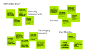
Intervention Study
Based on our research so far, we formed the following hypotheses:
- Publicizing one’s schedule among friends is a lighthearted expression of interest to connect for the socially awkward
- Busy people will value the convenience of accessing friends’ availability within seconds.
- Templates further decrease the effort required to reach out.
Designing the intervention study
Participants
5 graduating students (e.g. graduating with undergrad, masters, or phds)
Protocol
| Monday |
|
| Tuesday – Saturday, each night |
|
| Saturday |
|
Data
Questionnaires and interview notes collected from above protocol
Synthesizing our insights
 |
 |
Key insights
On the upside…
- Participants actually reconnect with old friends. Their friends are surprised but excited to catch up.
- Opening conversations use standardized language like “It’s been a while… I wonder if you’re interested in…” lending itself to the use of templates.
- They schedule meals or study sessions, which are things they always do, except now it’s with an old friend.
On the downside…
- Late reply or no reply happens, but participants are not discouraged. They’ll try someone else.
- Participants’ schedules might not work for the friend, and they’ll have to go through painful discussions. This suggests that our app should have a recommendation feature that only pairs up people with shared availability.
Design Architecture
From our intervention study, we ideated numerous potential solutions and eventually narrowed down to this particular solution architecture:
- A mobile app, since our target audience tends to use mobile device to stay in touch with friends
- 3 main features:
- First tab: a homepage that contains all the necessary quick information for the user to glance at, such as incoming requests for hanging out together or viewing public events nearby to choose from and suggest to friends to attend together.
- Second tab: a list of friends you can connect with. Whenever you click on a friend, the user will see a list of available matching times between them. Once a time has been selected, the user will send a personalized message request to the friend.
- Third tab: a calendar view. Users can view and click on any free spot, and see a list of friends who are also available in that time slot.
During our first prototypes, we were designed a fourth tab – ongoing chats between the friends for activity coordination, because it usually takes some time for both parties to respond back to each other and finalize the activity. However, later while building the solution, we realized that we’re not Tinder; we don’t need to create an in-app chat function. To chat with pre-existing contacts, people already use their own instant messaging apps.
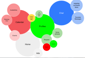
Mappings and diagrams
System path

Bubble map
Based on the previously mentioned 3 tabs, plus our originally-planned chat 4th tab
Assumption Mapping & Testing
Below is our assumptions brainstorming:
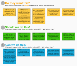
Assumption 1
Busy people will regularly use our product and respond to friends’ invitations on time.
People recruited
- People we recruited: n=3. We recruited these three people because they were all very busy and upcoming/already graduating students.
- Graduating undergraduate senior studying CS (7.5/10 busy)
- Graduated coterminal student, but still living on campus and about to leave (10/10 busy)
- Graduating PhD econ student (8.5/10 busy)
Interview procedure
- “On a scale from 1-10, how busy were you yesterday and today?”
- “Can you pull up conversations with the last 10 people who texted you?”
- For each conversation: “Who initiated the conversation?” “How long did it take for you to respond, if at all?”
Findings
| We what wanted to test:
|
What we learned from testing:
|


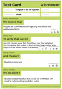
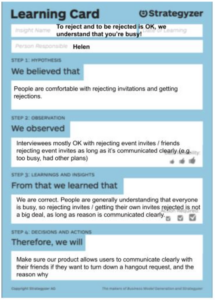
Assumption 2
People are comfortable with rejecting invitations and getting rejections.
People recruited
- Same people from previous experiment.
Interview procedure
- Note: We want to avoid any mass invitation sorts of events, like “I invited the senior grade to the senior night” but “I invited friends to come with me to senior night” is fine
- Questions include: When was the last time you were invited to an event? Did you accept it? How did you reject it? Let’s play would you rather – would you rather be invited to everything on earth and never be able to go with friends to them, or always be available but go alone to things?
Findings
| We what wanted to test:
|
What we learned from testing:
|
Building a Solution
In this stage, we thought about creating the optimal happy path. What are the best flows and visual hierarchies of our three core app functions: onboarding, processing incoming hangout invitations, and inviting others to hang out? What branding best inspires a sense of excitement and organization?
See our earlier relevant submissions here:
Wireflows to Sketchy Screens
Below is our happy path we’d like users to take, explained via our wireflow (see below).
1. Onboarding: Users first sign up for the app, sync their calendars so we know their availability, and sync their contacts so that we know the people they might want to meet with.

2. Process incoming invites: On the home page, users can explore events around the user that could be fun to hang out with a friend at (which we can imagine partially being ads, as a way to monetize our app). Most importantly, users can also view and process any invite requests to hang out. If so, we bring users to their messaging app of choice and users can invite their contact to hang out.

3. Invite other people to hang out: On the calendar tab, users can look at their contacts’ availability and see if the people they want to hang with have overlapping free times.

Ultimately, at the end of our happy path, we want users to find time to successfully hang out with people, whether this hangout happened from an incoming invite or an invite they sent to others!
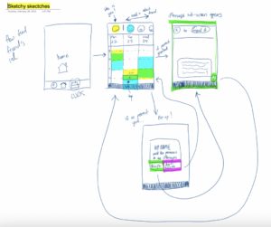
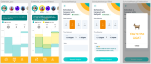
To dive more deeply into critical UI moments in our wireflow / happy path, below are our sketchy screens.
1. Onboarding: Onboarding requires calendar and contacts syncing, which could be tedious but ought to feel exciting. So here we outline a progress screen during the onboarding, which shows the whole onboarding process and the user’s place in it (and how close they are to finishing). This feels more exciting and affable, getting users excited like the happy teacup is, ready to socialize with acquaintances and friends.

2. Process incoming invites: Invites can be complex, where users want to maybe filter their invites or see their and contacts’ availability. To keep things simple and intuitive while also having a function that can take care of complex needs, we create a simple screen, but it has pop ups and dropdown menus that reveal complex functions. For instance, We want to provide users with a condensed view of all pending invitations, so “Requests” will list them with only the basic information: who, when and what. Invitations are clickable for users to get more detail.

3. Invite others to hang out: This part of the app allows users to view their and their friend’s schedule and identify free-time for hanging out with their friends. Its goal is to be extremely fast and easy in sending meetup texts. Typically, finding time to meet involves a lot of back-and-forth time negotiations and texting on both people’s ends. This part of the app aims to streamline all that, by 1) Let users see their own availability and friends’ availability, and then 2) Select available slots and send pre-composed texts to hangout. To highlight some UI decisions:
- After iterating through several designs, we landed on a “day” view broken up by hour—since other views resulted in an information overload.
- To schedule a hangout, you click and drag on the time slot you want to schedule something. We modeled this after the Google Calendar app, since many are already familiar with this input style.
- We considered adding additional fields like location, driver, pickup, etc, but figured that would be too complex and may not be applicable to every hangout session.
Branding: Mood Boards & Style Tiles
In creating our mood board, we wanted our app to feel empowering and exciting for users. If Palendar were a person, it would use a pastel bullet journal to plan a hyper-organized trip to jump into every puddle in town after a rainy day.
Thus, in our mood board, we have images of fun social scenes, created mostly with clean lines. We knew we’d be dealing with multiple people each with their complex availability, which could potentially get overwhelming for users. Instead, despite all the calendars, we want our app to feel simple to use. Thus, some mood board images are grids and cubes, diverse colors laid out in minimalist and flat – aka organized – styles. We also have more mood-board-y images in our style tile underneath.
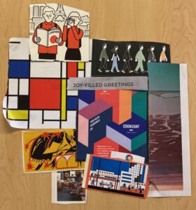
Meanwhile, our style tile conveys a sense of excitement and minimalism at the same time, which are reflected in our adjectives and images. In addition:
- We use a sans serif font, which is minimalist, but it’s one that’s “modern, curvy, fun”! According to color theory, we have the excitement of a yellow/orange-ish color, but also the calmness of the opposing color of something more greenish blue-ish.
- Our icons are simple and straightforward, with purposefully no “creativity” there to make navigating and using our app straightforward.
- To put all this into practice, we took the step of drafting up three of the example buttons – Events in your area, Friend request, Received Invites.
(Fun fact – The center image and the bottom middle image were generated by putting our adjectives into DALL-E!)

Usability Testing
The three tasks we wanted our users to accomplish were specific versions of the flows we sketched out. You can see the prototype we used in the section underneath, Final Prototype:
- Onboarding: Let’s say you just downloaded this app. Open the app for the first time to sign up for an account and get yourself set up.
- Processing incoming invites: You want to hang out with someone. How would you check for invitations from your friends? You see an invite from Millie that looks interesting. How would you go ahead and respond to the invitation?
- Invite others to hang out: You want to hang out with Safiyah. How would you find out when she is available and invite her to hang out?
After conducting usability tests, our 3 biggest issues are below, which we address in our final prototype (link). Note that the prototype screenshots above are from our final prototype, so the three issues below should be visibly resolved above already.
| Issue | Fix |
| When viewing the calendar availability, users couldn’t tell what those chunks meant – was it when they were free? When they were busy? when their friends were available? Or free? When both were available or free? This is a very large, visible, and core feature of the app, so making sure the calendar availabilities were clear was crucial. | To address this issue, we set the default calendar view to be just the user, and their friends’ availability overlay the users’ availability. In addition, we add a color legend to clarify that the colored chunks are free time, not busy time. This way, it’s clear whose availability is whose, as well as when both people would be free. |
| When viewing an invite to hangout, it’s unclear whether the invite time works with my calendar, their calendar, or both. “I can’t tell looking at the invite whether I’m free at the same time.” Seeing availabilities is a core goal of Palendar, so this was important to fix. | Upon tapping the invitation, we surface a preview of the user’s calendar, overlaying the invite with their availability. That way, they can tell whether they’re free during the invite time. |
| On the screen where users can schedule hangouts with friends, there’s no going back! If users change their minds about scheduling a hang out, they can’t exit. | We added a back button to exit this flow. So it’s an easy-to-fix issue but an important one. |
Other issues we addressed in our prototype included allowing users to import their calendars more than once, as well as making a less creepy (no more smiling teacup) and more welcoming and informative app opening screen.
Moving forward beyond the final prototype, if we had more time we would also allow users to title hangouts, add more complex data to a hangout like location, as well as the new core function of hangouts with multiple people at a time.
Prototype
Find our final clickable prototype here. We successfully implemented three flows:
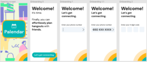
Flow 1: Onboarding
Onboarding is made simple but informative. In the opening screen we introduce our app as an effortlessly hangout planner. Users only need their phone number to register or login.
For first time users, we guide them to sync their calendar and contacts to get ready for scheduling hangouts. We’ll support syncing outside calendars like iPhone, Google and Outlook to reduce the burden of inputting their schedules manually.
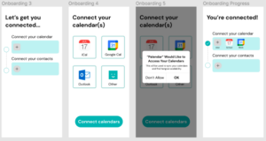
We’ll request to access users’ contacts list to identify which of their friends are already using our app. First-time users can directly connect to their friends in our app. With the calendar and contacts synced, you’re all set to start hanging out!

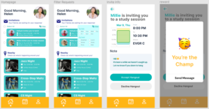
Flow 2: Invite Someone to Hang Out (Calendar Page)
In the Calendar tab, users will see their free time colored in blue. They can click on any friend to cross compare the selected friend’s free time, which is colored in yellow, with their availability. Due to privacy concerns, we only show free time to avoid disclosing the detailed schedule of any user. Now any overlap can be a potential hangout, and upon clicking an open slot, users can send out hangout invitations. They could write a short message in “Notes” to communicate their plan, but it’s totally optional if they don’t want to write a text. Once the invitation is sent, a celebration message pops out to award them.
Pending invitations will be prompted to the other user for their response. In the meantime users can still update or cancel this invitation if anything pops up.

Flow 3: Accept Invitation to Hang Out (Home Page)
In the homepage tab, users can see all the pending invitations from their friends. Each entry summarizes who’s inviting to do what, and the time and location. We believe this will give users an overview of what’s awaiting them. They can filter incoming requests by date and event type to select out the most suitable hangout in case they get busy. To get more detail, users can click on the invitation to view their friends’ message to them, and decide to accept or decline. Again we’ll celebrate if they accepted.
Ethics
There are several ethical considerations relevant to Palendar. While this is only a prototype, it is important that discussions regarding ethics happen early on in the design process, in order to avoid creating potentially harmful products.
Privacy
Privacy is probably the biggest ethical consideration when it comes to our app. In particular, our app allows users to view their friends’ calendars. To address privacy concerns, we designed our app to hide details of their entire calendar (title, description, and location of events). The user only has access to a visual representation of availability (a calendar with blockout times). In the future, an ability to pause calendar sharing with particular individuals could further address privacy concerns.
Nudging and Manipulation
While it wasn’t implemented in our clickable prototype, our team discussed the possibility of adding notifications encouraging users to schedule meetup times. The notification frequency would be determined by user defined goals for social interaction and serve as “nudges.” We made notifications opt-in as an ethical consideration since we wanted to prioritize user autonomy. In Wilkinson’s paper, he calls this “consensual manipulation.” We also want to implement other features to encourage users to schedule more meetup time including access to statistical data (daily averages, graphs, etc).
Accessibility
Due to the fact that our app design is very visual, our clickable prototype isn’t vision accessible. Right now, the process of finding mutual meet-up times is very visual, the calendar relies on colored blocks to indicate mutual availability. This may pose a challenge for not just people who are blind, but people who are low-vision, color-blind, or neurodiverse. An app that isn’t vision accessible is concerning considering that vision limitation is one of the most common disabilities. In order to cater to varying levels of vision, we will utilize audio cues by adding alt text for various elements on the screen.
The impact of this app is on a small scale. Unlike social media apps where you interact with a large range of people (anyone from those you barely know and those you consider your closest friends) in various different ways (sharing everything from life moments to memes to news) this app is less interdimensional. It has a clear purpose: schedule time to meet with your close friends. As a result, the ethical considerations are on a smaller scale, though they remain to be very important since relationships are such an important part of people’s lives.
Conclusion
Throughout the development of Palendar, our group gained valuable insights into the importance of social interaction and the role technology can play in fostering connections among individuals. Not only have we identified a gap in the market for an app that focuses on maintaining existing relationships, but we’re making a difference in the lives of people who are similar to ourselves. We gained a lot of insights on how to approach product development. By having a framework for designing an experiment/a pilot for a behavior change we feel a lot more confident in being a systematic thinker in the world of product and startup development.
Given more time to work on the project, we would be interested in investigating further refinements to the user interface and experience. We would also explore additional features, such as integration with existing social media platforms, and refining the onboarding process for new users who don’t have a big social circle on the app. Moreover, we would like to improve the accessibility of the app to cater to users with various levels of vision and other disabilities.
In our next behavior design effort, we will apply the lessons learned from this experience by thoroughly understanding the problem space, conducting comprehensive research, and iterating on our design based on user feedback. Additionally, we will continue to prioritize ethical considerations, such as privacy and accessibility, ensuring that our solutions are inclusive and respectful of all users.
Overall, our experience with Palendar has taught us the value of collaboration, user-centric design, and the importance of addressing real-world problems in innovative and meaningful ways.
Thanks for reading! 📅😀


